
When I was attending a graphic design class at UCLA back in 1978, the instructor gave us 10 simple tricks that we could use for spicing up an otherwise dull design. I can’t remember all of them, but several stuck in my mind and I still use them today:
- Reverse it.
- Enlarge it.
- Shrink it.
- Add a background.
- Tilt it.
- Put it in a frame.
It’s the last one, putting it in a frame, that I find most interesting, but also most difficult. Now that I’ve been studying letterpress printing and page construction, I have come to appreciate a good border design more than ever. It’s an art that can both help and hinder a page.
Modern page composition does not, of course, exclude the possibility of creating unique and distinct borders. But once again it’s a problem of too many choices and too little time. A good border is one that is constructed specifically for the job at hand, not one chosen from a clip art collection or automatically inserted by QuarkXPress or InDesign. In the era of letterpress, border construction was like putting together a complex puzzle — there were a limited number of pieces, but an almost infinite number of combinations. In that regard, many border compositions were one-of-a-kind. Once deconstructed, that combination of rules, ornaments, and flourishes might never come together again.
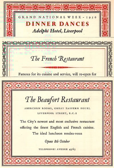
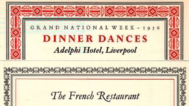
Figure 1: Mr. Bert Smith of the British Transport Commission is credited with these unique border designs from the mid Fifties. By using same colors and paper stock, he was able to achieve consistency, but make each piece unique.
Ornamental, My Dear Watson
There have always been simple line rules, and they are the default for most of us when we need a box to contain our work. If we’re feeling daring, we might choose a multiple-rule border from the pop-down menu. But it’s rare to see a truly ornate border these days. Maybe it’s no longer the style to create an elaborate frame, but I wonder if it’s more the lack of our collective ability than our desire. A distinguished border can still create a feeling of elegance and style that is hard to achieve any other way.
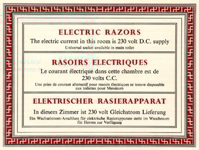
Figure 2: Borders and rules were made up of many parts — each cross in the red area is a separate piece, and the rules for a project like this hotel notice were all cut and assembled by hand.
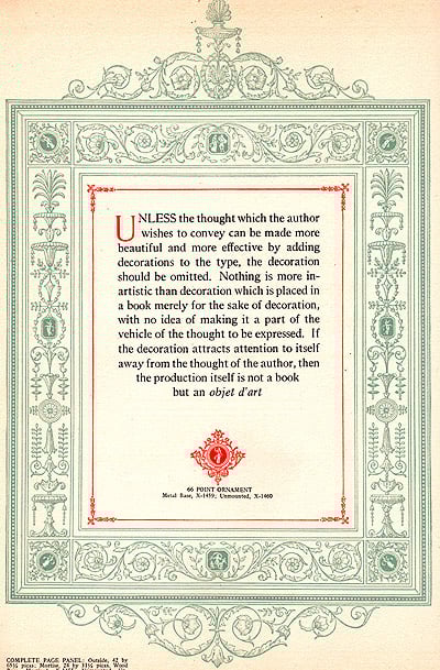
Figure 3: From the 1925 “Manual of Linotype Typography,” this example from the Adams series of ornament not only shows a great example of a frame, but gives rather good advice to designers of any era.
The simplicity and limited styles of metal type may have been why, to dress up a page, the printer often turned to stylish borders. These frames, usually printed in a second or third color, created a finished look, and if used consistently could distinguish one company from another. Background screens, reverses, distortions, etc. were not as easily accomplished back then. An ornate border was often the only art associated with a print project.
Because the individual elements of metal borders were designed to fit together for a variety of page sizes, the resourceful and creative printer could mix and match in highly unique ways. Many of the best borders were essentially borders-within-borders, as opposed to a pre-conceived pattern. A complex border design might contain hundreds of individual elements, all put together to fit a specific space. There were no keyboard commands for “fit to frame.”
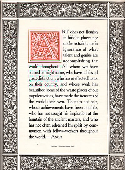
Figure 4: A sample of Benedictine ornaments set with Cheltenham type.
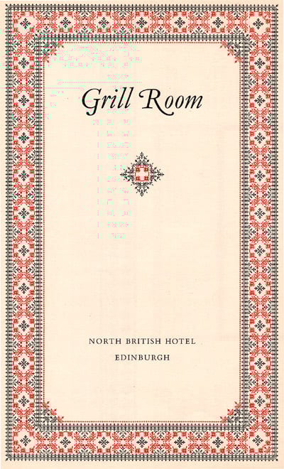
Figure 5: At the Grill Room in Edinburgh, diners were treated to a custom, hand-assembled border made up of hundreds of individual elements and printed in two colors. The additional flourish in the middle compliments the border by using the same elements, arranged in a diamond shape.
Flowers and Flourishes
Though widely used in Europe, especially by Dutch printers Elzevir and Enschedé, ornate borders made up of “flowers” were not well known in this country before the turn of the century. It was in 1916 that Sir Frances Meynell of the Pelican Press made these a central part of his philosophy of printing. After the first World War, Meynell and a group of typographers got together to form a private publishing society. It was at that time that Meybell coined the term “flouron” for this type of work — a name that is still used today to describer typographic flourishes.
In a 1958 edition of “The Monotype Recorder,” Christian Barman writes that “through printers flowers the opportunities for the humblest jobbing printer to apply imagination to his work, and for the compositor to express himself as a creative individual, can be increased a thousandfold.” Indeed a creative compositor could turn an ordinary menu or announcement into a work of art by adding a unique frame.
Figure 6: This title page uses 63 small squares and several solid line rules to make a distinctive border to compliment the Caslon Old Face type.
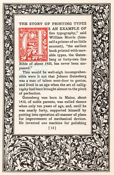
Figure 7: With a border from the Jenson series of Linotype ornaments, this page also includes a 96-point Jenson initial cap, and type set in Antique No. 1 Roman. It is from 1925.
My 1925 edition of the “Manual of Linotype Typography” states: “the most dominant feature of a piece of printed matter is its margins.” A good border design establishes these margins in a dramatic way, and serves as a container for text that may, otherwise, be non descript. In an era of full-bleed printing, we’ve lost some of the focus on the margins — I doubt most modern designers would agree with Linotype on that point.
Bordering on Beauty
It is not impossible to recreate some of these unique designs today. There are a variety of border fonts available, many of them are exact PostScript versions of early border elements. The problem is, most of us cannot imagine how these individual elements should be combined to form something beautiful, and we lack the time to experiment. We are much more inclined to choose a pre-conceived border design and fit it to our work.
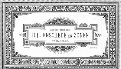
Figure 8: The Dutch printer Joh. Enschedé and Sons was famous for their ornate borders and typographic ornament. This 1891 example is from Enschedés catalog, which has been reprinted by Dover Publications.
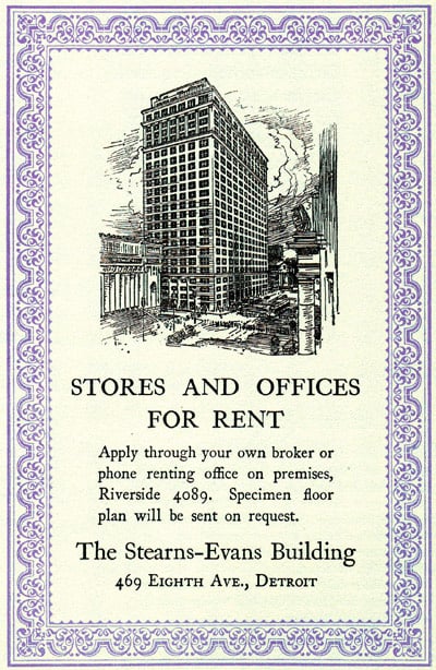
Figure 9: It wasn’t just invitations and menus that benefited from ornamental borders. Early advertising was often distinguished by a custom-made border, as shown in this 1923 ad for The Sterns-Evans Building in Detroit. The border is from the Caslon Old Style collection.
But I encourage anyone interested to reference the numerous Dover books on classic borders, and to experiment with some of the hidden border elements in many fonts, or to purchase any number of border font collections. By repeating certain elements and characters, then combining them with various rule styles, you can create a unique work of art. It’s still a puzzle waiting to be put together, only the pieces are much harder to find these days.
Read more by Gene Gable.
This article was last modified on May 19, 2023
This article was first published on November 13, 2003
Commenting is easier and faster when you're logged in!

Recommended for you
The Frank Romano Show Returns to WhatTheyThink, Sponsored by Press-sense
WhatTheyThink.com, the leading news and analysis site for the printing and publi...

InDesign User Conference Returns to Melbourne
The internationally respected InDesign User Conference will be held in Australia...

Tip of the Week: Making Find/Change Settings Stick
This InDesign tip on making Find/Change settings stick was sent to Tip of the We...