

dot-font was a collection of short articles written by editor and typographer John D. Barry (the former editor and publisher of the typographic journal U&lc) for CreativePro. If you’d like to read more from this series, click here.
Eventually, John gathered a selection of these articles into two books, dot-font: Talking About Design and dot-font: Talking About Fonts, which are available free to download here. You can find more from John at his website, https://johndberry.com.
The Enschedé Font Foundry (TEFF) is the digital successor to one of the great historical type foundries of Europe. Joh. Enschedé en Zonen, founded in 1703, produced a host of noteworthy typefaces for hand-setting and letterpress printing over the course of more than two and a half centuries, and its type-specimen books are rare compendiums of the development of metal type. The modern-day TEFF offers just five font families (so far, at least), but all bring a deep knowledge of historical type founding and design to the creation of contemporary digital fonts, intended for current technology and uses.
A New Branch From Old Roots
Joh. Enschedé en Zonen was founded in 1703, in the city of Haarlem in the Netherlands. It began as a printery, and it is still active as one of the most important printers in the Netherlands, printing the country’s stamps and banknotes among other things. Enschedé began manufacturing type in 1743, after buying an existing type foundry, and over the course of more than two centuries, type founding was one of the most important parts of Enschedé’s business. Many of the most respected type designers, from Johan Michael Fleischman in the 18th century to Jan van Krimpen in the 20th, worked for Enschedé. But Enschedé, like so many of the old-line type manufacturers, was severely affected by the changing technologies and business models of the font business, and in 1990 the type-foundry was moved out of its historic buildings, and effectively ceased to be a business.
The Enschedé Font Foundry was established in 1991 by Peter Matthias Noordzij, to carry on the Enschedé tradition in a new form. Rather than reviving old metal typefaces, he began by releasing a PostScript version of Trinité, which had been designed just a decade earlier (for Enschedé’s 275th anniversary) by Bram de Does as a phototype face. All the releases since then have been original, although one, Fred Smeijers’s Renard, draws its inspiration from types cut in the 16th century by the early Dutch punchcutter Hendrik van den Keere.
Variations on a Theme
The model followed by Noordzij is clearly one of doing a few things but doing them very well. Each of the five TEFF type families comprises more than the usual selection of weights and variations. Trinité, for instance, was designed as an elegant old-style text face but in three different versions, identical except for the length of the ascenders and descenders (collectively, “extenders”); there’s a version with short extenders, for use where the lines have to be set very tight, a version with very long extenders, for fancy setting on a spacious page, and an in-between version for everyday use (see Figure 1). All three versions are available as part of TEFF’s digital version of Trinité, along with a swash version of the long-extender italic.
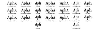
Figure 1: The many variations of Bram de Does’s Trinité, with its three lengths of ascenders and descenders.
Trinité also comes in both normal (“wide”) and condensed widths, in its roman style; the italic is narrow and designed to work with either of them.
Even more complex is Lexicon, also designed by Bram de Does (in 1992), which has only two lengths of extenders but comes in no fewer than six subtly gradated weights (see Figure 2). It is an elegant typeface, very much in the Dutch old-style tradition, but it was designed to stand up to laser printing and use at very small sizes; it has been used in everything from office memos to one of the biggest Dutch dictionaries.
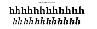
Figure 2: Lexicon’s six weights, with both long and short ascenders.
Lexicon comes with three different kinds of numerals: old-style (lowercase) figures with varying widths, “tabular” old-style figures (all the same width, so they’ll line up when set in columns), and tabular lining (uppercase) figures. It also has small capitals for all the weights (and italic small caps, too—a very useful addition). Interestingly, TEFF puts tabular old-style figures in the small-caps font; I would have expected the non-tabular old-style figures instead.
Renard is a serif face designed by Fred Smeijers, whose best-known typeface is FF Quadraat; Smeijers is also the author of Counterpunch, a book that spans the technological gap between punchcutting and digital type design. Although Renard is based on a display-size type that Hendrik van den Keere cut in 1570, it is meant to be a text face.
As Smeijers say, “Van den Keere’s typeface was cut in a large size for display setting: for use in choirbooks. for example. Such a book would be placed in front of the choir, so it had to be legible for all the singers in poor lighting conditions.” So although the typeface was quite large, it was meant to be seen at a distance—effectively at text sizes. “To achieve legibility the typeface is rather condensed, with a large x-height and dark overall colour. Van den Keere never cut a complete italic, so Renard’s italic is a new design, made in the spirit of the period” (see Figure 3).
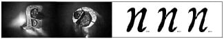
Figure 3: The three subtly different weights of Fred Smeijers’s Renard, with some of the original punches of the 16th-century types it was inspired by.
Family Affair
Collis, designed by Christoph Noordzij (Matthias’s brother) in 1993, is aptly described as “a typical ‘The Hague-style’ typeface with a certain elegance” (see Figure 4). The design school in the Hague, where Matthias and Christoph’s father Gerrit has taught for many years, is the source of an amazing number of contemporary Dutch type designers, and it’s easy to see a connection among them, in both their knowledge of the Dutch type-design tradition and their attention to letterforms and how letters get made.
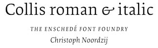
Figure 4: Christoph Noordzij’s “Hague-style” typeface Collis.
Collis is meant to work at both small sizes and display sizes; its distribution of weight and its low contrast between thick and thin strokes make it useful for high-impact text use, in posters, brochures, and ads. It comes in only one weight, in roman and italic, but it has the same variety of numerals as Lexicon, and it has an oddity of its own: a “Bible” version, where the capital letters with accents are slightly smaller than normal, so the accents don’t extend up above the cap height and you can set the space between lines very tight. (I’m not convinced that this is a good idea, but Collis gives you the option.)
The family theme is carried through in the last of the five TEFF typefaces, Ruse, which is designed by Gerrit Noordzij. It is a modern face (that is, “modern” in the typographic sense: high contrast, vertical stress, mostly unbracketed serifs), reminiscent a little bit of the text sizes of the early-19th-century classic Walbaum. But Ruse is based on Gerrit Noordzij’s handwriting, and on his ideas about how the “ductus” of writing influences the design of type: “I transferred the rhythm of the written word image into this typeface: the emphasis lies on the balance between the white shapes that keep the black shapes in place. The appearance of the typeface is casual, but what’s casual for me doesn’t necessarily have to be for other people. Let’s say that I excluded any striking peculiarities.”
Ruse has the largest number of weights of any TEFF typeface—eleven—with the increase in weight built up by increasing the contrast between thick and thin strokes (see Figure 5). The heaviest weight is hard to imagine using very often, but the variations remind me of the changing appearance of Robert Slimbach’s Kepler, which used multiple-master technology to span a wide range of weights in a similarly lively, calligraphic modern face. Ruse too has the common TEFF arrangement of old-style and lining figures.
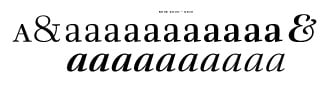
Figure 5: The eleven different levels of contrast in Gerrit Noordzij’s calligraphic Ruse.
Value for Money
The Enschedé Font Foundry charges a good deal more than the going rate for its fonts. The TEFF type families offer good value, but they’re not casual purchases; they’re meant to be workhorses that will be useful in many kinds of jobs over a long period of time. In pricing its fonts this way, TEFF is joining several other manufacturers of high-quality fonts in trying to counter the tendency to make type a commodity that’s practically given away for nothing. This is an effort that seems to have originated in the Netherlands; others taking the same approach include the Dutch Type Library, and designer Gerard Unger with his newspaper face Gulliver. It seems a reasonable way to compensate type designers for some of the long hours and high skill required to make a really good, versatile typeface.
This article was last modified on February 24, 2022
This article was first published on August 11, 2003
Commenting is easier and faster when you're logged in!

Recommended for you

dot-font: Massin, the Unclassifiable Free Thinker
dot-font was a collection of short articles written by editor and typographer Jo...

dot-font: How Type is Being Used Today
dot-font was a collection of short articles written by editor and typographer Jo...
dot-font: A New Face for Small Text
dot-font was a collection of short articles written by editor and typographer Jo...