

dot-font was a collection of short articles written by editor and typographer John D. Barry (the former editor and publisher of the typographic journal U&lc) for CreativePro. If you’d like to read more from this series, click here.
Eventually, John gathered a selection of these articles into two books, dot-font: Talking About Design and dot-font: Talking About Fonts, which are available free to download here. You can find more from John at his website, https://johndberry.com.
The most recent release from Font Bureau, which is known for extensive type families with a lot of visual character that work especially well in publication design, is a 35-member family called Amplitude, designed by Christian Schwartz. I can only guess that it got named “Amplitude” because of its wide range of styles: seven weights in five widths, from Ultra Wide to Light Extra Compressed (and, conversely, from Light Wide to Ultra Extra Compressed). It might also reflect the way most of the variations can be used at many sizes from tiny text to huge display; Amplitude is one of those robust sans serif typefaces whose details make it readable at small sizes while giving it a recognizable character at large sizes. In this case, the distinctive features of the face come from design details that are intended to keep it legible at very small sizes indeed.

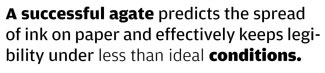
Crystalline Agate
Amplitude features “light traps”: knife-like cuts in the angles of some letters that keep the ink from filling in the narrow spaces and making the type look blobby when printed at small sizes on rough paper. At tiny sizes, readers don’t notice the light traps; all they see is that the type can be read easily. If you blow the same letters up to large size, however, all the details like light traps become very obvious. (When I was a typesetter in a phototype shop in the late ’70s, we had a version of ITC American Typewriter produced by Compugraphic that was meant for use at text sizes; we also had a separate machine, a “headliner,” for setting display sizes, with a separate filmstrip of display American Typewriter. If, instead of using the headliner, you used the lenses of the text machine to blow up the text version of this monoline, round-ended typeface to display size, it looked like a string of sausages, or a balloon sculpture.)
Schwartz observed the way these “entirely functional compensations” worked in the typefaces known as “agates,” specialized faces created for the very tiniest type in newspapers—for things like stock listings, which have to be clear and unambiguous but also have to take up as little space as possible—and he turned these peculiarities into features that give the typeface a distinctive look at larger sizes. Then he expanded this specialized idea into a very large type family.
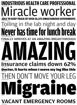
There’s clearly a demand for typefaces like this; and the malleable nature of digital fonts makes it easy to take typefaces that were designed for use at one particular size and use them at any size at all. A number of publication designers have used the old Bell Gothic, designed by C. H. Griffith in 1938 as a functional hot-metal type to set the listings in U.S. telephone directories, as a contemporary headline face. At large sizes, those little details become exaggerated and draw attention to themselves and their quirkiness—which is exactly the effect the designers who use the faces are after.
Font Bureau has capitalized on this demand once before, when Tobias Frere-Jones designed an updated type family, called Griffith Gothic, based on C. H. Griffith’s original. Amplitude fits right into the same niche. But Griffith Gothic is a more playful face than Amplitude, with rounder forms; Amplitude also partakes of the current taste for slightly squarish forms in its rounder characters.
Invaded by Space
Some of the sharp details of Amplitude look arbitrary at large sizes: the light traps in the capital Z, for example, especially in the Bold, Black, and Ultra versions. (All of these details are more noticeable in the heavier weights.) But others simply look chiseled and give the letters an interesting texture when you see them large. While the knife-thin light traps at the interior angles of A and M make those letters look oddly wounded, the white wedges intruding into the black shapes of letters like g, n, and r give them character.
I don’t think the designer had this in mind, but when I was looking at the showings of Amplitude on the Font Bureau Web site, I noticed how sharp it looked onscreen. This is not the same as a typeface designed specifically as a screen font, for use in text sizes at low resolution, but I suspect that Amplitude would work well at display sizes and large-text sizes in onscreen design.
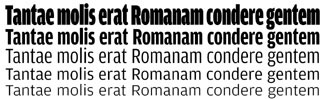
Amplitude is designed to fit a lot of words onto a line; most of its widths are at the Condensed end of the spectrum, and even the Normal width is narrow. Only the Wide version has a generous text width; in that, it reminds me of Ole Schäfer’s Fago, another large family of squarish sans serifs where the “wide” is what I’d call a normal width. While I wouldn’t want to see Amplitude’s narrowest widths used at small sizes, this abundance of slim options could make it very useful as a headline face.
Interrogatory, My Dear Watson
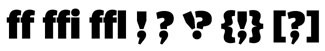
Although Amplitude doesn’t have an unusually extensive character set, it does include the double-f ligatures (ff, ffi, ffl) along with the common fi and fl ligs, and it has three oddities: an interrobang (a combination of exclamation point and question mark in the same punctuation mark, which was introduced as a concept—one that didn’t catch on—in the 1950s) and two original variations which might be called an interrocomma and a commabang. As you can guess, these last two incorporate a comma in place of the dot at the bottom of the question mark and the exclamation point. What real use they might have is hard to imagine, but they’re in the fonts, and they’re shown in the text samples on the Font Bureau site.
This article was last modified on February 24, 2022
This article was first published on July 14, 2003
Commenting is easier and faster when you're logged in!

Recommended for you
dot-font: Highlights from the Low Lands in “Dutch Type”
dot-font was a collection of short articles written by editor and typographer Jo...

dot-font: Cooling Magma
dot-font was a collection of short articles written by editor and typographer Jo...
dot-font: Industrial-Standard Typefaces
dot-font was a collection of short articles written by editor and typographer Jo...