
Designing Web Sites That Sell: Flowerbud.com’s Graphic Bouquet
Excerpted from “Designing Web Sites That Sell” (Peachpit Press).

Peachpit Press is offering this book at a discount to creativepro.com readers. Follow this link.
Theory and discourse can only take you so far. At some point, good thinking and planning need to be turned into a site that sells.
The challenge of site design is inextricably linked to considerations of technology, interaction, and performance — an unforgiving canvas for a designer. While effective information architecture an a logical layout will aid customers, they probably won’t entice them. For that you need the seductive art of good visual design.
In this case study of Flowerbud.com, we’ll see that graphic design plays a critical role in market differentiation
Flowerbud.com
In the crowded field of online (and off) flower sellers, this site for a Portland, Oregon, flower grower stands out. The mom-and-pop proprietors hope to cater to those who share their passion for flowers, not those looking for a cheap bouquet deal. Graphic design plays a critical role in market differentiation. The site has a seasonally rotating inventory of less than a hundred products, which affords a deep level of graphic detail. Despite this visual intensity, the site is very fast.
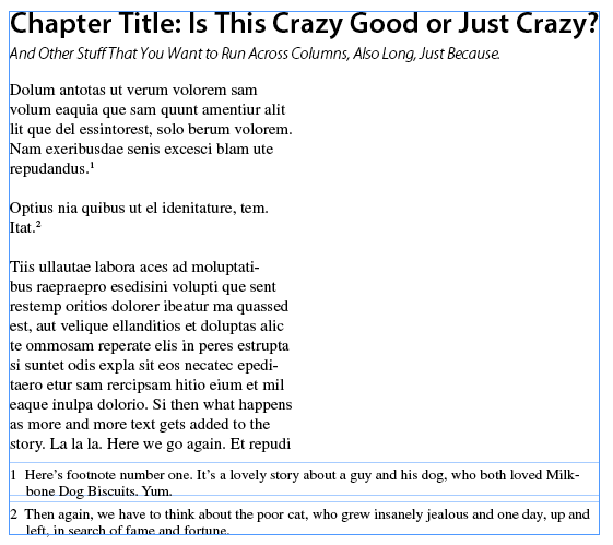
A page for the moment. Flowerbud uses a poster approach to showcase the newest flowers of the season and a link to options for the upcoming holiday. This is a perfect temporal anticipation of audience task. The left-hand side of the page features standing elements of the site, including the core navigation pull-down menu that is repeated throughout the site.
Home Page
Earth Tones. The colors naturally support the site’s theme; thick blocks of neutral tones contrast nicely with hyper-real flower photos.

Color Palette
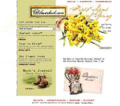
Scanability. Flower pages are easy for customers to quickly peruse: a brief description, bright photo, and a link to additional detail.
Product Page
Easy choices. Forms have been prefilled with an instruction or a useful default. Order options are clarified with parenthetical comments.
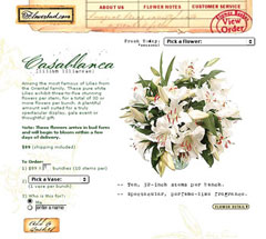
Have personality. With its calligraphic headlines, earth-toned watercolor illustrations, high-quality photographs, and intelligent product descriptions, Flowerbud displays a personality that says “thoughtful, elegant, and experienced.”
Product Detail
The writing on the site conveys precision, passion, and detail. With each flower description is a miniature history about the plant’s origins and its place in our lives. The writing implies that the Flowerbud folks care about getting things right.Therefore, your order will get the same care and attention as they took picking and growing the flowers.
Signal a change in experience. Flowerbud makes a smart design choice by using color to signify to the customer, “you have entered the checkout process.” Flowerbud’s designer has minimized the intensity of the visual experience because the customer must now focus on making exact checkout choices.
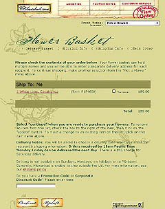
“Flower Basket” Checkout Page
Reveal last choice. In each step of a process, it’s helpful to present the customer with an indication that the system has registered their last set of choices. In this case, the page restates the shipping options and quantity chosen on the product page.
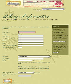
Billing Information
Reinforce process. Every good commerce site explicitly presents the steps of the checkout process. As a customer proceeds through each step, a visual reminder is displayed to show progression.
Ask when appropriate. This is the perfect time to ask customers to identify themselves for billing purposes. But Flowerbud does not force customers to create a permanent account. Instead, they respect customer privacy by offering a permanent account as an option. Repeat customers with an account sign in to bypass the billing information step.
Double-check. The final step of most checkout procedures is a confirmation review of all data the customer has submitted. Flowerbud combines the confirmation and payment info to shorten the number of steps in the process.
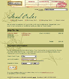
Send Order
Security. Flowerbud presents customers with a short message about the safety of completing a credit card transaction on the Internet.
Customers who experience a problem can use the e-mail link or call the toll-free number for offline help. Making it easy to contact a human being is mandatory for customer retention.
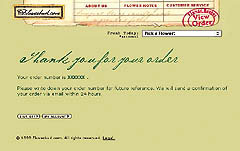
Thank You
Say “thank you.” It’s remarkable how many commerce sites fail to express their appreciation for a customer’s decision to shop at their site. Sales people thank you in stores, so why not online?
In addition, customers need confirmation that their order was processed. Flowerbud reassures customers by telling them their order number and to expect a confirmation e-mail “within 24 hours.”
“Designing Web Sites that Sell,” copyright 2002 © by Rockport Publishers, Inc., is published in association with Peachpit Press. For a list of bookstores that carry Peachpit Press titles, call (800) 283-9444 or online at www.peachpit.com.
This article was last modified on January 6, 2023
This article was first published on November 20, 2002
Commenting is easier and faster when you're logged in!

Recommended for you
How to Convert PostScript Fonts to OpenType with TransType
Need to modernize your font library to work with Adobe programs after they end s...

InDesigner: Theresa Stoodley
Learn about the creative process behind award-winning editorial and information...

How to Share Illustrator Swatch Groups
Learn how to use Illustrator’s brand-new Swatch Info feature and how to add swat...