

In amongst all the other goodies in Adobe Photoshop 7, you may have missed Auto Color entirely. Or, you may have chosen it from the Image > Adjustments menu, found that it gave you a fairly unattractive, cold, contrasty image and decided it was as useful as all the other auto-adjustments — which is to say, not terribly useful. In its fully automatic mode, Auto Color may disappoint, but if you dig a little deeper, you’ll find that with a very little work, it becomes a powerful tool for making your major initial corrections — call it “Semi-Auto Color.”
Confessions of a Latter-Day John Henry
I’ve always been profoundly distrustful of auto-anything when it comes to working on images — auto-corrections might be OK for amateurs and newbies, but they had no place in a professional environment. I always believed I could do a better job, faster, than any algorithm. And it’s true that the auto-correction features offered by previous versions of Photoshop were pretty much image-wreckers — Auto Levels seemed designed to destroy highlight and shadow detail while introducing massive color casts, while Auto Contrast contented itself with destroying highlights and shadows while preserving whatever color cast was present.
My first hard lesson was the harsh realization that Nikon’s auto-focus did a better job, faster, than my 40-something eyes could. So when I first saw Auto Color in an early alpha version of Photoshop 7, I resisted the inclination to ignore it, and began exploring.
I’ve been using Auto Color ever since, and I’ve become sufficiently convinced of its usefulness to recommend it as the first thing to do with uncorrected images. I use it on raw scans and digital captures, and it’s proved to be an enormous time-saver. But you do need to use it with some care. The guidelines laid out in this article will get your images much closer to where they need to be with a few simple tweaks. Failure to follow these guidelines will probably get you over-contrasty images with blown highlights, plugged shadows, and a color cast.
Automatic, but You Need to Press the Buttons
Don’t choose Auto Color from the Adjustments submenu-it doesn’t offer the control you need. Instead, use the controls that you can reach from either the Levels or Curves dialog box — I prefer using Levels because the dialog is smaller, so I can see more of the image. To reach the controls, click Options in either dialog box to open the Auto Color Correction Options dialog box shown in Figure 1.
 Figure 1: Access Auto Color Correction Options from the Levels or Curves dialog box.
Here you’ll run into the first little gotcha. Unless you take steps to make it do otherwise, the Options button in Levels and Curves always defaults to Auto Levels, and to make matters somewhat worse, the options in the Algorithm section of the dialog box have a completely different, albeit more descriptive, label than the equivalent menu commands. Here’s the secret decoder ring:
- Enhance Monochrome Contrast is the same as Auto Contrast.
- Enhance Per Channel Contrast is the same as Auto Levels.
- Find Dark and Light Colors is the same as Auto Color.
So the first order of business is to make the dialog default to Auto Color instead of Auto Levels — you only have to do this once. Choose “Find Dark and Light Colors,” (ignore what it does to the image for now — you’ll undo it as soon as you’ve closed the Levels dialog box) and check the “Snap Neutral Midtones” checkbox.
Then click the “Save as defaults” checkbox, as shown in Figure 2.
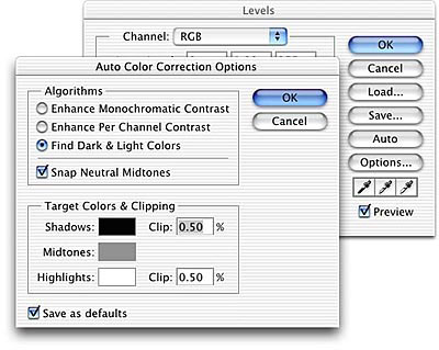
Figure 2: Choose Find Dark and Light Colors and check Snap Neutral Midtones, then Save as Defaults.
The goal of this step is simply to ensure that when you press the Options button you get Auto Color rather than Auto Levels, so click OK to close the Auto Color Correction Options dialog box, and click OK again to close the Levels dialog box (or just hit the Enter key twice). Then immediately hit Undo to undo whatever havoc the default settings wrought on your image.
Now you’re ready to start using Auto Color on images. The Auto Color Correction Options dialog box allows you to adjust quite a few different parameters, but I generally only tweak three settings: the highlight percentage, the shadow clipping percentage, and the neutral midtone target color, in that order. The default clipping percentages — 0.50% for both shadows and highlights — seem to harken back to a bygone era where capture devices were a great deal noisier than they are today. For most images, this is much too high a setting, tending to blow out highlights and block up shadow detail. The neutral midtone target color is set by default to RGB 128 gray, which often results in a rather cold color balance. In most cases, I end up raising the red value slightly, and lowering the blue by about the same amount.
This article was last modified on January 3, 2023
This article was first published on July 23, 2002
Commenting is easier and faster when you're logged in!

Recommended for you
How to Adjust Colors Using Photoshop’s Contextual Task Bar
Learn how to use the Photoshop Adjust Colors feature to make quick, non-destruct...

The Non-Designer’s Illustrator Book
Excerpted from The Non-Designer’s Illustrator Book by Robin Williams and J...

Scanning Around With Gene: When Printers Went to War
Editor’s Note: We recognize that some of you will feel strongly about this...