


dot-font was a collection of short articles written by editor and typographer John D. Barry (the former editor and publisher of the typographic journal U&lc) for CreativePro. If you’d like to read more from this series, click here.
Eventually, John gathered a selection of these articles into two books, dot-font: Talking About Design and dot-font: Talking About Fonts, which are available free to download here. You can find more from John at his website, https://johndberry.com.
The work of Gudrun Zapf von Hesse has just been published in a retrospective book from a new publisher, and the work of Hermann Zapf is now available in the form of a biographical and retrospective CD-ROM. Both of these are what we can happily call important books, even if one of them is a computer disc.
The CD-ROM that Hermann Zapf showed off in a beta version at the beginning of Zapfest, “The world of alphabets by Hermann Zapf: A kaleidoscope of drawings and letterforms,” is now available from the Cary Collection of the Rochester Institute of Technology, and the first-ever complete book of Gudrun Zapf’s work, “Gudrun Zapf von Hesse: Bindings, Handwritten Books, Typefaces, Examples of Lettering and Drawings,” which was designed by Hermann Zapf, is the first book from a new publishing company, Mark Batty, Publisher, devoted to “making books that explore the varied aspects of visual communication.”
Hermann Onscreen
“The world of alphabets by Hermann Zapf” is a summary and compendium of his life’s work, not only showcasing his well-known typefaces and his typographic design (which have been shown in books like “Hermann Zapf and his Design Philosophy”) but showing his development from a precocious young artist and would-be engineer to the respected grand master that he’s recognized as today. Zapf, who has always been involved in technical innovation when it comes to type, prepared the CD-ROM with the collaboration of a team of younger designers, making it a highly visual but understated multimedia experience that can be approached from several different directions.
You can choose to follow a chronological tour of Zapf’s life and work; alternatively, you can search for typeface designs, typography, sketches, or periods of time.
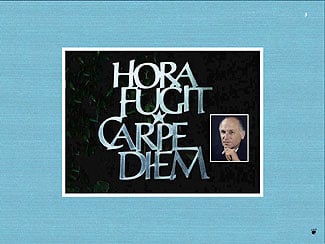
Zapf’s motto, cut in metal (as calligraphy, not as type), with an inset photo of Hermann himself.
The presentation fills the whole screen, where the images appear against a background of woven-textured cloth, in colors that vary. The material seems to be binding cloth for the covers of hand-bound books; at least, its textures suggest this, whatever the actual source may have been. It provides a rich but unobtrusive frame for the graphic work, giving an illusion of tactile feel to the glossy computer screen. In a similar kind of low-key enrichment, simple fades take the viewer from one image to another, punctuated by occasional motion effects, and each section is accompanied by quiet classical music played by a skilled German consort. None of these multimedia extras, though, get overbearing or distracting.
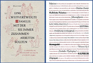
Palatino type specimen with a description of all the alphabets belonging to the Palatino type family. Click here for a full-size image (256K).
The CD is full of famous images from Hermann Zapf’s typographic work, images that will be familiar to anyone who has seen the various books of his designs and typefaces, or reproductions of them. The most fascinating images, in some ways, are the most unexpected ones: things that we’ve not only never seen before but never conceived of, such as the complete electrical construction set in a shoebox that the very young Hermann made for his childhood tinkering with electricity.

View of electrical construction set created by Hermann Zapf.
While no screen representation can have the same effect as a beautifully printed book, the bright, saturated colors available onscreen bring the images right into your eyes—and the CD format has the advantage of being highly portable and being available here and now. (Many of the books in which Hermann Zapf’s work has been published over the years are hard to come by today.)
The CD-ROM isn’t flawless. Surprisingly, there are typos in the introductory matter. But in the main body of the CD, which is highly visual but contains constant bits of captioning text, the level of precision is good. Not surprisingly, the integration of text and image is seamless.
This article was last modified on March 11, 2022
This article was first published on March 8, 2002
Commenting is easier and faster when you're logged in!

Recommended for you

dot-font: Room with a View
dot-font was a collection of short articles written by editor and typographer Jo...
dot-font: Seven Principles of Typographic Contrast
Carl Dair, an expert typographer, reveals the secrets of typographic contrast in...
dot-font: Can a Book Teach You to Set Type Perfectly?
dot-font was a collection of short articles written by editor and typographer Jo...