
Great Sites: The New Yorker’s Style

Editor’s Note: No magazine site has been more highly anticipated by loyal magazine readers than newyorker.com, which launched early this year. Contributing editor Anita Dennis weighed in on the site with a thumbs down, but her colleague Clay Andres respectfully disagrees, having chosen “The New Yorker” site as one of the greats. Read on for Clay’s take on this controversial site.
It has not been in business as long as some magazines for American intellectuals, such as “The Atlantic Monthly” and “Harper’s,” and it is not nearly as popular as other weeklies, such as “Time” or “Newsweek,” yet I don’t think there is another magazine in the United States that has the cachet of “The New Yorker.” This bastion of editorial traditions is known both for its extremely high standards and for its resistance to change. Its decision to use red ink for some of the magazine’s headings instead of the traditional all black was momentous for most of its readers.
It’s not so surprising, then, that “The New Yorker” did not have a Web presence until a few months ago. What’s especially nice about www.newyorker.com is that it manages to maintain the traditional “New Yorker” look in the medium of the Web. For instance, the Web site uses a digitized version of “The New Yorker’s” distinctive typeface for all the GIF headings, both red and black.
New Yorker, Old and New
The first page of wwww.newyorker.com includes the familiar “New Yorker” logotype and a small version of the week’s cover. Navigation is on the left, and articles appear in a content area divided into two columns to look like a magazine page. In the background under the navigation is “The New Yorker’s” unofficial mascot, Eustace Tilley, whose profile graced the first cover 76 years ago and who reappears, sometimes disguised, for the anniversary issue each February.

The primary navigation elements line up along the left of each page, atop the profile of Eustace Tilley.
The developers implemented the navigation bar as Javascript rollovers, so that the heading turns red and a sub-menu of hierarchical links pops up. It’s a straightforward scheme, but it’s executed with thoughtfulness and consistency. Also, even though the navigation is entirely textual, the use of “The New Yorker’s” typeface gives this simple column great visual appeal.
It is often said that you can’t take a magazine and turn it into HTML. In other words, it’s hard to make a Web site look like a magazine. But “The New Yorker” site comes close to proving this wrong.
Take a look at the section entitled In The Magazine, the first link in the navigational hierarchy. This table of contents looks just like the magazine’s, yet it works equally well as a Web page. The differences are interesting. First, the magazine listing includes page numbers for each article. Second, while the site lists all items as GIF text in “The New Yorker’s” font, other items are HTML text, which loads faster. Third and most important, not all the articles are available online, so links are listed in red and other items in black, so that you know what you are missing each week and will be tempted to go out and buy the magazine.

“The New Yorker” Web site’s table of contents looks much like the magazine’s. Content available online is denoted with red text.
In essence, this content listing serves simultaneously as advertising for the current issue and as secondary magazine-like navigation for the site. What you can’t do is read the site from cover to cover. But all the elements of this site are as magazine-like in appearance as is practical in the context of a Web-efficient navigational hierarchy.
For instance, larger sections have their own secondary hierarchy of links. The Talk of the Town section includes its own list of links, for example, and it is presented in exactly the same way as the content on the home page. This list looks as if it might have come out of the magazine, but it is an element created expressly for the site and used consistently throughout.
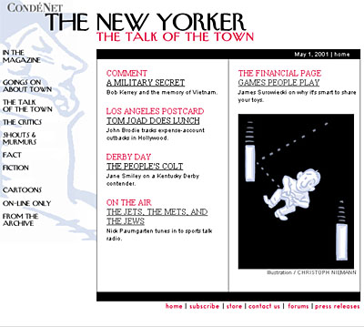
Clicking on Talk of the Town leads to this list of content in the section, within the content area fenced off with black bars at the top and bottom.
This box of space, delimited by black bars at the top and bottom and black lines down the sides, is a powerful element of each “New Yorker” page. It provides secondary navigation for section pages and also contains the articles themselves: When you click on an article link, the article appears in this box, the reading area. “The New Yorker” doesn’t try to do anything fancy with the text. It simply loads the entire article as HTML text within a narrow, very readable column. In this case, it is the surrounding elements — the logo, page heading, humorous image, and navigation column — that maintain the consistent “New Yorker” look.

Article text appears within the content area in one long column.
There are several Web-only features to this site, including links for Cartoons, On-Line Only, and From the Archive. And at the bottom of every page are several non-hierarchical links, including Subscribe, Store, and Forums. The store doesn’t have much to order at this time, but it includes “The New Yorker’s” Cartoon Bank, a separate domain of the publication’s distinctive drawings, that clearly has the potential to earn serious revenue.
For the time being, at least, the online store comprises the Cartoon Bank and a link to Barnes&Noble.com.
But all is not exactly as it should be at www.newyorker.com. One considerable omission that I hope will be rectified soon: The site provides no search engine for “New Yorker” content. (Editor’s Note: On this point, Andres and Dennis agree.) “New Yorker” Deputy Editor Pamela McCarthy told us that a search engine was indeed in the works, though she could provide no firm timeframe. As you’d expect, other new features are also on the way.
A Vehicle for Advertising
Long-time “New Yorker” readers will also notice that the dignified, understated ads that line the edges of the print magazine are nowhere to be seen. But don’t be mistaken: There are ads on every page of this site; it’s just that they’re contained in a graphic border that frames the content area. (To better focus on the site’s editorial structure, I cropped them out of the screen shots shown above.) Web content itself — akin to the editorial pages of the magazine — lack any sort of advertising.
While advertising may be held in the margins, it’s hardly marginal to the site. After all, “The New Yorker” is owned by the magazine publishing conglomerate Condé Nast. You’ll notice that directly above “The New Yorker” logotype is a discreet gray CondéNet logotype, a graphic that links to Condé Nast’s net portal. Set off in the large gray frame, a set of “New Yorker”-related links appears down the right side to the right of the “New Yorker” content area, and a useful Condé Nast navigation bar anchors the bottom of each page, providing drop-down choices for other magazines and sites. But also across the top of each page within the gray background, you’ll see a continuous grouping of CondéNet banner ads that, to this writer, seem tacky at best.

Banner ads for “The New Yorker’s” parent site, CondeNet, line the top of the Web site.
Clearly the designers of this site have tried to minimize the effect of the ads by setting them adrift in a sea of gray. But there is no hiding the harsh garishness of these elements. Eustace would look askance. The loading of each page is slowed down considerably while the ad randomizer searches through the database and supplies the next eye-offending element.
Is it reasonable to expect Condé Nast to put up a magazine site without trying to make a buck on it? Probably not, but the end result is a shame. Condé Nast has created an excellent and elegantly tidy “New Yorker” magazine site, but in its efforts to underwrite the site, the company has almost spoiled it, by making it look like a fashion magazine.
Given the familiarity of most elements of www.newyorker.com, Condé Nast seems to have designed this site to serve an already loyal readership. One might question the lack of more-interactive features, such as chat rooms or bulletin boards, but these things don’t strike me as being particularly germane to “The New Yorker” and all it represents — including its aforementioned resistance to change. Perhaps we will see more interesting features added in the future, once we get used to all those red headlines.
In the mean time, this writer will hope that Condé Nast comes up with a more-refined advertising scheme. The ads in the print magazine are often quite well designed and are intentionally laid out in such a way as not to detract from the content. Realistically, online publishers can’t control how online advertisements look — only their size — but as we worked on this article we noticed that all the banner ads were in fact for online merchandise sales or online publications associated with CondéNet. If you want banner ads to harmonize with your site’s design or content, you can at least attempt to set an appropriate tone with your own banner ads. Perhaps Condé Nast will find an alternative to the distracting banner ad and let “The New Yorker” online be even more like “The New Yorker.”
Read more by Clay Andres.
This article was last modified on July 18, 2023
This article was first published on May 15, 2001
Commenting is easier and faster when you're logged in!

Recommended for you

Preparing for PePcon: Hit the Ground Running With Social Media
Editor’s Note Author Renee Brisson-Khan is an enthusiastic veteran of prev...

TypeTalk: Make the Most of What You Have
TypeTalk is a regular blog on typography. Post your questions and comments by cl...

Convert Text to Lowercase with a GREP Utility
InDesign's GREP cannot convert text to lowercase... but that doesn't mean you ca...