


dot-font was a collection of short articles written by editor and typographer John D. Barry (the former editor and publisher of the typographic journal U&lc) for CreativePro. If you’d like to read more from this series, click here.
Eventually, John gathered a selection of these articles into two books, dot-font: Talking About Design and dot-font: Talking About Fonts, which are available free to download here. You can find more from John at his website, https://johndberry.com.
It’s a fertile moment for new design magazines, but the most ambitious may be “ONE,” the high-concept new magazine-cum-Web-site that just launched in San Francisco. “ONE” (complete with all-uppercase name) is the brainchild of Dana Lyon, a former publisher of “Wired,” and it’s aimed squarely at the same demographic.
All About Design
Before the first issue even hit the stands, “ONE” had achieved a certain amount of ambivalent buzz in the publishing world for going through three editorial directors. This may reflect the ambiguities and contradictions of the magazine’s goal: to be a design-centered magazine that reaches out far beyond the specialist world of designers and design writers, to the much wider audience of people who consume design.
The conception of “ONE” is based on the quite accurate observation that design is everywhere, and on the concomitant desire to celebrate it. The 20th century may well have been characterized by our first real awareness that we live largely in a designed environment. But if our present society doesn’t self-destruct, from the 21st century on we’ll be much more conscious of the fact that we’re creating and altering and morphing and modifying ourselves and all the world we live in—so we might as well pay some attention to designing it. (That’s what design is: planning, thinking ahead, thinking things through.) Making people more aware of design, and helping them think about it, is an admirable idea—and it might even be a way to make a lot of money.
But how do you go about talking to people about design?
Tangled in the Girders
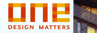
I have an intensely ambivalent reaction to “ONE.” Much as I like the idea of integrating a printed magazine with an online publication, I was not too impressed with the cluttered website as I first saw it. Too much style, not enough substance. And the style wasn’t very… well, stylish. The graphic cornerstone of “ONE,” as reflected in its logo (see below), seems to be an Erector Set construction of lots of rectilinear bars and squarish rectangles; and this is the dominant look of the Web site. Rather than focusing our attention or working with various types of contrast, this presents the whole thing as a jumble.
The website has since evolved into something that seems a little more solid (though it’s still awfully busy, and it commits the unpardonable sin of having animated ads that won’t scroll off the screen). The printed magazine has a little of the same problem with focus, but its medium affords a wider canvas, and some of its individual layouts look lively and strong. (I certainly don’t mean to suggest that the only designs that work are the big, simple ones without a lot of detail. But, to paraphrase the “ONE” subtitle: “structure matters.”) Like most first issues, this one attempts a lot of things, and some of them fail.
Types of Design
Typographically, “ONE” is squarely of its time. The typefaces, according to the colophon at the back of the magazine, are all from FontShop: FF Eureka and Eureka Sans, and FF Minimum. (I’m always pleased to see a proper colophon at the back of a magazine, giving the details of printing, paper, and typography, but this one has an odd way of expressing itself: “Typography from FontShop International,” it says, before listing the fonts and their designers. But of course what FontShop supplied was the typefaces; the “typography” was in the way they were used.)
FF Minimum has been around for a while (it was designed 1993–95 by Pierre di Sciullo), but I haven’t seen it used that widely. It’s one of those typefaces that takes boxiness and pixel-based angularity to extremes. “ONE” uses it for small headlines and running typographic elements, but for the most part it uses only the basic, straightforward “Noir” version of Minimum, which is easy enough to read. (The type family actually includes a bewildering, almost fractile set of variants.) The “ONE” logo, created by Abbott Miller, is clearly in the same spirit as FF Minimum. In the logo, though, the horizontal strokes are narrower than the vertical strokes, to give a certain lightness and horizontal movement, whereas in the typeface Minimum they’re strictly equal. (The logo’s structure of overlapping translucent girders has been modified on the cover of the first issue into three plain white letters—a much stronger graphic image against a busy background.) The use of Minimum in small ways weaves the square sensibility throughout the magazine.
FF Eureka is a more recent release, especially in its sans-serif version. (It was just used recently in the first issue of a much smaller, less commercial magazine about typography and design: “dot-dot-dot.”) Eureka was designed as a large serif/sans type family by the Slovakian type designer Peter Bil’ak and, although “ONE” doesn’t have much need of this feature, it’s available in a Central European version with all the accents and other diacritical marks needed for Polish, Hungarian, Czech, Slovak, and so on.
Eureka is a mix of the sturdy and the clunky. It has a bit of the angular sturdiness of many Dutch oldstyle typefaces, with some of the clunky shapes and gawky forms of late-19th-century attempts at oldstyles. There’s not much contrast between the strokes. It’s a little like a combination of the original Cheltenham and FF Scala, with a narrower body than either. The serif version reminds me quite a bit of Kurt Weidemann‘s Bible-typeface, ITC Weidemann, except that Eureka isn’t quite as condensed and has a much smaller x-height. With its sort of wedge/slab serifs and abrupt angles, Eureka has much more style at large sizes than in text, but as a text face it’s quite readable. I confess that its style in text simply doesn’t appeal to me, but it’s obviously deliberate.
FF Eureka Sans, which is shorn of the attention-grabbing serifs, looks much more contemporary. It’s used in “ONE” extensively for captions and small text, where it has the clarity and even texture you’d expect. (Interestingly, in both the serif and sans versions of Eureka, the bold weight is much wider and more rounded than the semi-condensed roman. And the italics of both are notably narrow and compact.)
Falling into the Perfect Gutter
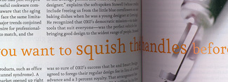
“ONE” is a thick magazine, chock full of ads. At 192 pages, on stock that’s noticeably less flimsy than that of some current magazines (60# Mead Vision Velvet, to be precise—thanks again to the colophon), “ONE” obviously needs a spine. It would be nearly impossible to saddle-stitch that many pages—and the trend these days is to perfect-bind any magazine you possibly can, whether it needs a spine or not. (“Perfect-binding” is a misleading term for the same binding method that’s used in cheap paperback books: trim off the inner folds of the signatures and glue the inner edges to a flat backing.) But like so many current magazines, “ONE” doesn’t really take into account the effect of perfect-binding on the page design.
In a perfect-bound magazine, unlike one that’s been saddle-stitched (stapled on the fold at the spine), the pages can never open completely flat. The inner edges always curve into shadow where they’re glued to the spine. It’s all very well to design a beautiful two-page spread that looks breathtaking on your double-wide monitor and in mock-ups and color proofs, but the reality is that whatever you let run into the gutter is going to disappear. If you’re going to run display type or an image across the gutter, you have to take into account what the pages will really look like when your reader is holding it in his hands or on his lap. (Maybe you can somehow make the fact of losing part of the image in the middle become integral to the design. Or you could overlap them slightly—but this is tricky. At the very least, make sure that nothing crucial is in the lost area.)
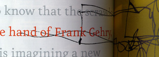
In one instance, the designers of “ONE” made good use of this awkward binding method, by inserting a single sheet of translucent yellow paper in the middle of the opening spread of an article on Frank Gehry (shown below); on the yellow sheet is reproduced a scrawled sketch of Gehry’s, which begins on the lefthand page and complements the photograph on the righthand page. But in many other instances, all the stuff running into the gutter is just distracting and frustrating.
Maybe it’s time for a campaign to return to the spineless magazines of yesteryear. And I do wish someone would start writing regularly, and critically, about the design of current magazines; it’s a fertile ground. (What a great way to lose friends and influence people!)
The Design Lifestyle
“ONE” seems to embrace pretty much everything. It’s got the feel of a lifestyle magazine (significantly, its promo to distributors says, “Display next to: Vanity Fair, Wired, Wallpaper”), where everyone’s stylish and even the humans have the look of consumables. It’s worth noting how many of the objects exposed in the pages of “ONE” have price tags attached. There’s an awful lot of product in here. When the photos of people are annotated with detailed lists of the clothing they wear and who made it and where you can buy it, you know you’re in the realm of fashion.
That’s the problem. It’s hard to find any distinction in “ONE” between design and fashion. “Every designed object has a story to tell,” says the magazine’s intro, and that’s a fine way to approach design for a wide consumer market. But the best way to spread knowledge of a subject is to have a firm, clear core of understanding about the heart of the subject, and then let the edges leak outward in every possible way. You don’t need to be rigorously theoretical or to write dry insider jargon to be serious, but you do need to have a definite critical perspective. And open borders.
Is fashion the same as design? No. The two are intertwined often enough, but they are utterly different things. I think it’s important to make the distinction, and I don’t see “ONE” doing enough of that.
The worry is that “ONE” will turn into just an undifferentiated “lifestyle” view of design. (I suppose the real worry would be if its publishers wanted it to be that. I certainly hope they don’t.) If the magazine can use people’s taste for fashion and style as a hook to introduce them to the design behind all those surfaces, then it will be doing something worthwhile. If it turns into a glorified catalog… well, the racks are full of them.
This article was last modified on April 1, 2022
This article was first published on January 12, 2001
Commenting is easier and faster when you're logged in!

Recommended for you

dot-font: True to Type, the Autobiography
dot-font was a collection of short articles written by editor and typographer Jo...
dot-font: Designing Running Heads
Learn the best practices for designing these inconspicuous but essential book pa...
dot-font: OK to Typeset
dot-font was a collection of short articles written by editor and typographer Jo...