
Not Much Needs To Be Said When You Lay Out A Good Photo Spread

![]()
Unless you work for a one-man (or woman) operation, chances are you’ve often been asked to lay out a photo spread for something you know little or nothing about. It all starts innocently enough. An editor comes up with a story idea, which is assigned to a reporter. The reporter brings along a photographer, who’s probably told very little about the story. Then, it all winds up on your desk with no more instruction than “Make a front-page photo spread.” What you, the designer, have to work with are three different views of one idea, and now you’re going to add your own point of view to the brew. Welcome to the world of publishing!
Your job can be frustrating–depending on what you’re given to work with. However, it’s very possible to end up with a great-looking photo spread, even when all you have to work with are a few photos, a minimal amount of text, and a headline. To show you what it takes to do this, let’s consider the photo spread shown in Figure A, which was designed for the front page of an inside section of a tabloid-sized newspaper. We’re going to take a look at what we had to work with, how we used those materials to interpret the story, and why we chose a particular layout over another.
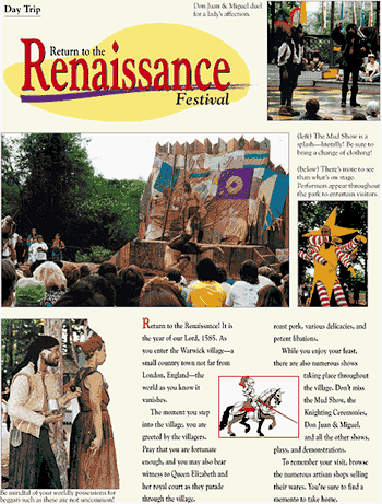
Figure A: Our sample photo spread shows the importance of proper placement of all the elements, especially the photographs, but also the text, headline, and captions.
What It’s All About
To create our photo spread, we were given four photos, about 200 words of copy, and a headline. That’s it. Our work was definitely cut out for us. The first thing we did was to evaluate the materials by reading the content and headline, and studying the photographs.
Once you understand what the story is about, you can begin to conceptualize the design. Because, as we said earlier, other people are usually involved in developing the various materials, check to be sure everything coincides:
- Do the photographs and content complement each other?
- Does the headline sum up the subject?
Every Picture Tells A Story
Most of us follow a similar pattern when reading a newspaper. We first look at the photos, then read the headlines, and, finally, scan the first few paragraphs of articles that managed to catch our interest. Photo spreads have the advantage, since most of us love to look at pictures, and there’s very little reading required in order for us to get the gist of the story.
This is because photographs are capable of telling a story all on their own. However, if the photos aren’t compelling enough, or are poorly positioned, even they can be ignored. In a photo spread, especially, you want to make sure the photos meet certain criteria. Good photos contain the following characteristics:
- Pleasing color
- Action
- Varying scale and direction
Pleasing color can mean just that, or it can mean black and white. It depends on the feeling you’re trying to project. If the story is about a carnival, black and white photos may not get the message across. If the story is about the changing roles of aging parents and their adult children, however, a black-and-white design could have a dramatic effect.
Action doesn’t mean everyone has to be running the 500-meter race. You just want to be sure to pick photos that show people or animals doing something, even if it’s just staring off into space. The secret to a successful photo is avoiding the grip-and-grin syndrome, as shown in Figure B. Of course, if your story is about an inanimate object, there may not be much chance for action. All you can do is hope the photographer took some dynamic shots.
Figure B: This example of a grip-and-grin photo is taboo for photo spreads because of its static presence (regardless of how cute the subjects may be).
Layout Guidelines
After you’ve decided which photos you want to use, but before you do any final cropping or resizing of them, establish a layout. When creating a photo spread, you need to consider several elements, as shown in the sidebar “Elements of a good photo spread.”
First, you have to look at the page as a whole. It will contain photos, text, a headline, photo captions and credits, and any other graphics you decide to use. Give positioning of the photos priority, since they’ll be the primary focal point. You don’t, however, want to just take the photos as is and place them haphazardly on the page. They should vary in size, perspective and shape, as shown in Figure C. Make the most provocative photo dominant and work your way down. Align some horizontally and others vertically. Also, be sure you’ve picked photos that add something to the page, rather than just take up space. There’s nothing wrong with white space, and often less is more.
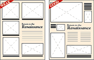
Figure C: The layout on the left appears static and dull because the photos are all similar in shape and size. However, the layout on the right shows photos with a variety of shapes and sizes. As a result, the page is more interesting and inviting.
When deciding on placement, try to arrange the photos to show movement. For example, have one photo with the subject facing right and another photo with the subject facing left. Place the photos so they’re looking into the page and toward each other, rather than looking off the page and away. This layout draws the reader into the page.
Headlines and Text
Once you’ve cropped, sized, and placed the photos, you can now create the headline. Unlike news articles, with features articles you can design a headline so it not only helps explain the story, but also adds a design element to the page. When selecting a font, keep the main subject in mind. Because our photo spread is about the Renaissance Festival, it made sense to choose an artistic font.
Depending on the subject matter, you can even incorporate the headline into the layout by manipulating the text into a particular shape. Also, be sure to make the headline a prominent feature. It should be large and legible enough to be seen and read in a matter of seconds.
As for the body text, your main objective is to make it easy to read. Don’t make your readers play connect the dots in order to figure out where it begins and ends. Also, make sure you don’t overcrowd the page with too much text. In our example, we didn’t have a lot of text to work with, so overcrowding wasn’t a problem. Sometimes, however, the reporter might get carried away. Your job is to make sure there’s a balance of art and text, preventing the page from suffering the dreaded gray matter syndrome (also known as too much text, not enough graphics).
Finishing Touches
Once you’ve finished laying out the page, it’s time to add the finishing touches. Every photo needs a caption or cutline to describe what it’s about. Two photos can share a caption, but be sure to explain which description belongs to which photo. Good placement for a caption, as shown in Figure D, is flush along the photo it’s describing and outside of the body text, as to not get confused with the main text.
Another detail to remember is to credit the photos properly. If the photos are all by the same person, you can run one credit line along the edge of the page or include the photographer’s name after the reporter’s byline. If various people took the photos, include a credit line beside each corresponding photo.
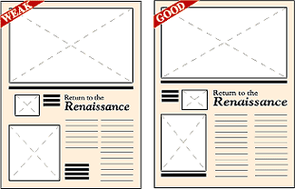
Figure D: It’s important to design in white space, like in the layout on the right, rather than have unexplained holes, as in the layout on the left. Also notice that the captions on the left run into the headline and text. It’s best to place captions on the outside, as shown on the right.
Completed Page
In newspaper design, it’s standard for photos and text to compete for space. One exception is with photo spreads, where photos get first priority. In such a situation, where the photos are the stars of the show, they require special attention. However, behind every good production is a cast that works well together. Take care to consider all the elements of your photo spread and it will get rave reviews.

Copyright © 2000, Element K Content LLC. All rights reserved. Reproduction in whole or in part in any form or medium without express written permission of Element K Content LLC is prohibited. Element K is a service mark of Element K LLC.
This article was last modified on March 12, 2022
This article was first published on October 24, 2000
Commenting is easier and faster when you're logged in!

Recommended for you

Like Futura? Try This Undiscovered Font
For decades, Paul Renner (1878–1956) was one of Germany’s leading designers. Bes...

Scanning Around With Gene: Mexican Flea Market Art
[Editor’s note: Just hours after this blog post was published, several sha...
Teacup Software Announces the Release of BarcodeMaker
Teacup Software announces the launch of BarcodeMaker, designed to quickly create...