


For such a basic typographic control, leading really isn’t very well implemented in today’s page layout programs. In this column, we’ll look at how you have to manage both leading and a tool known as the baseline shift to exercise full control over the vertical position of all the characters on your pages. Together, they’re a powerful, if awkward, combo.
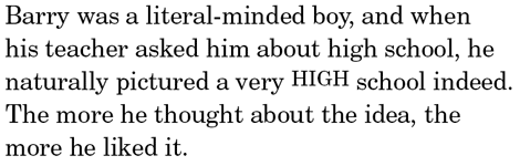
Once upon a time — say, 25 years ago — traditional commercial typesetting systems had a simple approach to leading: every character could have its own setting. For example, in the setting below you would raise the all-caps characters in the third line by simply reducing their leading, which brought their baselines closer to that of the line above them.
Figure 1: Traditionally, reducing the leading of select characters — as in the HIGH here — would bring their baseline closer to that of the line above them.
The first word processors to appear on personal computers, though, regarded leading — line spacing, in their lexicon — as a paragraph attribute, and all the type in any paragraph had to have the same leading value. Page layout programs followed this dubious precedent.
In QuarkXPress, leading is still a paragraph attribute. Adobe InDesign nominally regards leading as a character attribute (you specify it in the Character palette) but it’s implemented badly.
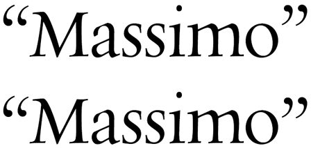
Figure 2: In the lines of type below, certain characters have a much smaller leading value than those around them. Can you tell which ones are which?

No, you can’t, because when two leading settings are applied in the same line of type, InDesign will only use the larger of the two. Only if an entire line has a different leading value will it appear differently spaced than its neighbors. In effect, then, leading in InDesign is neither a character nor a paragraph attribute, but a line attribute.
Instead of giving you straightforward leading controls for the vertical positions of individual characters, both InDesign and XPress offer the baseline shift. Using this, you can add or subtract points and fractions of points of leading for individual characters. This doesn’t change their leading as far as the programs’ palettes or control panels are concerned, just their positions.
Figure 3: In InDesign, you specify baseline shifts from the Type/Character palette, as shown on the left below. In QuarkXPress, go to the Style/Character dialog box.

In baseline-shift world, a positive value is used to indicate a reduction in the net leading for a character. In other words, positive values reduce your leading. Negative values increase your leading. This is confusing, so it’s best simply not to think of the baseline shift as a leading control even though it clearly is: when baselines change, leading changes.
Putting Baseline Shift to Work
Nevertheless, you can make it work, and in a slew of situations. If you want to top-align characters, you can, as the following illustration of a catalog price shows.
Figure 4: To create an effect like this, experiment with positive baseline shift values until you raise the dollar sign and the cents characters to align with dollar characters.

You can do all kinds of useful things with the baseline shift control, such as centering bullets on x-height instead of cap height.
Figure 5: When bullets are used with lower-case characters, they appear too high. Baseline shift to the rescue.

You can raise hyphens and parentheses when they’re used with numbers or all caps, as on the business card below.
Figure 6: Parentheses in most typefaces hang below the baseline to embrace descending letters. When used with numerals or all caps, they can look too low, as they do in d the “before” blow-up just below the full-size card. Hyphens set the same way, so they, along with the parentheses were nudged upward in the “after” sample at the bottom. The “at” sign in the e-mail address was also tweaked: reduced in size, boosted to bold, and raised a bit to align with and match the look of the lowercase characters around it.

The problem with all of these adjustments is that they’re expressed in points, absolute measurements. After all your fiddling to get your baseline shifts just so, if you change the point size of the text, the shifted characters are all out of alignment again. If the alignments of characters could be made relative to each other, you could change the size of the type, and the alignments would adjust accordingly.
QuarkXPress offers controls of this type — as Char Align in the Style/Formats dialog — but they don’t work all that well.
Figure 7: Here’s what happens when you choose Top in QuarkXPress to try to set that top-aligned catalogue price from an earlier illustration.

Close, but no cigar. Still, once you’re that close, you can use the baseline shift command to make the final adjustments.
Baseline Shift on Display
Because the baseline shift control is handy for making minute adjustments, it really comes into its own in display situations, where small variations in spacing and alignment loom inordinately large. In the following logo, what would look like normally placed quotation marks at text size look too high in this setting, where there are no ascenders, and the face has relatively short capitals.
Figure 8: In this logo, the opening quotes were dropped 3 points, but the closing ones are dropped an extra point to make up for the combination of the short letter preceding them and their own top-heavy appearance.
In display sizes, many characters simply look out of proportion, and when you resize them you should think about realigning them vertically as well.
Figure 9: To improve the relative proportions among these characters, the plus sign has been reduced and elevated.
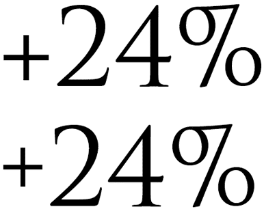
Figure 10: Here, the trademark character, designed to be legible at text size, would be far too large in display sizes, so it’s been reduced and lowered to top-align with the small caps.

In short, the bigger your type, the more repositioning of characters may be called for.
With the baseline shift command at your fingertips, there’s no excuse for not having everything aligned just so.
This article was last modified on August 12, 2021
This article was first published on November 1, 2010
Commenting is easier and faster when you're logged in!

Recommended for you

TypeTalk: Steve Lambert’s Typography for Social Change
Steve Lambert cannot be categorized. Although I was first attracted to his intri...
25 Type Tricks for InDesign
Great tips to set stellar type and create beautiful typography in InDesign

The 1923 ATF Specimen Book and Catalogue is Reborn Digital
A classic typographic resource, the 1923 edition of the American Type Found...