In the Spotlight: Pam Sparks
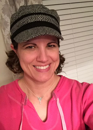
Meet the woman behind our new design!

This article appears in Issue 105 of InDesign Magazine.

What’s your favorite Pantone color?
Wow! You really know how to send a designer down a rabbit hole (i.e. the Pantone website), don’t you? So many to choose from… I’ll say 312C. It reminds me of the turquoise waters of a Caribbean beach.
What got you into design in the first place?
I’ve had the creative bug ever since I was a kid, but I credit my husband, George, with getting me into the design field. I was working as an administrative assistant when we met and when he learned that I had a passion for design he encouraged me to pursue it.
After taking just a few classes at the local community college (Photoshop, Illustrator, Premiere), I signed on with a creative agency and started getting assignments right away. I found short-term design contracts very rewarding because every few weeks I had a new client and a new design challenge. I learned a lot in a short amount of time
Have you ever designed a whole magazine before?
Never! But I’ve always been drawn to magazine design. I’ll pick up any magazine, doesn’t matter what the topic is, just to thumb through it and see how each one approaches the same core items in a different way. It never ceases to amaze me how many ways there are to craft a table of contents, lists, captions, image treatments, etc. The options are almost infinite! So you can imagine, being asked to redesign InDesign Magazine was not only an incredible honor but a dream come true for me. And I would be remiss if I didn’t share that you guys (David, Anne-Marie, and Mike) are a dream to work with—very collaborative and positive—so I didn’t feel like I was going it alone.
How did you get involved with InDesign?
I started working with Quark a bit in the mid-2000s but found it difficult to use. When InDesign came along I felt immediately that it was a superior product and making the switch was a breeze.
Do you prefer ebooks or print books? Digital or print magazines?
I must confess to a great fondness for paper. My mom passed her love of reading down to me; I grew up surrounded by books and we spent countless hours in book stores and libraries. So while I love the immediacy and searchability of digital print and the convenience of having tons of reading material on a single device, there’s just something about turning the actual pages of a book or magazine that’s very calming and satisfying. Also when I’ve spent the whole day staring at a computer screen for work, the last thing I want to do to wind down at night is stare at another screen.
What are some of the most fun or interesting design projects you’ve been involved with?
In all seriousness, this redesign project has been one of the most fun, interesting and challenging of my career. Redesigning a whole magazine is not for the faint of heart! But I loved having the opportunity to put together many of the different principles and skills I’ve learned over the years in one project.
I had a similar experience about 15 years ago working at BMC Software in Houston, where I was charged with building interactive training CDs. This involved designing the look and feel of the entire interface, editing the talking-head videos, adding the supporting graphics or visuals, flowing in and coding the transcription text to keep in time with the speaker, and creating the interactive menu for all the content on that CD. Talk about putting it all together!

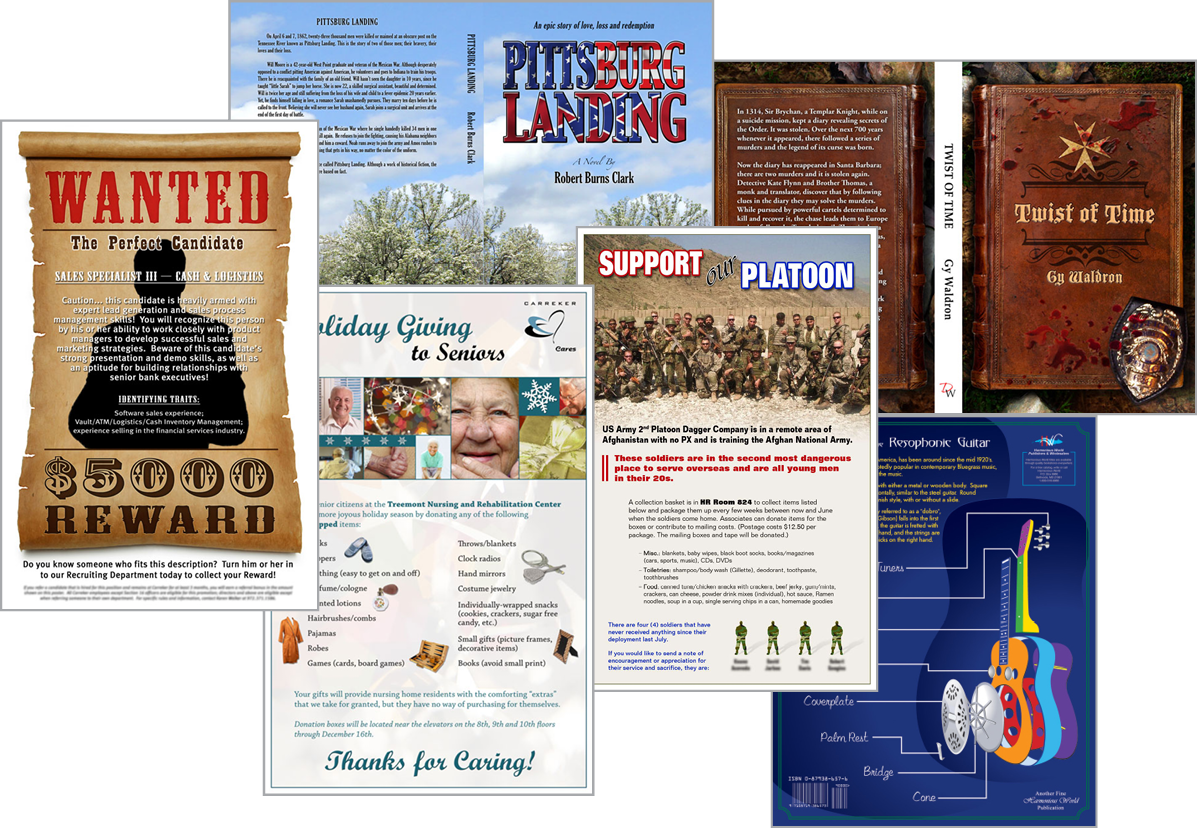
Book covers and posters are among Pam’s favorite things to design.
This article was last modified on February 2, 2026
This article was first published on January 3, 2018
Commenting is easier and faster when you're logged in!
Recommended for you

InDesigner: Hal Leonard
If you’ve ever bought sheet music, there’s a good chance you have something publ...

InDesigner: National Geographic Learning
Pam Pfiffner explores the classroom offerings of National Geographic Learning.


