

We humans are surrounded by colors. Our brains are evolved to understand things around us by the colors we see. From the brands we use to the movies we see, everything depends on a certain color theme to stir up emotions in a way we do not even realize.
Colors are much more powerful than one can think. In graphic design, using the right color can attract the people who matter the most, and using wrong colors can repel those you expect to stay. It is no surprise that big companies give so much thought to their color selection process. Some famous brands have got it so right that when we see a color, our mind flashes back to the logo it is associated with.
Within seconds, you can guess that the image below belongs to Coca Cola. Did you think, even for an instant, that it might be Pepsi’s?
No, you did not…
Because it is not the logo or the bottle shape that first reminds you of the brand; it is the vivid red color that we associate with Coca Cola.
The iconic Coca-Cola logo
The significant role of colors in a brand’s success may make selecting the right one an intimidating task. However, considering the following factors (in addition to the color psychology) when designing a logo will help immensely.
Know Your Audience
When choosing a color for your logo, you need to think about the end users— the people you are designing for. Different colors convey different messages; therefore, some colors will influence your targeted audience better than others.
Color preferences vary for each gender and age group. Pink, for example, is more likely to appeal to a teenage girl and turn away her male counterparts. When it comes to colors, genders literally don’t see things the same way. According to the Researchers at Arizona State University, men and women see red differently. The genes that help us differentiate between different shades of red (cardinal, maroon, crimson, etc.) are linked with the X-chromosome and since women have two of these chromosomes, they can easily distinguish the entire spectrum of red. Likewise, the grass always seems greener to women than to men.
Age also affects color preferences. In Color Psychology and Color Therapy by Faber Birren, blue and red are the colors preferred by all age groups. Whereas, colors like yellow lose their appeal as we age. The study states that as people mature, they increasingly prefer colors with shorter wavelengths (like violet, blue, and green) instead of colors of longer wavelengths (like yellow and orange).
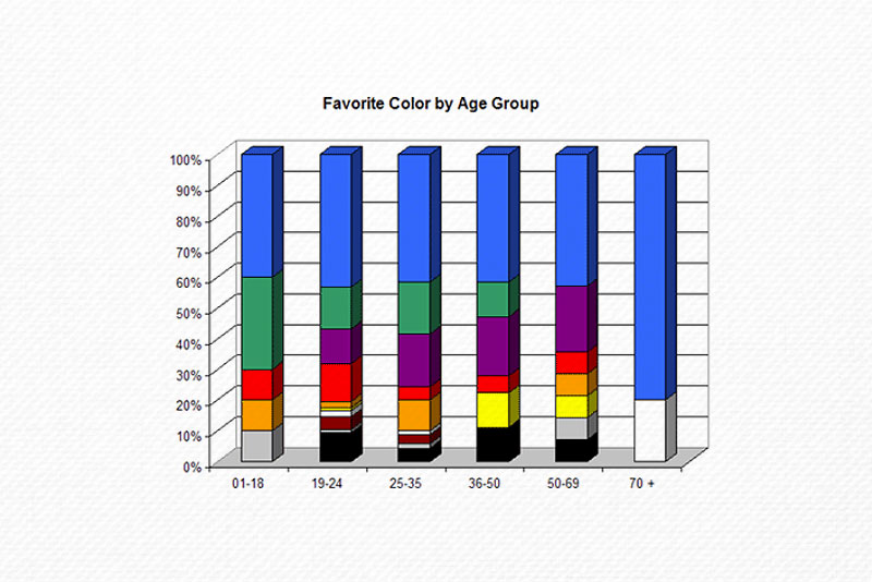
© Faber Birren, Color Psychology and Color Therapy (Source: TateDesign)
Therefore, whenever you design a logo, it pays to consider which colors are likely to be preferred by your target demographics.
While no color is “good” or “bad,” some will simply spark better responses than others.
Consider Color Perceptions in Different Cultures
Much like gender and age, culture affects color perception. When adding color to your logo, you need to be sure that your target audience and perceives the selected color positively. Green, for example, is the national color of Mexico, where it signifies independence. But in South America and other countries with dense jungles, green signifies death.
White, in western cultures, stands for purity and peace; the brides wear white dresses on their wedding days. But in Asian cultures, the color signifies death and mourning. People in Peru associate the color with angels and good health.
Yellow, in Germany, represents envy—but in Egypt, exemplifies good fortune and happiness. In Japan, purple indicates faith; in Brazil, it signifies mourning.
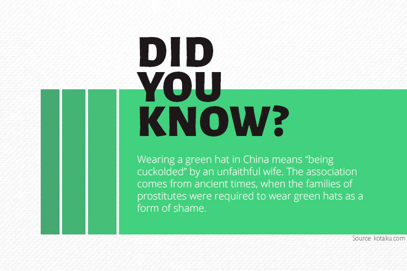
Don’t wear green hat in China.
Pick the Right Color Combinations
It may seem counterintuitive, but one approach for finding the right color combinations is to start with a black and white logo. Starting out monochrome can help you devise a logo that can be adapted to many different color treatments. Many famous brands like Nike, Apple, and Chanel, have black logos that allow designers to easily try out different schemes.

Nike shoes showing different colors of the swoosh (Source: Nike)
Use the color wheel to come up with appealing color combos. You can choose between analog colors (neighboring colors on the wheel) and complementary colors (colors on opposite side of the wheel). Analog colors do very well when your brand has a gentle or tender vibe. MasterCard is an example of analog color combination. Complementing colors, however, create high contrast and a dramatic appearance—Firefox, for example:
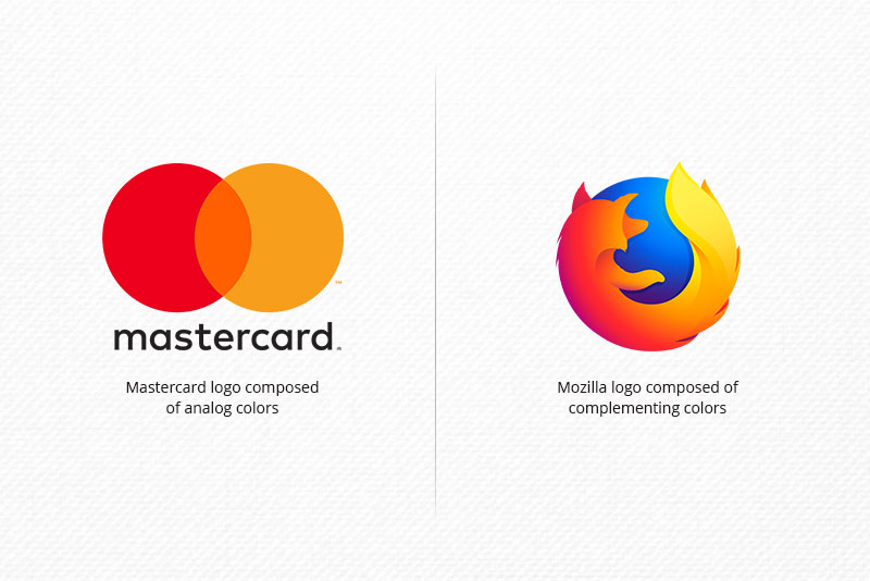
Analog vs. complementary colors in a logo design
Avoid Clutter and Chaos
The number of colors in a logo matters; as a general rule, your color palette should not exceed more than three colors. An excess of colors in your logo may overwhelm your audience. Either play it safe by using just one color in your logo (Starbucks, IKEA, and Apple) or keep your selection limited to two to three colors.
Multicolored logos, specifically for the startups and new businesses, may not be the right choice, as they’ll make the design expensive to print and potentially confusing. Brands who are eager to have colorful logos should consider ‘dynamic logos’ instead.
Dynamic logos are a new wrinkle to the logo trends. Unlike typical logotypes, dynamic logos are prone to changes in color, text, and even shape; thereby ensuring maximum adaptability. Though, it is advised to keep at least the basic elements, including font or icon, unchanged within the design. You can use them in gradient, flat, and line styles.
A glaring example of dynamic logos is the City of Melbourne logo. The designer and marketing team came up with different variants according to the overall theme. Despite these drastic changes, the form of ‘M’ letter remains the same across all variations.

The original logo of the city of Melbourne (top) along with its variants (bottom)
Play It Safe With Gradients
Show a gradient-filled logo to a designer and they may get a flashback to the time when they first used the gradient-styled “Word Art” in a school presentation to give it a “professional” look. Nostalgia aside, that same designer has probably avoided using gradients in any logos they’ve designed.
Nonetheless, these days, gradients have started to make a comeback. A noticeable example is the Instagram logo. Instagram’s head of design said that the main purpose behind the gradient fill was to represent all the expressions of the community, including past, present, and future.
The recent Instagram logo revealed in May 2016
When choosing colors for a gradient logo, rather than picking out colors at random, go for the analog or neighboring colors in the color wheel that can easily fuse into each other. Also, note that gradient logos do not “pop” as well in print as they might onscreen.
Keep Your Design Adaptable and Accessible
Dear designers, would it shock you to know that around 8% of your clients (male) are color blind?
When designing a logo, you have to consider people with colorblindness or other conditions like tunnel vision, loss of acuity, macular degeneration, and so on. There are many ways to design for these people, like using various shades of a single color rather than multiple colors, adding patterns, or applying high contrast.
One of the best examples of such designs is the Google logo. Audience members suffering from any visual impairment can easily see the logo.
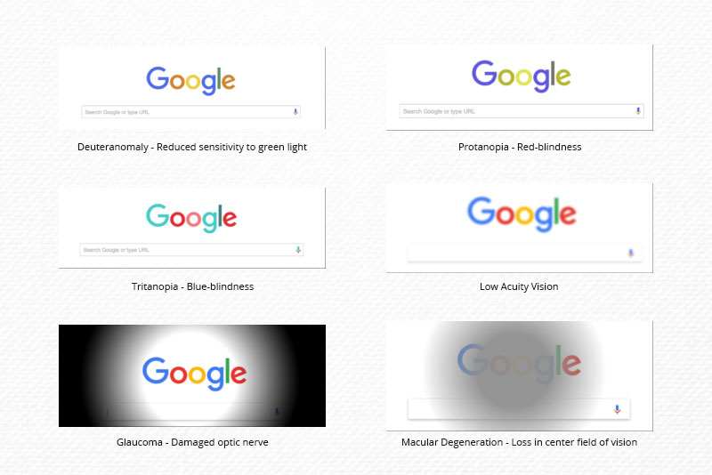
Google logo from the perspective of visually impaired viewers
When it comes to your audience, you should avoid using problematic color combinations. Since there are different conditions of colorblindness and visual impairments, you may find difficulty in determining the safe choice. However, there are a few color combinations that cause problems for a person with color-blindness, such as blue and violet, green and brown, green and red, light green and yellow, gray and blue, green and blue, green and black and green and gray. But with a few mindful color choices you can make your logo accessible to just about everyone.
Key advice:
- Start by designing your logo in grayscale
- Make sure your logo does not rely on colors
- Use the minimalist approach to keep your design timeless, trendy, and legible

The reason behind Facebook blue
Make it Work Across Media
“This color looks different on paper…” can be the worst nightmare for any designer. A great logo is one that looks equally amazing in print as it does onscreen. While designing a logo you need to keep your logo color consistent across media.
When designing a logo for your client, consider creating two files, a CMYK one for print and an RGB one for onscreen use.

CMYK color mode vs. RGB color mode
Color Counseling
Color selection is serious business! The right selection of a logo color may not come easily, but the considerations mentioned in this article can help.
- Start by sticking to the rules and experiment your way to improvement. Make sure your color delivers the right message and tone.
- Always consider your target audience. Keep your brand values in mind and your audience interest in heart. See which color works for your targeted audience. Remember the color preferences and factors affecting these preferences, like age, gender, culture, etc.
- Color psychology can guide you about how certain colors can excite your audience while some can put them off. But it’s OK to consider your gut feeling as well. If you think a certain color will not be the right pick, look for other choices.
- Don’t pick out the color randomly. Choose the color combination wisely in light of your audience. Also, see what colors your competitors are using to get inspiration, but don’t just copy them.
- Consider your output. Always check how your design colors will render in print and in web/mobile use.
We hope these considerations will guide you when designing your next logo design. Let us know what you think!
This article was last modified on April 29, 2019
This article was first published on April 29, 2019
Commenting is easier and faster when you're logged in!

Recommended for you

Ten Tips for New Web Designers
For those of you who may be less familiar with the details of web design it can...

GREP of the Month: Locations
Tips on how to narrow your GREP searches and styles to specific places in a para...

InDesign Magazine Issue 134: InDesign and Acrobat
We’re happy to announce that InDesign Magazine Issue #134 (June 2020) is now ava...