
20 Essential Color Production Tips
Kelly Kordes Anton shares key tips for achieving great results in print and avoiding costly errors.

This article appears in Issue 60 of InDesign Magazine.
In 1989, I designed my first brochure in Aldus PageMaker. Armed with my double major in English and History from a ritzy liberal arts college—something we all thought qualified us to be desktop publishers at the time—I created a stunning piece featuring an illustrated ivy border. The border actually consisted of a bitmap graphic repeated across the top and bottom of the piece. I proofed the bluelines with no idea what to look for, and the job went off to the press (for a run of 100,000). Fortunately, my alert sales rep yelled “stop the presses!” at the beginning of the print run when he noticed the greens in the border didn’t match. At all. The details are fuzzy, but somehow I had applied different green hues to each chunk of the ivy. The ivy looked great on screen, but in print all those shades of green looked ridiculous. I could have gotten fired from my first professional job. Soon after, I went on to work for Quark. There, I started to truly learn about color production from product manager and long-time designer and photographer Eric Shropshire. Anything Eric didn’t know, he learned from his partner, Tina DeJarld, a prepress expert. Today, of course, we all use InDesign. And we all follow one rule in our work: To get great colors out of InDesign, you need to put great colors into InDesign. This means you need to create colors with an eye toward the production process downstream, apply those colors consistently, and review your color usage carefully. So with nearly 100 years of combined experience in the graphic arts—how can that be right?! We’re still so young and good-looking—Eric, Tina, and I have compiled our top tips on using color in InDesign.
Creating Colors
Colors
show up in your InDesign Swatches panel in various ways, some good and some bad. A bad way, for example, is to import them with Microsoft Word text (you know, like that random “Word_RO_ GO_B255” blue). A good way is to create a CMYK build for a job printing on a CMYK press. Let’s look at some color creation tips:
1. Understand the downstream
When you talk to Eric Shropshire about color, the first thing he always says is, “know where you’re going.” If you’re printing a CMYK job, use CMYK colors. If you’re creating an ebook, create RGB colors. If you’re printing with a Pantone spot-color ink, then, and only then, can you create with Pantone spot colors. “I can’t tell you how many people just jump in and start creating Pantone spots for CMYK jobs,” says Shropshire. “They convert the colors at the last minute, but the job still never quite looks right. ” Pay attention to settings in the Color Type and Color Mode menus in the New Color Swatch dialog box to create colors that will work downstream.
2. Load Swatches for consistency
If your client has already established a color palette in an InDesign document, you can easily use the colors in other documents by loading them from the source document. Just choose Load Swatches from the Swatches panel menu (Figure 1) and select a source InDesign document. (Or, they can export their swatches to an ASE file by exporting from their Swatches panel, even if they’re using Illustrator.) All the loaded color swatches are automatically added to your active document. In addition to loading swatches from another document, you can load color themes in ASE format downloaded from the Adobe Kuler website.
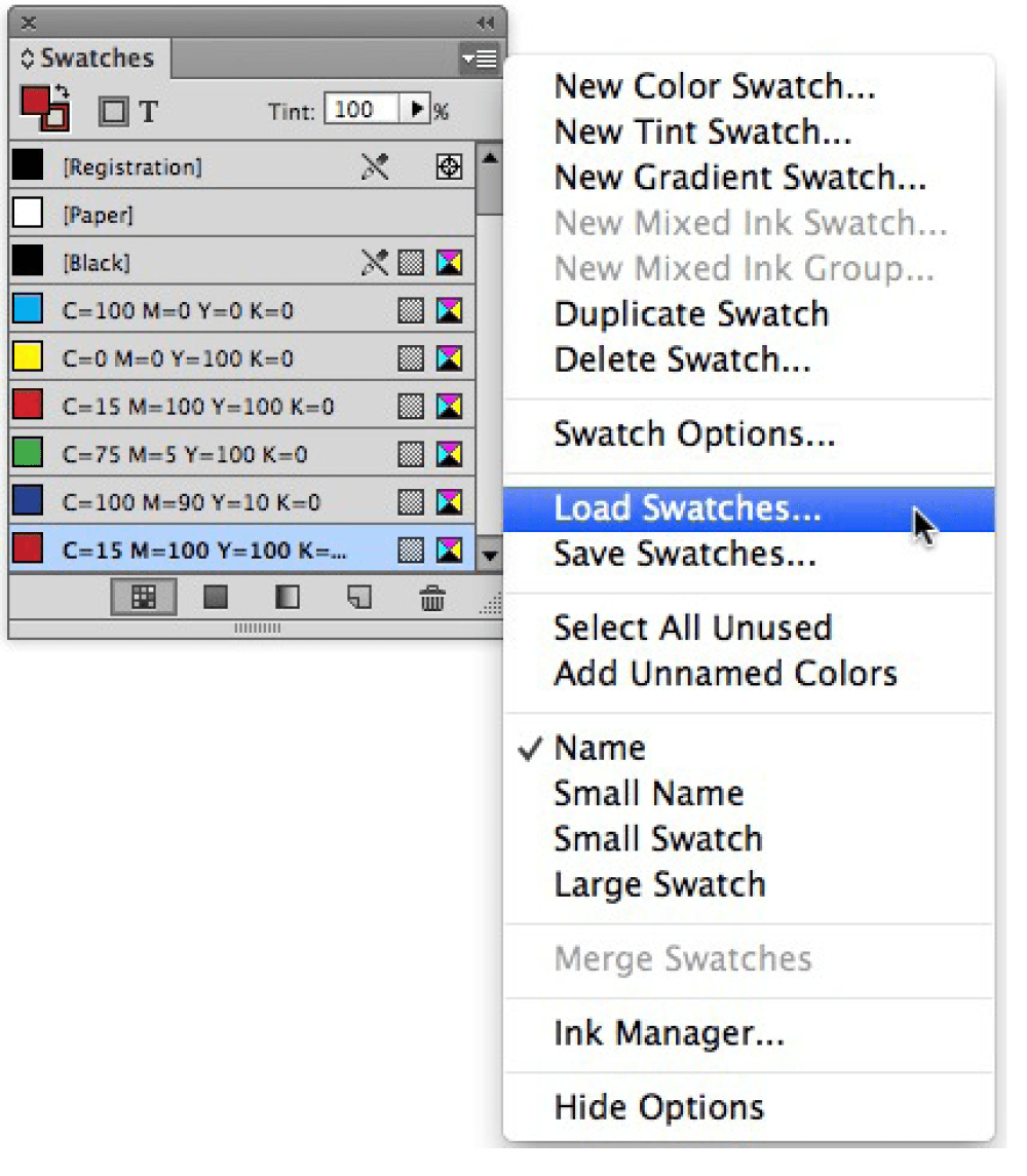
Figure 1: The Load Swatches command in the Swatches panel menu lets you quickly and consistently share colors among documents.
3. Add multiple colors
Tim Giesen of Straightline Design in Denver, Colorado provides us with this simple but handy tip: You can create more than one color at a time. While using the New Color Swatch dialog box, simply click Add—rather than OK—each time a color is set up (Figure 2). Once you’ve created all your colors, click OK to add all the colors to the Swatches panel.
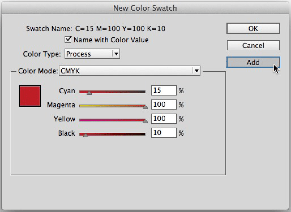
Figure 2: The Add button in the New Color Swatch dialog box lets you create multiple colors at one time.
4. Add unnamed colors
If you use the Eyedropper tool to snag a green grass color from a golf photo, the color displays in the Color panel. If you want to use that color in the document, choose Add to Swatches from the Color panel menu (Figure 3). Colors created from the New Color Swatch dialog box offer many benefits over those created in the Color panel, including the ability to apply those colors with styles, delete and replace them, and easily view color values. If you already used colors mixed on the fly, no problem. Choose Add Unnamed Colors from the Swatches panel menu and voilà, they appear.

Figure 3: It’s OK to mix colors on the fly or grab them from images with the Eyedropper tool—just be sure to add them to the Swatches panel if you want to use the colors elsewhere in the document.
5. Save tints
For consistent color usage, Giesen recommends creating tint swatches (Swatches panel menu > New Tint Swatch). Sure, it’s easier to grab the slider and change the tint value to 20%. But if you decide to use the tint again, 20 pages later, you’re forced to look back and try to figure out what percentage you used. As David Blatner keeps saying, “Take a little time now to save even more time down the line!”
6. Use opacity for transparency—only
The Opacity slider is in the Transparency pane of the Effects dialog box for a reason: because it makes objects transparent. Only adjust Opacity when you are creating transparency effects—not when you just want a lighter version of a color. For a lighter shade, use a tint. Tints are simple objects to process in production, while transparency creates a more complex object that may not look like what you’re expecting.
7. Review your swatches after you place content
Remember: “Garbage in, garbage out.” So glance at the Swatches panel after you place text, spreadsheets, and images. Word and Excel files love to bring along RGB colors. EPS logos often bring Pantone (PMS) spot colors. In both cases, it’s important to consider whether the new colors will work downstream.
8. Mix inks
If you are printing with Pantone inks, using InDesign’s Mixed Inks feature is a great way to expand the possible color palette of a piece. The idea is to create mixes between spot colors or between a spot color and black. The results are like the tonal range you get in a duotone image. Mixed inks work smoothly in print production. To get started, choose New Mixed Ink Swatch from the Swatches panel menu.
9. Talk to your printer about rich black
Don’t assume you know the formula for rich black, because it depends on the printing process and the printer. Digital presses can handle more colors on top of each other, so making a mixture using all four process colors is usually not an issue. But on traditional offset or web presses, this is not the way to go. A traditional mixture is 100% black with 30% cyan, but you should make sure that the mixture you use works for your printer’s equipment and processes. When you use swatches, it’s easy to change the definition of the rich black at the last minute.
10. Don’t trust your screen
When picking a CMYK color, pick it from a swatch that has been printed (preferably on paper similar to what you’re printing on). If you’re picking a Pantone color, use a Pantone swatch book. There’s no such thing as an RGB swatch book, of course, but you should just be aware that an RGB color is always going to look different on different devices.
11. Be organized when creating your color swatches
As you create swatches, organize them in the panel in a way that works for you. Consider using the Name With Color Value option or adopt a similar naming convention so you can see all your color formulas at a glance. A name like “c60y100” is much more descriptive than “NewGreen” (though you can always hold your cursor over a swatch to see the formula). You can also select one or more swatches in the panel and drag them to rearrange the order. If you want to make changes to the default set of swatches that will appear in all new documents, close any open documents before editing your swatches.
Applying Colors
After you carefully create the colors you plan to print or display, you still need to give a little thought to how you apply those colors.
12. Do not use Registration in your designs—ever
Registration prints on all plates so it is not interchangeable with using Black ink. “There is no place for registration in print production except for registration marks,” says DeJarld. She not only emphasizes that Registration should never be used in place of Black ink, but she also shares a brilliant tip from Anne-Marie Concepción to keep this from happening: Drag Registration to the bottom of the Swatches panel so you can’t click it accidentally (Figure 4).
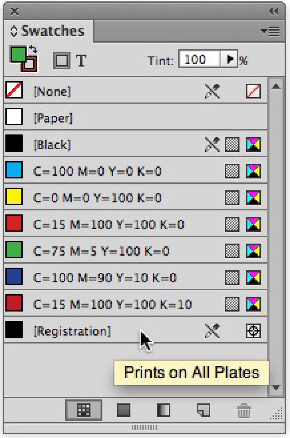
Figure 4: To make sure you can’t accidentally apply Registration, drag the Registration swatch to the bottom of the Swatches panel. After you drag it, be sure to click Black again, so that Registration doesn’t become your new default color.
13. Create a character style for a color
To quickly and consistently apply color to text, you can create a character style that specifies nothing but a color. You can then embed that character style in a paragraph style (see this article for details) or quickly apply it to text in any font and size. To do this, select the color in the Character Color panel of the New Character Style dialog box (Character Styles panel menu > New Character Style).
Reviewing Color Usage
While you’re flying along, crafting concepts and laying out pages, paying too much attention to the Swatches panel can ruin your flow. Plus, as mentioned, colors may just start appearing in the Swatches panel as you place content. Fortunately, InDesign offers many methods for reviewing and repairing color usage.
14. Delete unused colors
When asked for color tips, multiple designers immediately offered this one: Before you send a document to press, delete all the unused colors. “I like my documents all neat and tidy,” says Giesen. “Plus, you can review the remaining colors and see if there’s anything that doesn’t belong.” In addition, there’s no chance of an errant color getting applied later. To do this, choose Select All Unused from the Swatches panel menu, and then click Delete Swatch (Figure 5).
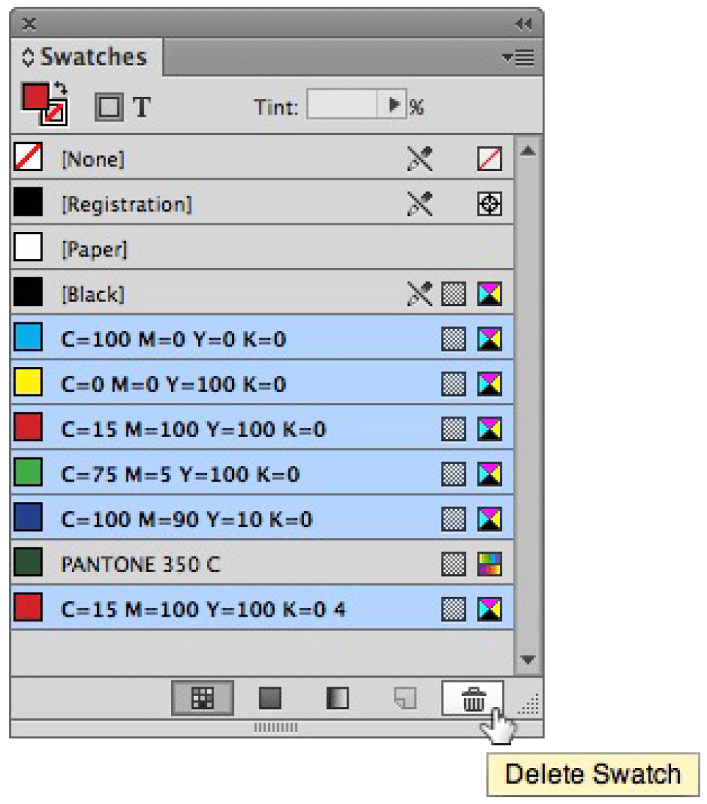
Figure 5: Select and delete all the unused colors in a document.
15. Review swatches for duplicates
It’s easy to end up with a few variations of a color applied in a document—for example, that friendly blue that came along with your imported Word file—but chances are you just want to use the one blue you chose with purpose. If you spot any errant colors in the Swatches panel, such as spot and CMYK builds of the same color, you can quickly delete one color and replace its usage with another. Just select the color swatch and click Delete Swatch on the Swatches panel. If the color is used in the document, an alert lets you select a replacement color (Figure 6).
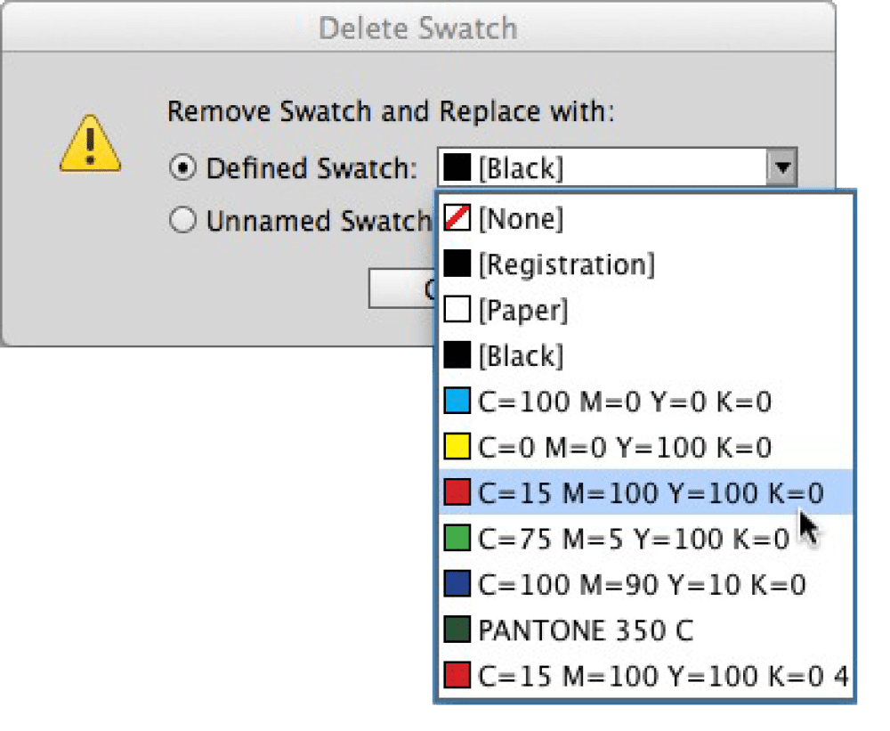
Figure 6: When you delete a color that is used in a document, you can replace its use with another color.
16. Remap colors with the Ink Manager
In Real World Print Production with Adobe Creative Suite Applications, Claudia McCue suggests using the Ink Manager to “fix spot-color errors by remapping extraneous colors to correct inks.” This method of resolving color problems is nondestructive, meaning that the changes occur in the output stream rather than affecting the document itself. To open the Ink Manager, select it from the Swatches panel menu or the Separations Preview panel menu.
17. Preview Separations
DeJarld highly recommends using the Separations Preview panel (Window > Output) to review color usage for print jobs (Figure 7). A glance at the panel can reveal a spot color that needs to be converted to process. You might even find something more mysterious, like 0% of a spot color applied to the stroke of a frame. Other reasons to review separations include ensuring that tints of a color all print on the same plate and that Registration is not applied to any page elements. To use the panel, choose Separations from the View menu, and then click the eye icon to show and hide the various plates. For example, hide the Black plate and review the document. If any black objects still display, chances are Registration is applied, and you need to change that.
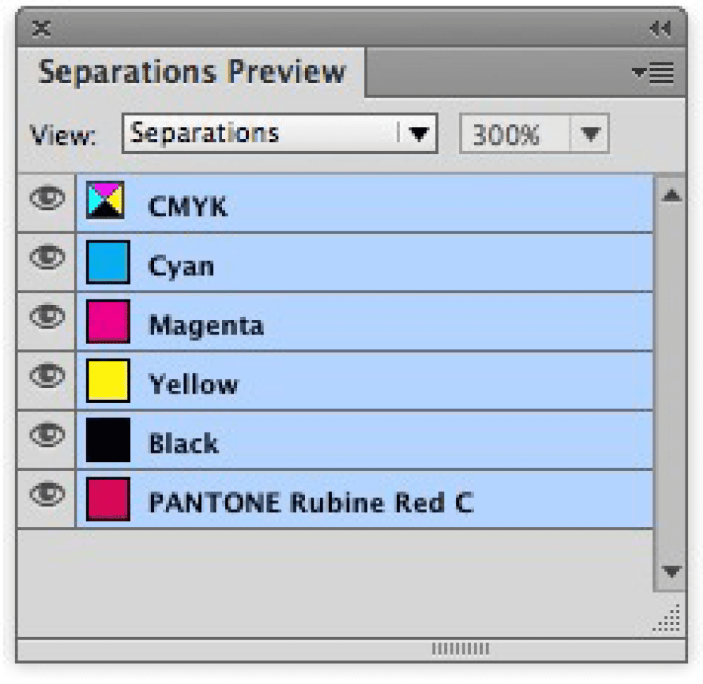
Figure 7: The Separations Preview panel shows which plates will print for a document.
18. Check out the Color Space column in the Links panel
DeJarld also reminds us that you can configure the Links panel to show any information that is helpful to you, including Color Space (Figure 8). Choose Panel Options from the Links panel menu to select the columns to display. If an image turns out to be in the wrong color space for the job, choose Edit Original from the Links panel menu to modify the image file. (Remember InDesign can convert your RGB images to CMYK for you when you print or export a PDF, but it’s still a good idea to be aware of which images are in which formats, so you can track them and make good decisions when exporting a PDF or sending a document to print.)
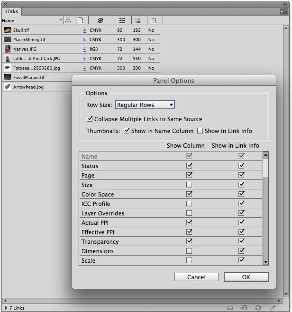
Figure 8: Display Link Info in the Links panel to see a linked image file’s Format, Color Space, PPI, and Dimensions.
19. Use the Preflight panel
A preflight profile can warn you about improper color usage as you work—so if you apply an RGB color swatch in a document destined for CMYK printing, a warning could display. In fact, a preflight profile can warn about output issues way beyond color usage, including image resolution, stroke weight, and overset text. Ask your printer for a preflight profile you can load, or make your own collection of profiles for various clients, jobs, and printers. To view the Preflight panel, choose Window > Output > Preflight (Figure 9). Preflight errors are reported in the panel and in the lower left corner of the document window.
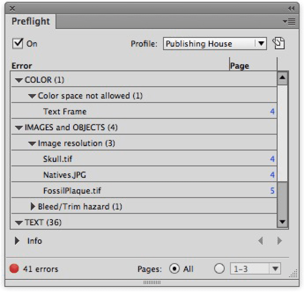
Figure 9: The Preflight panel provides details on potential errors in a document.
20. Don’t ignore warnings
Sure, commercial printers with modern prepress systems can spot potential problems and prevent them from becoming big, ugly (and expensive) mistakes. Still, you’re better off taking responsibility for delivering clean files, so make sure you understand any warnings that pop up and take corrective action. If you take nothing else away from this article, remember that every time you create a color, you need to consider how it will work downstream. Fortunately for you, InDesign provides many tools to help you make it a smooth and scenic trip.
Commenting is easier and faster when you're logged in!

Recommended for you

Acrobat Tips: Fonts Can Make or Break PDFs
Editor’s Note: The following article was written with Acrobat 5 in mind an...
Neenah Swatchbook Gives You Multitude of Packaging Options
Press Release Packaging papers are nothing new to Neenah Paper. What is new is t...
Arranger: The Smart Way to Arrange Objects in Illustrator
Free plug-in makes it a snap to arrange Illustrator objects in circles, grids, w...