

InDesign How to: Using Liquid Layout

Excerpted from InDesign Magazine, April/May 2012 (issue 47). Subscribe now!
In addition to the HTML version of the excerpt below, you can also download the excerpt as a PDF that retains the full design of the magazine. This PDF is best viewed in Adobe Acrobat or the free Adobe Reader.
Any time a feature is added to InDesign or any mission-critical tool, Adobe is always keen to tell us what that new feature is. Many InDesign experts then rush to tell us how to use that feature through articles, videos, blog posts, presentations, and so on. But in this article I’m going to go one further and tell you the answers to the questions than we all need to ask before we wonder how to use a new feature: (okay, actually it’s several) What can the feature do for us? Will it impact our work positively or negatively and to what degree in either direction? What will it save us—or cost us—in terms of productivity? Does it solve a need you and I actually have—or will have in the foreseeable future—or is it just something cool (or not) that sounds like we might want to use but probably never will??
The new feature under that scrutiny today is Liquid Layout in InDesign CS6. And in this article I’ll tell you how to use it, but first, here are the answers to those other questions I mentioned. Liquid Layout will help us. It will make our work easier. It will impact our work positively (by lessening it). It will cost a little bit of up-front learning time for a long-term payoff (like with styles). And yes, if you are planning any multi-output publishing, it will solve a need you actually have.
What is Liquid Layout?
Liquid Layout is a way to automatically or semi-automatically adapt page content and objects from one page size or orientation to another. It’s an alternative to using the hit-or-miss Layout Adjustment feature that has long been a part of InDesign; in fact, it’s intended as a direct replacement for Layout Adjustment (though Layout Adjustment is still available in CS6).
So what can liquid layout do for you? Short answer: It can save you hours or even days of reworking the same content into different layouts, page sizes, and orientations. It can do everything Layout Adjustment can, but with a lot less manual cleanup… and only a little more prep work.
OK, that was the short answer. Want more details? Still need to be convinced? Have a look at Figure 1.

I started with the page on the left, and Liquid Layout gave me the page on the right after I resized from the original iPad portrait-orientation (768×1024 px) to landscape (1024×768 px). I didn’t do any manual repositioning or resizing; I didn’t even manually change the text frame from 2-column to 3-column. The result isn’t perfect, but it’s a lot closer than Layout Adjustment could get me.
Liquid Layout can move and/or resize objects for you any time you change the page size or orientation—and not just for digital output formats. It’s highly useful when working with multiple print formats, too. For example, let’s say you’re laying out a non-fiction book, and that you’ll be producing both hardcover and trade paperback versions of it. For most designers that usually means two completely different layouts, built independently of one another, with text poured in from Word docs and figures, sidebars, etc. manually positioned separately for each version. For more-savvy layout artists who use anchored objects and such, the workflow is usually to create a copy of the hardcover layout, enable Layout Adjustment, and resize the pages. Layout Adjustment will do much of the heavy lifting to reflow and reposition anchored objects, but there’s still a lot of manual cleanup to be done. With Liquid Layouts, the workflow is: create the hardcover edition with anchored objects, prep the objects to resize when needed, create a copy for the paperback edition, resize the pages, and perform minimal manual cleanup. If you need a third edition—maybe a large-print or an on-screen or on-tablet version—that’s just as easy to create, because the original version was prepped to change to any page size, any format.
Minutes versus hours. One day versus two weeks. Hmm. Tough choice.
Let’s look at the workflow of a website or digital magazine. Typically layout begins with one orientation (say portrait) of pages sized for an iPad. The document is then duplicated, reoriented for the other viewing mode (landscape). From there, it gets really complicated because not only do objects need to be repositioned for the new orientation, oftentimes the text frames need to be adapted to the wider area, moving from one-column to two, two-column to three, or what have you. And once that labor is finished you still have to create portrait and landscape versions for the Samsung Galaxy, and other 7- and 10-inch Android tablets. On average it works out that only approximately one third of the total production time on a digital magazine is spent designing the magazine; the other two thirds, you’re simply adapting a finished design for alternate orientations and layouts.
With Liquid Layout you might not even have to design the second layout, much less everything after it. Think about that: the production time of a digital magazine, ecatalog, or media-rich ebook cut down by 66%.
How to Use Liquid Layout
Like Gridify, introduced in CS5, Liquid Layout is a set of behaviors rather than a tool, command, panel, or function of InDesign. It’s part of the program, always there, whether your actions expose its behavior or not.
Let’s start with a simple step-by-step to force Liquid Layout to expose itself (eek!).
In InDesign CS5 or CS5.5, open or create a single-sided document that looks something like the one in Figure 2 (this one is 8.5×11 Letter-sized, though the size dimensions aren’t really important).
Ideally, you want a document that includes a multi-column text frame and maybe an image or two.
Select Layout > Layout Adjustment and ensure that Layout Adjustment is disabled by clearing the checkbox in the dialog box (Figure 3).

Go to the master page controlling the document page we just looked at, and resize it via the Edit Page Size button at the bottom of the Pages panel (CS5 and later). I set mine to Tabloid. Now switch back to the document page to observe the change.
This action, done in CS5 or CS5.5 with Layout Adjustment off, which it is by default, would result in the image you see in Figure 4, where the document page size grows outward from its center to match its master’s new size, but the objects on that page remain completely unchanged—just floating within a much larger sheet of paper.

Undo your page size change with Cmd+Z/Ctrl+Z.
This time, enable Layout Adjustment, and then resize the master page. Your document page should now look something like Figure 5. Notice that the text frame now correctly resizes to follow the margin guides. The text itself doesn’t change size, but the frame does, and it remains in two columns, with each column merely enlarging to bisect the now-larger space offered by the 11×17-inch page. The unanchored graphic frame, however, isn’t handled so well by Layout Adjustment.

Okay, Let’s try it one more time, but this time in InDesign CS6.
Starting with an identical document, using a primary text frame filled with placeholder text in two columns and the same unanchored image. (If you hadn’t yet noticed, CS6 replaces the notion and behavior of a “master text frame” with a “primary text frame,” something you don’t manually have to override! Wahoo!)
After again making sure that Layout Adjustment is disabled (Liquid Layout is still technically available, in the Liquid Layout panel flyout menu), go to the master page, and use the Edit Page Size button at the bottom of the Pages panel to resize it to Tabloid.
Switch back to the document page and compare the results to what CS5/5.5 delivered. Here we see the first inkling of the Liquid Layout behaviors exposed (Figure 6). The text frame behaves exactly the same way as in previous versions of InDesign, but the graphic frame retains its relative position to that text frame—again, that frame is not anchored or inline.

At this point you might be thinking: It moved a picture but otherwise aped the behavior of CS5/5.5’s Layout Adjustment.
Big whoop! Maybe you’re also compiling a list of wishful behaviors like the following:
Resize the text along with the text frame.
Add (or remove) additional columns to fill the new space instead of widening (or narrowing) existing columns.
Resize the image instead of just moving it.
Keep the content positioned the same distance from one or two margins while increasing the space between the content and the other margins.
Or, in the same scenario, keep the content fixed to one or two margins and stretch or resize it in the direction of other margins.
That’s a pretty hefty wish list. You probably think it’s pie in the sky. Actually, Liquid Layout can grant all of those wishes. You just have to choose the correct rule and do a little of that prep work I keep mentioning.
The Rules
Liquid Layout rules are like directives you give InDesign to govern the resizing and repositioning of elements on the page in response to page-size or page-orientation changes. By default, no liquid layout rules are applied to master or document pages. But if you select a document or master page in the Pages panel, you can change it to one of several very helpful rules.
Before getting into those, however, I should advise you that Liquid Layout and Layout Adjustment are incompatible with one another. If you enable Layout Adjustment, it stops Liquid Layout behaviors from functioning.
The Controlled By Master Rule
The first Liquid Layout rule is Controlled by Master, meaning simply that document pages adapt based on whatever liquid layout rule you’ve applied to their master pages. And because the default rule for master pages is None, until you change the rule on a master page, this ends up being little more than a slightly-improved Layout Adjustment.
If that’s all you need, well, there you go—Layout Adjustment improved. If you need more advanced layout adaptation, you’ll need to employ a different rule.
The Scale Rule
An easy way to understand the Scale rule is to think about what happens when you’re manually resizing a bunch of objects. You group the objects, hold Cmd+Shift/Ctrl+Shift, and click and drag one of the group’s control corners to resize the object frames and their contents—text, images, videos, whatever. The Scale rule does that exact same thing (but without grouping the objects) and it works in response to page size changes. Let’s try it.
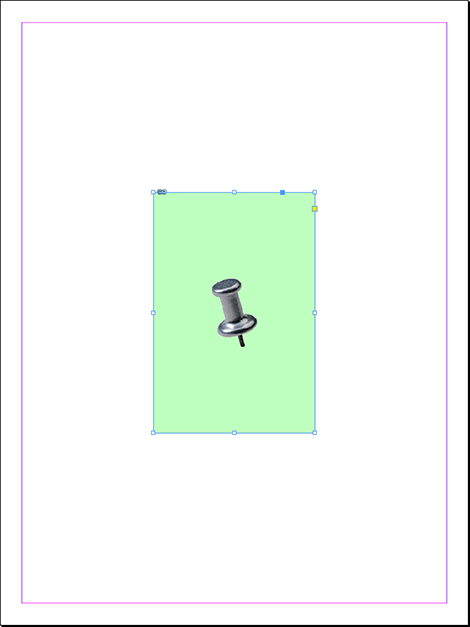
Start out the same way we have been, with a document page like we used above, or something a little more complicated, like my page layout in Figure 8.

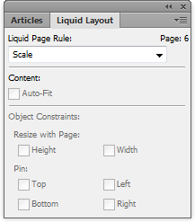
Let’s say I need to create a copy of this 8.5×11-inch layout that is 11×17 inches. And in this case, we only want this one page to change. So in order to use any rule except Controlled by Master, I need to change the document page rather than its master. So, I’ll select the Page tool (third down on the Tools panel), which sets the Control panel into Page mode (Figure 9).

The first thing I want to do on the Control panel in this mode is change the Liquid Page Rule dropdown to—you guessed it—Scale. Then, to the left of that, I’ll change the Width and Height (of the page) fields to Tabloid, which is 16×20 inches. Voilà! The page becomes what you see in Figure 10, which includes all frames and their contents resized in proportion, just as if you’d grouped them and resized that group manually.
The extra whitespace on the sides of my design is caused by the fact that the Scale rule scales the entire page contents in proportion until it reaches the edges of the page, either the horizontal or vertical trim edges. The content is then centered on the other plane, leaving space as needed. When the space is at the top and bottom, it’s called letter-boxing; space on the sides is called pillar-boxing. If your old page size and your new page size are not the same ratio, you’ll wind up with one or the other form of boxing, requiring you to either change the page dimensions or, more likely, adjust the content manually to fit.
Scale, by the way, is the only Liquid Layout rule that actually changes the size of type, and images, at least without using the AutoFit fitting option, which I’ll discuss later. All the other rules merely change the dimensions of frames, not their contents.
The Re-Center Rule
The Re-center Liquid Layout rule doesn’t resize anything. Rather, it merely keeps the content perfectly centered both horizontally and vertically to the page edges. You don’t really need a full walkthrough just for that, but this conveniently also gives me the opportunity to make sure you know about the new look and functions of a page and the Page tool when manually resizing a page.
Select the Page tool.
On either the Control panel or the Liquid Layout panel, set the rule to Re-center.
As you may have already noticed, with the Page tool active, CS6 displays a bounding box with a unique set of control corners on the page itself (Figure 11).

Now, instead of merely being able to select the page and change the size view in the Control panel as was offered by CS5/5.5, you can manually resize the page just like any frame—or like changing the size of an artboard in Illustrator—merely by dragging a control corner. Go ahead, drag one of those control corners. You’ll see the page resize and the content stay centered.
Then, when you let go of the mouse button, the page returns to the way it was! You didn’t do anything wrong; your copy of InDesign CS6 is functioning as it was designed. Adobe (in a decision I am convinced was solely to confound and befuddle creatives’ already deadline-addled and too-many-multi-tasking minds) made it so that dragging a page’s control corner with the Page tool merely previews the change rather than committing it. If you really want to change the page size, you must first hold Option/Alt and then begin dragging the page’s control corner.
The logic, says Adobe, is that Liquid Layout is predicted to be used most often for output to formats that inherently support liquid layouts, such as HTML, SWF, and, in a future release, Adobe’s Digital Publishing Suite Content Viewer for tablets. Adobe wants you to be able to set Liquid Layout rules on content that the viewing device may employ to create the change. Therefore, they say, using the Page tool to temporarily resize the page, thus previewing what will happen to the page in a web browser or mobile device, is something users will do more often than actually resizing the page with the Page tool.
Something else to keep in mind when using the Re-center rule: It only really works for making the page bigger. For instance, it’s ideal for web content. If a website design can’t be made fully liquid, i.e. adapting to fill all dimensions of the browser window, most web designers will create a fixed- or max-width layout of 960px, or the largest their content can support before the layout breaks down. The entire page content will then center in the browser window, pillar-boxed, with empty space (or a background image) to either side. If you size a page smaller than its content, the Re-center rule will force that content to fall outside the page trim area, cropping that content upon export. In other words: if you’re going to resize pages down, don’t use the Re-center rule.
The Guide-Based Rule
Here’s where we start getting to the real potential of Liquid Layout’s behaviors. Thus far, using the Scale and Re-center rules, we’ve scaled the content and moved it around, but have always been keeping the same relation between the component objects. The objects themselves really haven’t adapted to page sizes and orientations—they haven’t been liquid, if you will. Guide-based and Object-based rules control how Liquid Layout transforms individual objects to make truly adaptive layout changes.
There really isn’t any correlation between the Guide-based rule and other behaviors in InDesign. Although Adobe’s idea started out drawing inspiration from 3- and 9-slice scaling in Illustrator, Fireworks, and Flash, the implementation has evolved completely away from that initial concept. It’s a totally new way of doing things.
The idea is that by placing a guide—a new, special kind of guide called a liquid guide—so that it touches one or more objects on the page, those objects will then expand or contract, grow or shrink, in different ways to adapt to changing page dimensions. If it sounds confusingly simple, that’s because it is simple, and it will confuse you. Give it a try.
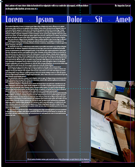
Beginning with a mixed-content layout like the one shown in Figure 12, drag a vertical ruler guide and drop it so that it touches one or more, but not all, of the objects on the page.

Now, with the black-arrow Selection tool active, hover your cursor near the top of the guide you just created. A short distance from the top of the guide, you’ll see an icon (Figure 13), signifying that the guide is a ruler guide.
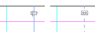
(You could actually hover your Selection tool cursor anywhere over the guide and the icon will appear at the top, but it’s easier for the next step if you start out there.) While the guide is still selected, click on that icon; the entire guide will transform from solid to dashed, and the icon will change as well. You’ve now converted your ruler guide into a liquid guide.
Switch to the Page tool and set the Liquid Layout rule to Guide-based.
Widen the page—either with the Page tool, the page size Width field on the Control panel, or the Page Sizes button at the bottom of the Pages panel. See Figure 14 to view the results when I widened my page almost 100% again. Did you notice that the objects touched by the liquid guide resized while the objects it didn’t touch remained fixed in size and location to the other side of the layout?

Undo your resize.
Now, while keeping the Page tool active, drag a horizontal guide out of the ruler and place it somewhere on the page overlapping some but not all objects. Note that when you create a guide with the Page tool active, it automatically becomes a liquid guide; doing so with any other tool active creates our old friend the standard ruler guide.
Resize the page width and height. For my design, I converted from an 8.5×11-inch page to a 20×16-inch, which gave me the results in Figure 15. As you can see, objects touched by the liquid guide can adapt in both dimensions while other objects remain unchanged.
One thing that bugs me about the results I received is the two-column text frame. Widening the page like I did made those columns too wide for my taste. Of course it’s a simple matter to select the frame and alter the number of columns via the Control panel, but I shouldn’t have to manually make that change. Doing so manually isn’t very…liquid. Let’s try this one more time.
Undo your previous resize changes.
Select your primary text frame, whether it has one, two, three, or 4 columns, and go to Object > Text Frame Options.
In the Columns drop-down menu, you’ll see that CS6 has added a third option (Figure 16).
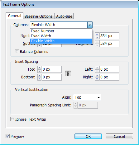
Select the new choice, Flexible Width, and in the new Maximum field underneath the Columns menu, specify the maximum width of a single column you’re willing to live with. Given the fact that my document started out as a two-column layout within half-inch margins on an 8.5-inch-wide page, I’m going to set my maximum column width to 3.5 in, which, considering the presence of the gutter, is a little bigger than what fits on the original version page. When you’re satisfied with your options, click OK.
Make sure that there’s a vertical liquid guide touching that text frame whose settings you just modified, and then widen your page—go big, nice and wide. Heck, like ZZ Top sang, go nationwide! Because of setting a maximum column-width measurement, you should now see your text frame pick up additional columns when its adaptation to the new page width would otherwise force a column to exceed that maximum width (Figure 17).

Think about that for a moment: With that one little alteration you can make text frames go from one- or two-column presentation in portrait mode digital magazine layouts to two- or three-column presentation in landscape mode—automatically.
Although it may seem a little weird in practice, using guides for this purpose really works out. I liken it to using frying pans as blunt weapons—an obvious choice in hindsight. To paraphrase Flint from Tangled: “Guides! Who knew?”
Object-Based Rule
Finally, we have the most confusing, counterintuitive, un-InDesign-like, but most controllable of the Liquid Layout rules, the Object-based rule. This rule lets you define a different adaptive behavior for each object on your page.
Start with a simple layout in which there is only a placed graphic floating dead center on the page (Figure 18).
Select the Page tool and click on the graphic frame (I know—the Page tool is for resizing pages, not objects, but that’s the way Adobe went with this). Now choose Object-based from the Liquid Page Rule popup menu in the Control panel. You’ll now see a bunch of new symbols perched on lines emanating from the graphic frame. Soon, those odd lines and symbols will multiply.
Open the Liquid Layout panel and set your options to match the ones shown in Figure 19.

Now there are a few more lines and symbols both within and outside of the graphic frame. Follow along in Figure 20 and I’ll explain what those symbols mean.

Let’s start outside the object and work our way in.
On the top and left, lines emanate from the frame and connect to solid circles on the page’s top and left edges, respectively. These solid lines, with filled circle terminuses, indicate that the object is pinned to the top and left, meaning that when the page resizes, the frame will always be the same distance from the top and left; only the distances to the bottom and right sides of the page will change, which is indicated by the open circles on those sides of the frame.
Moving along to the inside of the frame, dashed lines delineate the horizontal and vertical dimensions of the frame. On the horizontal line is a padlock icon, while the vertical displays a spring. These two symbols, respectively, communicate that the width of the frame will not change in response to the page size (“lock”), while the height will “spring.”
In other words, the frame will always be however wide it is, no matter how wide the page gets, but it will grow or shrink in depth along with the page height changes. The filled circles communicate the same thing—notice they’re on the line with the padlock—as do the open circles for the liquid or springy dimension.
Finally—and this isn’t a symbol on the frame—the Auto-Fit option on the Liquid Layout panel means (if selected) that the image inside the frame will also resize along with its frame, keeping whatever fitting method was chosen—Fit Content to Frame, Fill Frame Proportionately, Center Content, and so on. (This is the same Auto-Fit feature that was in CS5, but now it shows up in this panel, too.)
Assuming you have the same options set that I do, if you resize the page you’ll see the frame lengthen but not widen, and you’ll see that it remains the exact same distance from the top and left margins.
Now, imagine setting these object-specific movement and sizing options on all the objects within a complex layout destined for multiple outputs—a big poster, a small flyer, and a blowcard, or a digital magazine bound for the iPad, the XOOM, the Transformer, the Fire, the Galaxy Tab, the Playbook, and so on, in portrait and landscape versions for each device. Imagine the amount of time and energy involved in reworking the layout. If you become familiar with the Liquid Layout options and prep each object carefully, setting auto-fit options on the images and flexible width options on text frames, you could almost entirely automate the process of adapting the one layout you actually have to design to all those other devices and orientations. A few minutes of prep time in advance and a few minutes of minor cleanup after wholesale layout resizing or reorienting, and you’ve just saved yourself hours, days, maybe even weeks of tedious hand-ministration of the objects.
This is the power of Liquid Layouts.
An ounce of preparation really is worth a pound of layout.
Can I get a hallelujah?
 |
I still can’t quite grok how to make LL work in the simple resizing of a book, and only from US Letter to A4 — not a big difference. One issue is that margins don’t scale along with other items; I find this confusing.
And I don’t understand why checking ‘Auto-Fit’ causes an image to immediately scale down, even though I haven’t adjusted the page size yet! Is that a bug?
I did enjoy your writing though, particularly “If it sounds confusingly simple, that’s because it is simple, and it will confuse you.” True dat!
Brilliant article, thanks for the write up – soooo helpful you have no idea!
What a great, simple explanation of Liquig Layout!
I have a document that has the text locked to the baseline grid(12 lead). When I scale the page down, the text goes down in size, but the baseline grid does not change, thereby causing text spillover. How do I get the page to scale the leading down along with the text?