
When it’s time to start building your creative showcase website with Adobe Portfolio, the first step is to select a layout for it. But how do you choose? Fortunately, it comes down to just a few key factors.
But first let’s get some fundamentals out of the way. Adobe Portfolio is the browser-based website builder that’s included with an Adobe Creative Cloud subscription. The most basic unit of a Portfolio site is the Project page, which contains the content you want to show off. You can add all kinds of content to a Project page, such as photos, illustrations, videos, motion graphics, and text. If you have a lot of Project pages you can organize them under multiple Gallery pages. Compared to your computer desktop, Projects are like files and Galleries are like folders. You can also add Custom pages for content such a Contact form or an About page. The home page can contain links to project, gallery, and custom pages.
The overall design of an Adobe Portfolio website is governed by its layout. An Adobe Portfolio layout is analogous to what some other website building tools call a theme or template.
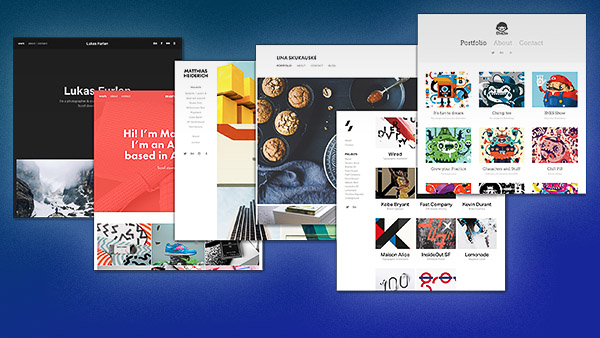
Looking at the Layouts in Adobe Portfolio
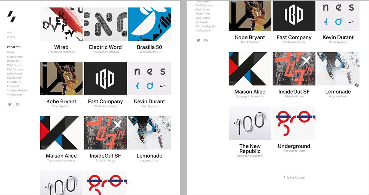
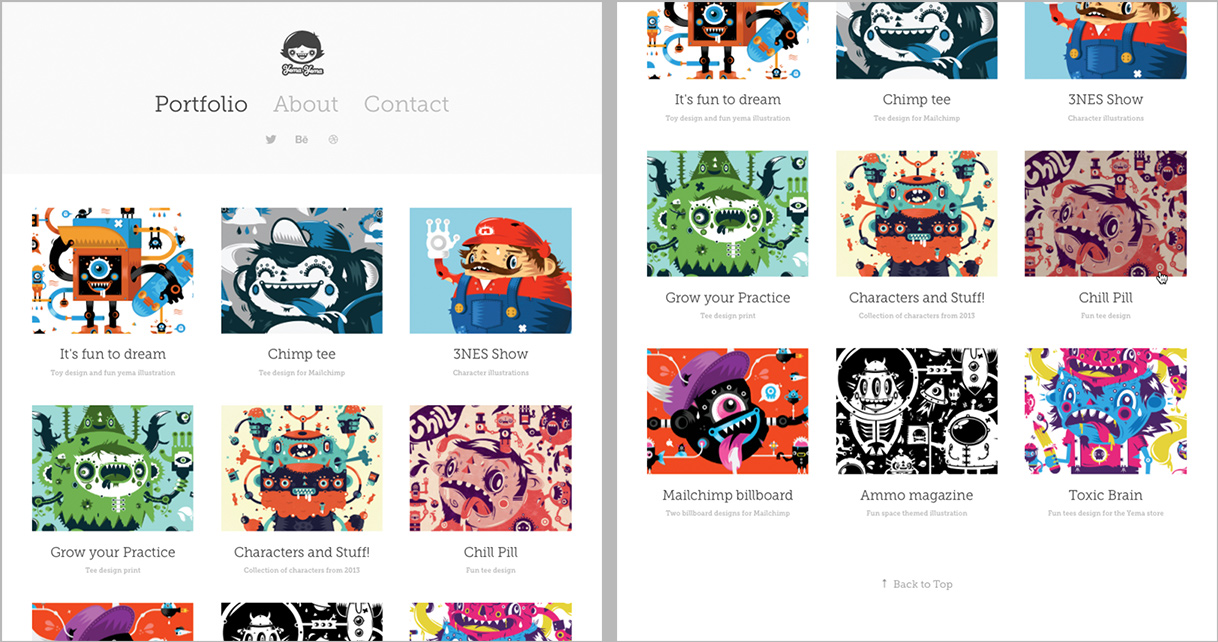
The Adobe Portfolio layout demo websites show the default settings for each layout. In the following figure pairs, the left image shows the top of each layout on a desktop-sized display, and the right image shows how the layout changes as you scroll down. In the layouts with opening mastheads, scrolling moves the grid of links up over the masthead. In the layouts with hidden labels, the right image shows how the labels appear when you move the pointer over the cover images (called a rollover, even though trackpads, styluses, and and most mice no longer roll).
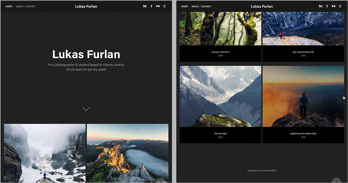
Lukas has the navigation and masthead at the top. Scrolling down slides the cover image grid up over the masthead but keeps navigation visible at the top; project or gallery titles are below each cover image.

Marta has the navigation and masthead at the top. Scrolling down slides the cover image grid up over the masthead but keeps navigation visible at the top; project or gallery titles become visible on mouse rollover.

Matthias has the navigation along the left side. On the cover image grid, project or gallery titles become visible on mouse rollover.
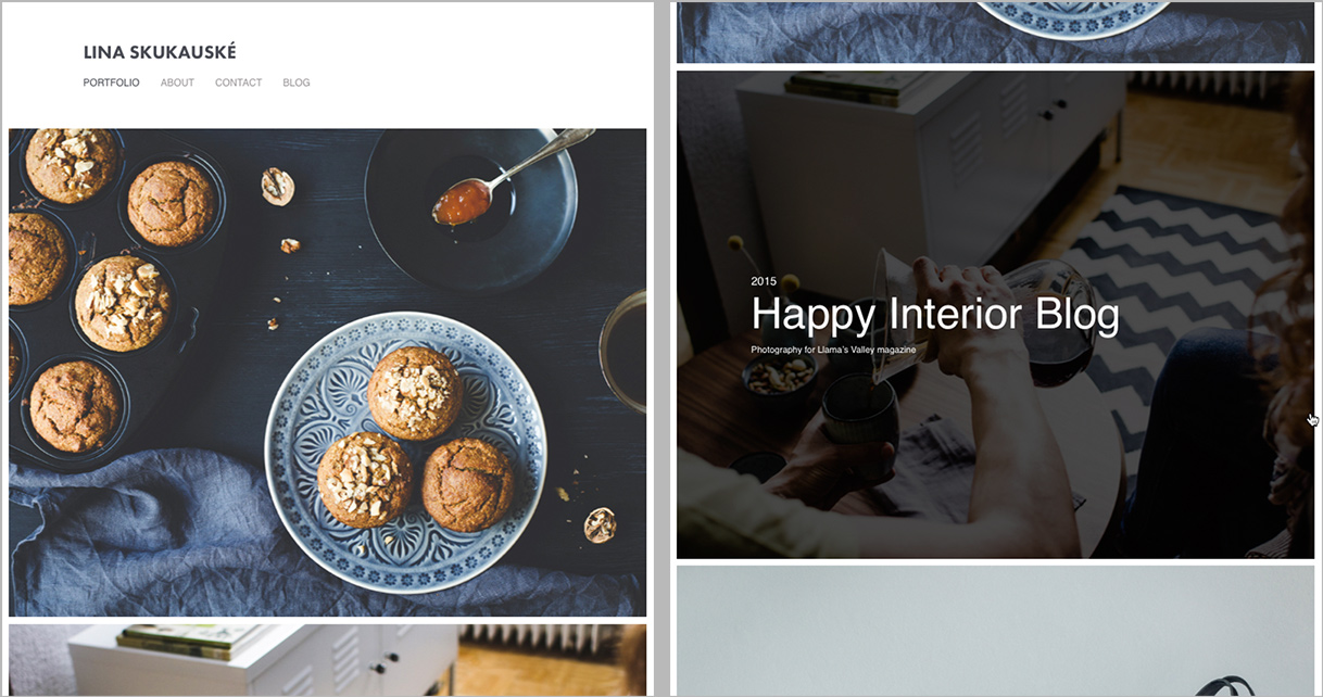
Lina has the navigation at the top. On the cover image grid (single column by default), project or gallery titles become visible on mouse rollover.
Sawdust has the navigation along the left side, with project or gallery titles below each cover image.
Mercedes has the navigation at the top, with project or gallery titles below each cover image.
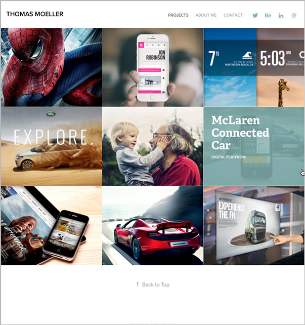
Thomas has the navigation at the top. On the cover image grid, project or gallery titles become visible on mouse rollover.
What Drives Your Layout Choice
When you choose a Portfolio layout you’re often choosing more of a starting point than a completely different design, because the available layouts are actually quite similar. Most of the differences come down to the settings for options such as fonts, margins, and colors, most of which you can change. If you change enough of one layout’s settings, you can make it look much like some of the other layouts. For example, if you like the Matthias layout but you also want your site to welcome visitors with a large masthead, don’t reject the Matthias layout just because it doesn’t show a masthead. That’s just the default setting; if you like the rest of the layout you can turn on its masthead.
What really differentiates the types of layouts are two things that can’t be changed:
- Navigation. The navigation links can be across the top of the page or down the left side.
- Cover image titles. Some layouts display titles below each cover image (thumbnail image), while other layouts display a cover image’s title as a rollover effect.
If you strongly prefer one of the ways that navigation and cover image titles are presented, consider only the layouts that do it the way you like and then customize from there.
Once you drill down past the home page, the project and gallery pages are very similar across layouts. The sequence of content on a project or gallery page isn’t related to the layout you choose; you control that sequence. If you see that a layout’s project page starts with a paragraph of text that introduces the project, that’s only because that designer added a text element before the the first visual item.
Design your Portfolio pages as single-column streams of content, because that’s how project and gallery pages are structured. The single-column layouts make Portfolio pages easy to build quickly, and easy to automatically recompose for different display sizes. If you want complete control over layout such as being able to position elements anywhere on the page, Portfolio doesn’t offer that; you’ll want to build your website with a tool such as Adobe Muse instead.
Customizing a Layout
Layouts let you customize the following settings (and more):
- Masthead: Whether or not it’s displayed.
- Site navigation (top level links): Whether or not it’s displayed, and the sequence of the links.
- Grid of projects or galleries: How many columns, the sequence of items, and the margins between items and around the grid.
- Fonts: Portfolio provides font choices for many elements including titles, headings, and links. You can also customize font size and the margins around some text elements. Because Portfolio is part of Adobe Creative Cloud, the fonts are provided by Typekit.
- Colors: You can change the color of many element types.
- Backgrounds: You can change the color or background image for many element types.
For example, if you like the Matthias theme but wish it filled the page with a single column of full-width images like the Lina layout does, just change the number of project cover columns from three to one.

I like the Matthias layout, but I don’t yet have enough content to fill out the three columns. I can customize the cover image grid to be just one column, which fills out the home page much better.
The Adobe Portfolio site has a gallery of examples of how real users have customized the available layouts.
When evaluating a layout, grab your phone or tablet and test the layout on multiple screen sizes. For example, the layouts with navigation on the left move the navigation to the top when the display is below a certain size.
You’re Free to Explore
Don’t spend too much time agonizing over which layout to use. You can switch to another layout at any time, and when you do, Portfolio saves the customizations you made to the current layout. So go ahead and explore the different layouts, and if a new layout choice doesn’t work out, just switch back to the one you were using before. If your most recent customizations end up going down the wrong road, Portfolio gives you a couple of easy ways to turn back before it’s too late: Undo Last Edit, and Restore Last Publish.

Undo Last Edit and Restore Last Publish are two ways to back out of mistakes.
There’s no penalty for experimenting with the layouts in Adobe Portfolio, so building your creative portfolio can be fast and fun. For more information about organizing pages and adding content see my earlier CreativePro article, Using Adobe Portfolio.
This article was last modified on January 8, 2023
This article was first published on October 3, 2016
Commenting is easier and faster when you're logged in!
Recommended for you

InDesign Magazine Issue 116: Excel Tips
Issue 116 of InDesign Magazine with articles on Excel tips, list spacing, tiny t...
Working With Text Styles in CC Libraries
Using the power of CC Libraries is the easiest way to share text styles across I...
Helping Photoshop and InDesign Play Nice
Chad Chelius and David Blatner offer advice on how to make these two software si...