

Color spaces can be quite different, as regular readers of this column will attest. In a previous column, I discussed various Photoshop RGB working spaces from the standpoint of an output-centric image-editing philosophy. This time around, we’ll look at the opposite philosophy — the input-centric approach.
What does that mean? In short, instead of limiting the gamut of the working color space to something close to what we can reproduce on output, the input-centric approach concentrates on using wide-gamut working spaces big enough to preserve all the color in the original. It might seem that you’d be better off retaining as much of the original color as possible, but as always, there are trade-offs involved that need to be considered carefully.
Wide Open Spaces
First, lets look at the reasons for using a wide-gamut, input-centric approach:
- You want to create archival digital color that preserves the entire gamut of the original.
- You want to control gamut mapping manually, rather than accept what’s built into the rendering intents of your various profiles.
- You want to print to wide-gamut output processes such as film recorders or HiFi-color offset press, without compromising the color in the source space.
- You’re an incurable optimist who believes that the current gamut limitations on output devices are merely a temporary inconvenience.
If none of these criteria apply to you, you probably are not a good candidate for using wide-gamut spaces, because doing so does have its disadvantages. Some of these drawbacks are inherent, while others are caused by limitations in current software implementations. Let’s look at the reasons for not using the input-centric approach.
The first disadvantage of wide-gamut spaces is that they are in fact wide and, hence, are not particularly friendly to 8-bit-per-channel images: An 8-bit channel allows only 256 possible values, and in a large space, these values are spread across a larger area than in a small one. Accordingly, when you edit color in a large space, you’re likely to encounter posterization or color-banding much sooner than you will in a smaller one. The wider spacing between values also gives you less control over fine distinctions of color and tone.
You can largely eliminate these problems by working with 16-bit channels, accepting the doubling of the file size with its concomitant demands on RAM and storage space. No matter what working space you use, you can often obtain significant benefits from performing your global editing for tone and color on 16-bit-per-channel files — smoother gradations, more accurate color conversions, and finer control — but if you’re working with wide-gamut spaces, it’s almost a necessity. (See Out of Gamut: The High-Bit Advantage for a much fuller discussion of the pros and cons of 16-bit channels.)
There are other less-obvious challenges you’ll encounter when you work with wide-gamut spaces. These limitations have more to do with current implementations of wide-gamut spaces, which are generally still geared to working in monitor-like spaces with 8-bit channels, than with any inherent drawbacks.
Working in the Dark
One such limitation is the inability of monitors to display wide-gamut spaces at all completely. Obviously, you can’t display colors on the monitor that the monitor is physically incapable of reproducing. Monitor profiles generally support only colorimetric rendering, which reproduces colors that are inside the monitor’s gamut exactly but clips the out-of-gamut colors to the closest reproducible hue. The upshot of this is that when you view a wide gamut space on your monitor, you’re looking through a small window in the center (approximately) of the wide gamut space.

Figure 1 shows the gamuts of Kodak’s ProPhotoRGB in green, photographer Joe Holmes’ EktaSpace in red, and a Barco monitor in blue. Note that while EktaSpace is considerably smaller than ProPhotoRGB, both spaces contain some “imaginary” colors that lie outside the range of human vision. They need to do so if they’re going to capture all the colors we can record on E6 (EktaChrome) film.
Note also that the Barco monitor, which is about as good as monitors get, can only display a portion of the colors available in either space. This can be problematic in that you can make fairly major edits to hue and saturation without seeing any visible change on the monitor.
What do I mean by “fairly major edits?” Well, in Kodak’s ProPhotoRGB, you can reduce saturation by about 20 to 25 points, and shift hue by about 7 to 8 degrees, without seeing any visible change in the display of strongly saturated colors. So you definitely need to proceed with caution.
It is possible to build monitor profiles with Perceptual rendering tables, which would compress the gamut of the source space into the gamut of the monitor, but no commercially-available products do so. And even if they did, there’s no easy way to select Perceptual rendering without changing to a completely different profile, and given that most people feel that color management is quite complex enough, thank you, it’s unlikely that we’ll see one added anytime soon. That means that you’d need to keep separate monitor profiles for normal and Perceptual renderings. (I do this. Occasionally I forget which one is loaded, and sometimes the results are decidedly not pretty!)
Putting on the Squeeze
A second problem arises with the Perceptual rendering tables built into most output profiles. All Perceptual tables contain an assumption about the source space: Some profiling tools, notably Pictographics’ ColorSynergy, actually allow you to choose a source space, but most use a hardwired assumption. Few if any use a space anywhere near as large as either EktaSpace or ProPhotoRGB, so the default gamut mappings may not work all that well.
You can get around this — very successfully, I may add — by working inside a simulation of your output space and adjusting the colors in the source image to achieve the appearance you want. Photoshop 6.0, which should ship in the next few weeks, offers better output simulations than any previous version, and lets you preview RGB output as well as CMYK. So you can regard the gamut mapping issue as a blessing and a curse. The blessing is that you can control the mapping of the colors in the original to your output. The curse is that you have to.
Watch This Space
Then there’s the question of which space to use. CIE Lab is certainly a wide-gamut space, but it’s not particularly well-suited to editing color. Very small changes to a* and b* values cause ballistic changes in color, and most people don’t find Lab all that intuitive when it comes to editing color.
Wide Gamut RGB, which is built into Photoshop, is pretty wide but has weak blues that tend to shift to purple, and hues tend to shift when you edit tone. This happens to some extent in any RGB space, but it’s much more pronounced in wide-gamut spaces in general, and even more so in Wide Gamut RGB.
I prefer the two wide RGB spaces I mentioned earlier in this article — EktaSpace and Kodak’s ProPhotoRGB. EktaSpace, which was developed by photographer Joseph Holmes and is sometimes known as Joe RGB, is available for download at ProfileCentral. Kodak’s ProPhotoRGB, formerly known as rgbMaster and before that ROMM (Reference Output Medium Metric) RGB, is available through a Kodak site.
There’s been some controversy within the color community over whether or not EktaSpace is big enough to hold the entire gamut of E6 film. My experiments suggest that it’s possible to create colors in a normal in-camera exposure (that is, making a photograph with a camera, not playing strange games like exposing the film with monochromatic lasers) that will be slightly clipped in EktaSpace. But you have to try really hard to do so. It’s entirely fair to say that EktaSpace encompasses all the colors you’re likely to find on E6 film.
ProPhotoRGB absolutely, positively, for sure covers the E6 gamut (not only of Kodak’s own Ektachrome film, but also of Fuji’s popular Velvia stocks). It’s a substantially bigger space than EktaSpace, but it’s surprisingly well behaved in terms of keeping hues constant as you edit.
Neither of these wide-gamut spaces emerges as the better choice for all jobs. Each has distinct characteristics that make it better suited for some circumstances than others.
Space Explorations
I use EktaSpace as an archive and transfer space for good scans of good chromes that need only light editing if any. With a good scanner profile, EktaSpace does an excellent job of preserving the individual characteristics of different transparency film stocks — more so than any other space I’ve used. If you shoot E6 and are interested in preserving the look and feel as well as the color gamut, EktaSpace is a good place to start.
ProPhotoRGB is certainly usable with transparency scans, but unless you shoot extreme color that pushes film to its limits, it’s questionable whether ProPhotoRGB will offer you any real advantage over the smaller and somewhat more manageable EktaSpace. You’re certainly very unlikely to see a difference in output produced on any of today’s technologies. The arena where ProPhotoRGB really excels (for me, at least) is in interpreting color negative scans.
A transparency is a pretty unambiguous entity. When you digitize it, you’re usually attempting to capture what’s on the film. That’s not true with negatives: You don’t want a reversed image with an orange color cast. So negatives always require interpretation, and ProPhotoRGB has proven to be a very useful space in which to carry out that interpretation.
The key trick is to deliberately scan the negative with flat contrast and low saturation, as a high-bit image. Once you bring that image into ProPhotoRGB, it’s very easy to get the desired appearance with very few moves.
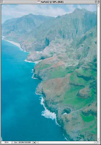
Figure 2 shows just such a raw scan of Kodak Ektapress negative film captured with an Imacon Flextight Precision II scanner. It’s flat, it’s unsaturated, and it has a slight cyan cast.
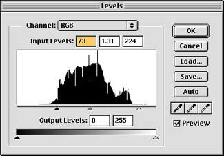


Figure 3 shows three quick Levels moves in Photoshop, on the RGB composite channel, the red channel, and the blue channel, respectively. I left the green alone. It took about 30 seconds to make this correction, and most of that time was spent fine-tuning the tweaks.

Figure 4 shows the resulting image. It could use further refinement, but it’s very much in the ballpark of where it needs to be. Using this technique — capturing the image flat and unsaturated, then editing in ProPhotoRGB — allows me to capture the very wide dynamic range and color gamut that color negative film can record, a range that far exceeds what can be translated onto a conventional photographic darkroom print.
Many photographers would like to take advantage of negative film’s greater exposure latitude, but have been daunted by the difficulty of interpreting the image the negative holds. I’ve been battling with scanning color negatives for years, winning some battles and losing others, and ProPhotoRGB has provided a real solution that not only works, but does so easily.
Thinking Big
Working with wide-gamut spaces definitely isn’t for everyone. It requires considerable care and a fair bit of skill. If your main concern is with producing great output with conventional four-color printing (whether you output to a printing press or a desktop inkjet), the headaches may not be worth it. But if you’re going out to a “big-color” process like HiFi printing (such as Pantone Hexachrome) or a film recorder and you don’t mind hanging out on the bleeding edge, you’ll find that wide-gamut spaces can help you produce results that are simply unattainable with the smaller spaces.
This article was last modified on September 13, 2000
This article was first published on September 13, 2000
Commenting is easier and faster when you're logged in!

Recommended for you

dot-font: Neutral Sans?
dot-font was a collection of short articles written by editor and typographer Jo...

New Features Guide for InDesign 2021
This comprehensive guide to InDesign new features includes the newest version of...

Before&After Design Tip: Make Your Signature Logo
How to make a unique logo that's an extension of you