


When I was down at Adobe a few weeks back, I wrote about the graphics used in the launch of Creative Suite 6.
It turns out I’m not the only one interested in the graphic treatments for not only the marketing of CS6, but also in the products themselves. While the periodic table-style icons are essentially the same as the last few versions, the splash screens of the applications are markedly different.
Apparently many of you aren’t thrilled with the applications’ new looks.
Adobe blogger John Nack says that he received more than 500 comments about the Creative Suite icons and splash screens (some of which predate CS6, which gives you an idea as to how long the debate has ranged).
In response to the ongoing onslaught of commentary that has reached new levels in light of CS6 imagery, Adobe Experience Design (UX) manager Shawn Cheris has written an exhaustive explanation of how CS6 branding was developed and how it evolved.
“The CS6 Desktop Brand System” is a fascinating piece and one that delves deep into how branding is not only designed but conceived and executed. Bolstering Cheris’s words are illustrations that show how the branding evolved.
I can’t do justice to the whole piece, but here are a few things that caught my eye.
Goals
Cheris writes that the goals and requirements of CS6 branding contain the following attributes:
- Expressive
- Interaction with Desktop
- Back to Squares
- Creating a Creative Suite brand segment
- A more cohesive connection to marketing imagery / packaging
Here’s what Cheris has to say about what the branding needs to express: “The product splash screens for CS3 and CS4 were basically extensions of the product icons. This helped establish the powerful color system that we now rely on for our brand. Having done this for two releases, there was some leeway in CS5 to do something a little different, and we had an opportunity to push it even further for CS6. We wanted to get back to the more expressive nature of pre-CS Adobe products while keeping what we loved about the past few iterations.”
Additionally, CS6 branding had to embody the following qualities:
- Legible
- Differentiable
- Flexible
- Credible
- Consistent
For example, Cheris says that Adobe acknowledges that users will often have open more than one version of the same application, therefore each suite’s icons must be “visually distinguishable” from previous versions. At the same time, icons and splash screens should be as consistent as possible, not only from version to version but also from application to application. “Each product is part of a system, the sum of which defines our brand experience.”
Steps
Cheris then goes on to describe the steps, methods, and processes the UX team employed to develop the graphics you see today. Here are some examples:
- “Whenever we start thinking about a new Creative Suite release, we like to start with the colors — and by extension — the icons.”
- “For many years, Adobe’s splash screens were illustrative and intricate and, for their time, were pretty impressive pieces of digital artwork. They taunted you, suggesting that if only you were skilled enough at Photoshop or Illustrator then you, too, could create something like this…When Adobe and Macromedia merged, they needed a new system that could accommodate a much larger tool set, and the illustrative work was wisely abandoned in favor of a systematic approach.”

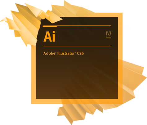
The Illustrator splash screen then…. And now.
- “We decided to start thinking about the splash screens as a canvas of sorts — a simple echo of the icon as it had been in CS3 and CS4. The two letter mnemonic system used by Adobe is reminiscent of the two letters used in the Periodic Table of Elements. Coupled with the textures, the splash screens began to feel like a visual representation of ‘elements’ of creativity.”
- “[The marketing team’s] work centered around human faces being used as a sort of canvas in much the same way we were thinking of our splash screens as a canvas. From that point forward, we collaborated closely with them to make sure the textures and colors were aligned for each product.”


The union of the efforts of marketing and user experience.
Will customers be happy with the changes? Yes and no, but greater principles are at work. Cheris says, “This doesn’t mean everyone has to like it, or that it is non-controversial. It means that it adheres to core design principles around typography, color, composition, etc. In other words, we should make something we’re proud of.”
This article was last modified on January 18, 2023
This article was first published on May 21, 2012
Commenting is easier and faster when you're logged in!
Leave a Reply

“gives you an idea as to how long the debate has ranged”
should be “how long the debate has raged“
Ranged would be used for a spread of ideas (“ranging from this to that”), rage for time.