

Fonts that are in vogue come and go, with popular typestyles constantly being replaced by newer, trendier designs. But even with the hundreds of new typefaces being released each year, there are some that don’t seem to age, and continue to look fresh while serving their typographic purpose.
Here are eight typefaces that, in spite of having been around for dozens—and in some cases hundreds—of years, don’t appear to have an expiration date any time soon.
ITC Machine Bold
This brawny, geometric, uppercase sans serif design was created in 1970 by the design team of Ronnie Bonder and Tom Carnase. It comes in two weights, but the Bold is a much stronger, more impactful design. ITC Machine Bold is most effective when set with tight letter- and line spacing, as this tightly-packed appearance creates a dense wall of typographic texture that makes a powerful statement. ITC Machine Bold is excellent for posters, headlines, signage, and other display applications that call for a commanding, authoritative look.

Fette Fraktur
Fette Fraktur is a blackletter typestyle that was originally issued by the C.E. Weber foundry in Germany in 1875. As the translation suggests, Fette Fraktur has a fat, broken appearance. This forceful, historic design is noted for its dense black texture, extreme thick and thin strokes, and highly decorated caps, all evoking the look of the Middle Ages.
Although this style of typeface might seem to have a very limited application, Fette Fraktur has expanded way beyond this narrow scope. Its highly-stylized, impactful appearance has become quite fashionable, and can be seen on book covers, magazine spreads, as well as posters and movie titles. It also lends itself to very dramatic initial caps.


Fette Fraktur is used sparingly, yet with purpose, making for a very stylish, eye-catching editorial spread. Courtesy of Nancy Campbell and Trevett McCandliss.
Linoscript
Linoscript is an elegant, readable, upright script that never seems to age. It was designed by Morris Fuller Benton in 1905 and released by American Type Founders as Typo Upright. It was renamed Linoscript in 1926 when it was integrated into the Linotype technology. Modeled on the then-popular style of upright French scripts, Linoscript has flourished capitals and connected lowercase letters with extravagant loops on the ascenders. It is ideal for a broad range of applications, including invitations, book covers, greeting cards, menus, editorial heads and subheads, and other uses requiring an elegant yet easy-to-read formal script.

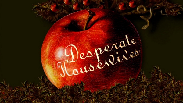
The use of Linoscript for the branding of this television show definitely sets the tone.
Clarendon
Clarendon is a slab serif (also knows as Egyptianne), a category of typestyle that first appeared at the beginning of industrialization in Great Britain in 1820. Originally designed by Robert Besley in 1838, it was reworked by Hermann Eidenbenz in 1953 for Monotype, and has been much imitated since.
With its chunky, geometric serifs, and its assertive forms, Clarendon is a timeless design that has never lost its contemporary feel. In spite of its historic beginnings, Clarendon remains a typeface that is widely used in popular culture. It commonly appears in catalogs, on web sites, book covers and movie titles, as well as signage and posters. Clarendon is available in three weights: Light, Roman, and Bold. The lighter weights are legible in small sizes, and the heavier versions make a bold statement when used at larger sizes.


This attractive Kansas statehood stamp, designed in 2011, uses Clarendon.
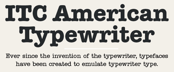
ITC American Typewriter
Ever since the invention of the typewriter, typefaces have been created to emulate typewriter type. One of the first was ITC American Typewriter, designed by Joel Kaden and Tony Stan in 1974. Its release marked the 100th anniversary of the invention of the typewriter, at a time when the typewriter was the only device used for office communication.
ITC American Typewriter retains the distinctive look of typewriter letterforms, but with improved legibility, especially for text. This typeface has a friendly, familiar appearance, with a touch of nostalgia. Since its release 40 years ago, ITC American Typewriter has never really gone out of style, and can still be seen in use, sometimes in the most unexpected places. In addition to more traditional uses such as logos, branding, and packaging, it can also be found in fashion magazines, mobile devices, and even tattoos! Grungy typewriter fonts might come and go, but this classic is here to stay.
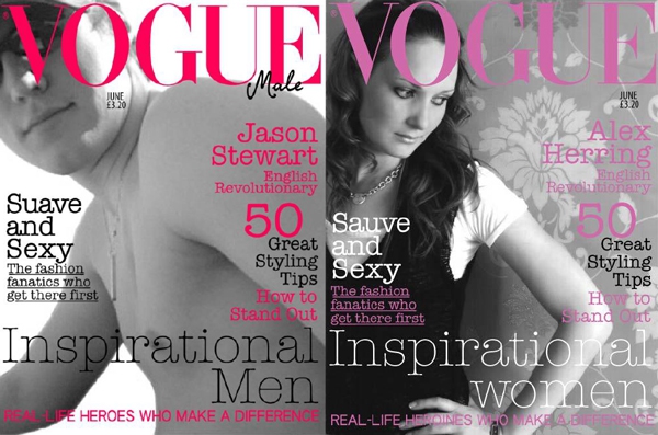
ITC American Typewriter can be seen in a most unexpected of places: two covers of Vogue!
Century Schoolbook
Century Schoolbook is recognizable to many as the typeface we learned to read from. It originated from Century Roman, which was designed in 1894 by Linn Boyd Benton for American Type Founder (ATF). In 1924, his son Morris Fuller Benton designed a variation based on his father’s design, and called it Century Schoolbook.
Although it was originally designed to be an easy-to-read typeface for children’s books, it became popular for advertising typography due to its extreme readability resulting from its open counters, generous character width and x-height, balanced weight contrast, and open letterspacing. Although originally designed in two weights, (Regular and Bold), italics were added at a later date, making this a much more useful typeface. This sturdy design, with its appealing, inviting appearance, is still being used for textbooks, periodicals, and other instances requiring a highly legible text typeface.


A page from GO: A Kidd’s Guide to Graphic Design, by Chip Kipp. Century Schoolbook is used for much of the text.
ITC New Baskerville
ITC New Baskerville is one of many contemporary type families based on the work of John Baskerville (1706–1775), a noted writing master and printer from Birmingham, England. This historic revival was designed in 1987 by John Quaranda, and is an interpretation of the Baskerville style. ITC New Baskerville is an inviting, dignified, and highly legible classic that makes an excellent and very readable text face. The italics are particularly elegant and distinctive, with several unique and recognizable glyphs including the lowercase v, w, and z.

ITC Franklin Gothic
Sans serif typefaces never go out of style. For that reason, there is a constant stream of revivals of older designs, as well as brand new originals to fill this ever-present need. But one family that will never be replaced is Franklin Gothic. Originally designed by Morris Fuller Benton in 1904 for the American Type Founders Company, this historic design still works well for both text and display, imparting a modern-day feel.
While there are several versions of this classic typeface, one of the most popular of them is ITC Franklin Gothic typeface, designed in 1980 by Victor Caruso for International Typeface Corporation. This version retains the strength and vitality of the original ATF Franklin Gothic, with a slight increase in x-height for improved legibility. This series was followed in 1991 by a suite of 12 condensed and compressed designs drawn by David Berlow.
ITC Franklin Gothic works well for both text and a display. It is considered a standard for newspaper and advertising, as well as in museums, film titling and subtitles, as well as logos. When set for text, it presents a clean, legible, and still contemporary appearance.

This article was last modified on April 29, 2022
This article was first published on January 14, 2015
Commenting is easier and faster when you're logged in!

Recommended for you
The Candy Wrapper Archive is One Sweet Collection of Package Design
If you’re looking for a little typographic inspiration, thoughts on the evolutio...

InType: Making Text Fit
When you have too much text to fit a given space and editing is not an option, u...
When It's Safe to Use Free Fonts
Many of us are intrigued by the idea of free fonts. However, the reality can be...