*** From the Archives ***

This article is from March 16, 2006, and is no longer current.

A New, New Logo for Quark

In September 2005, trumpets blared and banners waved as Quark unveiled a new logo. That fanfare quickly trailed off into a sputtering silence as critics across the world blasted the logo for its similarity to many others. Some detractors accused Quark of ripping off the logo; others said it was not theft, but lazy design.
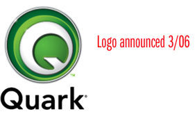
Quark denied copying any other logo and defended the design, but no company in the graphic arts industry could ignore that kind of bad publicity. Today it announced a replacement logo:

Glen Turpin, the company’s director of corporate communications, says that “Quark listened to the feedback we received from the design community in relation to our re-branding initiative in September and decided to create a new logo that is both an evolution of our visual identity and a strong representation of the new Quark… Changing the mark to avoid any perception of similarity enables us to further define our unique identity.”
I asked Turpin about the process behind the revamped logo. “Our internal creative team designed the new logo,” he replied, “and we received feedback from a variety of outside consultants throughout the design process. Then we undertook all the appropriate business, legal, and creative analysis in review of our new logo.”
To voice your thoughts on the new logo in particular or the controversy as a whole, click on the VoxBox icon on the lower left side of this page.

  • anonymous says:

    the new logo looks “functional”, as though it could actually be touched.

  • anonymous says:

    This logo is sooo much better!

  • anonymous says:

    If I had my wish Quark would just disappear. InDesign blows it out of the water, they’ve charged us thousands of dollars over the last seven or eight years for meager “upgrades” while forcing us to use the same tired interface and new features that only half-work.

    Quark needs to get it together, quickly, or just give up. And the ground they have to cover to catch up to Adobe is staggering.

  • anonymous says:

    Ptooi.

  • anonymous says:

    I did hate the 2005 Quark logo, I agree, its weak
    but the newest logo looks like a Apple X button of some sort. Quark is over thinking this and seem to be desperate to create a new identity. I do like the idea of using the Q as a bug of some sort, but they just have not nailed it.

  • anonymous says:

    OK, so maybe the Scotish Arts Council can get back to biz, but doesn’t Monster.com have a problem now?

  • anonymous says:

    The new logo is much better!!! I’m glad they responded to the much publicized comments.

  • anonymous says:

    If only they spent this much time and effort upgrading and improving their program for us… ::sigh::
    Lori Ellis, em-space.com

  • anonymous says:

    The brilliance of Quark 7 (conceptually), a year lead on universal binary, a blossoming relationship with Apple (as opposed to souring) and this identity will go a long way to restoring the order of the universe where quarks dominate the fabric of space, time and publishing.

  • anonymous says:

    I like the new logo better than the old one but then new one looks too much like SES Security icon that is present on Linksys and other routers. I never thought there was much wrong with the original Quark logo. They should spend more time working on their program, get updates out and the like than spending time worrying about their logo.

  • anonymous says:

    I agree, the first thing I thought of was that it looked like a Macromedia styled Monster.com logo. I don’t envy the design team at Quark.

  • anonymous says:

    quark’s old-old logo was just fine. get over it. we want more customer service and flexibility to keep us all from moving totally to in design.

  • anonymous says:

    First reaction: it’s an eyeball–and it’s looking DOWN. That’s symbolically appropriate because that’s where they are heading! Justifiably.

  • GeneGable says:

    What matters here is that Quark spent a lot of money and lost important marketing time to show respect for the design community. No company would have wanted the controversy over the previous logo, but many would have simply stood their ground and not made a change. Regardless of any other feelings toward Quark, I think even the most jaded user has to put a check mark in the “plus” column for this action.

    As for the design, it reminds me of a retro automobile nameplate–I can see it sitting proudly on a radiator cap or shiny hood (and in some cases rusting in the junkyard). It feels a bit home-grown, but I always consider that a plus.

    And I like the fact that this logo will probably also serve as the program icon–a nice bonus in a world where confusing butterflies, feathers and flowers represent applications despite having nothing to do with them. I’ve never understood that logic.

  • anonymous says:

    I think Quark is still missing the mark on the newest iteration of their logo. I much prefer the old standard, honestly. The new one looks like a webified cartoon martian eyeball. What’s that got to do with anything.

    As for the previous mistake mark, I can’t understand how it happened. It’s a great mark in it’s simplicity and elegance, but that’s what should have had them searching for similarities that already existed.

    I love that Quark has finally listened to their users by offering a substantial upgrade in v.7. They have been the tried/true standard and seem to want to set a new standard. I don’t think this new mark is suggestive of that though.

    For my 2¢ the newest logo is a quickie temp image lacking of concept and imagination.

  • anonymous says:

    OK, I guess, but nothing memorable or great. Would be better with only the white Q (in green or whatever). Now, it’s not only confusing at small (well, not that small) sizes, and looks more like one of the new cheap startups who sell cheap startup software.

  • anonymous says:

    Much better logo, bet it was done in Photoshop and Illustrator

  • anonymous says:

    We recently had to use Quark to complete design and editing on book that another design firm was fired from. We were told by the client that we had to complete it in Quark and not convert it to InDesign CS (which we’ve been with since 1.0).
    So we bought the new version and were quickly reminded us of how much we all hate using Quark. No trendy logo, no hip ad campaign, and no “rebranding their tourchpoints” or any other such twaddle will change the fact that it’s just clunky and frustrating to use as a page layout program.

    The simple logo was definitely the best one. Our condolences to the designer on the fiasco that ensued, his firm’s research department let him and the client down.

    ranch7creative

  • anonymous says:

    I live down the street from Quark. They still have logo number 2 on their building. I think they should have stuck with that one.

  • anonymous says:

    avoid multiple layars, simple and pretty is memmorable to human minds.

  • anonymous says:

    Sorry, Quark, it reminds me of a cartoon eyeball. I agree with a previous review…the original was the best. Just move beyond the logo to doing the best you can with product and support.

  • anonymous says:

    When first introduced to Quark, I was so excited to have a program that offered such versatility that I nagged my boss until they agreed to purchase it. Over the years as Adobe has improved the Creative Suite, it has left Quark sitting still. We moan and groan whenever we get a Quark doc in our office, knowing it will be nothing but trouble – it doesn’t work well with Tiger, it will only print to a pdf, fonts don’t show up, yadda yadda yadda. Forget the logo fiasco and focus on releasing a program version that we can use and justify the high cost of upgrading.

  • anonymous says:

    I am shocked that some art director accepted this new logo. Never, EVER, make a logo with photoshop-like effects like an emboss unless they are done very bold and thick. This looks like it was done by a first year design student exploring Photoshop for the first time. Subtle, illustrative effects equal a failed logo. The orginal at least demonstrated solid principles of graphic design.

  • anonymous says:

    With a history of poor product support and a shoddy product, it’s no wonder that Quark would only do half the work creating their logo and then introduce this ghastly fix a few months later after their impropriety was revealed. The 9/05 version was elegant and modern, a shocker until it’s discovered that it was “inspired” by identical designs. This new logo exemplifies what I expect from Quark 7: an ugly product full of bells and whistles that Quark thinks will impress us, minus any elegance or usefulness.

  • anonymous says:

    Wow, they haven’t changed a bit. 10 years ago, I worked at a screen printer and we once had to print some frisbees for Quark. They didn’t understand why we were having trouble printing their four spot colors job with halftone textures, gradients, and fine reverse lines on flexible, imperfect, plastic disks. And their NEW new logo still shows the same pig-ignorance. It doesn’t even look that good at small screen sizes – how is it ever going to have any impact in any other application? THESE are the people I’m supposed to buy graphics software from?

  • anonymous says:

    The new logo: from bad to worse

  • anonymous says:

    I’m not saying love Quark, their logo or use their software, but props are in order for the thinking behind version 7 and the logo is just fine. Really, how can you castigate a circle and a swoosh? You’d have to dis so many logos on that basis. They reacted to legit issues with the Scottish Arts Council and others and now the nattering nabobs of negativity are not down with it.

    Also, since when do Adobe’s logos, icons or website merit any design awards…BORING!

  • anonymous says:

    From a copy to a shocker!

  • anonymous says:

    As a designer I prefer the simple and elegant design of the logo introduced in 2005. This new logo (2006) is overworked. The first impression it gives is of a fish’s eye. It appears to be a subconscious rip-off of the Mac’s power button which Microsoft ripped-off for the X-Box. The more I look at it the more it reminds me of a dead fish.

  • anonymous says:

    Ever since our shop converted to InDesign, we’ve never looked back. Everyone moans & groans if we are forced by a client to work in Quark. I can’t imagine what they could do to persuade us to return. They’re a dinosaur (ooh, there’s a logo idea!)

  • anonymous says:

    Clearly, Quark is overthinking the whole thing. I realize there’s a design trend to go with 3D-ish logos these days, but… come now.

    As an aside, I gave it a quick (less than two minutes) try at coming up with something better (without researching whether my result is too similar to any existing logos), and came up with the following:

    https://tinypic.com/view/?pic=rw05fc

    The idea being that Quark is the center of your publishing universe (in a manner of speaking, bringing together images, text, fonts, etc.). Tried to evoke a ‘Q’ shape (not too successful — looks a bit like a donut, especially with the gradients added) and the idea of an actual quark (e.g., one subatomic particle orbiting around another).

    Not that great, but hey, it’s off-the-cuff.

  • anonymous says:

    Quark seams to be working very hard to loose any brand equity they had in its brand – so much so, Quark has taken two shots at it. Not that the original brand identity was revolutionary, it was not bad and it had strong recogniton that could have been built upon.

    What’s interesting is that Quark has taken the time and money and failed to take leadership position with its brand before its customers – the professional design community.

  • anonymous says:

    The latest Qk logo reminds me of looking down into a tin of green paint… it worries me that a co. that produces a so-called benchmark program for graphics should come up with something so dreadful… I have been dithering abt migrating to InDesign.. this has made my mind up for me.

    artbarn

  • anonymous says:

    First reaction: Looks like a circular firing squad.
    Dead fish eye, yeah. Or more like a scared rabbit, frantically trying to see what’s chasing it.
    I feel sorry for Quark. I never liked the program and the tech support was so bad for years, and then came that series of uber-hip postcards full of lies about InDesign (wish I’d kept them as they are now a collector’s item, but I was so disgusted). But I always hate to see anybody scared and running for their life, which is what this logo feels like.

  • Terri Stone says:

    Holy cow, miBlair, I think your off-the-cuff logo blows Quark’s March 2006 mark out of the water!

  • anonymous says:

    Quark still sucks! They can come up with a million different designs for their logo, but it won’t make their software any better. I think they should have started listening to the users about 10 years ago. Their old logo was fine! If you are bringing a completely revamped software on the market, then advertise that… not a revamped logo! Please!

  • anonymous says:

    Is THIS how Quark currently envisions itself?

    I am reminded of Hermann Zapf’s whimsical “horse by committee” picture story, in which an Art Director, laboring day and night, creates “a blue-blooded stallion with flashing eyes, proudly-arched neck, powerful legs … such a perfect animal that not even the ancient gods could have done better.” A conference is called to inspect the masterpiece, and the sales manager complains of the horse’s light gait, someone else criticizes its lack of vision, and the boss wants something fancier. In the end, the once-proud stallion is given elephant legs, giraffe neck, and peacock tail, and then everybody wonders why the idea “doesn’t pull.” The same committee appears to have gotten their hands on the current Quark logo iteration.

    What this “replacement” logo tells me is that Quark no longer has creative people working for the company; what the SicolaMartin logo tells me is that Quark doesn’t even have “detail” people capable of doing a little research to ascertain design originality.

    As a longtime designer and one of a multitude of burned-out Quark users, I derive no pleasure from the following observation: If an corporate entity such as Quark is unable to visualize a symbol or mark which embodies its vision, its soul, then is it not probable that such an entity has lost or misplaced its vision, its soul?

  • anonymous says:

    This is my second post on the subject, but I’m really hoping we bring thing these points home to Quark.

    First, the product; 4.11 has been my tried and true friend for many years (off network, that is). I’ve never upgraded because the supposed new improvements meant little to me when compared to the problems and complaints voiced by users of the upgrades. I’ve been listening carefully to those trying out the pre-release of version 7 and I have to say, I want this upgrade. I pray this truly is a new trend for Quark, developing for the needs of their users.

    BUT, while I think they want to communicate their new attitude with their new logo, it fails completely. I say, don’t abandon the old logo of the tried and true version. The balance and simplicity of the text logo is what I want from a Quark rendered document. Minimal edits to the letter forms would be fine, and I’m completely happy to lose the red because it never had anything to say to me to begin with. Fine, alter the colors to say “new” and that you’re alive and kickin’ (with the users now, not in spite of them).

    I’m all for Quark recapturing part of the market and supporting those of us who have continued with their product. I despise the idea of there only being one game in town, especially in the professional world of design. Users have only to benefit from vendor competition.

    I’m not an InDesign user yet, but hope to be. But, I won’t abandon Quark. From my reading comments of those who use both I know that InDesign is not a perfect product either. It’s compatibility within the Creative Suite is what makes that product. But in many ways, for straight layout, QXP is more straightforward and intuitive, more elegant, and I love it. There, I said it.

    But their newest logo/brand is neither reassuring or inspiring. It’s going to take the right words and very smart marketing to get this new release over the hump of skepticism with old users, and grabbing the attention and curiosity of new users. They’ve completely missed a part of their market who began with CS, never having used QXP. The new brand doesn’t cut it. I can’t imagine who they’re consulting externally, and I don’t know that their inhouse creatives able to see through the eyes of the users out here in the real world. They need everything to work, their branding an marketing need to work together like never before. And they better be listening for the smallest negative from those trying out v.7 and put out a solid release. They’re already late and there’s no undoing it. Rushing to market with something that’s, well, quirky, would be a very bad mistake to repeat.

  • anonymous says:

    new logo looks like it was put together by a bunch of drunken design undergraduates. what were they thinking?????

  • anonymous says:

    Hopefully the third time will be the charm for Quark and their logo. A shame they wasted time and money on this monstrosity. Advice for Quark: Loose the Q-frisbee-eye-thing, it’s meaningless. The typeface is nice. Just use the brand name, it’s enough.

  • anonymous says:

    Tired and irrelevant, a bit like the the application. I don’t
    think I’ll even load Quark onto my new G5.

  • anonymous says:

    The green Q announced a few weeks ago has the feel of a mid-70s design (does it come in harvest gold?). It was dull, uninteresting, unemaginative, mechanical. The latest one is so clever that it forgets to say anything. Remember that a logotype’s purpose is to encapsulate the companie’s image of itself.

    I have been out of the industry and recently took a class in Quark 6.5. Frankly, I was shocked at how little had really changed since version 3.3. Come on guys, get with the decade! (Or at least withiin a decade)

  • anonymous says:

    First they borrowed (read stole) someone else’s design (the last re-design). Now it looks like a view from the trashcan that I threw the product into (InDesign is far superior IMO). I guess they (Quark) really have fallen from grace (not that they were ever graceful). Hopefully Adobe won’t make the same mistakes with their branding & products…

  • anonymous says:

    Leave it to Quark to take a lackluster design and run with it. It is so typical of the way Quark seems to think. There was a time when Quark was the real choice of professionals, but they seemed to have stopped there, or fired all their creative people. In Design is not perfect, there are a lot of faults, but at least they keep trying to improve. Maybe the logo design team brainstormed over lunch at Quizno’s!

  • anonymous says:

    This is a window into the company itself – confused with no direction. Does Quark honestly expect to sell me tools for design? This is not only a new face for Quark but another schizophrenic personality for the company. How can you brand when you can’t decide on who you want to be?!?! This isn’t a new logo, it’s a black flag.

  • anonymous says:

    The 09/05 logo is the best and the cleanest. The 03/06 logo is more like a website logo with the 3 dimensional effects.

  • anonymous says:

    Although the one who proved that inhouse work was better than a hired marketing company made a better logo, it was also deeply trendy. Not a longterm logo at all.
    The slow response to needs and poor customer service will never change thier image with a logo. This is why people chose more proven applications like FrameMaker. Talk about hidden perfection. I just wish Adobe would pull thier head out of their butts and update it.

  • anonymous says:

    new Quark resembles much like the sonyericsson logo, isnt it..? in an Quick glance

  • anonymous says:

    I am not going to sit here and bang my drum but like my teacher in gradeschool always said go with your first choice.
    Save the money quark send it to me and go back to your roots. stop trying to think your consumers need a fresh look when they really want good tools.

  • anonymous says:

    They have been fobbing us off for years with their program that doesn’t change and these attempts at a logo just shows it their lazy and they don’t deserve our money anymore.

    Yes inDesign is not perfect but at least it changes with it’s upgrades, I will not be buying the ‘new program’ and the logo is just ‘sour’ cream on the cake.

  • anonymous says:

    By all indications over the last year, I sense an honest and well-intentioned effort by Quark to reconcile bad blood with disillusioned customers. Indeed, Quark wallowed in a innovation slump, and perpetuated an aloof and uncaring rapport with users for years. But I’ve been quite pleased with the latest version of Xpress, and their marketing efforts have yielded better support, and a clear, determined path of improving their software. This isn’t about InDesign. This is about a rebranding that reflects a repentant company on course to win back customers. This latest logo is contemporary and attractive, perhaps not designed for long-term application, but it feels appropriate for engaging a next generation of up-and-coming designers. I’m still using Quark after 16 years, and their forthcoming product update feels like frosting on the cake.

  • anonymous says:

    First of all..I love Quark, however, another logo redesign? Come on people. This new logo makes Quark look like they are hiding from something, continuously being surrounded by annoying beveled/embossed circles of frustration, maybe?

    Hey Quark, stand tall and stick with consistency–work on product think branding later. Shop at “Target” lately? Now there’s an example to look up to.

  • anonymous says:

    Quark is obsolete, so their logos really don’t matter.

  • anonymous says:

    How does this logo relate in anyway to what they do as a company. I know it’s just an abstract symbol but I cannot think of a decent reason why it has the 3 dimensional effect is all about other than fashion. Logos should be above fashion IMHO.

  • anonymous says:

    Like Michael Jackson’s nose, Quark should have stopped at the last iteration.
    Does anyone even use Quark anymore?
    With InDesign there is no reason to use Quark.
    May they rest in peace no matter what their logo looks like.

  • anonymous says:

    Speaking as a graphic designer / art director with 17+ years of experience, and a Quark user since the beginning, I’m disappointed and shocked that someone at Quark thought the new logo was a good idea. The designer(s) definitely exceeded the maximum amount of Photoshop effects allowed by law for such a small image. LOL! – Why not lose everything but the circular shaped letter “Q” and call it a day. Less is more. Or, revert back to one of the old logos? “Old” is new again. – Perhaps you could invite all Quark users to submit logo comps and give the winner free software. – Whatever you do, please don’t embarrass the company or your users by using such a monstrosity of a logo. It doesn’t even come close to representing the product or its users.

  • anonymous says:

    Previous quote:
    “I’m not an InDesign user yet, but hope to be. But, I won’t abandon Quark. From my reading comments of those who use both I know that InDesign is not a perfect product either. It’s compatibility within the Creative Suite is what makes that product. But in many ways, for straight layout, QXP is more straightforward and intuitive, more elegant, and I love it. There, I said it.”

    ——-

    I just had to respond to this. You preface your post with “I’m not an InDesign user yet.” That explains the rest of your post. If you were an InDesign user, there is NO WAY you would use the words Quark, intuitive, elegant, and love in the same sentence.

    I switched to InDesign in 2002 and never looked back. The first two weeks, it felt clumsy because I wasn’t used to it. But after a few weeks went by, it became second nature. Recently, I took a job at an agency that uses Quark. After getting used to InDesign, I can’t believe how bad/buggy Quark is. And, there are soooo many features I miss from InDesign… I can’t even begin to list them.

    I’ve always said – IF you give InDesign and honest try and learn it well, you will see the light and wonder just how you ever got by with Quark.

  • anonymous says:

    … and it wouldn’t faze us a bit. Our creative shop has Quark in the rear view mirror and love the drive of InDesign. I know this is a common rant – comparing Quark to InDesign – but for us, InDesign is a far superior product. Quark who?

  • anonymous says:

    IF THAT IS ALL YOU GOT…WELL IT SAYS
    IT ALL!

  • anonymous says:

    Of course the old logo needed updating. Of course the new one had to go. But despite the confusion, the new one should go also. With all the great new redesigns of late, or even last few years–not to mention new competition–Quark needs something great, not just acceptable. And this ain’t great. Too complicated. Should work with just the middle Q (in green or whatever). And with so many possibilities in the design of a Q, why settle for less than the best? Contact a few hot type foundries, not logo makers or ad agencies. They’ll be more likely to give what’s necessary.

  • anonymous says:

    kkiser’s post called the logo a monstrosity and I had already been reminded of the “Monsters, Inc” character with the one big eye… and yes, having “exceeded the limit of photoshop effects”!

  • anonymous says:

    After seeing at&t’s efforts they must have figured they should go ahead and do something along those lines instead. Is this just fallout from interBrand?

  • anonymous says:

    What a winer fest. Get a life!

  • anonymous says:

    I have been using Quark since its inception. While I understand that Quark desperatly needs to revitalize their brand, I think that they must investigate carefully the emotional response of their mark instead of tapping into stylistic trends. The purpose of a brand is to communicate the intended personality of a company and I think the new logo cheapens the company. I understand that Quark must do something drastic due to more and more designers switching to inDesign. But this new logo looks like they are grasping at straws. So many are angry with QuarkXPress right now — I think this new identity is only going to hurt the company more. Very sad really.

  • anonymous says:

    For those who wish Quark would stick with their “older, better logo,” you might want to see the striking similarity to the 1969 design for Alitalia Airlines for some perspective on the creative decisions made by Quark. Here’s the addres: https://earlstreetdesigns.com/pages/punk/alitalia.htm

  • >