

Stuart Davis
Lettering can turn up in the most surprising places. Stuart Davis (1892 – 1964) was an American Modernist painter known for his bold, brash, and very colorful paintings, much of it heavily influenced by his love of jazz. He incorporated painted words and lettering in much of his work to represent their literal meaning as well as to serve as graphic elements.
My own love of letterforms began way before I knew what typography was. My interest in and excitement for letters was initially sparked by seeing the work of Stuart Davis, most likely in a class museum trip or from art books. The impression his paintings made on me stuck, and I became a lover of his work (and letterforms) ever since. I went on to study art and painting in college, and only got into graphic design and typography later on. Having a background in fine art has taught me something invaluable: the elements which contribute to good composition—whether it be in fine art or graphic design—are one and the same.
Stuart Davis was known for his jazzy, colorful, proto-pop style. He was born in Philadelphia, Pennsylvania to artistic parents: his father was an art editor of the Philadelphia Press and his mother was a sculptor. Davis began his professional career as an illustrator for several magazines. His subject matter included pop culture items such as cigarette packages and spark plugs. His subsequent interest in cubism led to personal work consisting of flattened, abstracted forms with colorful patterns, lines and textures, all of which can be seen in his earlier work.

Garage, 1917, oil on canvas, approx. 19 x 23 in. This early painting clearly shows Davis’ interested in letterforms, and how they integrate into the landscape of the world around him.

Still Life with Dial, 1922, oil on canvas, 49 x 32 in. This painting, with its incorporation of line, color, shape and plane, suggests Davis’ early Cubist influence.
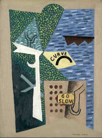
Curve—Go Slow, 1922, gouache on artist board, 16 x 12 in. Here Davis combines shapes, textures, lettering and color to create a shoreline scene.
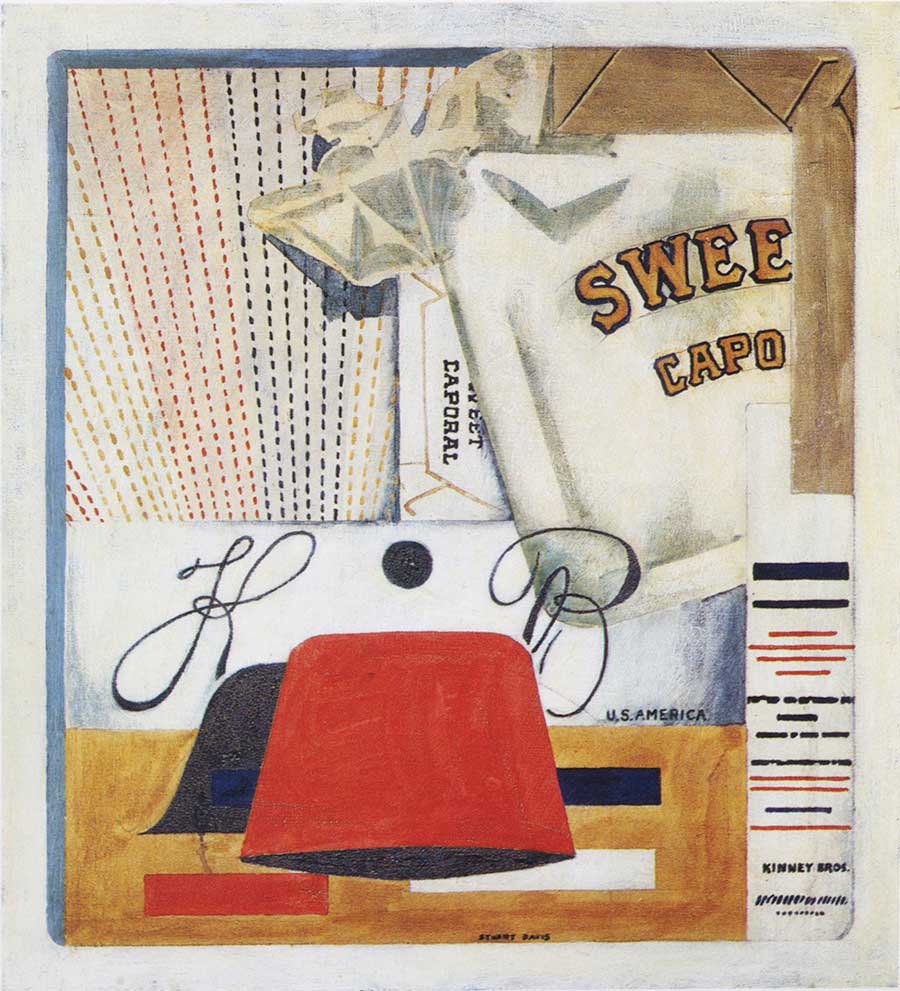
Sweet Caporal, 1922, watercolor and oil on canvas, approx. 20 x 18 in. Sweet Caporal, or “Sweet Caps” as it was known, was a brand of cigarettes sold by the American Tobacco Company from the end of the nineteenth century.

Lucky Strike, 1924, oil on paperboard, 18 x 24 in. A painting that clearly reflects his attraction to artifacts of everyday life, including newspapers, and smoking paraphernalia. This was a time when advertising was considered art by many artists.

Percolator, 1927, oil on canvas, 36 x 29 in. A popular consumer item is deconstructed in Cubist style, with the addition of a geometric numeral six.
In the 1920, his work began to mature, and broadened to include still lifes and landscapes. From 1928 to 1929 Davis lived in Paris, where much of his work (paintings, drawings and lithographs) was inspired by cafés and street scenes. Upon his return to America in 1929, he relocated to Greenwich Village and summered in Massachusetts; his work took a new turn, using forms suggestive of American life, often referred to as the Ash Can School. He went on to become a muralist for the Public Works Art Project from 1933 to 1939.
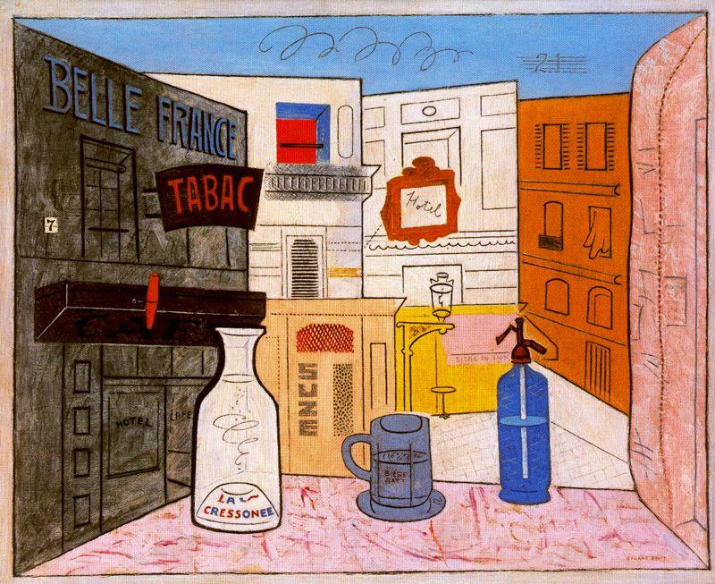
Rue Lipp, 1928, oil on canvas, 32 x 39 in. This streetscape incorporates lots of street typography and signage, combining both visual and literal imagery.
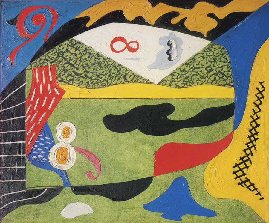
Lawn and Sky, 1931, oil on canvas, approx. 19 x 23 in. This landscape consisting of shapes, textures and colors, all encircle two figure eights.
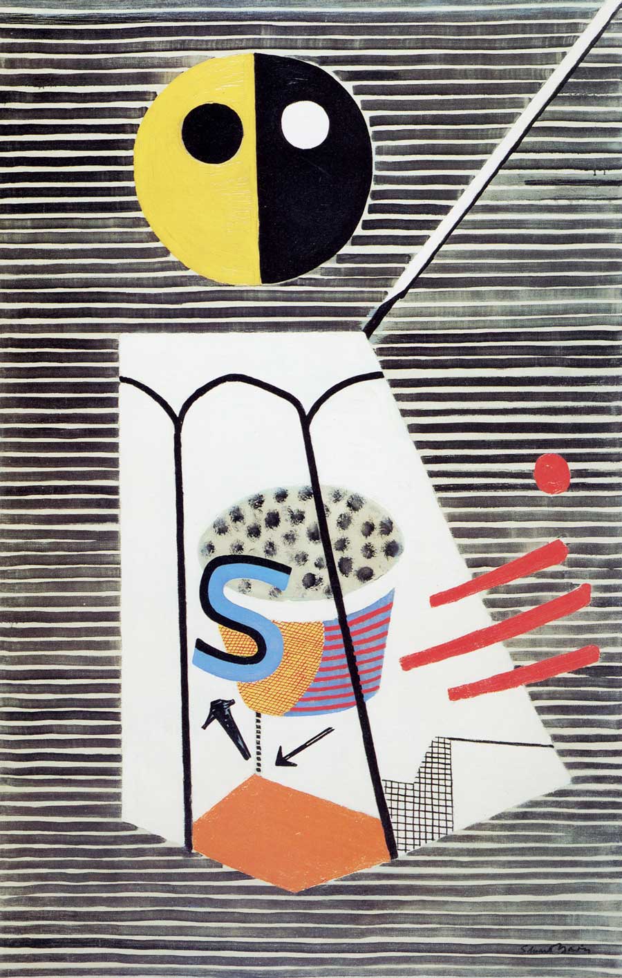
Salt Shaker, 1931, oil on canvas, approx. 50 x 32 in. Davis’ interpretation of an actual salt shaker from a Paris café, including a prominently-placed, broad stroked letter S
House and Street, 1931, oil on canvas, approx. 26 x 42 in. This work is suggestive of the view from two subway car windows, including two words that contribute to the numerous textures that make up this painting

New York Waterfront, 1938, gouache on paper, approx. 12 x 15 in. This small yet dynamic abstracted cityscape includes letters, glyph-like shapes, as well as Davis’ printed signature that carries the eye down to the lower right corner.
Davis’ later work transitioned to pure abstract compositions, often containing lettering and letter-like forms suggestive of advertisements, posters, and other commercial themes related to both the urban experience and rural life. His interest in jazz contributed to the zest and dynamism of his work. Davis is attributed with the creation of a distinctive American style of cubism. Yet however abstract his works became he always claimed that all of his imagery was inspired from reality: ‘I paint what I see in America, in other words, I paint the American Scene,’ Davis said.
Davis’ signature is deliciously graphic in its own right. In fact, it becomes part of the composition of each and every painting it appears in, with its size, style, color and position artistically and intentionally placed within the composition. His lettering, handwriting and personal signature was the inspiration for a typeface designed by Harold Lohner, Syncopated Script, Lohner says, “After looking at all the reproductions of Davis’s paintings I could find, I used some of his writings and my own intuition to fill out the alphabet. I’ve tried to maintain both the erratic, jumpy quality and the continuous linking. The originals were painted; these feel as if they were cut out of paper.”
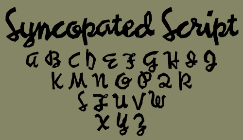
Syncopated Script, a typeface designed by Harold Lohner, and inspired by the work and handwriting of Stuart Davis.
Stuart Davis created some of the boldest work of the century. His energetic, dynamic compositions, many which incorporated both abstracted and literal letterforms, are still relevant today and continue to inspire painters and designers alike.

Report from Rockport, 1940, oil on canvas, 24 x 30 in. An explosion of color, shapes, and texture that express the energy of this cityscape that include words, numbers, and other type-like forms.

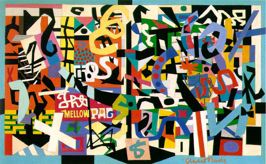
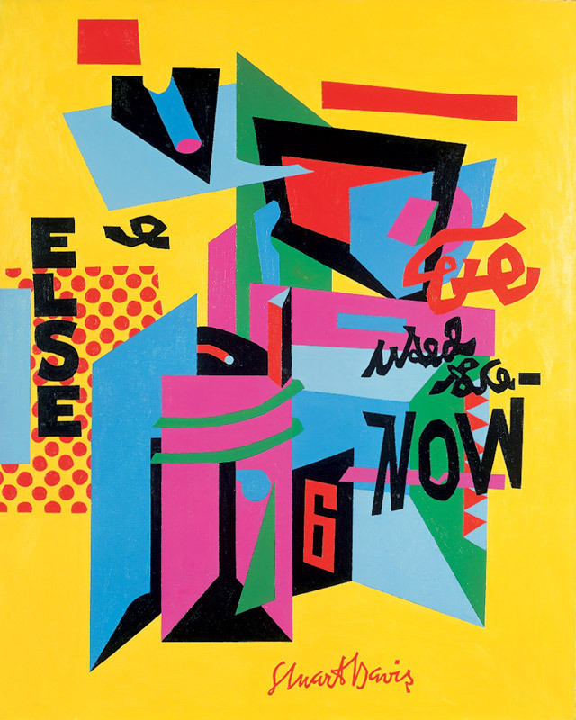
The Mellow Pad, 1945–51, oil on canvas, 26 x 42 in. This painting is one of Davis’ most complex works, painted over six years with many studies. This dense, rather chaotic composition includes words, letters, symbols, and squiggly forms suggestive of writing; it is framed by a blue border which includes his cursive signature, as opposed to the printed sig of earlier works.
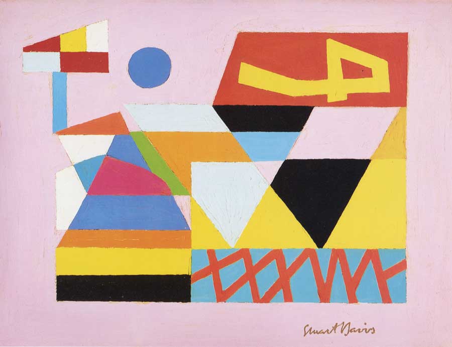
Max No. 2, 1949, oil on canvas, 12 x 16 in. This small, jewel-like painting includes a numeral four on its side, balanced by Davis’ contained signature on the bottom.
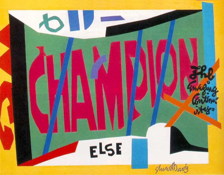
VISA, 1951, oil on canvas, 40 x 52 in. Words in both print and script are the dominant elements in this painting—one of his later works.
OWH! In San Pao, 1951, oil on canvas, approx. 52 x 41 in. The typographic forms that circle around this painting include his signature, which becomes an important element in the composition.

Eye Level, 1951 – 54, oil on canvas, 17 x 12 in. Davis’ signature occupies a prominent position in an orange rectangle on the upper left of this canvas—an unusual position and treatment for a signature.
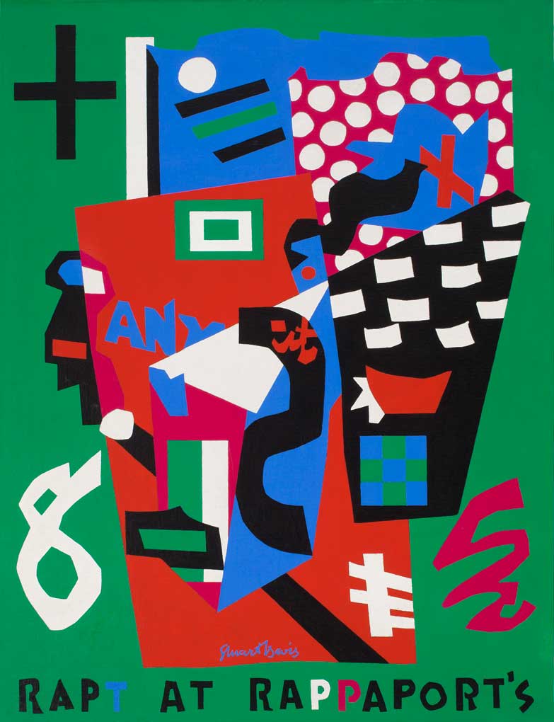
Rapt at Rappaport’s, 1952, oil on canvas, 52 x 40 in. Davis’ style shifts to a more limited palette in this, and future works. Type is used to express both literal and figurative meanings in this painting.
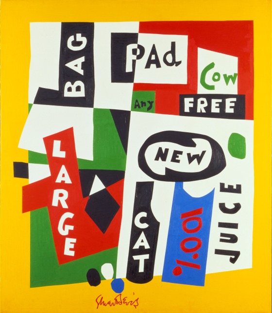
Premiere, 1957, oil on canvas, 58 x 50 in. In 1956, Fortune magazine asked Davis to create artwork from products found in a supermarket. He represented them with words, not products in this painting of mostly primary colors.
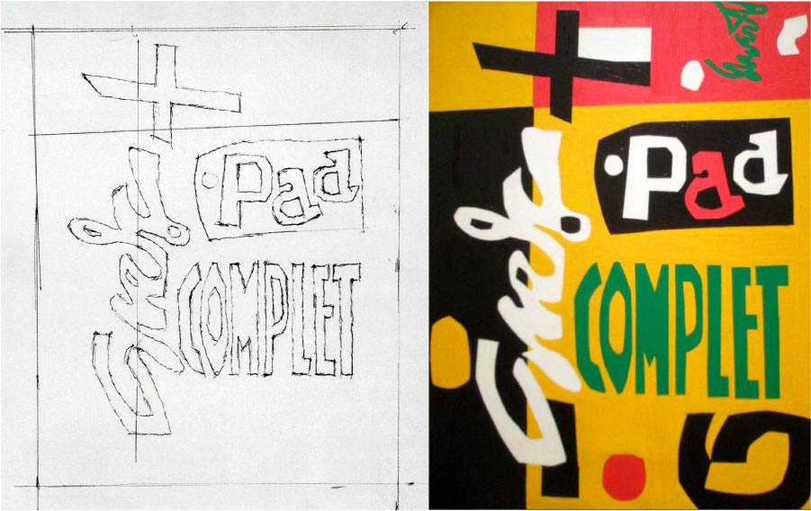
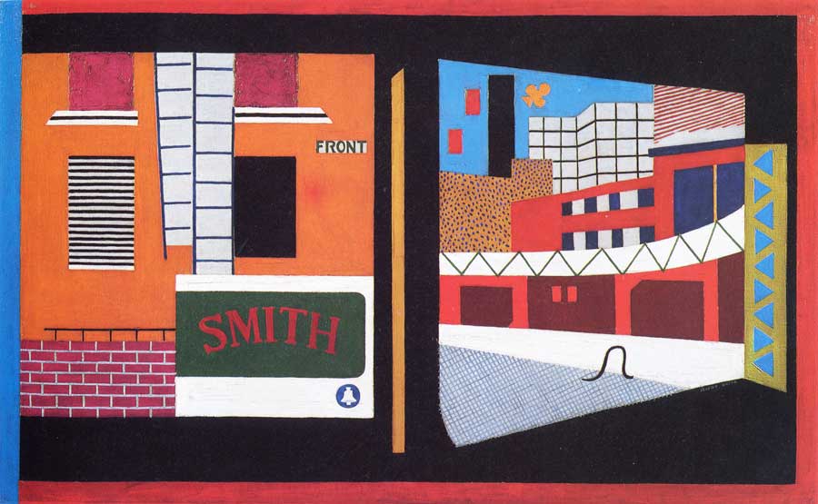
Standard Brand, oil on canvas, 1961, 60 x 46 in. Once again, both readable letterforms as well as symbols and script-like shapes are the primary elements in this painting (and its sketch). Davis’ signature is almost unrecognizable, yet an important element in this composition, as it bleeds off the canvas on a 90-degree angle.
This article was last modified on April 14, 2022
This article was first published on April 6, 2016
Commenting is easier and faster when you're logged in!

Recommended for you

TypeTalk: Ten Commandments of Type
What better time than January to make typographic resolutions? Adhering to the t...
Ascender Corp. Offers Microsoft Office 2008 for Mac Fonts
Ascender Corporation, a leading provider of advanced font products, today announ...

TypeTalk: How to Attract Attention With Pull Quotes
A pull quote is a key phrase, sentence, quotation or excerpt that is taken, or p...