


What better time to round up new typefaces than on Friday. Not only is “Fonts on Friday” alliterative, but showcasing new fonts also seems like a good way to end the week.
The fonts featured in this week’s installment have a decidedly ’70s vibe. The type and lettering of the ’70s often had a look and feel that today we might associate with the social change that started in the ’60s. Think of the revival of Cooper Black, a chunky face that looks like it had just been liberated from its girdle.

Two designers of that era helped define the aesthetic: Ed Benguiat and Herb Lubalin.
Benguiat designed faces for Photo-Lettering Inc. as well as International Typeface Corp. (ITC), the co-founder of which was Herb Lubalin, an influential letterer and logo designer. I won’t get in the careers of these two men — Benguiat most recently collaborated with House Industries on a collection of fonts; Lubalin died in 1981 — as much has been written about them.
I mention Benguiat and Lubalin in the context of two contemporary typefaces: Bookmania by Mark Simonson and Herbie by The Infamous Foundry (TIF).
Bookmania is a tribute to Benguiat’s Bookman (itself a revival) that he drew in 1975 and that enjoyed new popularity as one of the first PostScript fonts on the Apple LaserWriter.
Simonson calls his Bookmania a revival, which it certainly is, but it also expands the font as a result of OpenType. For example, it has more than 680 swash characters and 35 discretionary ligatures, plus plenty of alternates.
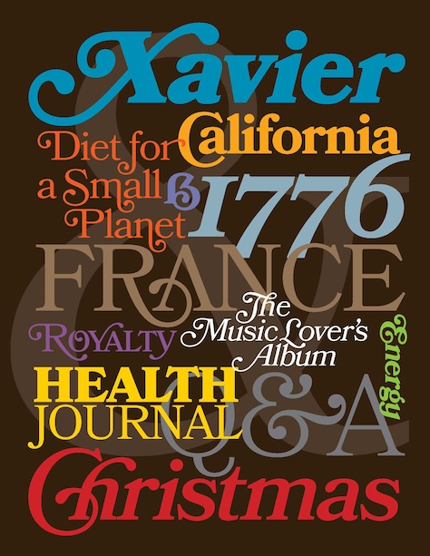
Bookmania is available from multiple font resellers, such as fonts.com (see Simonson’s site for the complete list).
TIF’s Herbie is an homage to Herb Lubalin. The website for The Infamous Foundry describes Herbie as an “uppercase display font with alternates on every character (lowercase), based only on circles and geometric lines. Herbie is inspired by, as the name might indicate, Herb Lubalin’s work and the decorative style and kerning of his era.”

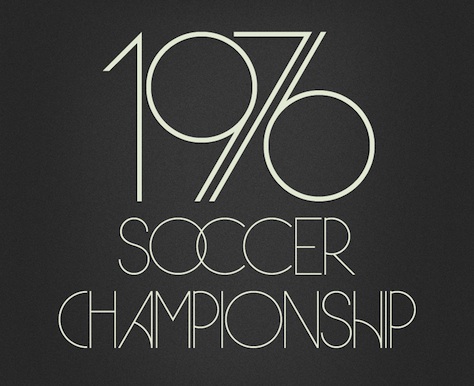
Herbie is available from The Infamous Foundry website.
Tip of the cap to grainedit and I love typography.
This article was last modified on July 11, 2023
This article was first published on May 18, 2012
Commenting is easier and faster when you're logged in!
Leave a Reply

Thanks for the interesting article. I trained under Ed Benguiat, and worked at Photo Lettering well after its heyday. I only wish to point out here that Cooper Black was never “revived” per se — it has remained essentially as Oswald Cooper drew it 70 some odd years ago. This is unlike Benguiat’s very liberal and very Benguiat-ian redesign of Bookman. Many designers have tinkered with Cooper’s letter forms. For one, Bitstream expanded Cooper Black into an entire family with Bitstream Cooper (https://www.myfonts.com/fonts/bitstream/cooper/). And there have been at least a dozen variations on the theme, Christian Schwartz’s Fritz (https://www.fontbureau.com/fonts/Fritz/) being a personal favorite.
• • •
One last comment about dear old Ed. Though Herb was his dearest friend and colleague, he never had any great fondness for Lubalin’s Avant Garde typeface, which was originally designed for a magazine of the same name. To the point, Ed was never shy about offering that: “The only time that Avant Garde ever looked good was on the front page of Avant Garde magazine….” He was quite the character, pun semi-intended.