

After the Garamond, er, Jannon rediscovery, the revival of interest in Garamond’s type designs started in earnest. First out of the blocks were the French foundry Deberny & Peignot, who in 1912 started work on a series of “Garamonds” based on what we now know to be Jannon’s faces from the Imprimerie Nationale. But Garamond only caught the commercial spotlight with the 1917 debut of American Type Founders’ ATF Garamond, an immediate success, upon which Linotype’s Garamond #3 was later based. In 1921, Lanston Monotype released another Jannon variant designed by Frederic Goudy (this is the source of the Garamond face included in the Microsoft Windows font set). Stempel Garamond followed in 1924, the first Garamond revival actually based on a Garamond type, from the Egenolff-Berner sheet. Mergenthaler Linotype followed suit the next year. Other notable contributions include a lovely 1961 Garamond from the Simoncini foundry in Italy, and Robert Slimbach’s elegant 1989 Adobe Garamond. All but the Deberny & Peignot and ATF Garamonds are still commercially available (although some sources sell Garamond #3 as a virtual twin of the ATF face).
Less interesting from a design standpoint but enormously more successful in the marketplace is ITC Garamond, which has the merit of including four weights from Light to Ultra Bold, a choice of three set widths, and even a handtooled (engraved) version. Apple Garamond (the company’s corporate identity face) is a variation that could justifiably be tagged ITC Garamond Light Somewhat Condensed.
A Family Tree of Many Branches
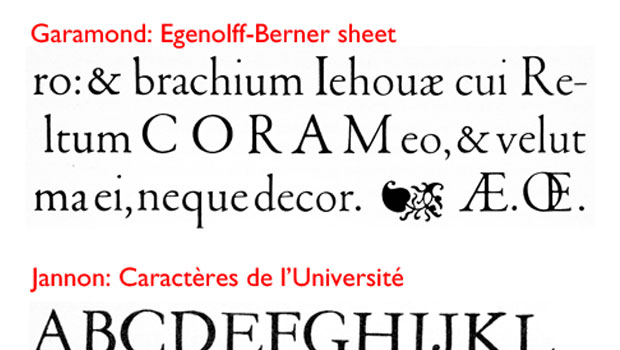
Starting with ATF’s breakthrough revival, the Garamond family tree rooted in Claude’s original works has spread to cast an enormous shadow. The names of the principal limbs read like a who’s who of 16th century typography: Granjon (who worked with Garamond in Paris); Plantin (who bought Garamond’s punches and brought them to Antwerp); and Sabon (who may have brought Garamond punches to Frankfurt, where the Egenolff-Berner sheet was printed).
In turn, from the work of Granjon has come Galliard, and from a revival of a Plantin type came Times Roman.
In 1931, the midst of all this, English Monotype created a version of Garamond that to avoid confusion with competitors’ offerings it called Granjon. This led Warde to note that “Garamond’s name, having so long been used on a design he never cut, is now by stern justice left off a face which is undoubtedly his.”
In the world of type, winners beget winners through incremental changes, not through revolutionary redesigns. As the redoubtable Stanley Morison said, “For a new font to be successful, it has to be so good that only very few recognize its novelty.”
And so we have it, a typeface design with the gravity to hold readers and inspire type designers for 500 years, and it all started with Claude Garamond. Or was it Francesco Griffo?
This article was last modified on July 31, 2021
This article was first published on July 31, 2012
Commenting is easier and faster when you're logged in!
