
It’s no secret among my friends that someday I’d like to go to the granddaddy of the Comic-Con circuit in San Diego. I’m more into the sci-fi and pop culture aspects than comics—ahem, graphic novels—but I do appreciate the art of the comic. I also enjoy a good superhero story on the screen, big or small, and I was immediately intrigued by the new DC Comics/Warner Bros. motion logos unveiled at last week’s Comic-Con. WBTV held a “Night of DC Entertainment” event to wrap up the convention with a bang (or a splash, if Aquaman is your thing).


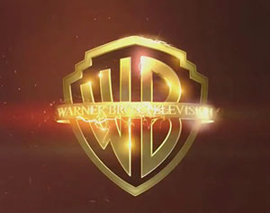
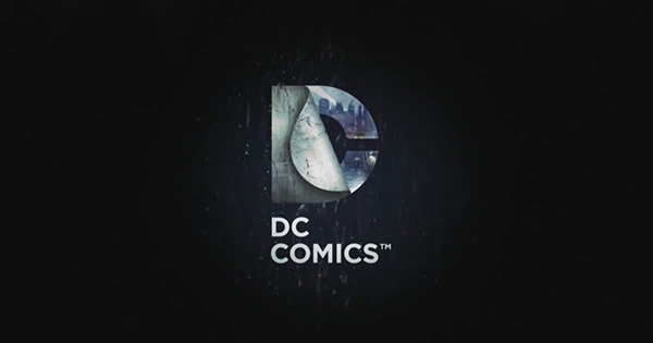
Each motion logo features the iconic WB badge within an environment befitting the fantasy world the show is introducing. From the foreboding dark stone facade representing Gotham, to the glowing green-clad WB—complete with flying arrows—to open Arrow, to the electric sizzle of lightning to announce The Flash, each logo conveys the feeling of the show and draws the viewer right into the DC landscape. Each WB badge is followed by the updated DC Comics logo. Behind the “peeled back” D, we can glimpse a quick view of the fictional world or characters that inhabit it. Rounding out the list of Warner Bros. shows with a new logo opener are Supergirl, DC’s Legends of Tomorrow, Lucifer, and iZombie. All the logos can be seen in the video Warner Bros. unleashed at Comic-Con.
This article was last modified on July 16, 2015
This article was first published on July 16, 2015
Commenting is easier and faster when you're logged in!
Leave a Reply

I must admit I have not enjoyed the late DC logos since they changed it in 2005, it got too industrial to my taste. But that’s just me. :)
Is the logo pictured above the one from 2005? I’m not super familiar with the history of the DC logo, but I have to say, I’m not all that impressed. I like the individually-tailored look for each show, but the overall logo doesn’t do much for me. The WB logos, on the other hand, look great! Of course, all the movie studio logos hold a special place in my heart, so it’s part nostalgia. I love these new motion graphics, as well.
The one above is the new version that was installed in 2005, like you I think it’s partially a matter of heart since I grew up on comics as a child and the original logo hold fond memories for me. Same as you for the film logos they endure. I’m wondering how I will like the start of the new Star wars movie when it comes out since it will no longer be with 20th Century theme and logo.
Sorry, The DC logo above is from 2012 not 2005, 2005 was another version