

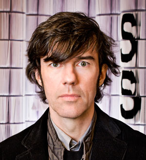
Stefan Sagmeister. Photograph by John Madere.
Stefan Sagmeister is one of the most imaginative and original creative thinkers around today. Mention his name to any graphic designer and chances are you will get enthusiastic words of admiration and respect… and with good reason! This award-winning designer has created some of the boldest, most innovative, most engaging work around, especially his type and handwriting-inspired solutions. Sagmeister makes type come alive—sometimes almost literally. He takes type and fashions solutions that are visually dynamic expressions, above and beyond the actual meaning of the words. He will on occasion use a human canvas—whether himself or others—with striking results.
Stefan Sagmeister was born in Austria and currently lives and works in New York. His studio, Sagmeister & Walsh, is a NYC-based design firm that creates identities, commercials, websites, apps, films, books, and objects for clients, audiences, and themselves. He is known for his work in the music industry, and has worked for the Rolling Stones, The Talking Heads, Lou Reed, Jay Z, Aerosmith, and Pat Metheny. But his client list is more diverse than that and includes the Guggenheim Museum, HBO, and Levis. Sagmeister has done four TED talks, has written several books, and is a dedicated educator whose work has been exhibited world-wide.

Sagmeister & Walsh studio, photograph by Mario de Armas
In spite of his success, Sagmeister is a very down-to-earth, approachable guy and was happy to answer some questions about his work and design philosophy.
How did you get interested in the kinds of lettering and handwriting solutions you are known for?
I started in design when Letraset (transfer lettering) was still around. Since we could not afford to buy new sheets, we worked with discarded sheets from design studios. As there were always letters missing from these sheets, I figured out it was easier to draw the whole headline by hand than to copy a couple of missing letters.
How do you decide when to use a typeface and when to use handwriting?
Of course we go with handwriting when the content is personal, emotional, and deeply human, but we might also go against that and express personal content in deliberately cold typography. And vice versa.

For this lecture poster for AIGA Detroit we tried to visualize the pain that seems to accompany most of our design projects. Our intern Martin cut all the type into my skin. Yes, it did hurt real bad. Art Direction: Stefan Sagmeister; Photography: Tom Schierlitz.

The collected lyrics of Lou Reed features a self portrait with embossed type on its cover. I went to a show in Soho by Middle Eastern artist Shirin Neshat. She used Arabic type written on hands and feet. It was very personal. When I came back, I read Lou’s lyrics for Trade In, a very personal song about his need to change. We used his lyrics written on his face. Design: Stefan Sagmeister, Hjalti Karlsson, Jan Wilker.


The Aizone Fall/Winter 2013 campaign was focused on bold, colorful typography and positive, exuberant energy which reflects the dynamic, vibrant nature of the brand. They debuted the typography through colorful face painting with positive inspirational maxims. Working with renowned body painter Anastasia Durasova, we painted the models’ faces with strong, geometric graphics and bold, playful typography. Art Direction and Design: Sagmeister & Walsh.
More work for Aizone, a luxury department store in the Middle East. We took the vibrant nature of the brand and presented it in campaigns that were printed in newspapers, magazines, and billboards throughout Lebanon. Art Direction and Design: Sagmeister & Walsh.
Do you have a design philosophy?
Try to touch the heart of the viewer.
What is your typical process? That is, how do you develop an idea? How important is collaboration in your process?
The process I’ve been using most often has been described by Maltese philosopher Edward DeBono, who suggests starting to think about an idea for a particular project by taking a random object as a point of departure. Say, I have to design a pen, and instead of looking at all other pens and thinking about how pens are used and who my target audience is, etc., I start thinking about pens using… (this is me now looking around the hotel room for a random object)… bed spreads. Okay, hotel bedspreads are… sticky… contain many bacteria… ahh, would it be possible to design a pen that is thermo sensitive, so it changes colors where I touch it? Yes, that could actually be nice: An all black pen that becomes yellow on the touching points of fingers/hands. Not so bad, considering it took me all of 30 seconds. Of course, the reason this works is because DeBono’s method forces the brain to start out at a new and different point, preventing it from falling into a familiar groove it has formed before.
What project has been the most fun?
The most fun, possibly the series, “Things I’ve learned in my life so far.” My grandfather was educated in sign painting and I grew up with many of his pieces of wisdom around the house—traditional calligraphy carefully applied in gold leaf on painstakingly carved wooden panels. I followed his tradition with these typographic works. All of them are part of a list I found in my diary under the title “Things I have learned in my life so far.”
What would be your dream (design) job, real or imagined?
My standard answer used to be Coca Cola, as it is such a visible brand that has such an incredible impact on the visual culture of the planet, and it used to look so terrible. But now that they got their act together (without our help) and are doing quite good work, I have to come up with a new answer: Pepsi.

Graphic illustration for Jay Z’s “A New York Holiday” luxury line at Barneys. Printed on bags, cards, totes, and other promotional materials. Creative Director: Stefan Sagmeister; Designer, Art Director: Jessica Walsh.

Identity and logo design for a store in the meatpacking district in NYC that changes themes every six weeks. Art Direction and Design: Stefan Sagmeister.

Adobe approached us to interpret their MAX typography as well as their Creative Cloud logo. We wondered what we could do with a few basic tools in an empty studio space for a 24-hour-straight play session. The process was live streamed on a Times Square billboard. Art Directors: Stefan Sagmeister, Jessica Walsh; Designers: Santiago Carrasquilla, Wade Jeffree; Photographer: Henry Hargreaves.

Sagmeister & Walsh created an art car for KIA called “Light & Shadows” (yin & yang). The car and the surrounding environment were turned into a giant word search. Visitors to the show were asked to find hundreds of hidden yin & yang-themed words. Yin words included “fearful, lazy, slut, shyster, hell, vomit” and yang included “joy, excitement, orgasm, optimism.” Art Direction and Design: Stefan Sagmeister.
You studied at the University of Applied Arts Vienna and Pratt Institute. How important do you think academic design education is for aspiring designers?
I myself loved design school a lot, extended it for as long as I possibly could (I also have a master’s in communications), and probably would still be in art school if I could have found a way to make it happen. Having said that, many of my favorite designers (Tibor Kalman, James Victore) have never been to art school at all.
Right now I think there is too much emphasis on concept and too little emphasis on form in design education. The current generation of design school faculty all learned about design in the 80s and 90s, when ideas and concepts were king and formal considerations were dismissed—including by me—as decoration. I now think that was wrong. Beauty is very much part of what it means to be human. Good-looking things communicate more effectively.
Any other advice for budding designers?
If you are fresh out of school, look for a design company that does the kind of work you want to do. Try really hard to get a job with them. Work your ass off. Then, start your own place. It’s a great job.
Any good stories?
A story I have told before: When I first met Mick Jagger (while we designed Bridges to Babylon), I asked him about his favorite Stones covers and he mentioned without hesitation: Exile on Main Street, Sticky Fingers, and Some Girls. I said “We should have an easy time working together, since I would have told you exactly the same covers only in a different order: Sticky Fingers, Some Girls, and Exile on Main Street.” Charlie Watts turned to Jagger and asked in a lowered voice: “What’s on Sticky Fingers?” to which Mick replied: “Oh, you know, Charlie, the one with the zipper, the one that Andy did.”

We started a documentary movie about happiness, called The Happy Film. It’s a proper look at all the strategies serious psychologists recommend that improve well-being, including meditation, cognitive therapy, and psychological drugs.


Concept/design for a typographic installation billboard at Houston & Lafayette in Soho. Art Direction: Stefan Sagmeister.

I found the line “Thinking that life will be better in the future is stupid. I have to live now” under the heading “Things I have learned in my life so far” in my diary. The client graciously agreed to use it on the poster advertising the School of Visual Arts in New York. An entire life cycle of caterpillars and butterflies lives within the twigs. Art Direction: Silas Rhodes; Design: Stefan Sagmeister, Irina Thaler, Paul Rustand.

When designing these “Take it On” posters for the School of Visual Arts (SVA) in New York City, we looked around our studio and realized that the Sagmeister & Walsh team is rooted in the SVA community. Stefan teaches at the MFA Design department, Jessica teaches at the BFA Design department, and Santiago was a student at the BFA Design department. We embraced the maxim by literally “taking on” the typography on our faces. We worked with renowned photographer Henry Leutwyler and creative retoucher Erik Johansson to achieve this poster series, which is now displayed throughout the NYC subway stations. Art Direction and Design: Stefan Sagmeister.

Two tongues opposing each other are an obvious symbol for a design lecture called Fresh Dialogue, in this poster designed for AIGA New York. Since we all have short tongues, photographer Tom Schierlitz bought two fresh cow tongues from the nearby meat market and shot them with the 4×5 camera. Somehow they came out phallic. We did not mind. Some AIGA members did. Art Direction and Design: Stefan Sagmeister.

A giant monograph about Ashley Bickerton, the eclectic visual artist living on the island of Bali. We designed a limited edition version (shown above) featuring a hand carved foredge as well as a rather elaborate teak and mother of pearl slipcase. Art Direction: Stefan Sagmeister; Design and Typeface: Philipp Hubert.

This 60 second advertisement for the conservative (and socially conscious) bank Standard Chartered takes its typographic approach throughout Asia, Africa and the Middle East. Art Direction: Stefan Sagmeister; Design: Joe Shouldice, Stephan Walter, Andrew Byrom.
This article was last modified on May 15, 2023
This article was first published on January 20, 2016
Commenting is easier and faster when you're logged in!

Recommended for you

Vintage Print Magazine Covers
Print magazine has been in business since 1940, showcasing creative excelle...

Scanning Around With Gene: The Speedball Pen
A speedball is a pen you dip in ink and use primarily for lettering. It was inve...
TypeTalk: A New Column on Creativepro.com
Welcome to the debut of TypeTalk, a monthly question-and-answer column on typogr...