

Gail Brill, the artist
Gail Brill is a truly gifted artist whose talents embrace an impressive blend of hand lettering, calligraphy, illustration, and graphic design. Not only is she proficient in numerous styles of calligraphy and lettering, but her watercolor illustrations are absolutely charming. Then there is her graphic design background, which affords her the ability to pull all elements together in one cohesive composition. She’s quite the powerhouse!
Gail has been a graphic designer for forty years and a professional calligrapher and lettering artist for twenty-five. Her lettering work has included invitations and envelopes, monograms, certificates, signage, and magazine covers (including several for Martha Stewart Living). To compliment that, her illustration and design skills have allowed her to tackle projects that call for the integration of lettering and image, such as posters, logos, hand drawn maps, family trees, menus, stationary, gift wrap, and even things like dishware, fabric design, and flags.
One of the aspects of Gail’s work that I find impressive is that she has been doing the kind of informal handwritten lettering that has become extremely popular in the world of type design and fonts. Gail has been doing this kind of lettering for years, way before it became a “hipster” trend. This popular style of lettering continues to be part of her work, but unlike a font, it can be customized for each project.
I asked Gail some questions about her work, her background, her favorite projects, and other related topics:
How did you get your start in lettering? Who were your influences?
In the third grade, I had to write 500 times “I will make an effort to improve my conduct in the cafeteria” and that was a life changing exercise for me. For most of my life I have been a graphic designer in one way or another. As a kid, I designed fliers and drew posters that mimicked Wes Wilson’s Fillmore Posters. I did business cards and logos. I always had good handwriting and my childhood was full of doodling and drawing letter shapes. One of the first things anyone paid me for was to draw the Batman logo on paper bag book covers for classmates.
In 1987, I was hired as an assistant to Ellen Weldon, an invitation designer in New York City (she’s the daughter of Sylvia Weinstock, the Cake Lady of Soho). Ellen hired me because I had good handwriting, and my skill was put to use immediately addressing envelopes for clients like Dior and others. I had never done calligraphy and had never taken a calligraphy class when Ellen hired me. She encouraged me to take classes, so I did.
That year, I enrolled in my first of many calligraphy workshops by the Society of Scribes in Manhattan. That was the day that I saw Lisa Niccolini’s Copperplate script on an envelope. I was left breathless. It was a thing of beauty like I had never seen. That was my moment of epiphany. At that moment, I knew what I was going to do with my life. I knew that I would do whatever I could to learn how to create those beautiful letter shapes. Then I set about doing just that. I feel so lucky to have had that moment of clarity, that moment when all rockets were firing and I could feel myself lifting off to my goal. Every day, I am deeply grateful for that. Lisa was my inspiration and my guide as I embarked down the path, lending me antique nibs to try out, critiquing me on my slant, my pressure on the nib, and encouraging me to learn.
Next came Jeanyee Wong, a true legend in the world of calligraphy. Jeanyee taught me to see. From Jeanyee, I learn what differentiated beautiful calligraphy from mediocre calligraphy. Through Jeanyee’s guidance, I trained my eye to see the harmony and extraordinary beauty in the letter shapes. Once I started to learn that mental skill, then I could train my hand to do as my brain instructed. I know to some, this may sound kind of wacky, but this is how I learned the art of calligraphy.
It was The Zanerian Manual of Alphabets and Engrossing that pushed me to the next level. This is a quirky, sexist, but extremely useful how-to guide for creating what many calligraphers feel is the most beautiful kind of pointed pen calligraphy. Written in 1895 to train bookkeepers and certificate designers (also known as engrossers), its simple illustrated instructions are unparalleled. I would read the book a small amount at a time right before bed. Then I would close my eyes, see my nib in my pen holder, dip it into the ink, feel the nib hit the surface of the paper, and mentally get to work practicing the strokes I had just learned in the book. I could see in my mind’s eye my hand making the right shapes, keeping my lines parallel, using the right amount of pressure on the nib to get the same thick and thin lines, creating a thing of beauty. I really do think I trained my hand to do what my brain was telling it to do using this technique. The next day, when I picked up my pen, I was that much better. Like any learned skill, it’s the practice and repetition that takes you to perfection.
What are some of the most unusual projects you have worked on?
My love of the alphabet and hand calligraphy has led me to produce art with a wide range of applications, from lettering on the side of a canoe, to tattoos, to silk prayer flags, to dishware and beyond. The art of hand lettering is a reminder that not everything is created in a nanosecond.
…and your favorite projects?
I love making maps! I want a bird’s eye view of the world wherever I go! I think the addition of a hand-drawn map with the invitation really sets a welcoming and unique touch to a wedding. It builds anticipation! I’ve always been interested in genealogy, and drawing a family tree is similar in many ways to drawing a map. It’s putting down on paper those things which we hold in our brains in an abstract way. They are kind of mapped out in our heads already—“where to take the left that leads to the big lake” is similar to who Great Aunt Rose was married to and how many children she had. Putting this on paper is deeply satisfying to me.
What made you move from New York City to the Adirondack Mountains?
After 9/11, my family decided to move from the crowded metropolitan NY area to somewhere else. I wanted more nature in my life and a healthier environment to raise our two sons. After 48 years of living in the urban crush, we struck out for northern parts and now live happily in Saranac Lake, New York, nine miles north of Lake Placid in the beautiful Adirondack Mountains. It was an adjustment in so many positive ways, too many to count really. Now we are woven into the fabric of the community and I can’t imagine living anywhere else.
When should a person consider using a lettering artist rather than the use of fonts?
This is such an interesting question because there is definitely a place for both. I love type. In fact, I call myself a “font-a-holic.” As a designer myself, I would say the bulk of my work is with brides and grooms. Weddings are such a beautiful time to pull in the skills of a professional calligrapher. An invitation that has hand lettering engraved or letterpress printed on the paper that arrives in a hand-addressed envelope can be exquisite and leaves a lasting impression on the guests.
I also think that the only way to do a successful monogram is with hand lettering. When I see three letters jammed together to make a monogram, I cringe. Of course some of the old Victorian monograms that used type were breathtaking. But monogram making is the art of making the letters dance together and harmonize. It’s tricky because all letters do not fall conveniently into place. They need the skill of a hand-lettering artist to introduce them and then get them to fall in love with each other.
I believe that in our highly technical world where children are not learning handwriting in schools anymore, the art of hand calligraphy and hand lettering is more and more in demand. It’s a thing of beauty to watch. You can see some videos of me working on my Facebook Page, Gail Brill Design.
How should someone interested in doing the kind of lettering you do, get started? Do you teach, or offer any mentoring?
If you are interested in learning calligraphy, I would recommend you begin by visiting the Society of Scribes website, where there is so much inspiration. Find a local Calligraphy Guild and sign up for a beginning calligraphy class. I would suggest learning from a professional calligrapher and starting out with Italic. Be cautious of beginners that are teaching. You want to learn from the best. Once you learn the basics, practice… all the time! Practice the letter shapes with a ballpoint pen. See the correct letter shapes with your eyes closed. Look at a lot of calligraphy so that you train your eye to see what’s good—and what’s bad. Yes, I teach. Yes, I tutor, and yes, I love to mentor and critique. (Gail can be reached at ga*************@***il.com.)
Any final thoughts?
Creating a thing of beauty that others delight in brings me great happiness. Twenty-six years after that calligraphic epiphany in 1987, I still have much to learn, and gratitude and joy in every stroke.
Examples of Gail Brill’s Work
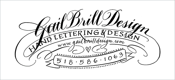
Gail’s logo du jour
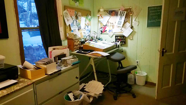
Gail’s studio—where it all happens!

A collection of wedding menu cards as place cards with guests names on the top

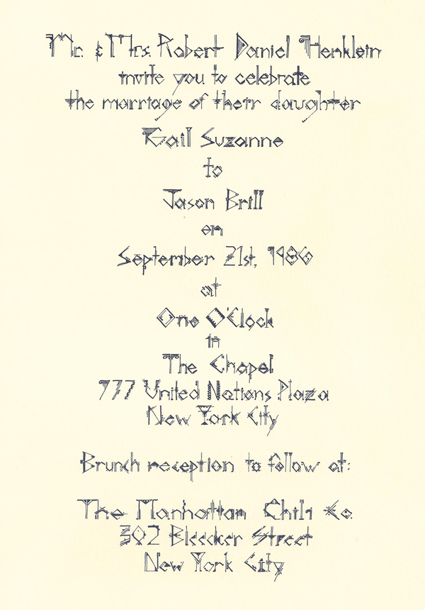
Wedding invitation
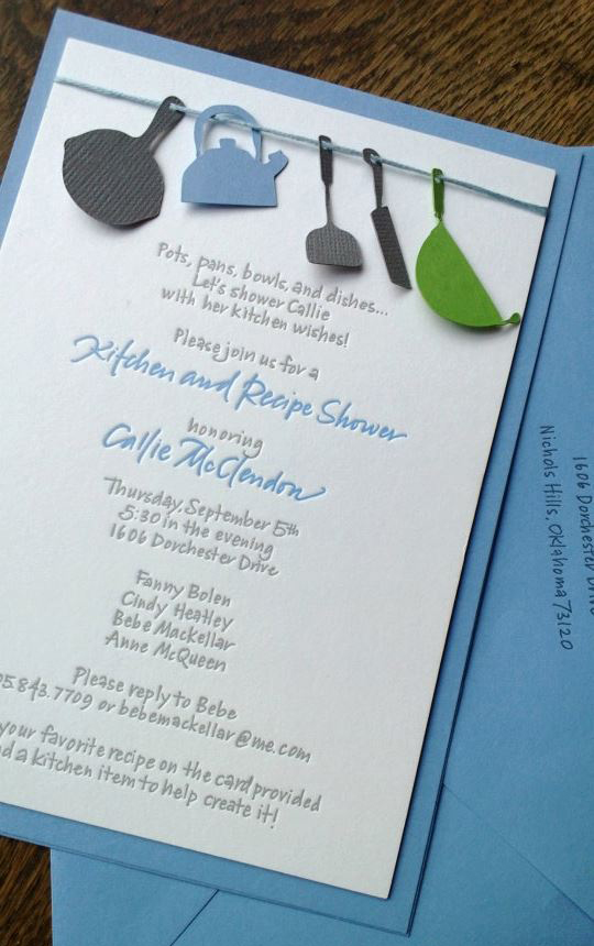
Bridal shower invitation
Gail‘s own wedding invitation with one of her more experimental lettering styles
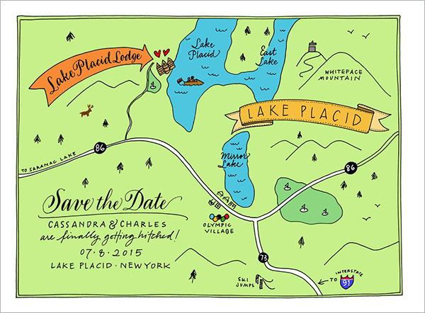
“Save the date” and map, all in one
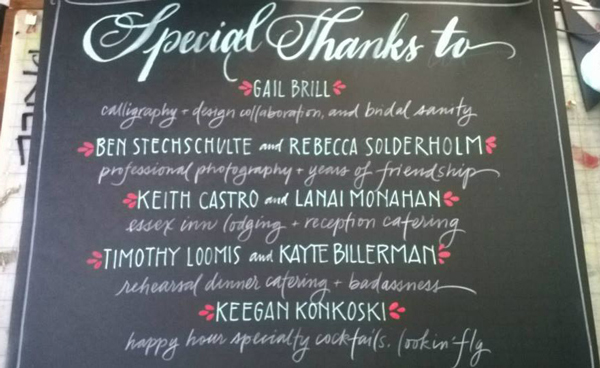
Hand-lettered “Thank you” chalkboard at wedding
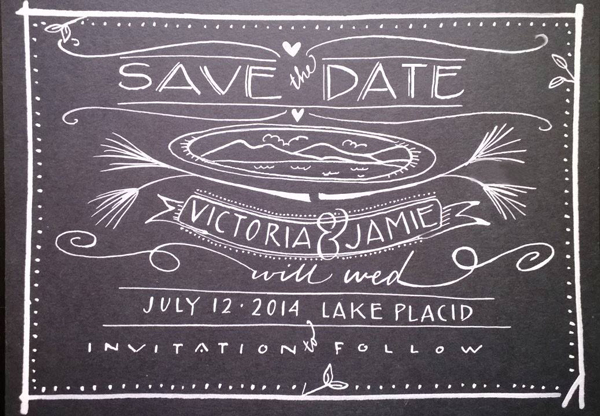
“Save the date” design for a wedding

Wedding parking signage
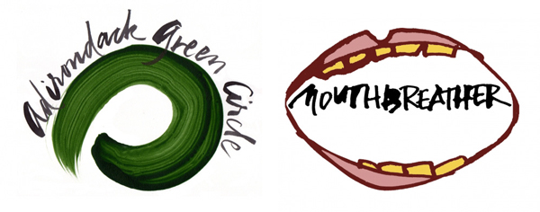
Logo for environmental group (left), logo for punk band (right)
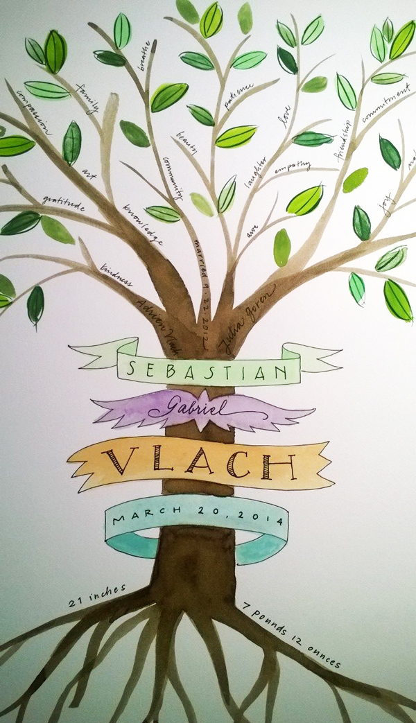
New baby tree
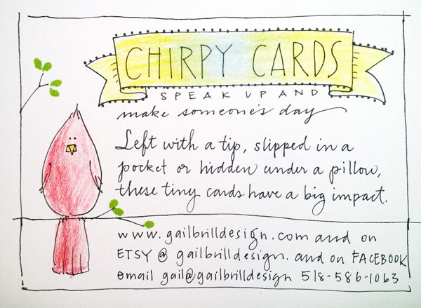
Card explaining Gail’s line of “Chirpy Cards”
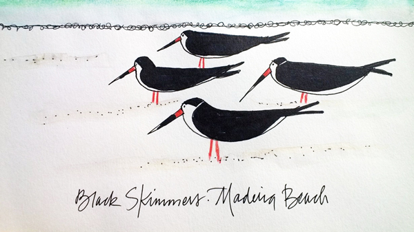
Vacation sketching
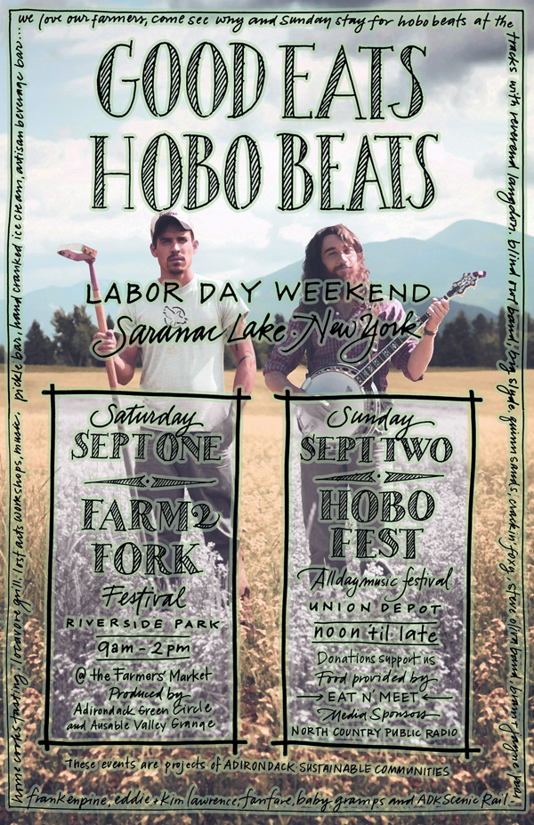
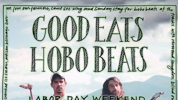
Poster for a local Labor Day celebration
This article was last modified on April 20, 2022
This article was first published on April 22, 2015
Commenting is easier and faster when you're logged in!

Recommended for you

All About Titling Fonts
When looking for just the right display typeface, have you considered a titling...

TypeTalk: What's In a Name?
TypeTalk is a regular blog on typography. Post your questions and comments by cl...
Scanning Around With Gene: Stuff Magazine
A look back at a magazine that featured punkish designs and cutting edge type in...