


Jim Parkinson, the designer
Customizing a typographic setting for a more decorative, personalized appearance has been an undertaking most often executed by the (graphic) designer. The addition of color, outlines, shadows, and other special effects can often be seen applied to type—especially display type—to give it more personality and make it stand out. But due to the profusion of special effects available in today’s software, one runs the risk of over-stylizing in ways that can look overstated, contrived, and frankly, very amateurish. Enter the multi-layered font—a relatively new breed of font family that gives the designer many options for customizing type in ways that are creative, professionally-conceived, and lots of fun to use!
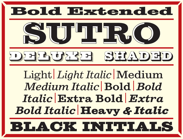
Sutro Deluxe, designed by the legendary typographic designer Jim Parkinson, is one such type family. This bold slab serif with a double drop shadow was originally conceived as a simple black and white display alphabet. But, according to Parkinson, “it seemed unfinished, begging for something more. So I decided to add several layers of fill and detail to try and make it more interesting.” The result is this eye-catching, five-layer chromatic font family.
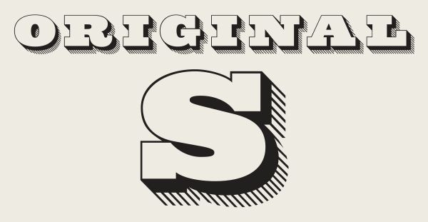
Sutro Deluxe before Portland: black and white, no layers

Sutro Deluxe after Portland
Sutro Deluxe consists of the Primary, or main font, in addition to the four secondary fonts—Fill, Inline Fill, Inline and Shaded Inline—which exist solely to support the Primary font. This chromatic font family (chromatic being another term for multi-layered) can be stacked or layered in different combinations and colors to achieve various effects.
A little about the designer: Parkinson has been designing letterforms professionally for almost 50 years, starting as a lettering artist for Hallmark Cards in Kansas City in 1964. After returning to his home in Oakland, California in 1969, he determined to continue making his living doing some sort of lettering. In 1990 he put away his pen and ink and went totally digital, and hasn’t looked back since.
We asked Jim some questions about the evolution and usage of Sutro Deluxe.
So how did Sutro Deluxe come about?
There was a lot of talk about color fonts at TypeCon 2013 in Portland. Designers have been making layered digital fonts for a few years, I just wasn’t paying attention. The idea that you can add additional parts to a font to enhance its versatility is very intriguing, like dresses for a Barbie Doll. It reminds me of the old chromatic wood type from the late 19th century. I became familiar with chromatic wood type in the early 1960s. I was working as a lettering artist at Hallmark Cards in Kansas City at the time Rob Roy Kelly was making a big splash at the Kansas City Art Institute with his work with wood type. I got to know Kelly a little, and he let me spend hours in his office with his fabulous library of Wood Type Catalogs. I was drawn to the chromatics, and worked at producing a few chromatic characters as linocuts to print with. But that was a long time ago. Everything was very labor-intensive. There were no computers. It was like caveman days.

An example of chromatic wood type from Specimens of Chromatic Wood Type, Borders, Etc., a specimen book produced in 1874 by the William H. Page Wood Type Company
Then, during TypeCon, it was like, “Wow! Chromatics!” I started experimenting with layers as soon as I returned from Portland. I’ve been working on several layered families at once. Sutro Duluxe is a typeface I thought I had finished before I went to Portland, but I was wrong. It was originally designed as a simple bold outlined slab serif font. The double drop shadow was its main feature. No layers. No fill. No nothing. After Portland, I was excited to try some layered fonts. Sutro Deluxe hadn’t been released yet, so it became the subject of a little chromatic experiment. I felt it needed a shot of energy. I decided to leave the original font alone, and just add some options for ornamenting the interior of the letters. First, I did a Fill font to put color into the letterforms. Then I added various other inline and fill fonts. Sutro Deluxe ultimately became a five-font family.

Each version, displayed individually
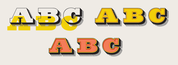
Upper left: Primary font with the Fill font sliding in behind. Upper right: The Fill font behind the Primary font and the Inline font has been added. Lower: The Inline Fill font has been added and the Inline Shaded font has been substituted for the Inline font.
How does it work?
As I mentioned previously, the original font is now called the Primary font. A fill font was added to put color inside of the letters. The next three fonts are the Inline font, the Inline Shaded font, and the Inline Fill font. Now they are a little Type Family. The Primary Font is like the Daddy Font. The other four fonts all depend on the Primary Font to tie them together.
The Fill font has a slight bleed so when the Primary font overprints it, not a sliver of light can come through. The stroke widths of the Inline font and the Inline Shaded font straddle the boundaries of the Fill and Inline Fill fonts. With color, there are lots of possibilities.


These five fonts provide numerous possibilities.
Any tips when working with chromatic font families?
Eventually, there will be better technology to set layered fonts, but until then, I just set these in Adobe Illustrator. InDesign works fine, too. The fonts are kerned, so set the kerning to Auto or Metrics. Don’t use Optical Kerning and be careful with adjust tracking.
Have you designed any other chromatic families?
Yes! There is Modesto Open (five fonts), Modesto Initials (two fonts), as well as Sutro Shaded (six fonts). In addition, the original, unlayered Sutro is available in 12 styles, including versions suitable for text (good companions for the display versions!), as well as a fat caps and an open version.

The Modesto chromatics
The original, unlayered Sutro family

More of Jim’s type designs—quite an impressive body of work!
So what’s coming up next? Working on anything interesting?
I have a bunch of fonts in the works, including a couple of complex chromatics. I always have several oil paintings going at the same time. Other than that, my lovely wife Dorothy (Yule) and I are just enjoying life.
This article was last modified on April 21, 2022
This article was first published on April 5, 2015
Commenting is easier and faster when you're logged in!

Recommended for you

Font Aid for the Philippines
Since 1999, The Society of Typographic Aficionados has organized series of chari...
TypeTalk: Font Sizing Guidelines Part 1, Design Characteristics
Q Are there any guidelines for selecting fonts for use at a range of sizes? A. I...
TypeTalk: The Hand Lettering, Calligraphy, and Design of Gail Brill
Gail Brill is a truly gifted artist whose talents embrace an impressive blend of...