

TypeTalk: Good Looking Bodoni at Any Size

Giambattista Bodoni
Bodoni is one of those classic typefaces (neoclassical, to be specific) that never gets old. Its elegant, sophisticated appearance, characterized by extreme stroke contrast and ultra-thin hairlines, is timeless. It can be seen in logos, titles, headlines, branding, packaging, publishing, and a lot more.
Giambattista Bodoni (1740–1813) was a typographer, type designer, compositor, printer and publisher from Parma, Italy who created some of the most beautiful and majestic typefaces ever produced. Most were intended for display usage, but several were designed for text. Many think that ‘Bodoni’ is one typeface design, but in actuality, Giambattista Bodoni designed over 200 fonts bearing his name. They are all the same basic style, but with varying design details, such as stroke thickness, x-height, proportion and weight.

Actual Bodoni punches, courtesy of Sumner Stone.
There have been numerous versions of Bodoni. Some of the more faithful revivals are ITC Bodoni, E+F Bauer Bodoni, URW Bodoni Antiqua, Monotype Bodoni, ATF Bodoni, Berthold Bodoni Antiqua, Poster Bodoni, and WTC Our Bodoni. All Bodoni typefaces are different interpretations of this classic design—some with subtle differences (such as those listed above), while others barely resemble their historical inspirations. This last category includes Bodoni Brush, Bodoni Egyptian, Bodoni Classic Chancery, and Bodoni Ornamental, plus many more.
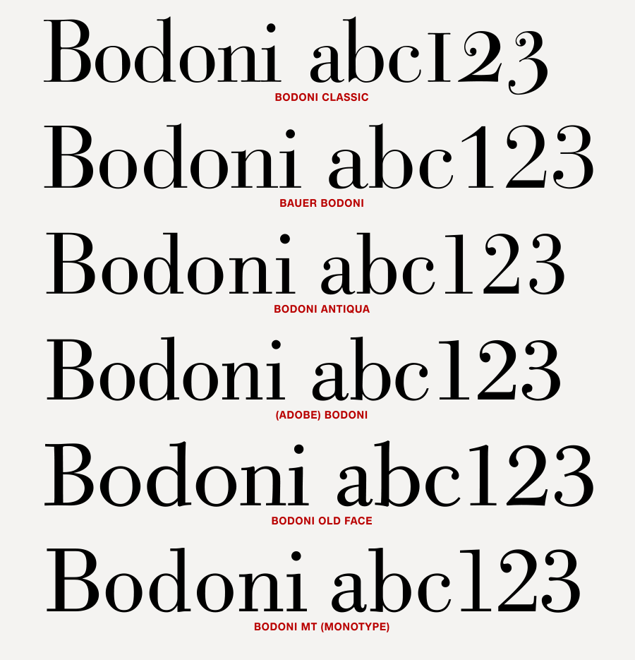
Six different Bodoni revivals, from the thinnest thin strokes at the top to the thickest at the bottom.

You can more easily see their differences in an enlarged letter b.
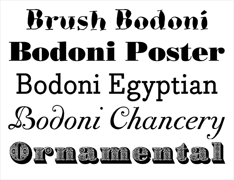
Poster Bodoni, Bodoni Brush, Bodoni Egyptian, Bodoni Classic Chancery, and Bodoni Ornamental
A major cause for confusion is that Bodoni designs have very similar names—that is, they all include the word ‘Bodoni’. That being said, they are all different to varying degrees. Often, the designer or foundry creating the revival will merely add a prefix or suffix to the name of the original design to distinguish it from its competitors. Some are closely based on historic models, such as original matrices, punches, or printed documents, while others are inspired by original Bodoni typefaces.
Bodoni’s Manuale Tipografico is one of the greatest specimen books ever printed. Issued in 1818 in Parma, Italy by Bodoni’s widow, the two-volume work shows an impressive array of 142 roman alphabets, including some foreign language versions, such as Greek and Cyrillic. Many designers have used this text as a resource when designing a Bodoni typeface.
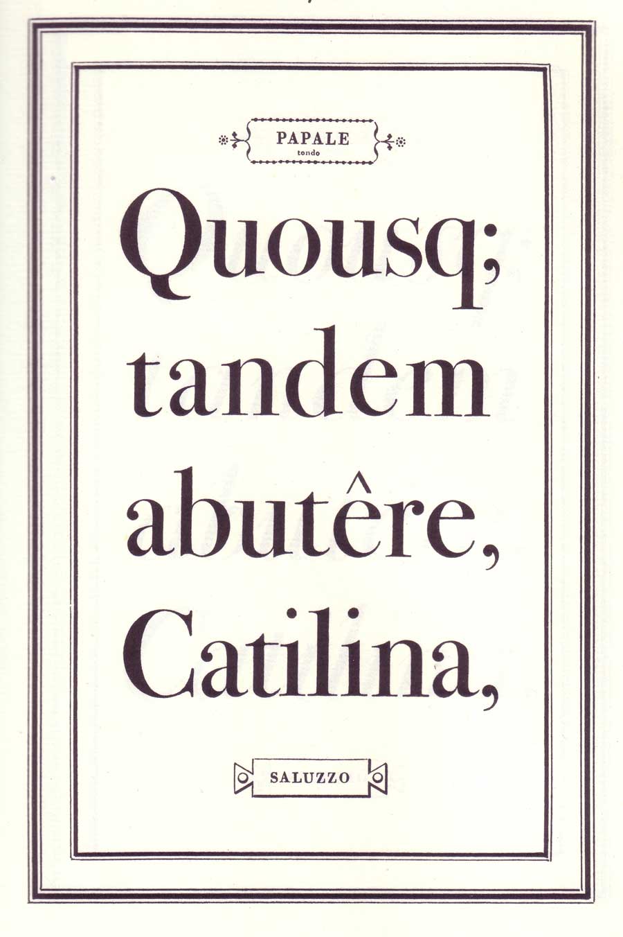
Bodoni’s Papale from his Manuale Tipografico was the model for ITC Bodoni Seventy-Two.

Bodoni’s Filosofia was the model for ITC Bodoni Six.
Bodoni in Use
“The Bodoni typestyle is not an all-purpose workhorse. It is, rather, a high-strung thoroughbred,” says Allan Haley, Monotype’s Director of Words and Letters. He is absolutely correct! Most currently available Bodoni designs are intended for and best used for display sizes. Their extreme thin strokes won’t reproduce well at smaller sizes, which often degrade their appearance and lessen readability. Using a Bodoni outside of that version’s “sweet spot” size range can have unintended results: If you’re using one that is intended for display but setting it at small point sizes, the thins might not hold up, spacing will most likely appear too tight, and overall readability will begin to be compromised. Conversely, if you’re setting a text version at larger sizes, the thins will look too heavy and clunky, and the spacing will look progressively too open, all which can compromise readability and typographic color.
There are a few Bodoni versions that were designed for text usage, and others that will hold up at smaller sizes. The ITC Bodoni family consists of three size-sensitive versions, including two intended for text: ITC Bodoni Six, Twelve, and Seventy-Two. ITC Bodoni Six, based on Bodoni’s Filosofia was intended for very small type—in the range of six point—and is useful for captions, credits, and other small settings, while ITC Bodoni Twelve was designed for text copy. ITC Bodoni Seventy-Two was based on Bodoni’s Papale, and is intended for display settings.

The three size-sensitive versions of the ITC Bodoni Series.

The quote above is set in the beautiful ITC Bodoni Seventy-Two Italic with swash, while the credit is set in ITC Bodoni Twelve.
Another Bodoni typeface optimized for book printing (around 9 point) is Bodoni Old Face. Bodoni Old Face was overseen by Günter Gerhard Lange, art director of Berthold Type Foundry, in 1983 and is known for its legibility and clarity even in the smallest sizes. Lange adapted this Bodoni to meet the demands of current technology. The results are a Bodoni strictly dedicated to Giambattista Bodoni’s originals of the late 1700s but with more color and stroke variations than other Bodoni versions.

This quote by Giambattista Bodoni is set in three versions suitable for text: ITC Bodoni Six, ITC Bodoni Twelve, and Bodoni Old Face.
There are many Bodoni revivals to choose from for larger settings. Other than the aesthetics and personal preference, which one is best for your intended usage can be determined primarily by the thin strokes, which should remain proportionally thin at the intended size. Other considerations when selecting the right Bodoni for a job are the width, the look of the italics, and the existence of swashes and typographic features that might be desired for a particular job. Therefore, when selecting a Bodoni typeface that is right for your job, allow plenty of time to explore the dozens of available options.