The Path to Beautiful Tables: Working With Table Rules

In this installment of our series on creating beautiful tables (see Part 1 here), we’ll look at a couple more aspects of table setting that relate to form rather than, strictly speaking, content.
The grid structure that programs use to delineate tables seems to call out for rules to separate rows and columns. Using them well—and judiciously—can make a table work better and save you lots of time. In contrast to the rigid geometry of rules are the tricky situations that arise in getting elements stacked in columns to look properly aligned.
It’s all part of the thicket of details that separate successful tables from flops.
Use rules only where necessary
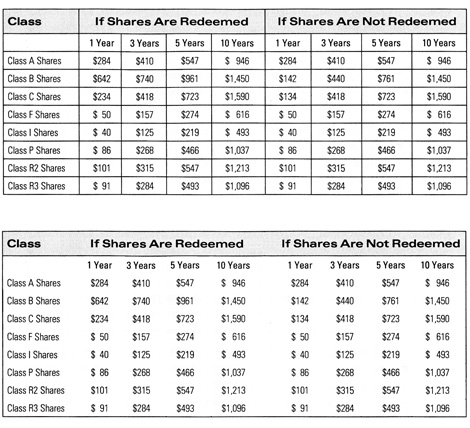
It’s wise to use rules only when they make a table function better. Using them as decorative elements often just clutters things up, as shown in Figure 1.

Figure 1:The table on top (copied from a real annual report) doesn’t need all of the rules it’s been burdened with. It looks unnecessarily busy. Below, the table works perfectly well with most of the rules deleted and the gutter between the two sections expanded for clarity.
That said, certain rules are conventional when setting tables, such as one that separates the heading row from the content rows below it. In general, though, adding white space—extra leading—between rows usually works better and creates a cleaner impression.
It’s easy to add horizontal rules to a table rather late in the process. But if you intend to use vertical rules, you should add them at the very beginning. Because you add vertical rules by adding strokes to the vertical edges of the cells in a column, the only way to position them logically is to define in advance the exact widths of all your columns. You can tweak the horizontal positions of cell contents using left and right insets, but you’re stuck with the positions of the cell boundaries themselves and the rules that sit on top of them.
Rules are best applied (or selectively omitted) through the use of cell styles.
When you do use rules, pay close attention to their leading
Traditionally, typographic rules set on a leading of their own. The bottom edge of a rule constituted its baseline, and the distance from the bottom edge of the rule to the baseline of the text or rule above it was its leading.
Page layout programs have changed this. A typographic rules now plays by the same rules as a stroked path in a graphic; that is, its width is built outward, equally, on both sides of the path, in this case the cell boundary. (Oddly, InDesign allows you to define how a stroke is aligned to—or rather built out from—a path in many situations, but not this one.)
A rule at the top of a cell, then, straddles the cell boundary, pushing text below it down and text above it up, and the text “sees” the edge of the rule as the new border of the cell. At the bottom of the cell, use an inset to create space between a rule below and the text above. These principles are illustrated in Figure 2.

Figure 2: At the top is the program view of a single table cell with no insets that’s been created based on type set solid—where point size and leading are equal—and the position of the first baseline is defined by the type’s leading. With these specs, the bottom of the cell coincides with the text’s baseline. In the center, the cell has had rules applied to its edges, and you can see how they are built out on each side of the cell boundary. The text’s baseline now coincides with the top of the lower rule. In the bottom sample, a bottom inset has been added to visually center the text vertically.
When you want to vertically center a line of type between two tables rules, things get tricky. First, reset the first-baseline offset in the Cell Options dialog to “x-height,” and then choose “Center” from the Vertical Justification pop-up menu. If your entry has a fortunate balance of ascending and descending characters, it will appear fairly well vertically centered. If it has lots of descenders and not many ascenders, it’s going to look like it’s riding too low. Likewise, a preponderance of ascenders will make the text look too high. These effects are shown in Figure 3. You can tweak its position using cell insets or the baseline shift control in the Character palette, but watch out for obvious base-misalignments with the contents of neighboring cells.

Figure 3: Normal text is composed mostly of x-height characters, so centering text between rules based on its x-height will always get you close to visual balance. But as seen in the top sample here, ascending characters combined with an absence of descenders can make the text appear too high. In the corrected sample below it, a baseline shift has been applied to get the text to look more centered. In the lower pair of samples, the opposite is the case, and the surplus of descending characters makes the text in the upper sample appear too low until its baseline has been raised slightly.
If the text you’re trying to center is all-caps, choose “Cap height” instead of “x-height” in the First Baseline pop-up menu in the Cell Options dialog and “Center” from the Vertical Justification pop-up. No additional tweaking should be necessary.
Use these same techniques to assure vertical centering when you choose to use a background color to highlight selected rows of a table.
Take the time to carefully align entries in each column
Coherent alignments across the width and depth of a table are often difficult to manage. Where tab entries vary in width or character (text vs. numbers, for example), no computerized alignment tools are going to help. The only way to get a harmonious feel overall may be to tweak alignments on a cell-by-cell basis.
The most logical way to achieve coherence in the alignment of vertically-stacked table elements is to define them all as centered within their cells. The main problem with this is that it usually looks weird. Text entries look more logical when they’re all set flush left, and numbers look better when set flush right.
Where text entries vary greatly in length, it may be better to manually beak the longer ones into multiple-line entries to keep the profile of the entire column more consistent. To force these breaks use Shift-Return, which creates a new line without creating a new paragraph.
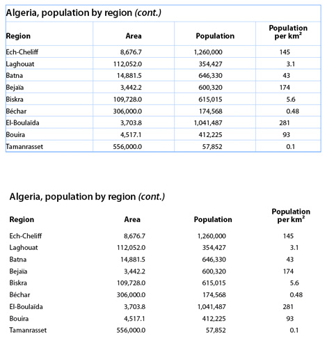
A more common problem is getting column headings to appear properly aligned over the column data below them. Text headings over a column of numbers is a classic case, as shown in Figure 8. But no matter what the situation or cause, there is only one solution: manual fiddling. There is no mathematical solution, so your program will rarely get these headings to look right, and what looks right is right, regardless of how the headings
may be positioned in their respective cells.

Figure 4: In the table above, adapted from “The Complete Manual of Typography,” the headings set with default cell values don’t appear well aligned over the cell entries below them. It’s not a fatal flaw, but it looks sloppy. In the bottom version, cell insets were used to push the headings into a more balanced position (paragraph indents work just as well).
There are some cases in which they simply never will look perfect, but you still have to try. The most important step is to look for misalignments, never assuming that the program will do the right thing.
All typesetting is a matter of managing white space, but nowhere is this more true than in tables, which consist mostly of empty space. (Even a full page of text is at least 90% white space.) This puts the spotlight on every printed element in a table, and the light it casts is unusually harsh. You have to approach refining your tables with the assiduousness of a proofreader, looking for every detail that catches the eye for better and worse. No amount of advance planning can eliminate the crucial tweak-o-rama that’s part of setting any table.
It’s part of the perverse pride typographers take in admiring the invisible.
This article was last modified on January 6, 2024
This article was first published on June 26, 2013


There is a simpler method to vertically centering the contents of cells, rules or no rules. Cell Options>Text…>Vertical Alignment gives you the option of vertical centering, which I find perfectly adequate >95% of the time–and far simpler than the “x-height plus baseline shift” method explained here. I’ve done that, sure, but rare is the font that doesn’t respond well to the Align Center setting. Maybe it’s just me, but I always try the KISS rule first.
I also strongly agree with the previous reviewer regarding the “wave” in the last example’s last column. At my work, we would not find the decimal alignment acceptable here, for that very reason. Align the numbers with a right tab stop, placed so as to visually center the entire column of data. Or better yet, add placeholder zeros to get the same number of digits for each entry, as the reviewer suggests.
Sadly, not so beautiful tables. In the top example, granted the vertical rules should be removed; but, there definitely needs to be some type of horizontal guide—rules or very lightly tinted shading. It’s several columns and several rows of numbers only, which is very hard for the eye to track. There needs to be visual separation between the three primary columns, and again, an easy-to-glance-at variation between the two 4-column subset columns. I really look forward to the ideas and techniques from this site, but today’s ‘beautiful tables’ was a huge let-down.
Technically, it’s not necessary, but would suggest using the same number of digits for the entries in each column. Visually, the wave caused by the numbers in the last column make me dizzy. But at least they are decimal-aligned! For example:
145.00
3.10
43.00
174.00
5.60
0.48
231.00
93.00
0.10
(Of course those won’t really align here, unless the comment is in a monospaced typeface.)