


dot-font was a collection of short articles written by editor and typographer John D. Barry (the former editor and publisher of the typographic journal U&lc) for CreativePro. If you’d like to read more from this series, click here.
Eventually, John gathered a selection of these articles into two books, dot-font: Talking About Design and dot-font: Talking About Fonts, which are available free to download here. You can find more from John at his website, https://johndberry.com.
It’s not often that a type designer attempts a new category of typeface. Or rather, in the case of Nick Shinn’s new type family Panoptica, a new combination of categories: monowidth and unicase. Shinn believes that this almost unique combination may solve several typographical problems.

Panoptica Old Style Roman, designed by Nick Shinn.
There have been a lot of monowidth (or “monospace”) typefaces—faces where each character is exactly the same width, like the letters on a typewriter. The ur-monowidth typeface, at least on computers, is Courier, which was developed originally for IBM’s golf-ball typewriter, the IBM Selectric, and later adapted to computer typesetting. Courier is essentially a typewriter face, and it looks it, although at the time it was a modernized design that contrasted with the older, clunkier letters to be found on manual and electric typewriters. In the couple of decades, quite a few monowidth fonts have been developed, for uses such as displaying code in computer books. Several recent type families have included a monowidth version (usually in an attempt to produce a monowidth font that doesn’t look like a typewriter face). Although the technical limitations of typewriters, which created the monowidth letter in the first place, are long gone, there is still a small but lively category of typeface design reserved for monowidth typefaces.
There have been far fewer unicase designs. These are typefaces with only one case—no uppercase and lowercase letters, but a mix of the two designs that can be used indiscriminately where we would ordinarily use capital letters or lowercase letters. At the Bauhaus, in Germany in the 1920s, Herbert Bayer and others worked on “universal” alphabets that abolished the distinction between uppercase and lowercase (particularly revolutionary in German, where far more words are routinely capitalized than in most other languages that use the Latin alphabet); it was part of the general revolutionary spirit of the era. In the 1950s, the graphic designer Bradbury Thompson created a unicase typeface that used mostly capital-letter designs but incorporated lowercase forms of a, e, m, and n in order to give it a pleasing readability. Thompson’s face has attracted many designers for its attractiveness, but it doesn’t get used much.
Created for a Purpose
Nick Shinn decided to combine the two forms. This wasn’t just a designer’s whim; he had a specific project for which he developed Panoptica. The poet Christian Bök, who wrote poems where the precise alignment of the letters on the page was important, asked Shinn to recommend a monowidth typeface that he could use to set his poems. Being a type designer, Shinn proceeded to design the face that Bok would need.

Title page of Christian Bok’s “Diamonds,” set in Panoptica Octagonal.
Shinn says that he “rejected available monowidth fonts on two grounds. Firstly, they carry the utilitarian connotation of a typewriter, inappropriate for a book of poetry. Secondly, they all have an upper and lower case, and in a normal setting of predominantly lower case forms the combination of narrow letters such as ‘I’ and ‘l’ with wide ones such as ‘m’ and ‘w’ makes for distorted letters and uneven spacing between them.” Panoptica gets away from the typewriter look, and it also achieves an unusually even texture on the page. “For instance,” as Shinn says, “by combining the lower case form of ‘a’ with the upper case ‘t’, the gap between ‘AT’ or ‘at’ is avoided.” He has chosen where to use uppercase forms and where to lowercase forms very carefully, with this effect in mind.
Panoptica’s monowidth letters can be aligned vertically, as well as horizontally, across the page.
Extending the Possibilities
Then he went on from the original brief, to turn Panoptica into a whole family of typefaces. There are 10 different styles so far: an old-style roman and italic, three weights of sans serif (no italics), a slab-serif Egyptian, a handwriting-style Script, the pseudo-screen-font Pixel, and two artistic alternates—Octagonal, based on 90- and 45-degree angles, and Doesburg, using all square angles and harking back to the typeface designed by Theo van Doesburg in the 1920s.
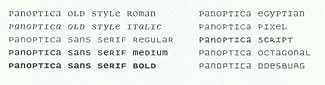
Panoptica’s 10 different styles.
By widening the choice of styles, Shinn hopes that his new typeface will be much more useful than previous monowidth typefaces. “Now,” he says, “contrasting styles of monowidth font—Bold Sans heads with Old Style Roman and Italic body text, for instance—may be mixed on the same page. The extreme metric regularity of the typeface, which also has (with the exception of slight tails on the ‘q’ and ‘y’) a uniform height, creates new layout possibilities.”
The complete Panoptica alphabet, set in Panoptica Sans Serif.
How it Looks
One of the unintended consequences of Panoptica’s design, which is particularly apparent in the Old Style, is how much a page set in Panoptica resembles a page set in a Cyrillic text face. The Cyrillic alphabet has far fewer ascenders and descenders than the Latin, and quite a few square letterforms, giving any Cyrillic text (no matter the language) a more uniform look on the page. I’m sure that Shinn didn’t have this in mind when he was designed Panoptica, but since I have mused on the texture and color of pages set in different scripts, the resemblance popped out at me. Of course, it’s only a superficial effect; I’m not claiming that Panoptica looks like a Cyrillic typeface.
It’s hard to imagine Panoptica being adopted as a regular text face for most uses, despite its elegance. It’s just too different from what we’re used to. But it’s so interesting that I’m sure designers will go out of their way to find uses for it. And it is quite readable, especially the old-style roman and italic. (The italic was apparently the hardest to design within the square grid Shinn was using. He solved the problem successfully.) Panoptica may be one of those typeface designs that you just want to find a use for. It’s available from Veer in a 10-font package. See how many uses you can find for it.
This article was last modified on February 21, 2022
This article was first published on January 19, 2004
Commenting is easier and faster when you're logged in!
Leave a Reply

Points of articulation, whether of economics, politics or any other sphere of human interaction, bring people together in alliances. If alliances are sufficiently useful and long-lived, the groups within them may begin to merge into common identities. The greater the contrast between alliance members and non-members, the faster this process.
=======================
melanie
WideCircles