

Behance portfolios aren’t just a place for you to showcase your talents and share them with the world, they can also be a wonderful source of inspiration. If you haven’t already done so, I would suggest taking a little time to just wander through the massive collection of talent housed there. Whether you’re looking for work created using a particular piece of software, or just want to browse the curated galleries, lose yourself for a while and see where inspiration strikes.
Here are a few Behance artists that have recently caught my attention. Think of them as the door that will lead you down the proverbial rabbit-hole. While you might not encounter evil queens, white rabbits, or talking cats, you will undoubtedly stumble across many wonders in Behance-land.
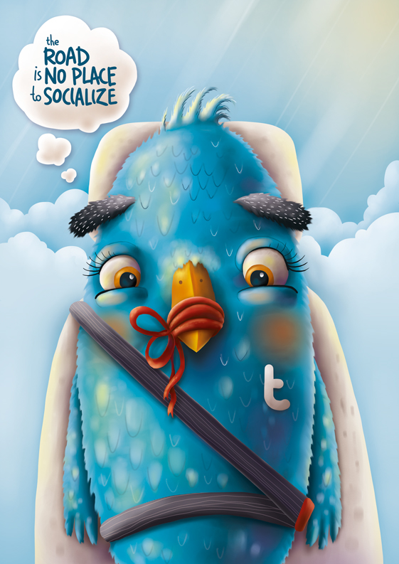
Fil Dunsky is an illustrator based in Russia whose Behance portfolio is bursting with colorful creations. I think if I had to sum them up, I would categorize them as Tim Burton wrapped in Pixar covered in Crayola. His work is comprised of a lot of character design for games and apps, as well as fun illustrations for the usually humdrum banking industry.
One of Dunsky’s featured projects is for Wrigley’s gum in China. His calendar for them brought a popular Chinese story to life with three-dimensional whimsical characters. His campaign for road safety in the UAE made clever use of anthropomorphized social media icons. All of his designs look tasty enough to eat!

Kim Høltermand is a photographer from Denmark, focusing mainly on the sleek modern architecture that dominates the urban Scandinavian landscape. Whether you’re into photography, architecture, or all things Danish, there is something for you to drool over in Høltermand’s portfolio.
You might draw inspiration in his use of color and shadow, or get lost in the photos and the amazing geometric shapes that take center stage in his shots. Høltermand shoots his architectural subjects sans people, creating a self-described “kind of apocalyptic architecture noir.” For me, the draw to his work comes from the angles that are inherent in modern design. Also, the patterns that pop from his photos provide a jumping off point for shape and design ideas.
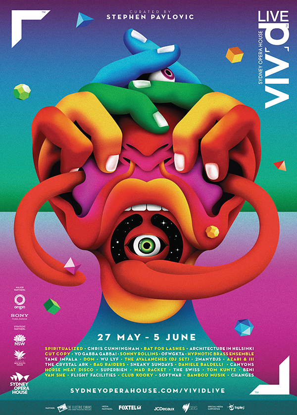
Bright vivid colors seem to be the theme permeating much of the featured work from London-based La Boca. The dearth of type also doesn’t go unnoticed and really emphasizes the graphical elements that much more. Their Behance gallery is comprised of posters and advertisements focused mainly on film, music, and book design.
Their film posters include anniversary celebrations of the release of King Kong and The Terminator. The former relies on type to convey a sense of 1930s art deco New York, while the latter is counting on character recognition by displaying the title character’s two distinct looks. The posters for a (relatively) recent New Order concert and an Australian music festival draw your eye in with bright colors, but sport a vintage grainy look.

I’m not sure what first caught my eye about Nathan Walker’s Behance portfolio. Probably the beer labels, if I had to hazard a guess. I love beer and wine labels that have a whimsical nature and lots of color. Walker’s labels definitely check those boxes. The designs on the Temptress series feature similar but unique lace patterns. The DFW labels depict two brothers (twins?) celebrating the fact the brew was a collaboration between two local breweries.
Other works of Walker’s include simple badge logos and an alphabet that I’d call fun if it weren’t for the fact that the letters are formed by grotesque faces and protruding bones. Not that that makes it any less cool, mind you! His work also ventures into the more serious, including intricate illustrations for a campaign against child trafficking.
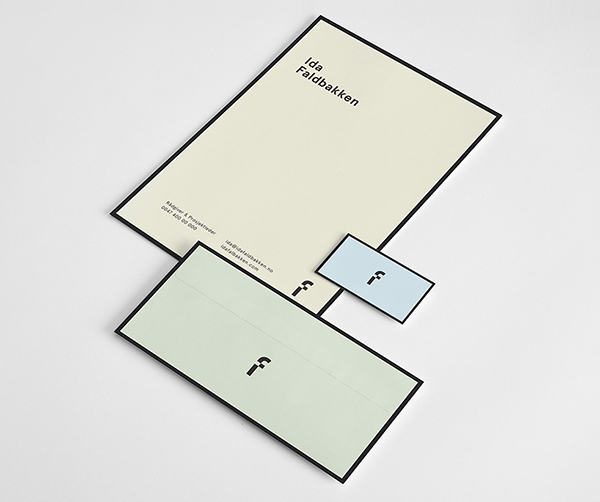
Another Scandinavian designer, more clean modern design. Nicklas Lindholm Haslestad’s branding work mimics the Norwegian landscape: seemingly cold and austere, yet ultimately welcoming. From the sleek branding for the cafe housed in the Astrup Fearnley Museum of Modern Art to the corporate identity of a high-end catering outfit, he seems to operate on the “less is definitely more” side of things.
Haslestad masters the entire concept, including packaging and presentation. My favorite of his showcased work is probably the packaging for an up-and-coming honey company. Each of the three flavors are presented in a case that resembles a beekeeper’s hive box. Also, just look at that print-to-the-edge border on the minimalist identity package created for Ida Faldbakken.
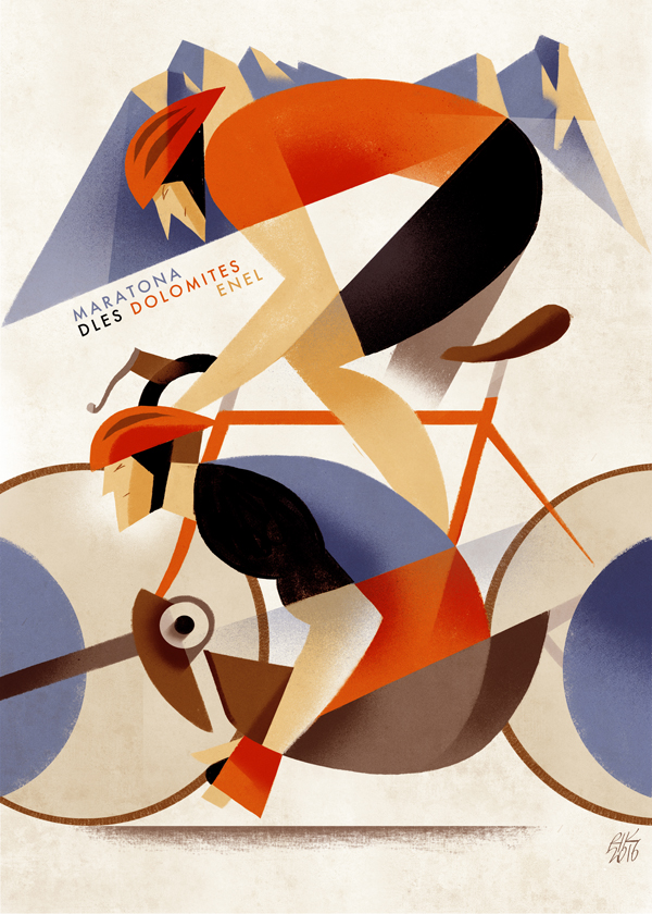
Riccardo Guasco of Italy has a style of illustration you’d expect to see gracing the walls of a European café in the 1930s. Maybe it’s just me, but his bike race posters alone had me swooning and wishing I was living in the golden age of cycling. Even if you’re not into bicycles, his illustrations for the book Three Men in a Boat and his Jazz festival posters just might transport you back in time.
Guasco’s wine labels also have that same look and feel to them, showcasing his simple style. I think what pulls me to his style is the way his creations are colorful, yet gritty at the same time. As a troglodyte of the art world, I’m unaware of the proper term for Guasco’s style—if there is one—so I will just deem it charming and leave it at that.

I think if I had to choose one word to describe Pavel Zertsikel’s work, it would be “shiny!” Most of the work in his Behance portfolio features type-driven logos and concepts. Many sport a clean metallic feeling with the type the center of attention. I am partial to his series of what can only be described as metallic animals, such as a swan and a snail. My favorite, however, is the bird’s head—or as he proffered, possibly “a steampunk croissant.” Zertsikel even includes a video tutorial of how he creates such creatures.
He features some of his hand-drawn sketches and has created title cards for an independent film, having also designed the logo for the film creator’s company. A non-commercial project of his that caught my eye was the “Alphabet of the Countries” where he conceptualizes each of the countries represented through type.
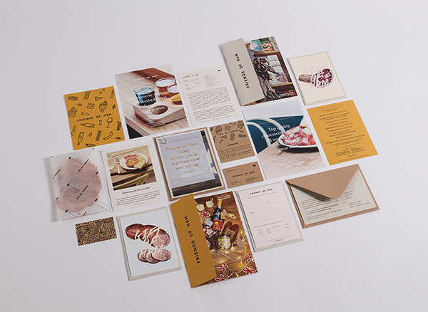
England’s Passport design studio provides across-the-board branding with a contemporary flair. Looking through their portfolio, you can see their campaigns cover everything from simple logos and identities to branding for stationery, client giveaways, customer-facing consumables, rubber stamps, and even the perfect binding mechanism.
I’d say Passport goes whole hog on a project, but that’s probably because I was highly amused by their “Friends of Ham” identity package. That’s the name of a local bar and charcuterie, for which Passport carved out a new identity. Passport’s profile says they like to use unconventional processes and materials, which is evident in their use of paper made from spent brewer’s grain.

The portfolio of Dan Gartman is (mostly) filled with happy, bright characters and cheery backgrounds. He has created characters for apps, online learning tools, videos, and UI/UX design. I can’t really pin one particular style moniker on his work, as each character has its own unique charm.
His flat backgrounds and characters for the Postly postcard app are what first caught my eye. I’m not a fan of flat icons, but when it comes to flat cartoonish characters, I can’t get enough. Gartman’s characters may be flat, but they aren’t all static. Many of the examples showcased include motion animation, like the animated chat icons “The Fine Family.” He also lets us peek behind the scenes at his techniques with his frame-by-frame animation piece.
This article was last modified on August 31, 2016
This article was first published on August 31, 2016
Commenting is easier and faster when you're logged in!

Recommended for you

Willoughby Design and the Evolution of a Typographic Paper Promo
Nothing makes a designer happier than paper and type. So when Neenah Paper asked...

InDesigner: The IRS
Learn how the IRS uses InDesign to develop courtroom graphics that bring tax-dod...