Managing Problems With Rotated Images in InDesign

Does anyone else have problems with poor previews of placed graphics in InDesign? Or poor results when exporting an InDesign page to JPEG format? If so, I hope you’ll add your comment on this page.
Recently, I wanted to make a simple ad in InDesign that included a PDF of a book cover, and export it as a JPEG. My client was justifiably proud of the book I’d helped him publish, and he needed an ad to include in an email. Easy, right? Unfortunately, that’s when things got absurdly complicated in InDesign, and even Adobe’s InDesign development team couldn’t resolve the problem…
The setup:
Here are the steps I followed. Feel free to repeat them with your own files and see what results you get.
1. Create the book cover in either InDesign or QuarkXPress (it doesn’t matter which) and export to PDF.
2. Place the PDF of the book cover into InDesign CC or CC 2014 and rotate slightly (in this case, 4°).
3. Set the Display Performance in InDesign to High Quality Display (for maximum preview quality).
The result:
Individual characters in text jump up and down on their baseline, both when previewed in InDesign and when exported as a JPEG from InDesign.
I contacted Adobe about the problem, and they said that InDesign uses the same rendering engine for placed PDFs that Acrobat uses to display PDFs. This seems to be true, since the bouncing text problem appears in Acrobat as well. They also said that because of my report they’ve begun working on a fix.
An Alternate approach:
1. Use Photoshop to convert the PDF of the book cover to PSD or TIFF.
2. Repeat steps 2 & 3 above in InDesign.
The result:
Unacceptably jagged lines and text, either when previewed in InDesign or when exported as JPEG from InDesign. Acceptable output when exported to PDF.
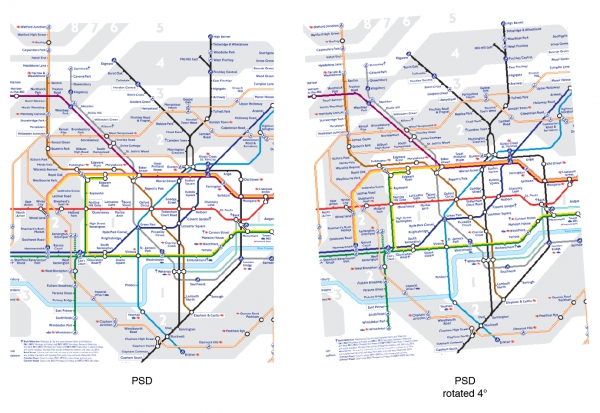
Below is a screen shot of all three formats (PDF, PSD, and TIFF), as they appear when imported onto a page in InDesign CC 2014 (with High Quality Display enabled). Click the image for a closer look.
Additional tests:
1. Try a different PDF, like the London Tube map, which you can download from the official website.
2. Try a TIFF of that same map, converted by Photoshop.
3. Try an EPS of that same map, converted by Acrobat.
4. Try a vector-based PNG.
The result:
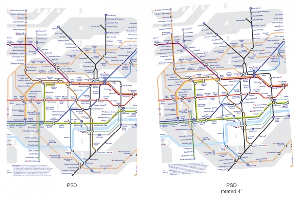
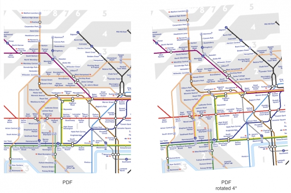
Same as above — text in PDF or EPS bounces up and down on their baseline, vector lines and text in any format unacceptably jagged in preview or when exported from InDesign to JPEG.
Below are screen shots of these other files and formats, as they appear when imported onto a page in InDesign CC 2014 (with High Quality Display enabled). Again, click each image for a closer view.
PSD test
TIFF test
EPS test
PDF test
PNG test
How QuarkXPress Compares
Searching for options, I reproduced the same tests in QuarkXPress 10 and the results were far superior, both when previewed on-screen and when exported to JPEG. (I used Markzware’s incredibly handy ID2Q XTension to convert the InDesign document to QuarkXPress.
Here are screenshots of the same pages in QuarkXPress 10:
PSD test
TIFF test
EPS test
PDF test
PNG test
Book Cover Tests
Note that in every example, the lines are less jaggy and the text characters do not bounce up and down on their baselines. (The white circle in the second book cover image is due to a bug explained below.)
Text is also clearer in QuarkXPress
QuarkXPress also displayed a better preview of text (in my opinion).
Ad preview in QuarkXPress
Ad preview in InDesign
Exported JPEGs are also better from QuarkXPress
QuarkXPress also exported the finished ad as a JPEG far better than InDesign:
JPG from QuarkXPress
JPG from InDesign
QuarkXPress has its own issues
Unfortunately, I ran into a bug in QuarkXPress because I used a feature not available in InDesign: I filled the circle with a full circular blend from White to None (transparent). While this doesn’t present a problem when printing or exporting to PDF, the preview in QuarkXPress shows a solid white circle. I contacted Quark and they said they are working on a fix.
Here’s the ad in QuarkXPress:
And exported to PDF:
So, what’s a busy designer to do?
Even though the preview of the placed PSD file looked bad in InDesign, and the exported JPEG of the ad was unacceptably rough and jaggy, the ad exported properly to PDF. So, the final solution was to export the layout from InDesign to PDF, then open the PDF in Photoshop and export it as a JPEG for the client’s email. The result was usable.
In the end, what I expected to be a simple process of dropping some content onto an InDesign page and exporting it, instead turned into a convoluted series of trial-and-error stabs in the dark. I was left with the lingering question of, “if Quark can give me perfect previews and exports, why can’t Adobe — especially when they own the technology?” Hopefully a fix is on the way soon.
Please add your own experiences to the Comments section below, and perhaps the folks at Adobe will see these reports of sub-par previews as an opportunity to improve them, and consequently improve the daily experience of designers everywhere.
***

This article was last modified on December 8, 2014
This article was first published on December 8, 2014
Commenting is easier and faster when you're logged in!
Recommended for you
Improve Your Talent for “Eyeballing It”
I’m kind of a stickler for neat and tidy layout; blame it on my printing b...

Review: LandscapePro
LandscapePro is the latest offering from Anthropics, developers of the excellent...
Four Under-the-Radar Lightroom CC Features Worth Knowing About
Adobe’s new Lightroom CC application is a streamlined sibling to Lightroom Class...


