


InDesign makes some assumptions about you. It’s pretty sure that your worldview is pretty Dark. It thinks you measure things in picas and points. If you’re using older versions, it’s pretty sure that you don’t want to take advantage of that gorgeous monitor you’re using. And in recent years, it wants to act like it’s your best friend with chummy greetings when you fire it up to get some work done.
If you find any of these quirks annoying or distracting, InDesign also lets you customize your work environment. So if you’ve never thought to change your preferences, press Command+K (Mac) or Ctrl+K (Windows) to open the dialog box and follow along.
[Editor’s note: Some of your options have changed from version to version. This article, originally posted in 2014, has been updated and is current with InDesign 2021, version 16.4.]
1. Lighten up
Do you really like that Dark interface? You have a choice! Select Interface > Color Theme in the Preferences dialog box. You can choose from a range of four gray swatches in the Appearance area—and, yes, you can make the default interface even darker if you really like that. As for me, I like the retro soft gray, so I go with the lightest swatch. (Whew! So much easier on my aging eyes.)

2. Keep those curly quotes comin’
Now, this one is a little tricky because Use Typographer’s Quotes (Preferences > Type … ) is actually checked by default (and for good reason). But you might suddenly find that your quotes are no longer converting to curly. What happened?
InDesign offers a default keyboard shortcut that will change this single setting. Chances are you went to use straight single or double quotes—as you would for indicating feet or inches—with the usual respective keyboard shortcuts: Command+’/Command+Shift+” (Mac) or Ctrl+’/Ctrl+Shift+” (Windows).
If Use Typographer’s Quotes in the Type area of the Preferences dialog box is mysteriously unchecked, you almost certainly added Option (Mac) or Alt (Windows) to those commands and accidentally changed the way InDesign works for you.
Select Use Typographer’s Quotes again. And if it keeps happening, consider changing that keyboard shortcut. Choose Edit > Keyboard Shortcuts, then select Text and Tables from the Product Area menu and scroll to Toggle Typographer’s Quotes Preference. Click on the current shortcut and click Remove. (If you’re using the [Default] Keyboard Shortcuts set, InDesign will prompt you to create a custom set.) You can select a more obscure keyboard shortcut or eliminate the shortcut altogether.

3. Keep line spacing consistent
When do you not want the leading to be the same within a paragraph? There might be a case here and there, but chances are, you want the same spacing between lines no matter the text sizes. Check Apply Leading to Entire Paragraphs in the Type panel. (If you need more details on this topic, read Rein in Rogue Leading.)
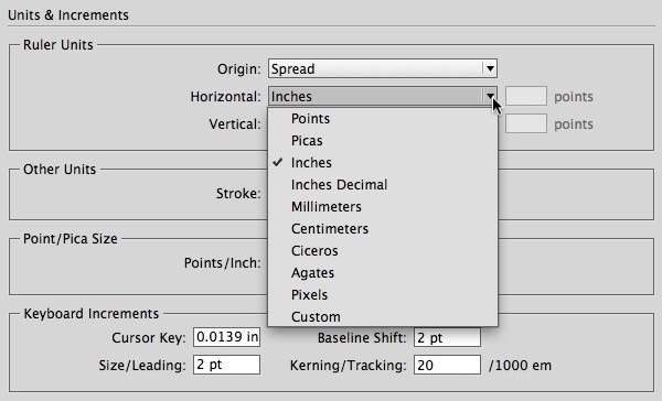
4. Rulers that rock
Apparently, Adobe thinks all designers not only understand picas but are most comfortable using them. As a writer and page layout person with no design training, I never learned picas. I never changed the default rulers because I thought that’s what the pros use.
At one point, though, a brilliant production artist mentioned to me that nobody really knows picas except for people with newspaper training. Whether this is true or not, that observation freed me up to work in inches. Let go of your guilt—work in the measurement system you prefer.
To change your units of measurement for your rulers, choose from different options from the Horizontal and Vertical menus in the Units & Increments panel of the Preferences dialog.
And if you are curious about those other units of measurement, check out “The Measure of Type.” (No pressure—now you know that nobody will make you use ciceros if you don’t want to.)
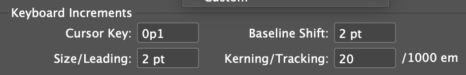
5. More careful kerning
Keyboard shortcuts for kerning and tracking are awesome for quickly experimenting with type and for copyfitting. But I find InDesign’s default increment of 20/1000ths of an em to be huge. I knocked it down to 5 in the Kerning/Tracking field (Preferences > Units & Increments > Keyboard Increments). You can adjust this setting to make it work for you.
6. Spot those spelling errors
Do you like how Microsoft Word underlines potentially misspelled words, repeated words? You can enable similar behavior in InDesign with by selecting Enable Dynamic Spelling in the Spelling panel of the Preferences dialog. (You can quickly toggle this preference from the Edit > Spelling menu as well.)

7. Quick corrections
Another preference that mimics Microsoft Word is Autocorrect. If you type in InDesign a lot, turning it on is worth a try. Check Enable Autocorrect in the Autocorrect panel of the Preferences dialog box.
Tip: You can use Autocorrect as a poor person’s keyboard macro as well. For example, in one project, I repeatedly had to use the tedious phrase “financial capabilities program.” To speed up the typing, I added a new Autocorrect entry that automatically changed “fcp” to expand the text.
8. Set up your Display Performance to work for you
For many years InDesign would, by default, protect your computer’s resources and display graphics with mediocre quality. Now, by default, graphics come in looking their best.
But if you’re using an older computer or a machine that otherwise isn’t maxed out, you might find that the computing power needed to display your graphics beautifully isn’t worth the tradeoff. Conversely, if you’re using an older version of InDesign, you might wonder why your stunning 27-inch iMac Retina 5K monitor is displaying jagged graphics.
To change the default, select the Default View from the menu in the Display Performance panel of Preferences. You can then set the way that those views behave whenever you override them, which you can always do individually via Object > Display Performance.
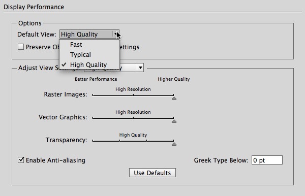
While you’re in that panel, you can select Preserve Object Level Settings so that even graphics that are set to Fast or Typical always display at High Quality—or vice versa.
Tip: If you’re adjusting your preferences because InDesign is behaving sluggishly, check out “Six Tips to Speed Up InDesign.” One more idea: Don’t forget that you can put any or all of your graphics on a separate layer and simply turn off visibility from the Layers panel.
This little hockey player’s shot is super crisp, but you can’t see it onscreen with Typical display. Bump it up to High Quality for a clean look.


9. Greek be gone
I’ve often been irritated by seeing lines of type on my page displayed as little gray bars instead of text. Another setting you can change! It’s the Greek Type Below setting in the Display Performance panel of the Preferences dialog box.
Essentially, text will display this way when its size on your monitor (not on your page) dips below this value (default: 7 point). If you want to see all your characters, no matter how long it might take to draw the itty-bitty ones, change this value to 0.
Again, it’s a matter of performance. It takes a similar amount of computing power to draw each letter, and if those letters are too tiny to be legible, it might be worth keeping the text Greeked. If your computer is lagging, you might even increase the value.
(Thank you to John Cruise for this tip.)
10. Spend less time on links
By default, every time you open an InDesign document, it scours your computer to look for the links to graphics and text files. If they’re missing, you will have to respond to an alert before the document opens.
I often open documents only to edit them and, in many cases, I don’t even have the graphic files, so of course they are missing! InDesign is spending time checking something I already know about. It made sense for me to turn off Check Links Before Opening Document in the File Handling pane of the Preference dialog.
Now, are you thinking to yourself, “I did change that once, but it didn’t stick?” Even experienced users can get confused by which preferences are document-specific and which ones are application-specific. For help, read A Visual Guide to InDesign Preferences.
And remember: Anytime you find yourself irritated by how InDesign is working, take a trip to the Preferences dialog and see if you can change a setting to better suit you, your computer, and your work environment.
And a bonus tip from 2021…
For the past few years, InDesign has tried to become increasingly friendly to new users with a Home Screen (“Welcome to InDesign, <Your Name>”) and a snazzy New Document dialog box.
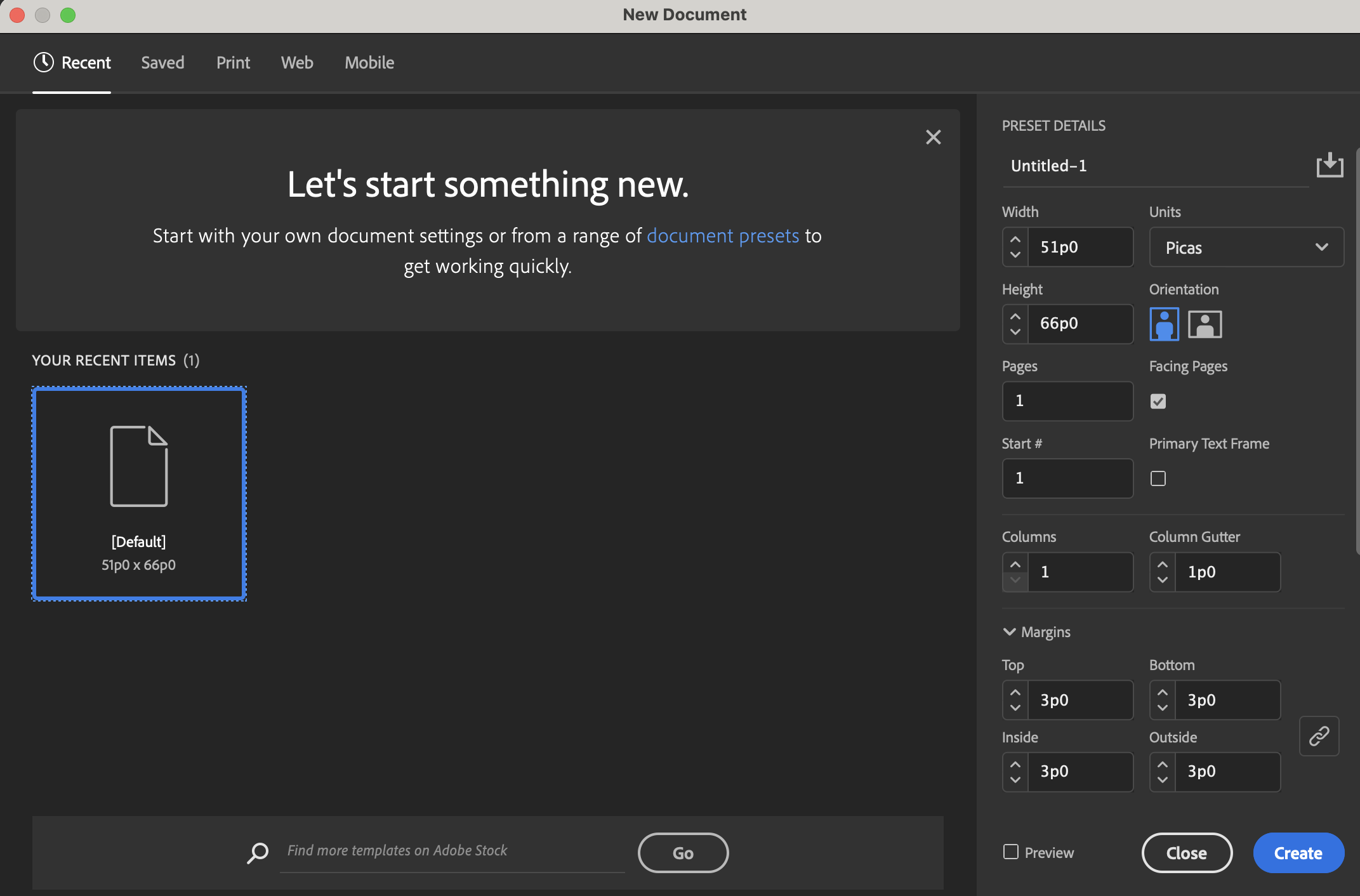
New users might appreciate these new ways of approaching serious software. But if you find them getting in your way or you pine for the simpler, less communicative InDesign, you can go to the General panel of the Preferences dialog box and:
- Disable “Show Home Screen When No Documents Are Open”
- Use Legacy “New Document” Dialog
Doing so will restore the boring but far smaller (and seemingly speedier) New Document dialog box.

This article was last modified on September 23, 2021
This article was first published on May 23, 2014
Commenting is easier and faster when you're logged in!

Recommended for you
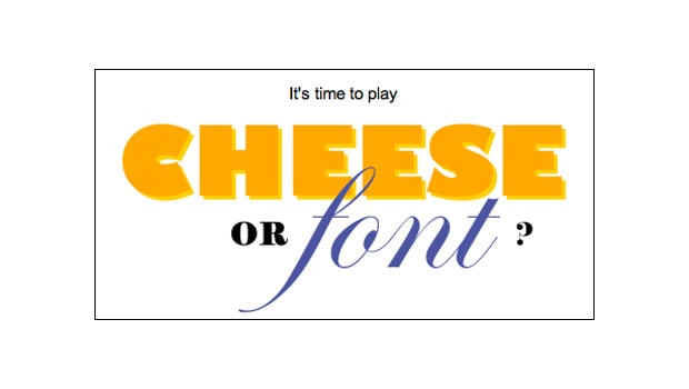
TypeTalk: Font Games Galore
Several type and font games are making the rounds on the Internet. Most are mean...

InDesign Magazine Issue 109: Digital Asset Management
Issue 109 of InDesign Magazine include articles on digital asset management, col...

Typography Playing Cards
If you’re pondering what to get your favorite type nerd for the holidays,...