

TypeTalk: The Ins and Outs of F-ligatures

F-ligatures are special characters found in just about every professional font. A ligature is two or more characters that are combined to form a single glyph. Ligatures fall into two categories: standard and discretionary. Standard ligatures are designed to solve the problem of neighboring characters that either collide or combine in unattractive ways. Discretionary ligatures are more decorative in nature and are intended to be used at one’s discretion, thus the term discretionary. F-ligatures usually fall into the first category; they are considered to be desirable in most typesetting usages, and are therefore “turned on” by default in nearly all design software.

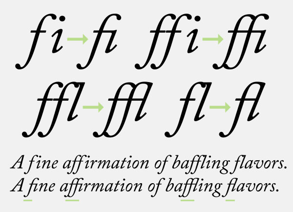
All of the f-ligatures found in Adobe Caslon Pro improve the appearance of the character combinations.
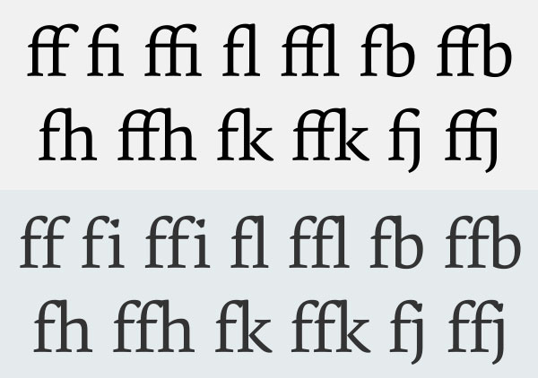
There can be as few as two, or as many as a dozen or more f-ligatures in a digital font. Older font formats, such as Type 1 and TrueType, only had room for the fi and fl ligature. Today’s OpenType fonts, with their greatly expanded character set, can accommodate many more, often including ff, fi, fl, ffi, ffl, and occasionally fb, ffb, fj, ffj, fk, ffk, ft, fft, fh, and ffh, some of which are more common in other languages.
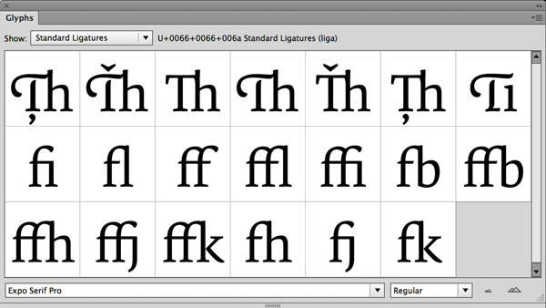
Expo Serif Pro has numerous f-ligatures (upper) as options for the individual characters (lower).
Many f-ligatures are connected forms, while others are not—yet they are all designed to improve the appearance of these neighboring glyphs. Note that all digital fonts need to have something in the fi and fl position, or digital map, so even if these character combos look fine without a special ligature, they will still appear together in this location with no alteration.
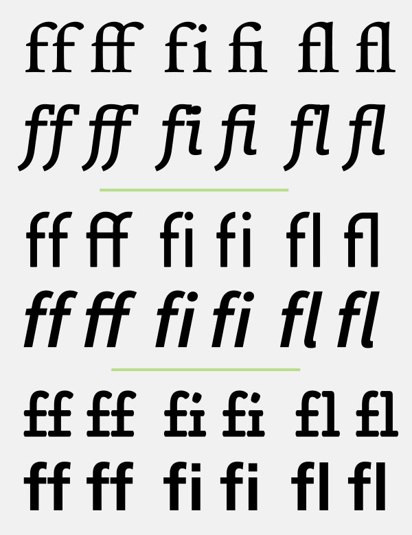
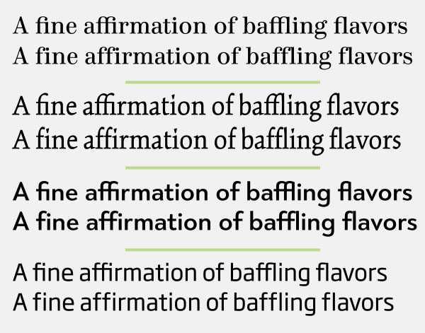
Not all f-ligatures are connecting: the top two showings all connect gracefully, the middle two have both connecting and non-connecting ligatures, and the bottom two are all unconnected, some with barely, if any difference at all. Set in ITC Legacy Serif, Enclave, ITC Conduit, Source Sans Pro, Alphatier Pro, and Frutiger 65 Bold.
History
F-ligatures can be found in metal type where one block of type would replace two or more, thus improving the appearance of colliding or unattractive character combinations. These corrective forms were included in the phototypesetting technology that followed metal type, as there were no limits on the number of characters. But with the onset of digital typesetting, many ligatures had to be discarded, as the earliest digital font formats (such as Type 1 and TrueType) didn’t have room for more than two ligatures. The greatly expanded OpenType font format that followed changed all that (as previously mentioned), and can include as many ligatures as the typeface designer could wish for. 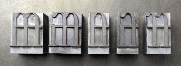
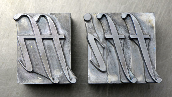
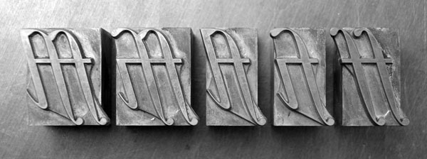
Ligatures existed in metal type, as seen in these examples of Garamond. Photos by Ray Nichols of LeadGraffiti.
Usage
The opinion commonly held by many designers is that f-ligatures are very desirable in text—especially with serif typefaces—but not always in the larger display settings. Personally, I keep the standard f-ligatures activated in all instances, but will turn them off for the occasional setting if the individual characters look better than the ligature. It is really a question of personal taste, and a decision that should be made on a case-by-case basis depending upon the font being used.
F-ligatures don’t always improve appearance, and their use is a question of personal taste. For instance, I prefer the setting of Kinesis (second pair from the top) without the ligatures, as they eliminate the quirky i dots (also known as tittles) which I quite like. Set in Consul, Kinesis Pro, Tangent, and Soho Gothic Pro.
There are several situations that call for special consideration regarding the use of f-ligatures:
• Take notice of any ffi or ffl combinations when using a font that only contains the fi and fl ligatures. Sometimes the combination of the single f with the fi or fl ligature can results in an unattractive, unbalanced appearance. When this is the case, turn off the f-ligatures for these instances.

When setting text with ffi or ffl combinations in a font that only has fi and fl ligatures, it might be best in some cases to turn off the ligatures in order to avoid an unattractive threesome, as shown in this setting of Garamond Antiqua.
• Don’t confuse the long s ligatures with f-ligatures. The long s is an historic form that looks like an f that is missing the right side of the crossbar, resulting in a glyph that is commonly mistaken for an f. To complicate matters even more, long s ligatures are frequently grouped together with f-ligatures under the standard ligature category, making it easy to confuse them.

Don’t confuse long s ligatures (under the yellow bar) with f-ligatures, as they are totally different characters.
• Use f-ligatures with extreme care—or avoided entirely—if you plan to adjust the overall letterspacing (or tracking) of the text containing these combinations. Since a ligature is a single glyph, the spacing between the characters won’t change when the letterspacing of a word or setting is opened or tightened; this can result in uneven and inconsistent spacing between the ligatures and the rest of the text. (Note that some design software will replace ligatures at a certain tracking threshold with the single characters in order to maintain consistent spacing.)
Accessing Ligatures
All ligatures can be easily viewed in the Glyphs panel, especially from the Standard Ligatures submenu. As mentioned earlier, most standard ligatures are turned on by default, as can be seen with a check mark in the InDesign Character panel dropdown menu. This is also where they can be deselected. If you want to turn f-ligatures on or off on an individual basis, highlight the character(s) in question and either select or deselect “Ligatures” from this panel; a ligature can also be selected from the Glyphs panel. Note that most word processing software has ligatures turned off by default, but they can easily be turned on.
All standard ligatures can easily be viewed using InDesign’s Glyph panel via the Standard Ligatures submenu.
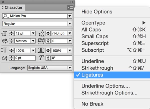
Standard ligatures can be turned on and off in InDesign via the Character panel’s drop-down menu.
Of course like most english centric articles here this is only true for english typesetting practice. But even in english there does exist exceptions but quiet often in german.
[…] The Ins and Outs of f-Ligatures […]
You can also usually see most or all ligatures by starting Charmap, choosing your font, and typing “ligature” in the “Search for :” box.
Note: When entering my info in the “Comment as a guest” name and website boxes, the text is grey on the same grey background, and is thus invisible.