

TypeTalk: The Complete Guide to Line Spacing

Line spacing, or leading (as much of today’s design software calls it), is a typographic term referring to the vertical space between lines of type. It is measured from baseline to baseline. The term leading comes from the days when type was set in metal and slugs of lead (thus the term leading) of varying thicknesses were inserted between the lines of type to add extra space.

An assortment of leads and slugs.
In print, line spacing is traditionally measured in points (and as normal, double, and triple in some word processing programs). But for the web and digital devices, it is commonly referred to as line height, and can be expressed in pixels, points or centimeters (px, pt, or cm), or as a percentage of the type size (120% or 1.2). Other accepted terminology includes normal, small, and big. 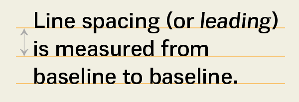
Proper line spacing is a major factor in the legibility of text. Too-tight leading makes type harder to read, while more open line spacing increases readability. You almost cannot add too much leading, but how much is appropriate depends on the amount of copy you have, your audience, and the overall design.
Display type generally calls for less leading than text. This is due to the fact that as type gets larger, the space between the lines appears progressively larger, calling for less line spacing as the type size increases. All-cap settings can be set with little or no leading (also referred to as set solid) and often look best with negative leading due to the lack of descending characters.
Line spacing, to some degree, is style-based. Settings have gone from somewhat open spacing in the days of metal type, to very tight spacing when phototypesetting took its place, and back to open line spacing with the emergence of digital type. Why all this variance? When phototypesetting was first introduced in the 1970s, line spacing had total flexibility—more so than ever before. As a result, designers set type very tight as a rebellion against hot-metal type where this was not possible. Today, line spacing leans toward a more open look, increased readability and a less crowded appearance.

The setting on the left is set 19/19 or set solid, and is a bit tight for optimum readability, especially for long lengths. The setting to its right is set 19/23—a bit more open than the auto leading value of 22.8.
Auto Leading
Most design programs have a default line spacing setting, called auto leading. This feature assigns a line spacing value of 120 percent of the point size of any text. (Note that this value can be changed by the user, as can most default values.) Auto leading can be a real convenience when you are unsure of your final point size and want the freedom to experiment. By using auto leading, you can change text sizes as often as you like and the leading will adjust proportionally and automatically.
On the other hand, auto leading does have some drawbacks:
- When you are combining type, symbols, or dingbats of different point sizes on the same line, auto leading can wreak havoc with the line spacing in a text block, making one line mysteriously “jump” to adjust to the larger glyph. To avoid this sometimes unexpected and usually unwanted occurrence, be sure to convert the leading to a fixed value.
- While auto leading can facilitate the setting of body text, it is not as useful for display type which generally needs a lot less leading than text. This is especially true with all-cap settings that have no descenders to fill in the space between the lines.
(Upper) The text and ornament are both set at 19 point with (22.8) point auto leading. (Middle) When the ornament is enlarged to 31 points, the auto leading for that entire line changes to 37.2 point, creating an unexpected jump in that line only. (Lower) When the leading for the entire paragraph is converted to a fixed leading of 23 point (or even the fixed auto leading value of 22.8), the line spacing stays consistent even though the ornament is still 31 points.
Jumpy Line Spacing
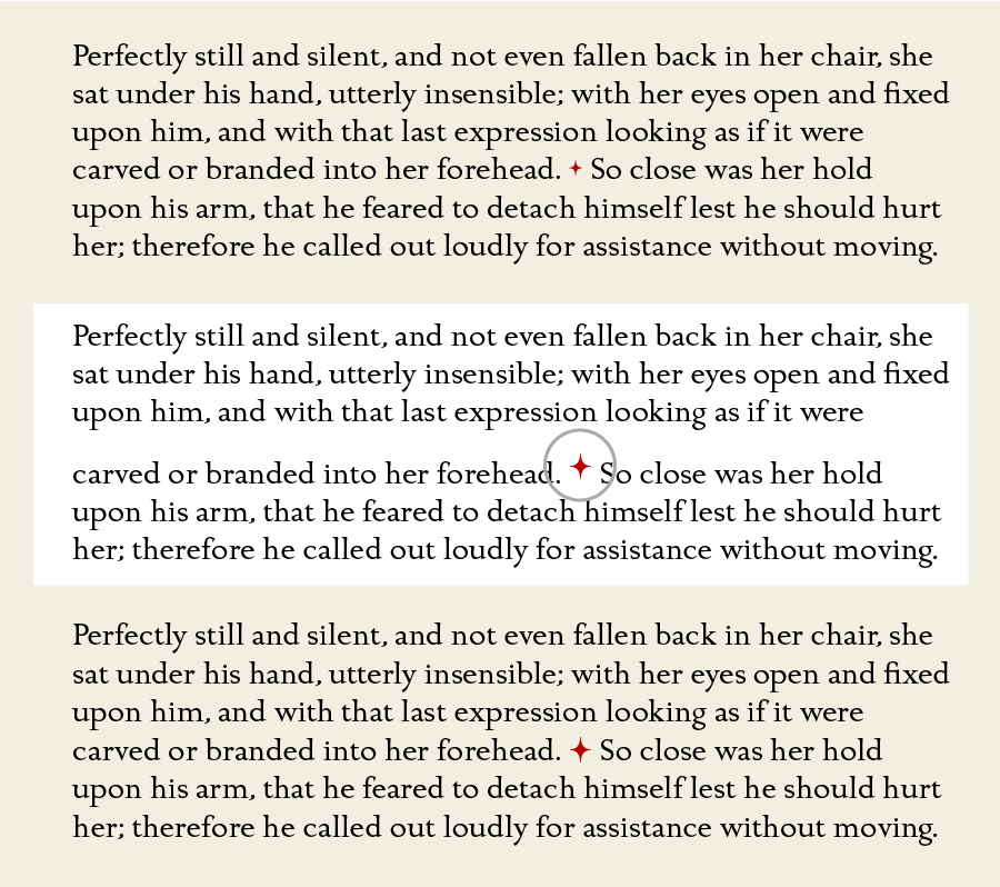
Have you ever noticed a stray line at the end of a paragraph that has different line spacing than the rest of the paragraph? This frustrating occurrence can happen when you change the line spacing of a paragraph, but neglect to include the invisible end-of-paragraph sign, called a pilcrow, which also carries formatting information.
The fix is to highlight this invisible sign, usually the one extra “space” after the last printed character in the paragraph, and format it the same as the rest of the text. Going forward, when formatting text, make sure to include this invisible symbol. (Turning on invisibles when working can help.) When using InDesign, either quad-click (four clicks) on a paragraph, or Selecting All. If you click and drag to highlight the text, you might miss this important symbol!
NOTE: You can avoid some (but not all) of these instances by turning on Apply Leading to Entire Paragraphs located in Preferences > Type.

(Upper) The text is set in 19/27 point. (Middle) When the text is manually highlighted and the leading is reduced to 22 pt., the line spacing of the last line hast not changed because the invisible pilcrow was not included in the new formatting. (Lower) This invisible symbol at the end of the paragraph must be highlighted as well to ensure all text will be included in the reformatting.
Glad to learn why I get those occasional wide spaced lines at the ends of paragraphs. Thanks.
[…] Line spacing, or leading, is a typographic term referring to the vertical space between lines of type. By Ilene Strizver. […]