

The Interrobang Is 60?!

Yes, dear reader: It’s been six decades since adman Martin K. Speckter announced to the world that what we needed was a single piece of punctuation to do the job of both a question mark and an exclamation point. It was the spring of ’62 when he proposed what came to be known as the interrobang.

Interrobang in Palatino Linotype
Birthdays are a perfect time to reflect on the past and contemplate the future. So let’s consider our friend the interrobang. It it useful? Is it anachronistic? Is it tattoo-worthy?
Wait—what is this interrobang you speak of?
If you know, you know. But if you’re in the dark, don’t feel bad. The interrobang is an obscure punctuation mark that experienced a flutter of fame in the 1960s when it was introduced. But these days, it’s mostly admired (and sometimes even employed) by a small group of people who probably all answer to the description “creative.”
You can read more about the interrobang right here on CreativePro. You can listen to this great episode of 99 Percent Invisible. And you can dive into Keith Houston’s thorough explanations of this quirky mark on his excellent Shady Characters website or his book of the same name. But here are the quick, major facts:
- Martin Speckter, who headed up his own New York ad agency, proposed the new mark in the March–April 1962 edition of an advertising typography magazine he edited called Type Talks.
- The interrobang was supposed to work for the sorts of exclamations that express a question—particularly rhetorical—or a sense of doubt.
- Speckter worked with his art director, Jack Lipton, to create a few potential designs and invited the magazine’s readership to propose their own designs and names.
- Interrobang is a mashup of interro- (as in question) and bang (a nifty way to say exclamation point). Other names considered were exclamaquest, rhet, and quizding.
- The interrobang was made available on a special switchable keys for certain Remington and Smith-Corona electric typewriters in 1968 and 1969, respectively.
- Despite early interest, the interrobang never really got a foothold. Today, though it does enthrall a handful of fans, it barely survives on the fringes of our written communications.
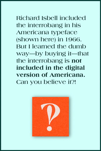
This is the interrobang shown in American Type Founders’ promotional collateral for the typeface Americana.
Let’s take a closer look at the interrobang’s origin story.
After reading everything I could get my hands on about this two-in-one punctuation mark, I made three conclusions about the interrobang.
1. It was deadline-inspired.
There’s a great 2018 episode of the Netflix series Explained that’s dedicated to the exclamation point. The show includes an interview with Penny Speckter, Martin’s widow, in which she recalls the provenance of the interrobang.
We were at dinner [in a restaurant] one night, and he [Martin] was lacking four pages [for Type Talks, the magazine he edited]. And all of a sudden, he thought of the interrobang. So he called the art studio that we used, and he said, “Is anybody … around who can draw?” And we went over. We were there until about three o’clock in the morning and he came up with a number of versions of the interrobang.
In other words, Mr. Speckter had an impending deadline, and the mother of invention, Necessity, drove him to come up with a topic for a typography article. The alleged need for the interrobang—the “inelegance” of a side-by-side exclamation point and question mark—was probably more of a good hook than a bad problem.
2. It was PR-nourished.
Speckter was a Madison Avenue man, and he’d worked in the ad biz for decades. He’d been in Army public relations during World War II, and then he went on to work for Bozell Jacobs and start his own agency. Before his long PR and advertising run, he was a staff reporter for the Omaha World-Herald. So it’s fair to say that he knew the world of publicity inside and out.
In 1962, his company, Martin K. Speckter Associates, had Dow Jones on its client roster. The agency regularly promoted publications like the Wall Street Journal, the National Observer, Barron’s, and the Dow Jones News Service.
So is it a coincidence that the Wall Street Journal picked up the interrobang story immediately after the Type Talks article ran?
According to Keith Houston, Penny Speckter called the Wall Street Journal’s early coverage of the interrobang “a complete surprise.” She insisted that “back in 1962, journalism was much purer than it is today” and the editorial staff “barely spoke with the advertising side.”
But I don’t think it’s a stretch to imagine Speckter simply making certain that the right people at the paper knew about his new punctuation mark—and what a compelling article it would make. I know he made a convincing pitch to Joseph Kaselow of the New York Herald Tribune, because the resulting article began this way:
Note came to us the other day from Martin Speckter reading: “There’s a fascinating article in the attached copy of Type Talks Magazine. It is written with verve, dash and a touch of scholarly roguishness which will, no doubt, have high appeal when this year’s nominations for the Nobel Prize are studied.”
Funny, sure—but also effective.
3. It was advertising-centered.
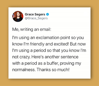
These days, we tend to be cautious in our use of the exclamation point. We don’t want to come off as shouty or unbalanced. I think this tweet sums up the common attitude perfectly:
But at the time when the interrobang was born, the exclamation point got a whole lot of play, particularly in advertising. Just look at this ad from 1962. Essentially every! Sentence! Is! Exclamatory!

You can imagine why in 1962, the average ad agency might feel compelled to punch up its many rhetorical headlines (à la Can you believe it?) with a big bang.
Martin Speckter thought the interrobang would be embraced by the advertising industry and catch on in the world beyond. But it turns out that advertising and real life are not quite the same.
Troubles in interro-dise
The interrobang has never been easy to use. Even though it eventually got included in a couple of fancy typewriters and a metal typeface in the 1960s, these were rarities. Most of the time, typing an interrobang meant superimposing a question mark on top of an exclamation point (or vice versa). And if you needed to print an interrobang, an illustrator or lettering artist generally had to custom-craft something for the job.
But fast-forward to today, when we could technically have an interrobang in every typeface, in every app, for every situation. We could, but we do not. Even the typeface on this very page (Merriweather) lacks an interrobang.
This is largely because demand is so very low. Why should type designers bother creating a glyph that no one ever uses?
Additionally, the interrobang is an awkward little beast that’s almost impossible to include in real-life text without calling attention to itself. It often looks like a beefed-up P or a drunk pilcrow (¶). It’s virtually impossible to design for real workability.
Steven Matteson of Matteson Typographics says that when the interrobang was conceived, no one considered “how poorly it would render in bold weights of type.” Even in regular text weights, he says, “it can blot up, causing an annoying dark spot on a page.”
Type designer Laura Worthington says, “I only have the interrobang in one or two of my fonts, because it’s such an incredibly difficult character to design. For anything bold, it starts fill up in on itself. What do you do with that little counter space? How tall do you make it?”
Treacyfaces’ Joseph Treacy says that design difficulties combined with nearly nonexistent need translate into disappointing results. “Many well-known foundries, knowing that interrobang will always be an obscure bauble but mostly unused, just don’t spend time actually solving the design problem. They just crash the two characters together as the ! and ? were drawn and stop there. Unfortunately, the results are predictably unusable. And often, even bland to unrecognizable.”
You can see what he means. Here are most of the selections available on my own computer. (These are the ones I think of as having a vertical orientation. Keep reading for some admirable variations.)

I’m a member of the fanned club.
One way to combine a question mark and exclamation mark is to let them share a dot but lean apart just a bit so they each have enough room to express themselves properly. This can’t work in every typeface, but I do think it’s the best-looking option, and I believe it would make a great go-to emoji.

An “early version” of the interrobang, as it appeared in an article by Allan Haley in Typeworld in 1980 (July).
Keith Houston refers to this style as “disjoint”; Joseph Treacy has suggested “splayed” and “fanned.” I like this last term best, not only because it’s so easy to associate visually with a fan or a hand of cards, but also because “fanned” hints at its potential popularity.
Christian Schwartz has designed several charming fanned interrobangs. Joseph Treacy notes that this approach “produces a better result that also recaptures some of the emphatically fun, ‘luncheonette’ handlettered sign art styles of the ’20s through the ’40s.”

Here are a couple of interrobangs doing their thing in Schwartz’s Fritz and Amplitude typefaces (released in 1997 and 2003, respectively):

Schwartz gave so much thought to his interrobangs, he even came up with a new hybrid in Amplitude. Maybe we could call it the questocom:

Anyway, if a good-looking fanned interrobang were always within easy reach, I could actually see wanting to include it in my writing every now and then.
That “easy reach” thing is only a dream at the moment, though.
Hunting down the elusive interrobang
The interrobang doesn’t have a home on our keyboards, alas. I typically look the thing up on Wikipedia and attempt some copying and pasting. Which often leaves me with something like this:

Even if you can get an interrobang to appear in your text, it’s unlikely to be available in whatever font you’re using. In more casual communications, however, aesthetics aren’t crucial, and you can settle for a one-design-fits-all interrobang.
The emojinterrobang
On my Mac, if I pull up my emoji keyboard and type “interrobang,” I get these choices:

That upside-down fellow on the right might be good if you were writing Spanish. It has a terrific name: gnaborretni. (Get it? That’s interrobang spelled backward.)
The emoji panel on my iPhone doesn’t include any “real” interrobangs, for some reason. But I’ve set up a shortcut in the text-replacement section of my system preferences so every time I type a question mark and an exclamation point together, I get the interrobang emoji.
Except … that doesn’t work in the very Google doc where I’m writing this. Have I mentioned that the interrobang is terribly tricky to use?
Could it live as a ligature?
Type designer David Jonathan Ross pointed out to me that the interrobang could be regarded as—and programmed as—a ligature. The same shortcut I use to quickly get an emoji in my texts (!+?) could be included within well-designed typefaces. Using his own unpublished font, he created a demonstration:

Neat, right?
The ligature could (and probably should) be discretionary. But ligature status might bring this punctuation mark out of the shadows a bit.
Happy birthday, interrobang!
At sixty, the interrobang remains something of a recluse. It will probably never be widely used in highfalutin journalistic and literary endeavors, but it could prove useful and gain traction in personal communications—texts, tweets, and the like. It could enhance or even politely replace the common term “WTF.”
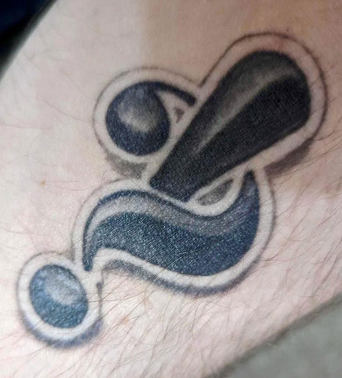
Those who admire this unusual punctuation mark will continue to do so. Such enthusiasts are all around you. They use the word “interrobang” to name their design studios, advertising firms, and music albums. They form interrobang appreciation societies and Facebook groups. Some even make the mark permanent, like copywriter Justin Blackman, who shared this photo of his forearm.
How about you? Are you a member of the interrobang fan club? If you do use interrobangs, how do you go about doing so? And what kind of reactions do you get? Do tell!
All trademarks belong to their respective owners.
Bibliography
Consuegra, David. 2011. Classic Typefaces: American Type and Type Designers. Allworth Press.
Contributors to Wikimedia projects. 2002. “Exclamation Mark – Wikipedia.” Wikipedia, the Free Encyclopedia. Wikimedia Foundation, Inc. June 24, 2002.
———. 2003. “Interrobang – Wikipedia.” Wikipedia, the Free Encyclopedia. Wikimedia Foundation, Inc. September 19, 2003.
Explained: Exclamation Mark (!): . 2018. Netflix – Watch TV Shows Online, Watch Movies Online. Netflix.
Garfield, Simon. 2012. Just My Type. Avery.
Haley, Allan. n.d. “X-Height: FontHaus’ Online Magazine?: The Interrobang Is Back.” Wayback Machine. Accessed June 21, 2022.
Houston, Keith. 2013. Shady Characters: The Secret Life of Punctuation, Symbols, and Other Typographical Marks. W. W. Norton & Company.
“Interrobang – 99% Invisible.” n.d. 99% Invisible. Accessed June 16, 2022.
“Interrobang – The Passive Voice.” n.d. The Passive Voice – A Lawyer’s Thoughts on Authors, Self-Pub and Traditional Publishing. Accessed June 25, 2022.
Jay, Alex. 8AD. “Tenth Letter of the Alphabet: Creator: Martin K. Speckter.” Tenth Letter of the Alphabet. 8AD.
Kaselow, Joseph. 1962. “Along Madison Avenue with Kaselow.” New York Herald Tribune, April 1, 1962.
“Martin K. Speckter.” n.d. Academic Dictionaries and Encyclopedias. Accessed June 25, 2022.
“Martin K. Speckter, 73, Creator of Interrobang – The New York Times.” 1988. The New York Times – Breaking News, US News, World News and Videos. February 16, 1988.
“Miscellany ? 81: Toward a Taxonomy of the Interrobang – Shady Characters.” n.d. Shady Characters – The Secret Life of Punctuation. Accessed June 17, 2022. .
“MYRTLE SPECKTER Obituary (2020) – New York, NY – New York Times.” n.d. Legacy.Com. Accessed June 20, 2022. .
Nordquist, Richard. 2008. “Definition and Examples of the Interrobang.” ThoughtCo. ThoughtCo. August 15, 2008.
Omaha World-Herald. 1962. “We Should Have an Interrobang!?,” May 27, 1962.
Quinion, Michael. n.d. “World Wide Words: Interrobang.” World Wide Words. Accessed June 25, 2022.
Stinson, Liz. 2015. “The Secret History of the Hashtag, Slash, and Interrobang | WIRED.” Wired. WIRED. October 21, 2015.
Strizver, Ilene. 2009. “TypeTalk: InterroBANG | CreativePro Network.” CreativePro Network. September 3, 2009.
The Economist. 2014. “The Rise and Fall of the Interrobang | The Economist.” The Economist. The Economist. October 1, 2014.
“The Interrobang, Part 1 of 2 – Shady Characters.” n.d. Shady Characters – The Secret Life of Punctuation. Accessed June 20, 2022.
“The Interrobang, Part 2 of 2 – Shady Characters.” n.d. Shady Characters – The Secret Life of Punctuation. Accessed June 20, 2022.
“TypeTalk: Standard vs. Discretionary Ligatures | CreativePro Network.” 2014. CreativePro Network. August 13, 2014.
“You Call That a Punctuation Mark?! The Interrobang Celebrates Its 50th Birthday – The Millions.” 2012. The Millions.
GREAT article, Sara! I find myself typing ?! so often that I would love to have the discretionary ligature interrobang available in fonts. I had not heard of the “questocom”… that’s brilliant.
Thank you! I never used the interrobang before I wrote this article, but while I was writing it, I set up the keyboard shortcut, and now it’s easy to use (if not particularly elegant).
Wow, I never heard of the interrobang before, but I felt I was becoming a fan as soon as I started reading this article :-)
It reminded me of Esperanto. Such a useful invention, but somehow ignored by the majority of people. I will definitely start looking for it in my fonts and use it as soon as I can. A discretionary ligature would be a very interesting option. David Jonathan Ross has my vote!
Yes! I agree 100% about Esperanto. It was motivated by such good intentions, and it makes so much sense. But language (and punctuation) insists on evolving organically.
Thanks for digging into this and happy birthday interrobang!
I use “?!” often in texting, emails, and occasionally in more formal writing (but not that formal, obviously). I refuse to use the red character emoji because they’re in the wrong order. It’s a bang-interro? I was actually taught about the interrobang in English class in the 80s. I was told to think of it like a question asked with gusto or emphasis. I visualize pearl-clutching when I use it. Can you imagine?!
Your English teacher sounds fun!
Before I wrote this article, I never felt the need for both a “!” and a “?” (in any order) at the end of any sentence. But now that I’ve set up the keyboard shortcut for the interrobang, I might start employing it from time to time.