

Scanning Around with Gene: The Best Type Book with No Typesetting
I rarely feature any single work here at Scanning Around with Gene for fear it could easily turn into a weekly book review. But I recently unearthed a 1927 edition of Studio Handbook Letter & Design for Artists and Advertisers by Samuel Welo, and I simply had to share it with you.
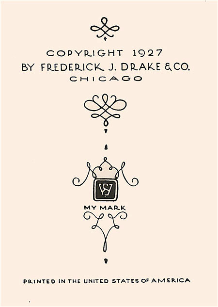
On its own, this 5-inch x 8-inch, 232-page handbook would be a terrific resource for designers wanting a basic education in letter design and advertising layout techniques. But the book goes well beyond that because it is, from cover to cover, entirely hand-lettered by the author. There is not a single use of machine or even hand-set type, rules, or photographs. Every page number, line of text, ad layout, border, rule, and dingbat is hand-drawn. It is a wonderful homage to the craft of hand lettering, and when you browse through the hundreds of pages, you can’t help but wonder how long it took him.

There’s not much information on Welo available, though you can purchase several contemporary font designs based on his hand lettering, and at one point he authored a book of Art Deco designs for Dover.


So as much as I’d like to wax on about the impact this little book made on me, I feel the best approach is to show my favorite pages and remind you that it’s all hand-drawn. I hope you enjoy the craftsmanship and simple design wisdom that comes through in the text.
If you can fill in any details of Welo’s life, please post in the Comments section.


Go to page 2 for many more samples of Welo’s artistry.
I was absolutely blown away by this set of scans.
I was wondering, though, how did the printer get this man’s drawings from paper to the press? I don’t recall the exact time when lithography (as we know it) came into general use, but I would have to imagine that there must have been some kind of photo etching (or engraving). Obviously this couldn’t be a letterpress process…
It’s pretty clear from some of the pages that they were reduced photographically, so I suspect the printer simply made metal plates (usually copper or zinc) from film negatives, much as they would have for a halftone or illustration. This process was typically called “engraving” or even “etching,” though it was a chemical process using acid, not done by hand.
Off topic, but I’m curious about the technique Lewis Scott uses to make multicolored line drawings. It looks very old fashioned. How was this kind of thing originally produced? Here is his website: https://www.lewisscott.com/. And he has an illustration in the NY Times Sunday Aug 24 Week in Review section: https://www.nytimes.com/2008/08/24/weekinreview/24kershaw.html?em
I’d suggest that you ask the folks who frequent the Type ID Board athttps://typophile.com/resources.
Nice work!
Samuel Welo’s Lettering: Modern and Foreign will be featured on my blog, Tenth Letter of the Alphabet, https://alphabettenthletter.blogspot.com.
Starting on Monday, October 10, 16 images from his book will be posted each day through Friday, October 14. On Saturday, a profile of Welo will be posted.
This was incredibly inspiring, I really want to practice calligraphy right now.
This book has been my Bible since I was shown an old edition at a print shop where I did paste up. Simply the best.