

Saul Bass, Master of the Movie Title Sequence

 Mention movie titles to any designer in the know, and undoubtedly the name Saul Bass will come up. Saul Bass (1920 – 1996) was an American graphic designer and movie title sequence designer whose innovative approach virtually transformed the entire genre in the 1950s. Although he designed many iconic logos – many still in use – he is most known for his title sequences and related materials. He designed movie titles, trailers, and posters for more than 40 movies. His best known works include a series of unforgettable posters and title sequences for films such as Alfred Hitchcock’s Vertigo and Otto Preminger’s The Man With The Golden Arm and Anatomy of a Murder.
Although Bass was creative director and designer of all these pieces, he did not do most of the lettering. Robert Trogman, a typographer who has first hand knowledge about the process, says “I worked with Saul Bass for two and a half years along with with Art Goodman and his assistant Dave Nagata. Main titles were usually hand lettered. Dave was a master lettering artist, and most of the comps were done by him while Art Goodman cracked the whip. In the movie Man With the Golden Arm, Art Goodman’s crippled arm was the model.”
Saul Bass was equally known for his work in corporate branding. He created some of the most famous logos and corporate identity campaigns of the century, including those for major companies such as AT&T, United Airlines, Quaker Oats, and Minolta.

In 1955, his wife Elaine Bass (née Makatura) joined Saul Bass & Associates, and after 1960, much of Saul Bass’s title design and film work was done in collaboration with Elaine. Toward the end of his career, Saul Bass was “rediscovered” by James L. Brooks and Martin Scorsese, who urged the Basses to return to main title design. For Scorsese, Elaine and Saul Bass created title sequences for Goodfellas, his remake of Cape Fear, The Age of Innocence, and Casino, their last title sequence. Bass said, “I want to make beautiful things, even if nobody cares, as opposed to ugly things. That’s my intent.”
Here is a sampling of some of Bass’s most well-known and enduring creations:
The Man with the Golden Arm (1955)

(Click image for video.)

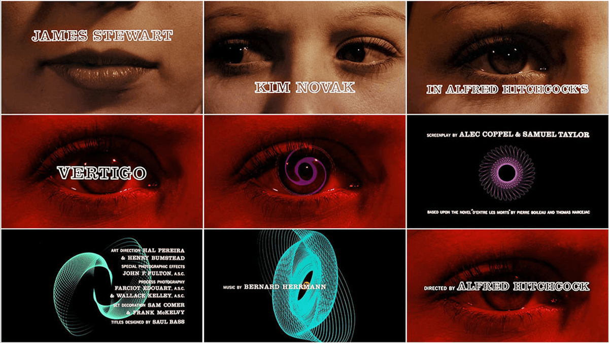
Vertigo (1958)
The title sequence and poster for Alfred Hitchcock’s Vertigo are totally different from each other, but both are classics. The creepy sequence features Kim Novak’s horror-stricken eye that fills the screen, and then blends into spirographic imagery – all accompanied by a sinister score. The poster is Bass’s trademark graphic style, with its hand-lettered, all caps type, as well as the black, foreboding drawing in the middle.
(Click image for video.)

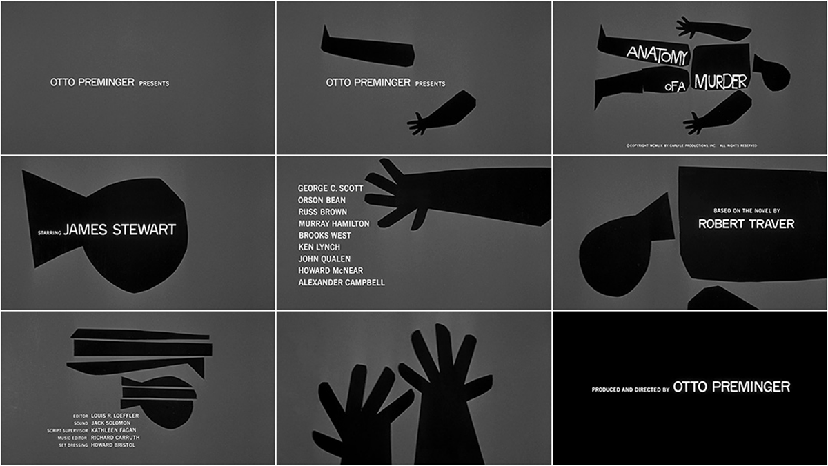
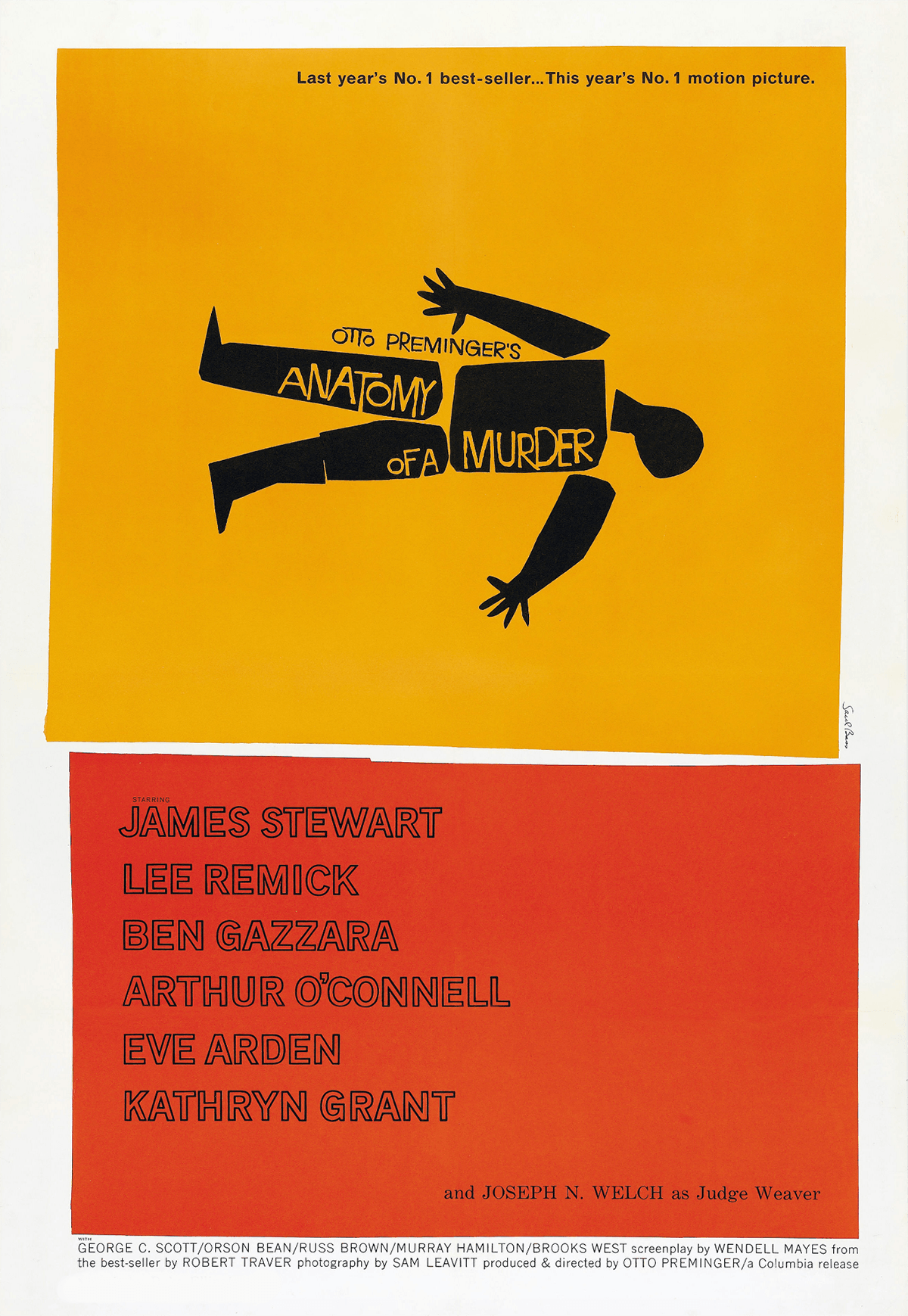
Anatomy of a Murder (1959)
The opening sequence for Otto Preminger’s crime drama, Anatomy of a Murder, suggests tension by means of paper cutout shapes of body parts. These dismembered shapes interplay with the simple type treatment, which plays second fiddle to these intrusive cutouts – all in black, white and gray and accompanied by a stylish score. The movie poster is slightly different in that it introduces color as well as more expressive typefaces to create an eye-catching, dramatic still image that mirrors the mood of the film.
(Click image for video.)
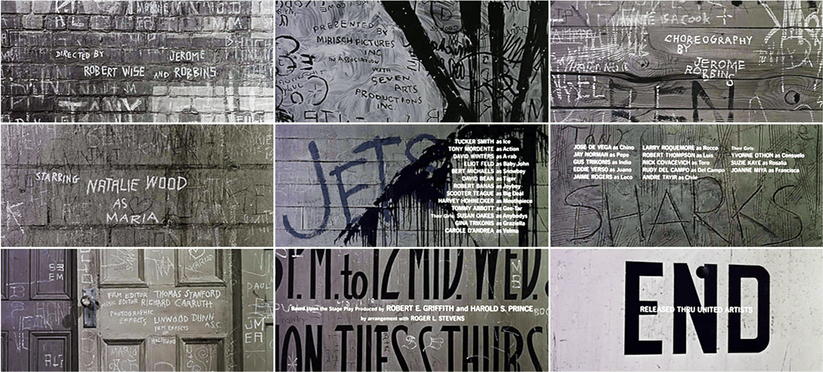
West Side Story (1961)
The credit sequence for West Side Story, a Romeo & Juliet-themed movie that takes place in the slums of Manhattan, appears at the end of the film. It mirrors the gritty, gang-related graffiti from the movie, with typeset copy superimposed. The poster is the more iconic of the two, and creates a grid-like arrangement of the distressed, stencil title blended with illustrative elements from the story.
(Click image for video.)

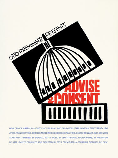
Advise & Consent (1962)
I included this sequence from Advise & Consent for its use of a stylized yet personal handwriting paired with an all-cap neutral sans setting. It is notable today because although there were no handwriting fonts at that time, this personalized treatment has become extremely popular today in both font and hand-written forms. Perhaps Bass’s handling of this sequence was a forerunner of this ever-popular treatment…?
(Click image for video.)
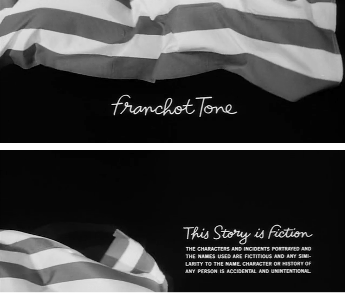
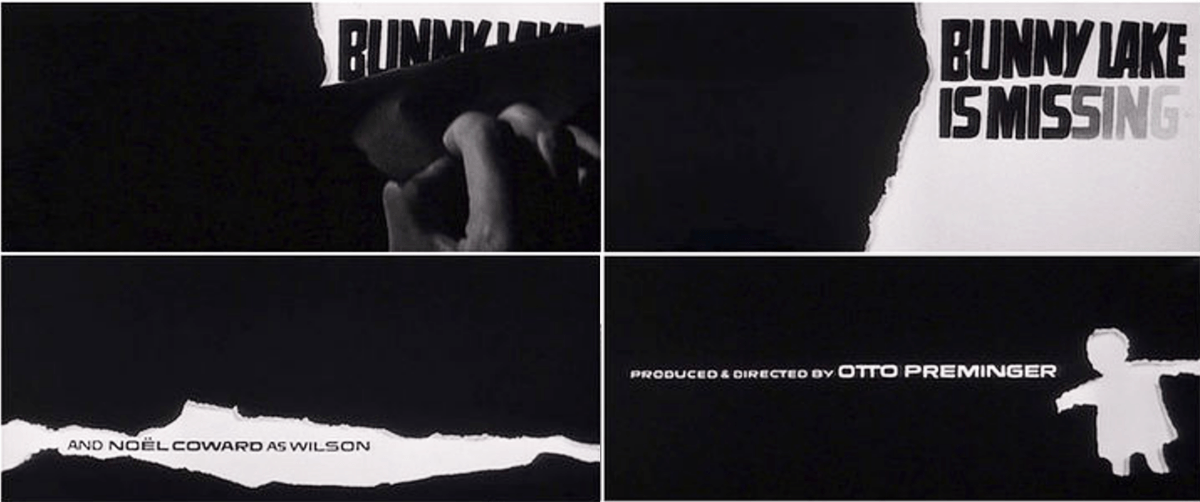
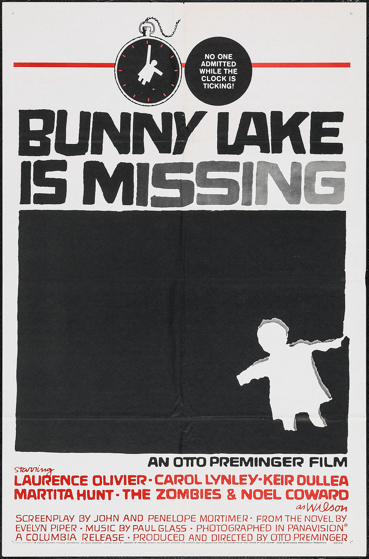
Bunny Lake is Missing (1965)
Bunny Lake is Missing is a film about an emotionally disturbed individual involved in the disappearance of a child. Most frames of the dramatic title sequence consist of a man’s hand tearing back black paper to reveal the credits. The last tear transforms into the shape of a small, cutout paper doll. Quite a simple concept, but the torn, jagged edges set the mood for this film which deals with a complex topic.
(Click image for video.)
Film and Non-film Posters
Saul Bass made his mark on many other posters, both for film and non-film. Here are some of his most notable works of that genre:
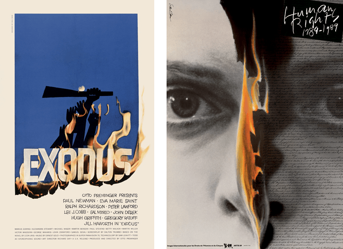
This Exodus movie poster from 1960 and the Human Rights poster from 1989 both use images of flames to dramatically make their points.

These movie posters from Schindler’s List, 1993, and The Shining, 1980, express different kinds of horror.

Each of these posters, The Two of Us, 1967, and Such Good Friends, 1971, combine type and image to create one, eye-catching focal point.

Three posters with dramatically different treatments: Human Rights Week, 1963; Truth, 1957; and the 4th San Francisco International Film Festival, 1960.
Saul Bass: A Life in Film & Design (Book)
 If you want to know more about Saul Bass and how he worked, check out one of the few, and most complete books on this design legend: Saul Bass: A Life in Film & Design. Designed by Jennifer Bass, Saul Bass’s daughter, and written by distinguished design historian Pat Kirkham who knew Saul Bass personally, this book is full of images from the Bass archive, providing an in depth account of one of the leading graphic artists of the 20th century.
You can also check out The Saul Bass Poster Archive.
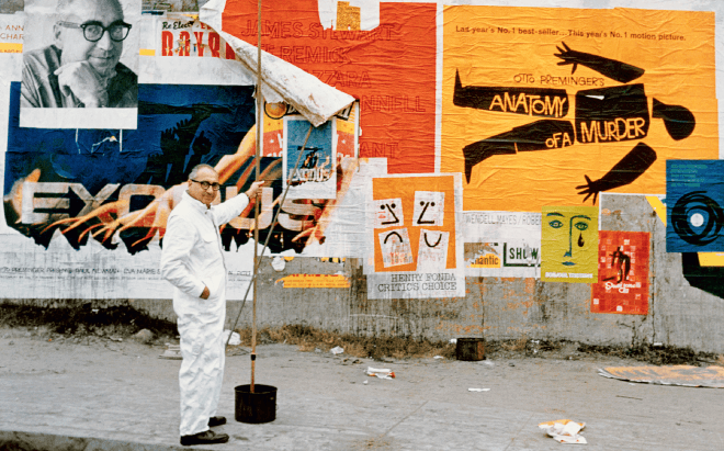
Saul Bass in front of a wall of his work.

Recently watched The Man with the Golden Arm. Its a perfect movie and reflecting all trends and cultural aspects in that time. Have to watch remaining movies in the series.
I love Saul Bass! He’s my favorite person in the entire universe and in my entirety of existence.
I liked West Side Story, this film is great for me
My all time favourite movie is West Side Story really fantastic story.
Saul Bass is one of the best Director of Hollywood movie. He won many award for production and Direction love to watch all his movies.