

Photoshop How-To: Divide and Conquer
The ancient Chinese art of cloisonné is fascinating in its texture, colors, and design, and it’s exciting to watch the painstaking artists concentrate on the difficult and detailed steps of production. Touring a cloisonné factory in Beijing, China, in 2004, Fabian Krajmalnik saw immediately the potential for a classic image of a timeless process.
In his mind’s eye he looked past the hundreds of people crowding the workshops, the clutter of the artists’ materials, and the off-color fluorescent lighting. The tours moved quickly and everyone wanted to be very close to take snapshots. Coming toward one artisan’s station, he noticed how her face and hands were illuminated at an oblique angle and knew he had a winning image if only he could shoot quickly enough.
Fabian set his Nikon D-70 on Aperture Priority at 1600 ISO equivalent and fluorescent white balance, capturing in NEF RAW. This setting yielded only a 1/30th of a second at F8 exposure on a 28-70 2.8 ED-IF AFS Nikor lens. He had time for just one shot (Figure 1).

Figure 1. The original shot. Click on the image for a larger version.
Diamond in the Rough
My first glance at this image told me it was a diamond in the rough, with wonderful composition, great directional lighting, and an interesting story to tell. It was also a microcosm of challenging retouching issues. My job was to use Adobe Photoshop to cut and polish the gem so it could shine.
I find that the best approach in any retouching process is to divide and conquer. This method of working just one area at a time is essential with an image such as this, where there are many varied concerns to address. While Fabian sat looking over my shoulder, I listed the elements I wanted to change:
- Basic color correction for the mixed lighting
- Enhancement of the individual’s face and clothing
- Almost-total recreation of the background to remove the tourists
- Removal of foreground clutter and recreation of the missing details
- Neutralization of the color and texture of details in the environment
- Narrowing and refining the lighting emphasis for meaning and impact
Basic Changes and Background Recreation
For best results I worked in 16-bit Adobe RGB, making frequent snapshots and saving at major stages of the process.
Fabian’s expertise with white balance and exposure made color correction relatively easy. I did gross correction in Levels, and fine adjustment in Color Balance. I corrected for skin tone and the artist’s off-white smock. I selectively added saturation until the metal glowed richly. Facial corrections were minimal, just some blemish removal and smoothing of skin texture.
It’s hard to decide what to do when an area as big as this background needs to be reworked. I took inspiration from the mottled colors of the metal vases. The retouching method was a time-consuming combination of the Patch Tool alternating with the Healing Brush, partly in normal mode, partly in replace mode, to clean up small areas, edges, and corners. I blended more than 75 irregular patches, taking almost an hour and a half of work. While time-consuming, my process doesn’t create artifacts or unattractive grain. I also hand-colored and deepened the tone of the vases on the far left. Figure 2 shows the progress of color correction, facial and clothing enhancement, and the completed background.

Figure 2. The tourists are no longer a distraction. Click on the image for a larger version.
Foreground Clutter and Missing Details
I couldn’t simply crop off the unattractive and distracting jars on the workbench; I had to eliminate them and recreate certain details to preserve the image’s composition. I started with a medium-hard Healing Brush in Replace mode and then selected with the Marquee and duplicated elements of the metal design detail on layers. I blended them seamlessly with layer masks. Figure 3 shows the recreation of the vase detail.

Figure 3. I removed the red top of the jar and recreated the vase’s previously obscured details. Click on the image for a larger version.
Starting on the second jar, it became obvious that the frayed white fold of cloth supporting the vase would be a visual roadblock, pulling the eye away from the subject. Once the jar was gone, only a tiny sliver of the cloth remained. At very high magnification I selected the area with the marquee and duplicated the small shred of white and the wood table top.
I darkened the cloth, altered its color, and removed the ripped bits. I then extended the elements with the Healing Brush in Replace mode to fill the compositional void at the bottom of the image. I again darkened the whole area, so it looked aged and blurred. Removing the jars, recreating details, and neutralizing the other elements took another hour and a half. Figure 4 shows the cloth recreation.
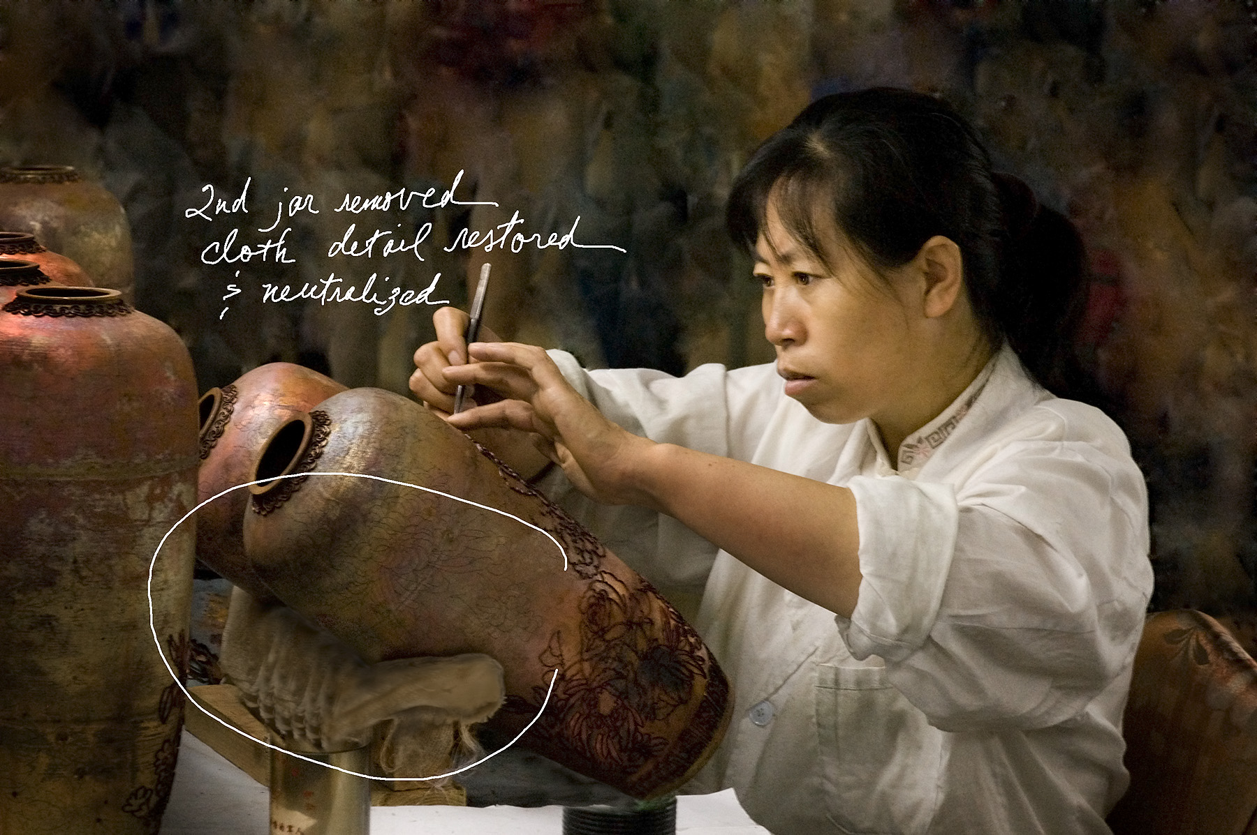
Figure 4. The second jar is disappearing and the supporting cloth is darker. Click on the image for a larger version.
Lighting Enhancement
The last concern was to enhance the lighting so the viewer’s eye would slide into the composition, instantly take in the details of the environment, and then concentrate on the artist’s expression and her graceful hands, which tell the story of her dedication to her age-old art. I knocked down the shine on all the vases in different intensities. I also vignetted edges, a rather old-fashioned touch to echo the ancient subject. I sharpened the image for output with a combination of portrait and scenic sharpening algorithms I’ve developed (Figure 5).

Figure 5. The final result. Click on the image for a larger version.
The entire enhancement and retouching process took more than four hours. My keys to success and speed are a fast computer (Quad G5 Mac with 4G of RAM); lots of screen real estate (30-inch flat screen monitor); key strokes rather than mouse movements; pre-planning; solid knowledge of the tools and techniques; and, of course, constantly moving in and out on the image to magnify while using the tools and back away to judge the total combined effect.
I made the final print in my studio on an Epson 4800 inkjet and K3 inkset with the Gemini III software package. It netted Fabian a merit at the 2006 Professional Photographers of America competition. Naturally, I wanted to try to win an award too for the post-production. I heard about the O’Reilly Media Photoshop Cook-Off contest, entered, and won the Retouching division!
I appreciate the detailed breakdown of the retouching process.
Great work! and Great article indeed! the introduced work flow was extremely helpful.
The success keys mentioned at the last part of the article are very helpful too. Thank you.
i noticed the author used levels and then used color balance when she could’ve taken care of both tasks with 1 curve adjustment, of course you can use whatever tools serve your needs but if you were to follow her example during a job interview your chances of landing that job would be diminished as levels and color balance are tools geared for beginners…