

How to Take an Infographic from Good to Great

It’s easy to make a good infographic. But it takes a lot of dedication to turn a good infographic into a great one. Why go through all the trouble? While a good infographic can generate a bit of interest, it doesn’t create traction. It’s quickly forgotten, left behind by other, better infographics. A great one, on the other hand, will be shared across social media and maybe even hit the infographic jackpot by getting posted on a big site like Mashable, Fast Company, or Popular Science, which will bring in huge amounts of traffic.
As a designer, it’s your job to make your infographic unique, engaging, and ready to go viral. Sound like a tough job? You bet. But here are some tips that should make the process a little easier.
Appeal to Popular Culture
Things having to do with popular culture, including anything from TV to movies to books to celebrities to fashion, are some of the most shared content on the web. Your graphic is much more likely to go viral if it appeals to a large crowd, and pop culture has a huge number of devotees who are constantly posting about it on social media.

For instance, an infographic about the hugely popular AMC drama Breaking Bad will appeal to a large swath of people, and not only fans who watched the show, but also those who want to appear cool and in the know about popular television. They’re more likely to share an infographic with their friends if it makes them look smarter or more culturally aware.
If you’re not well-versed in entertainment, you can still embrace pop culture in some other format. Lots of people identify with apps or app stores; an infographic that plays off a hugely popular game or messaging service will also resonate with people. Or you could just roll them all into one big pop culture burrito:
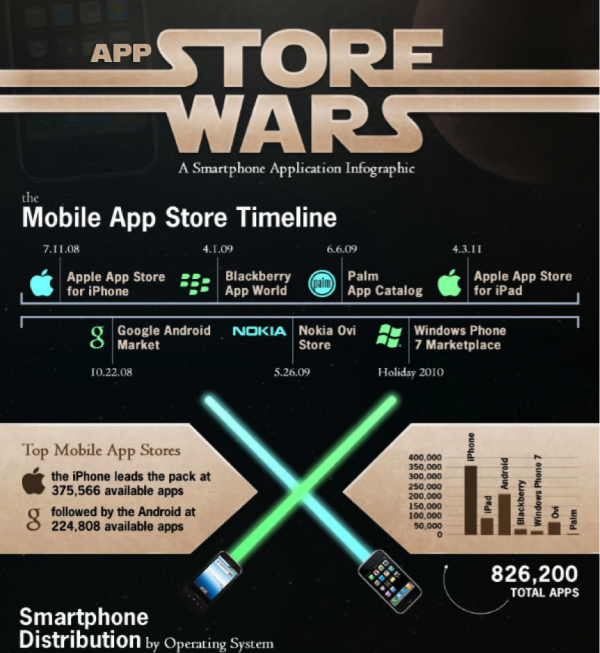
This infographic connects the apps we use every day with a film franchise almost all of us are familiar with, using a simple pun as the binding thread. Nice!
Are you tasked with making an infographic about something sort of dry or technical? Try to find a way to hook it in with pop culture. In most cases, as long as you create your own graphics, channeling a famous icon falls under fair use.
Make It Funny
Who doesn’t need a good laugh now and then? Employing humor is one of the best ways to convince people to share an infographic. Think about your personal Facebook newsfeed and how many things on there, even from businesses and brands that you follow, are aimed at eliciting a chuckle.

Some brands have found success with memejacking, or incorporating common memes into their work. This infographic about credit cards plays up Angry Birds, a game that was hugely popular in 2012 when the infographic was made, as well as common memes like the “Y U NO” Guy.
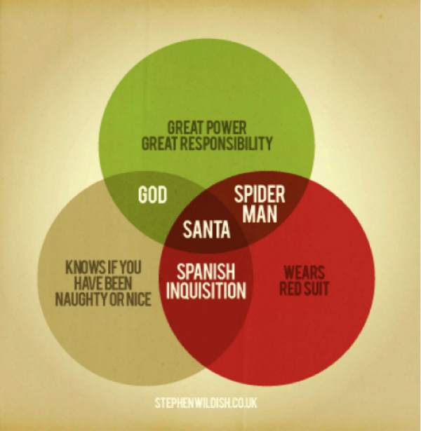
Other brands go a simpler route with deadpan humor, such as this infographic comparing and contrasting Spiderman, Santa, God and the Spanish Inquisition. Still, others find a subtler sense of humor works best. This graphic about the 2015 Mustang is mostly serious, but midway through, there’s an amusing and unexpected section about how many clowns could fit in the car:

Most audiences will appreciate an unexpected break to humor in the middle of your graphic, so when possible, include something designed to make the viewer crack a smile. It might just be the thing that drives them to hitting the “share” button.
Break Form
Nothing catches the reader’s eye like something unexpected. Most infographics are done in the traditional tall, skinny format. We’ve become accustomed to seeing this shape being shared on Facebook and Pinterest, so sometimes we completely overlook it—oh, it’s just another stupid infographic. Not good! If you really want to draw attention, sometimes you have to try something different.

This square infographic packed with 35 habits that will make you a more productive person is just the right size: the format makes it stand out from typical infographics. Importantly, it’s not too small to read when embedded on a blog (since many viewers will not click through to the full-sized version, this is essential). It grabs us from the first second with the little flexing guy, and the colorful winding circles hold our attention.
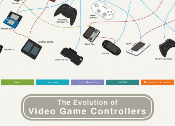
Or try a flowchart, such as this extremely detailed one that follows the evolution of the video game controller. In this case, a viewer must zoom in to read names or see details – but because this piece is being sold as a print, that’s perfectly acceptable!

Or take a page from this infographic about the world’s tallest buildings, which overlays all the information into a single, highly detailed chart. Yep, that’s the whole infographic. Sometimes you don’t need thousands of pixels of height to tell the whole story you want to tell.
Make It Interactive and Immersive
Using different formats or different approaches to the infographic isn’t the only option for designers. You can also, with the right developmental know-how, turn the infographic into an entirely new experience by making it into an immersive or interactive event.
Interactive infographics have some challenges; they usually involve some amount of coding knowledge, and they’re typically hard to offer up as an embed, so you have to bring the traffic to you in order to have a chance of making an impact. Still, they stand head and shoulders above the vast realm of mediocre static graphics, so if your goal is to shake things up and get some hard-earned attention, they’re the way to go.
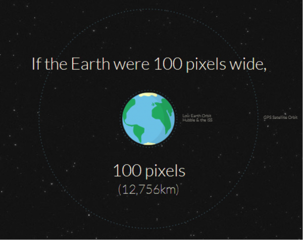
Our first example, Distance to Mars, requires people to click through in order to see, in pixels, the distance from the Earth to Mars. The first jump to the moon is a few thousand pixels in distance, but then the journey to the pixelized Mars takes the better part of a minute. To keep viewers interested, text comes in from the side to explain when a manned trip is likely to happen. Putting things into pixels that we can literally zoom through really puts things into perspective!

This interactive infographic about how drugs are provided to the world immerses the reader in powerful information with red, dull grey and white slides, sort of like a fullscreen slideshow with more motion.
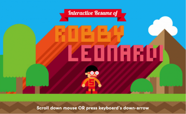
Robbi Leonardi’s interactive resume is an incredibly polished example of interactive infographic design, inviting people to literally take a stroll along his chosen career path using their mouse. This piece uses gamification—one of those design buzzwords that has been gaining popularity as of late – to show off his design and development knowledge to potential employers.
By trying a fresh approach to infographics, whether it’s through using a sense of humor, embracing pop culture, breaking the traditional form of the tall, skinny graphic, or going interactive, you can take your work from good to great. And you’ll be rewarded with a huge number of shares and an infographic that sticks in people’s minds, generating traffic long after its first post.
***

Hi Adrienne,
Thank you for sharing this material, i’m working on a Making a great Infographic class and this will help a lot.
In addition to your approaches i think is needed to explain more about the process of making an infographic. The method that we are learning its called LATCH and suggests that is needed to organize the info by Location, Alphabet, Time, Category or Hierarchy, have you heard about other method?
Best regards,
M.