How to Be a Better Designer
This article was originally published in InDesign Magazine issue 53 (April-May 2013). Subscribe now!

At PepCon this year I was honored to give two presentations, both on the topic of How To Be a Better Designer. This article summarizes the first of those presentations.
But before I start dispensing the advice, a question, an answer, and some disclaimers. First the question: Who am I to be giving such advice?
Answer: I’m a graphic designer. Like many of you, I wear several hats. These days my working life is cobbled together from a combination of authoring online tutorials, writing, training, consulting, art, photography, public speaking, and…graphic design. I put it at the end of the list, but really it is graphic design that informs everything else. I’m not a great designer, but I am an improving designer. And while I try to improve at all the aspects of my job, I put the most time and effort into improving and growing as a designer. If I am a better designer, it follows that I will also be a better photographer,
artist, trainer, and writer.
And now the disclaimers: This is not a manifesto. It is not a “fail-safe system”—nor should you trust anything that claims to be. Rather, it is an evolving list of unfinished thoughts and contradictions. It is not random, but it is not comprehensive either. I’m sure you’re already applying much of this advice. And I’m sure you’ll disagree over my emphasis and the things I’ve left out, intentionally or otherwise.
This is a path, not the path. That said, I am confident that if you follow these practices you will be a better designer.
I should also state that I am focusing here on design technique rather than the business of graphic design.
As a novice graphic designer, a book I found useful was The Non-Designers Design Book by Robin Williams.

When I find myself over-complicating things, I continue to find her common-sense advice and practical tips on how to improve your designs a sobering lesson in the value of keeping it simple. Robin cleverly orders her tips around four design principles: Contrast, Repetition, Alignment, and Proximity. Taken together, they form the memorable mnemonic, CRAP. Teaching graphic design, I have found this device immensely useful. If the students remember one thing, it is CRAP, and from that they can unravel a set of simple and easy-to-apply design principles.
Graphic design is not complicated. On the contrary, it is nearly always more effective when it is simple. But the road to simplicity can be a winding one. Or to put it another way, there’s a lot involved in keeping it simple. In trying to boil these tips down to a ten- or however many point plan, I felt the nuance was being lost. And I think nuance is important in design, as is the ability to embrace contradictions. I don’t mean embracing contradictions in the Orwellian sense of 2+2 making 5, but rather in the sense that the answers are rarely black and white, nor set in stone—and that as designers we should also be questioning everything. For example, how often do you hear terms like “think out of the box,” or “learn the rules to break the rules?” These have become such tired phrases that they have lost much of their meaning, and far from challenging conventions, they have become conventional. But I digress. Let’s get to that list.
Study the Past
It is said in all sorts of scenarios that there’s nothing new under the sun. This applies to graphic design as much as to anything—and that’s reassuring, because the past is an inexhaustibly rich vein of inspiration.


The cover design of Franz Ferdinand’s You Could Have It So Much Better (above right) is a direct reference to Alexander Rodchenko’s 1924 portrait of Lilya Brik. Rodchenko was one of the most versatile Constructivist artists to emerge after the Russian Revolution. He worked as a painter and graphic designer before turning to photomontage and photography. One of Rodchenko’s posters, for the movie One-Sixth Part of the World, inspired the cover for Take Me Out, also from Franz Ferdinand.
In putting together this article, I asked my designer colleagues this question: “If you had to give just one piece of advice to novice designers about how to improve their graphic design skills, what would it be?”
The response I received was fantastic, and reminded me that we’re fortunate enough to be part of a profession where people are typically open to sharing information and being helpful. All you have to do is ask (politely)—but that’s another point in its own right that I’ll address later. I want to share with you the responses I received—some I am rephrasing and paraphrasing; others I will quote verbatim. On the subject of graphic design history, my friend illustrator Hugh D’Andrade had this to say:
Study the past! This will enhance your work in three ways: 1) you will be inspired by the best work our civilization has produced; 2) you will learn the skills, techniques, and tricks of those who came before you; 3) you will absorb design history, so that your future contributions are more original while still continuing a conversation with the past.
Of course there is a fine line between paying homage and plagiarism. Common sense should be enough to keep us on the right side of that line.

Left: John Heartfield’s design for the cover of AIZ magazine (1932). Right: The back of the CD booklet for The The’s Mind Bomb (1988)—more a copy than a tribute.
Many famous graphic designers wear their influences with pride. For example, Neville Brody, perhaps Britain’s most famous living graphic designer, makes no secret of the debt he owes, especially in his early work, to Alexander Rodchenko. Acknowledging your sources is about gratitude and connection. Gratitude for how they have informed and enriched your work, and connection because you are strengthening the continuity between the designers of the present and those of that past. Making conscious references to what went before gives a depth to your work that discerning viewers will appreciate.

The work of Alexander Rodchenko (left), a Neville Brody-designed cover for The Face magazine (1984), and typeface for the movie Public Enemies (2009).
Here’s a piece of advice from Sharon Steuer, author of The Illustrator Wow! Book:
When you find something you love, pick it apart and figure out how it’s made…Make the masters your teachers.
It is often an interesting exercise to choose a historical piece of design and re-create it with today’s tools.

Take it apart so you know how it fits back together: the back cover of Pink Floyd’s Ummagumma (1969)
An essential resource is Philip Meggs’ History of Graphic Design. It’s pricey, but there’s a good chance of picking up a used copy. There’s also a related smart phone app, essentially a deck of flash cards which you can use to test and improve your recognition of famous works of graphic design.
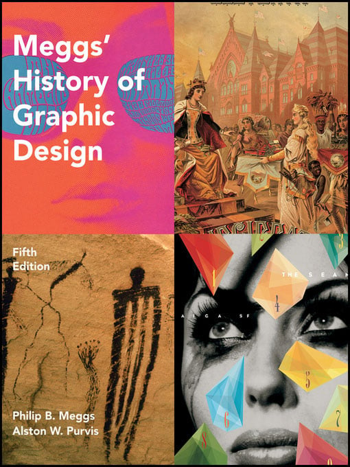

Studying the history of graphic design helps us appreciate that methodology trumps technology. Designers working 25, 50, even 100 years ago were trying to solve the same problem we are today: how to most effectively communicate their message. The only difference is that they were using a different set of tools.
The core is the communication, not the tool. And when we understand the process, the techniques can apply to whatever new tool we are using. We might have to make a few tweaks and adjustments, but how we got to where we are now is pretty much how we are going to get to where we are going next. In the midst of what sometimes seem like a whirlwind of change, that can be a comforting thought.
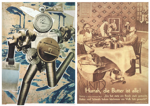
John Heartfield, the world’s greatest Photoshop artist—and all he had were scissors and glue!
Left: “Rationalization on the march” (1927). Right: “Hurrah, the butter is all gone!” (1935)
Now it might sound like I’m suggesting it doesn’t matter what version of the software you’re using and that it’s all about concept and craft. Not at all. It is, of course, imperative to keep up. This doesn’t have to mean downloading the new version on the day it is released, but it does mean developing a fluency with your software that lets you use it intuitively (and aids rather than impedes your creativity). A large part of this fluency comes from sharing ideas with others who are using the same tools. For that reason—and because we never want to be pushed out to some technological ghetto—we need to stay current with our tools.
Learn about Type
A colleague once suggested that I take a course in typography. This was 1988, before fonts were cool, before most people knew anything about type, and before I knew a serif from a sequin. I remember thinking, “You mean a course about letters?! Is there enough material to fill a course?” I marvel now at my ignorance. Type is the foundation of our designs, and without strong type our work falls down—or more likely it gets overlooked and not taken seriously.
Typography has a rich and colorful history, full of mavericks and intrigue. Understanding the evolution and the cultural importance of type opens up a whole new world. Type is everywhere, and when you start to see it—really see it—it’s like a new and fascinating information overlay has been added to your world. Think of it as your personal augmented reality.
The complaint that I hear most frequently from design tutors about their students is that they lack sufficient knowledge about the fundamentals of type. This is only anecdotal evidence, and of course every older generation is notorious for complaining about the failings of the upcoming generation, but it does seem to be the case that while on the one hand there is more typographic awareness than ever, on the other, lessons about the basic rules of typographic usage have been skipped or forgotten.
The good news for us is that with the simple application of typographic best practices we can set ourselves aside from the crowd. In terms of improving the quality of your work, making it typographically sound gives the biggest return on your investment of time and money. And today there are so many good books about typography available that one can make the transition from type neophyte to type practitioner and rise a whole division in the design league rankings within the space of a week and at a cost of under $50. Three of the most popular texts are The Elements of Typographic Style by Robert Bringhurst, Thinking with Type by Ellen Lupton, and Stop Stealing Sheep & Find Out How Type Works by Erik Spiekermann and E.M. Ginger.
A graphic designer should be well versed in concepts like contrast, alignment, hierarchy, and differentiation, and how they all relate to type. And then there is the mantra of Keep it Simple. This is woven into all aspects of design, but is especially important when it comes to type. It is often said that you shouldn’t use too many fonts. I’ve heard the advice “no more than three fonts per page,” though I myself try to avoid being too prescriptive. Learn the principles of type, combine them with a dose of common sense, and you will inevitably gravitate to more simple designs. But there will be occasions when simplicity doesn’t work and you need a medley or sometimes a cacophony of styles—and more than three fonts on your page.
Another piece of common wisdom, and one that I have dispensed myself on more than a few occasions, is that it is better to know a few fonts really well than have a font list as long as your arm and not be familiar with any of them. This is like saying it’s better to have a few really good friends than lots of casual acquaintances, and if you have to choose between those two extremes, choose the former. (But it’s better still to have lots of really good friends.)
Know Your Colors
At last count there were about 16.7 million RGB colors, so there’s no shortage of raw material to work with. Equal parts science and instinct, proficiency in working with color can take a long time to acquire. But while we’re developing a sixth sense for how to choose and com
bine colors, here are some essentials that we as designers need to know.
Fundamentally, we need to know that CMYK is the color of ink and pigment and that RGB is the color of light. Or to put it another way, that CMYK is subtractive (adding more ink makes things darker or takes away light) while RGB is additive (higher numbers in your levels means more light). To put it another way still: CMYK = print and RGB = screen, though this oversimplifies things. For example, what about a color-managed workflow where the images are not converted to CMYK, or an inkjet printer that uses CMYK inks but delivers better-looking prints from RGB files?
Nevertheless, knowing the essential difference gives us insight into the eternal color problem—why things look different on screen from how they look in print. And once we’re aware of this problem, we can understand the need for color management as a partial solution. Color management, which is all about achieving consistent color from screen to proof to press, is a difficult and jargon-ridden field, but as anyone who’s ever had a print job turn out unexpectedly knows, we avoid the issue at our peril. For more information on color management, check out Chris Murphy’s course on lynda.com, or the book Real World Color Management that he co-authored with Bruce Fraser and Fred Bunting.
Getting familiar with the color wheel helps us understand color, and in particular getting familiar with the HSB color model with Hues referenced by their angle on the wheel—red is 0 (and 360). From the fifth concentric circle, if you move outwards you are adding shade; move towards the center of the wheel and you are adding tint.

Knowing how colors are arranged around the color wheel is a key ingredient in knowing how to combine colors and also how to perform effective color adjustments in Photoshop. Armed with two pieces of knowledge—1) that to fix a color cast of a certain color you increase its color complement, i.e., the color diagonally opposite on the color wheel, and 2) that areas of neutral color should have equal R, G, and B values—you can become adept at color balancing your images.
Kuler is Adobe’s web application for generating and sharing color themes. It’s incorporated into InDesign, Photoshop, and Illustrator (Window > Extensions > Kuler) so you can search, browse, or create themes and add them to the Swatches panel. By playing around with the color wheel in the Kuler interface, we can quickly appreciate color harmony rules like complementary, triad, monochromatic, and analogous.
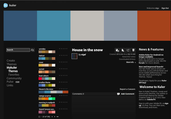
The Kuler website: kuler.adobe.com

A treasure chest of information about everything color: Colormatters.com
The tools we work with every day not only facilitate our use of color, but are designed in such a way that they can also help us understand color. For example, Photoshop’s Color Picker provides a wealth of information: Slide up and down the vertical bar to change the hue. Move horizontally on the color field to adjust the saturation of that hue. Move vertically to adjust its brightness. The Color Picker also gives us a numerical breakdown in 5 different color models: RGB, CMYK, Lab, HSB, and hexadecimal. There’s also access to the color libraries for Pantone and other color matching systems.
If you’ve ever tried to work with spot colors in Photoshop, you’ll know how tricky that can be (and if you understand CMYK and RGB color, you’ll understand why it is tricky).
InDesign makes it easier to work with spot colors, like those from the Pantone Matching system, by identifying them with distinct badges on the Swatches panel. But we still need to know the reasons for using spot colors—economy, or precise color matching, or extending the gamut of traditional CMYK—as well as how to avoid the potential pitfall of paying for extra colors when printing in CMYK.

InDesign helps us understand the difference between CMYK and RGB and spot color.
An old piece of advice, and one that can be applied to all aspects of design, is to keep samples of color combinations you like. In the past, this meant a physical swipe file; now with camera phones and smart phone apps like myPantone, it is easier than ever.

Whenever you see an interesting color combination—and our environments are full of them—snap it and store it. But also ask, why does it work? Or why does it not work?
The notion that “for every argument there is a counterargument” has lead some designers to prefer designing without color. They believe that in a world oversaturated with color, the most contrast (and arguably the most impact) comes from juxtaposing pure black and white.
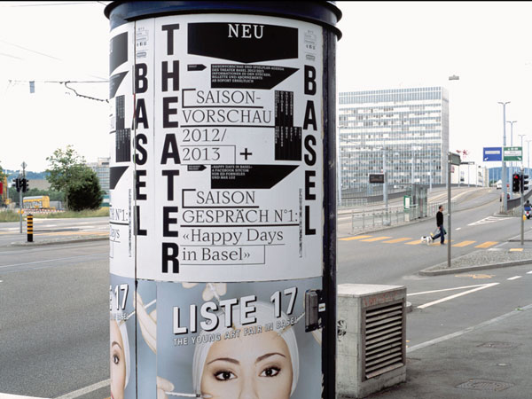
This black and white poster and identity system for Theater Basel in Switzerland, designed by Ludovic Balland, stands out due to its strong contrast.
A monochromatic approach is also useful—some might say necessary—when designing a logo, at least in the early stages. To be effective, any logo worth its salt must work in black and white as well as color. In the design phase, you want your client to focus on the shape and type rather than worrying about whether it should be this or that shade of blue. For that reason, it’s only after the basic form of the logo has been agreed on that color should be introduced into the equation. To do so any earlier would merely be a distraction.
Learn About Space
As designers, we organize stuff within a finite space. So we need to understand the figure-ground relationship of our letter-forms, our type blocks, and the images, illustrations, and other graphic elements we arrange on our pages, screens, and canvases. For every positive form, we create a negative space. Knowing how these interact, we can more effectively arrange our puzzle pieces in ways that are both practical and visually compelling.
A master of the effective use of negative space is the illustrator Noma Bar, whose series of book covers for the author Don Delilo are beautiful examples of what’s possible
with a heightened use of contrast and a carefully crafted figure-ground relationship.

And then there are those negative space logos: “Do you see it yet? Do you see it?” With a simple twist, an otherwise unremarkable logo is transformed into a talking point and takes on additional meaning. These are the logos that keep on giving.

But using space effectively is not just about graphic tricks. Your page or screen is a canvas that will most effectively convey its message if the space within it is designed. Typically we start with margins, the importance of which is often overlooked. Margins frame your page, and in the same way that a good frame can transform a picture on a wall, margins can make a page inviting or foreboding. The space around objects, the space between columns, the space between paragraphs, between words, between individual letter pairs, and the figure-ground relationships of the letterforms themselves all contribute to the design of the space on your page. And then there’s the wild card, that kind of space that is often hard to sell to clients—white space. The phrase “what you leave out is as important as what you put in” has a wide application, but it’s particularly applicable to space. When it comes to creative use of white space, it takes confidence to leave areas of your page blank. Designing with white space may in part come down to intuition, but there are tools that make designing the space on your page easier. Which leads me to my next point…
Design on a Grid
Designing with a layout grid can help you make decisions about where you place your content on the page. InDesign’s Create Guides feature lets you divide either your whole page or the image area of your page into a series of rows and columns. These make up grid fields, each of which is surrounded by a gutter.
With some care and practice, you can create layout grids that allow for the easy proportional scaling of your images, ensure that any white space on your page is used in an active way that enhances the design, and determine that the spacing between the images remains consistent.
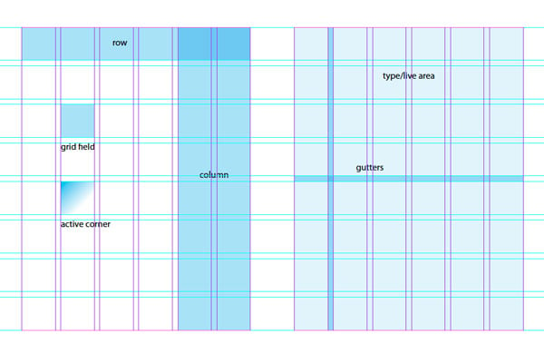
Grids are a practical tool for creating layouts. But grids are also a design philosophy, and if they appeal to you, they can underpin every design you create, regardless of the tool you’re using. A great resource for designing with grids is the website thegridsystem.org.
To the “gridnicks” (and I like to count myself one), the work of Swiss designer Joseph Müller Brockmann and Dutch designer Wim Crouwel are held in high esteem as examples of what can be achieved with this rational approach. To a newbie, the grids such designers use may at first seem intimidating and complicated, but after a while you start to see that whole mess of gridlines as a flexible and modular design system. And what looked so complicated at first yields designs that are both simple and effective.

Some examples of work by Joseph Müller-Brockmann (top) and Wim Crouwel
That said, any system applied too rigidly becomes an orthodoxy, and orthodoxies are boring. When you use a grid, it’s good to shake it up a bit every once in while; otherwise things start to look too boxy. To use another design cliché, we need to “break the grid.” Don’t abandon it, don’t throw it out with the bath water, just deviate from it—cut things out, pop them out of frames, rotate things. It doesn’t need to be much; a little goes a long way.
That’s it for now. In the follow up, I’ll continue the list and look at the importance of DIY, Collaboration, Keeping Up With Trends Without Being a Fashion Victim, and Why We Should All Step Away from the Computer.


An incredible reference for any designer or any “non” designer even: Before & After magazine. Get the full DVD set for $150. Covers everything from A to Z all in easy to understand language. Type, color, grids, Gestalt theory, etc. Awesome. John McWade was one of the first users of Aldus PageMaker, tons of great info. Several free article and videos on their site to check out. https://www.bamagazine.com
Muy bueno!!!!!
Wonderful Post! Learned a lot.
This article is absolutely great! It gives innovative ideas and new designs to the developers. Newbie’s in web development and design industry must straightly learn through your post. Ali tassavor
Excellent article. I love that you call yourself an evolving designer. What a nice way to phrase the lifelong learning process. I’m not a designer, but I often end up doing graphic projects to go along with my photography and writing. I find using grids very helpful for print and the web.