The Fashion Fonts of Moshik Nadav
If you don’t think an inanimate entity can be sexy, you might change your mind once you set eyes on the work of Moshik Nadav. His fonts Lingerie and Paris are two of the sexiest typefaces you might ever set eyes on.
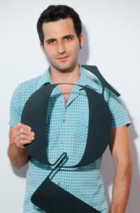
Born and raised in Israel, Moshik Nadav lives and breathes for typography and seeing design through the sophisticated form of type. Moshik established his type design firm in Israel in 2009, and relocated to Brooklyn, New York in 2013 to expand his business, as well as to draw further inspiration. His company, Moshik Nadav Typography, is a typography-based design studio specializing in elegant type design and logos for fashion and luxury. “We create type based design solutions tailored to every client’s project needs. We build anything from specialized typefaces to high-end logotype to custom type designs, which give life to elegant layouts, editorial spaces, and even architectural designs,” he says. Moshik broke from his custom work to design several commercially available fonts, most notably the Lingerie and Paris families.
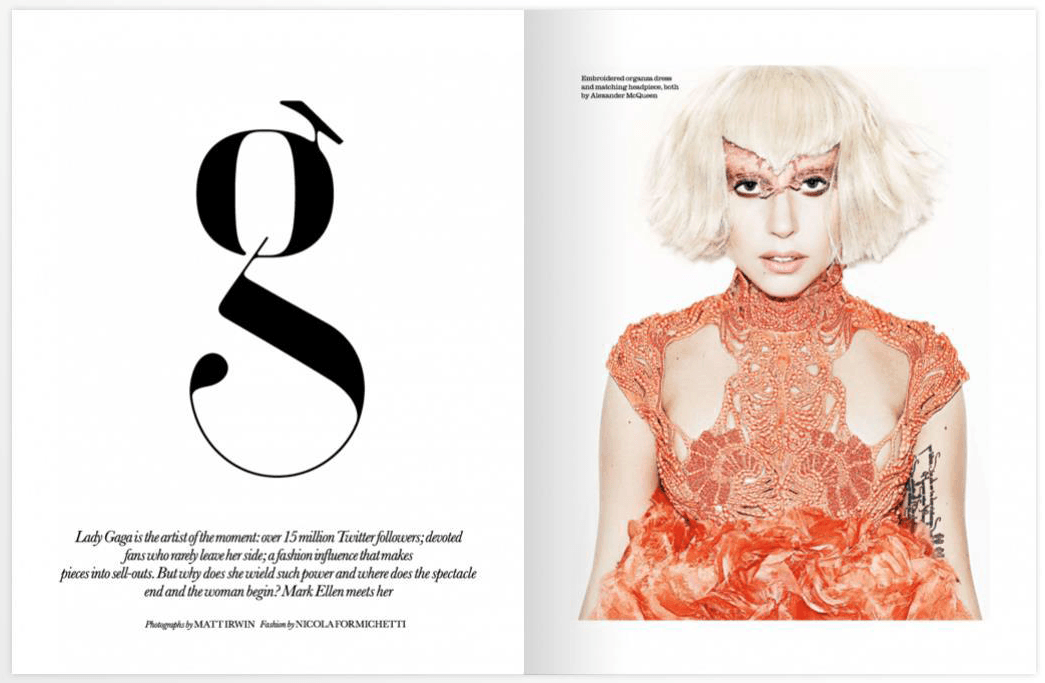
The Paris typeface was Moshik’s first type design with roots in his student days. Paris Pro came out to the world on later on with major improvements, and included lots of original and unique ligature, alternate glyphs, and many swashes of each letter. He envisions its use by super luxury brands or any other usage that calls for this highly-styled look. It comes in three weights, with the light version containing five weights, and the Regular and Bold consisting of four styles named Plain, Exit, Strip, White, and Light. This typeface family also contains custom-made words and cool open-type features.
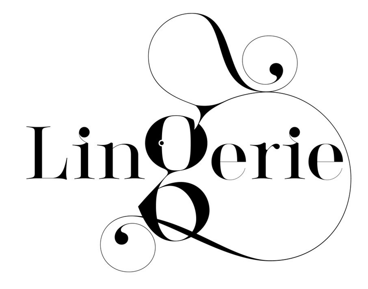
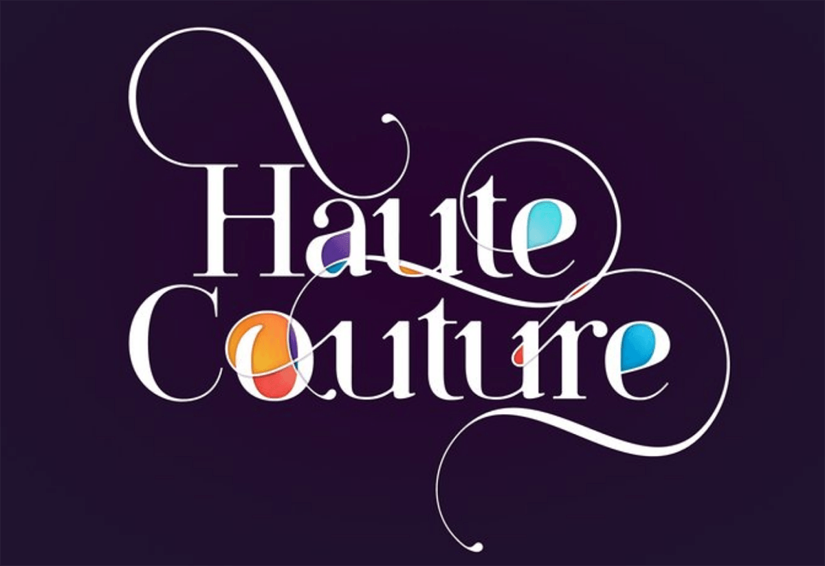
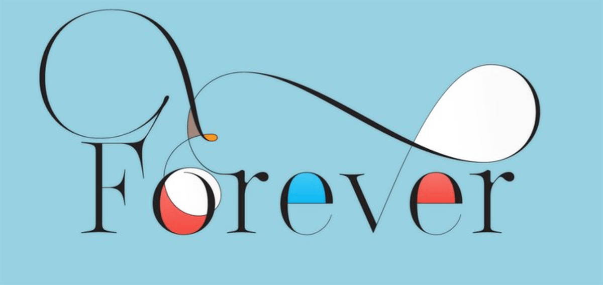
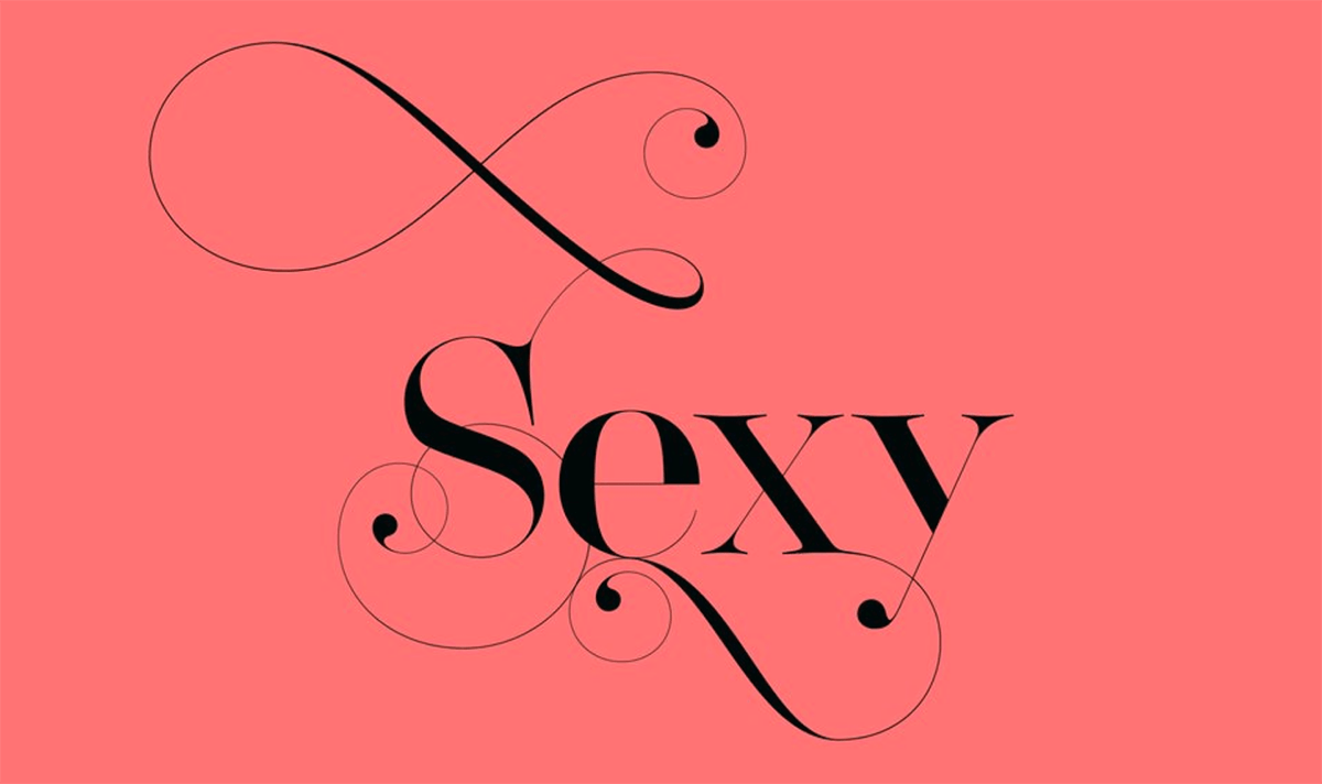
The Lingerie typeface is a fresh, new design intended for the fashion industry, but can be used anytime you need to make a show-stopping, dramatic statement. Each style of Lingerie comes with more than 30,000 glyphs, and the entire family includes more than 700,000 glyphs. The Lingerie XO typeface is Moshik Nadav Typography’s latest release and described as “the sexiest, most powerful typeface yet” by it’s creator. Lingerie XO comes in two swashes styles: Calligraphic and Dreamline – which can be combined or used alone. It also contains numerous ligatures for two and three letters combination, alternate glyphs, and hundreds of ready-made words.
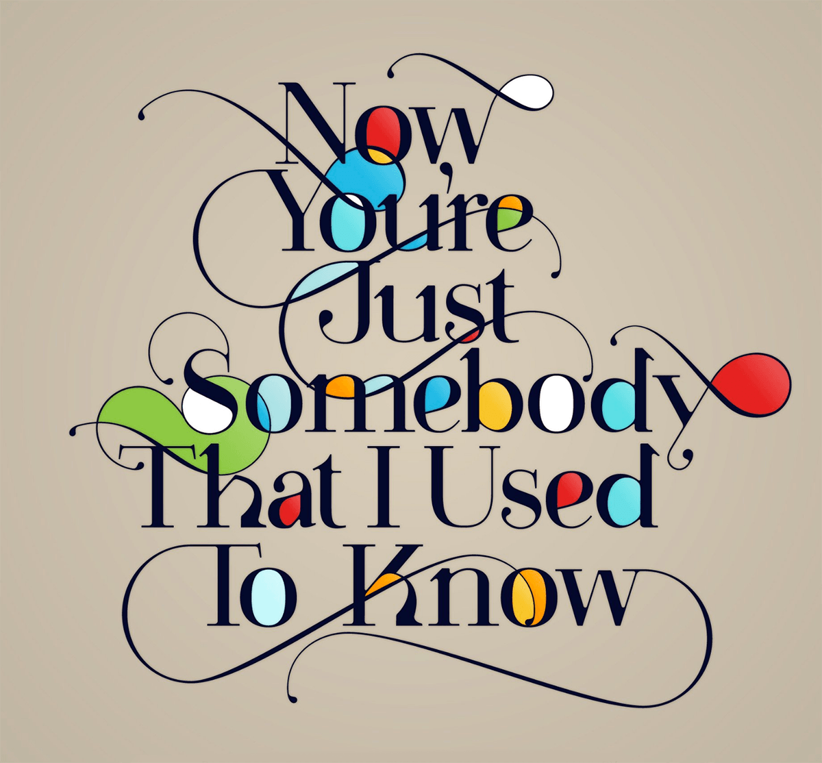
Both designs have very fluid shapes and forms, dramatic weight contrast, and many unexpected details. They each have endless possibilities that allow the designer to create totally customized, eye-popping statements, making every word a creation.
Moshik Nadav fonts are made to be used for ads, editorials, invitations, websites, t-shirts—virtually anything you can think of—to give a luxurious and fancy look. We asked Moshik some questions about his inspiration and creative process, which he was kind enough to answer:
How did you get started designing fonts for fashion?
Fashion is not something I ever was interested in, but serif fonts with a luxury high contrast become my passion with the years. I wanted to create sexier fonts than the ones Vogue, ELLE, or any other fashion magazines are using. It started with the Paris typeface; I designed it while I was a student. It was my final project for my Visual Communication design university degree. I remember that I gave myself a mission to design a new, original, and nothing like ever been see before typeface. I wanted this typeface to be in use in every fashion magazine.
The first version was ready after one year of almost 24/7 of hard work. I made it to the presentation. I remember that I invested all my time into this type. I was so confident about it. I arranged a crazy presentation at the university with iPads, a projector, posters, booklets… everything you can imagine showing the Paris typeface in the best way. I guess it was too much for my school—almost all my teachers didn’t like it. They told me that they could see the hard work but “it’s not a font.” They didn’t like it. They didn’t support it. But I didn’t take it too seriously. I believed I had something special in my hands. Two weeks later, it was in use by ELLE Magazine next to Lady Gaga. The rest is history.
Who was/were your inspiration?
My father, Jacob Nadav, is and has always been my inspiration. Unfortunately, he passed away half a year ago. My father was a very talented designer, calligrapher, and creative person. He was a great person as well, and I loved him more than anything. The way he did calligraphy was inspiring. Things that I was working on for two weeks on the computer, he did in two seconds. I learned everything from him, and I’m so grateful that I had the honor to have him as my father.
Did the move from Israel to NY change your work in any way?
The move from Israel to New York was essential not just because it was my dream for years, but also because I started to get projects from big brands in NY. Working in NY improved my productivity in a major scale. I took many courses in NY, met many super-important designers who become my friends and opened my studio in Williamsburg, Brooklyn. New York gives me this magic of inspiration and drives me to push my boundaries like no other place.
Do you have any favorite projects?
I love my projects like they were my children, but if I had to to choose from all of them, I’ll choose my new Lingerie XO typeface. It’s a revolutionary font that includes all the skills I learned over the years in one design. From original forms of letters to swashes and super-cool ligatures, I think it is my best typeface design to date. Lingerie XO was made to be in use in fashion magazines and luxury brands. It comes with thousands of glyphs, swashes, alternate glyphs, ligatures, and a number of very useful ready-made words. Lingerie XO was designed in New York, and I decided to dedicate it to my father who passed away two months before I released it.
Do you have any advice for students of typography and design?
Get yourself a comfy chair because you are about to spend most of your time on it. Be original, be unique. Show the world something new. Don’t try to be someone else. Don’t mimic your favorite designer. Invent your style and be good at it. Never stop learning even after you graduate.









Does Moshik have any SVG fonts?
I asked him and he said he doesn’t have SVG fonts, but he does have web fonts in .Woff format. Ilene