

Confusing Type Terms, Part 2

Within the world of typography, there are a variety of terms that are either confused with each other, or just totally misunderstood. In Part 2 of this series (Part 1 is here), I will explain five more of these word pairs. Note that these explanations refer to their meaning in today’s digital environment, as some have slightly different meanings in other typesetting technologies, i.e. metal type.
Tracking vs. Kerning
These two terms both relate to the spacing of a font in use (as opposed to the spacing built into the font), but have different meanings and uses. Tracking refers to the opening or tightening of the letterspacing of a range (more than two) of characters, while kerning is the addition or reduction of space between two characters.
Tracking can be used to adjust the spacing of a setting to improve its appearance. Although each font is spaced (and kerned) by its designer to look best at a particular size range (i.e. small text, mid-sizes, or headlines), you might choose to set type that’s much smaller or larger that that target range. If the built-in spacing is not ideal for the way you use the font, try opening or closing the tracking. This will add or reduce the overall letterspacing in a selected block of text. Tracking can also be used to create a desired spread-out effect, often called “letterspacing.”
Manual kerning (as opposed to a font’s built-in kern pairs) is used to create more even and balanced spacing and typographic “color,” especially in headlines, signage, and other large-sized uses when the built-in kerning might not be not adequate. Both tracking and kerning are easily adjusted in InDesign and other design applications that support these typographic functions.
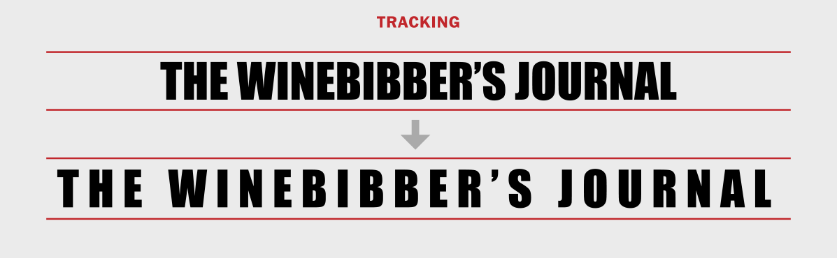
Tracking can be used to add extra space, or “track out” a setting for a desired effect, such as the example shown above.

Kerning is used to improve spacing between a pair of glyphs. The setting above illustrates the improvement of the spacing around the apostrophe by altering two kern pairs.
En Dash vs. Em Dash
Both dashes are used to indicate a break or separation of some kind. The en dash (–), the narrower one, is used to indicate a range, including days, time, dates, and pages. In fact, an en dash is correct in any instance where a preposition such as the words “to” and “from” can be substituted. An em dash (—), the wider of the two, and is most commonly used to indicate a break in thought, or a thought within a thought or a sentence. There are exceptions to these rules, as well as best practices for certain instances, so to be totally “in the know,” read up on all the details here. 

The differences in use of the en and the em dash are shown above.
Lining vs. Oldstyle Figures
There are two design styles of figures: lining, also referred to as aligning, modern, or cap figures; and oldstyle, also called lowercase, ranging, or text figures. Lining figures are all the same height, and optically align on the baseline and the cap height. Oldstyle figures approximate lowercase characters in that they have an x-height as well as fixed-arrangement of ascenders and descenders.
Lining figures are great for use within all-cap settings, such as headlines, as well as for vertically-aligned numbers, where their uniformity creates a balanced appearance. Oldstyle figures, on the other hand, look great when used within running text, as their ascenders and descenders allow them to blend in with the text, rather than stand out, as lining figures would.

Lining figures (upper) optically “align” with the cap height, while oldstyle figures (lower) imitate lowercase in that they have an x-height, ascenders and descenders.
Proportional vs. Tabular Figures
The other differentiating characteristic of figures is their spacing, which comes in two varieties: proportional and tabular. Proportionally-spaced figures have varying, or proportional total widths so their spacing looks even and balanced. Proportional figures are the preferred style for any instance that does not require them to be vertically aligned; they should not be used for tables and listings since they won’t align in vertical columns.
Tabular figures, on the other hand, are those which all have the same horizontal space, that is, the total width of the numeral itself plus the assigned space on both sides. Tabular spacing allows numerals to align vertically in tables (thus the term tabular), such as annual reports, price lists, financial statements, invoices, and other columns of figures. Many OpenType fonts have these figure styles, so be sure to check this out before choosing a font for which you need more than the one, available style.
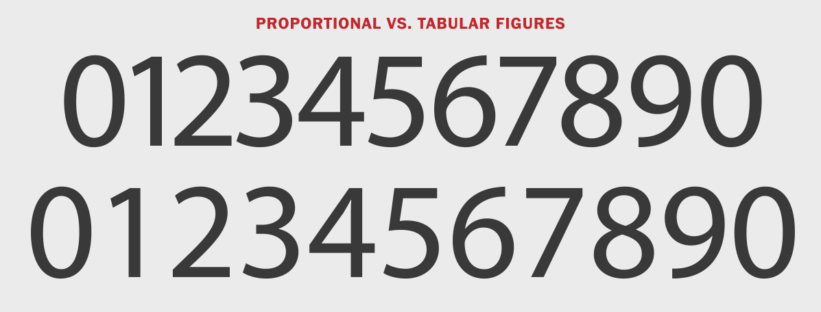
Use proportionally-spaced figures (upper) is desirable in most cases except when setting figures in a column, including lists and tables (as in tabular), so that all figures align vertically.
Typography vs. Lettering
Even though these two terms have different meanings, their differences are frequently misunderstood. They both refer to the representation of letters, but the way they are created and applied is totally different (although in today’s world of OpenType fonts with their large character sets, it can be hard to tell!).
Typography refers to the composition of text with the use of a font, whether by digital, or any other mechanical means (such as phototypesetting or metal type). It consists of selecting an appropriate font, and applying a size, line spacing, line length, and other physical characteristics, for use in print, on the web, or other media.
Lettering (AKA hand-lettering), on the other hand, is the creation of hand-drawn letters, most often by a lettering artist, calligraphy, or illustrator, and is customized for a particular usage, such as greeting cards, posters, logos, and signage. Lettering artist Gerard Huerta says it best: “A client should consider a lettering artist when something unique is required. Drawing provides a distinctive, one-of-a-kind solution.”

These images by Jill Bell showcase three instances when hand-lettering would be preferable over typesetting: when the letters change sizes… (Jill Bell for Edelman Digital)

…when they need to match an illustration (and your lettering artist can do both, as many do)…

…and when the concept is too intricate for fonts – which might not even be available for a concept such as this one.
After reading all of these, I have something else to ask you. When I studied graphic design, I only learned that “headline” and “subhead” was the correct terms. However, my co-worker often used the terms “heading” and “subheading” and I had a debate with him a few years ago about it saying that “headline” and “subhead” was the correct term (because I learned it in college). Still, he uses the latter. What do you think about this? Am I right and he’s wrong? Or are we both right? What’s the difference between these two anyway?