

Applying Gradients to Dot Leaders in InDesign

In writing this post I feel like the scientists that Jeff Goldblum’s character criticized in Jurassic Park: “They were so preoccupied with whether they could, they didn’t stop to think if they should.”
But you’re a grownup. You can decide for yourself. I’ll focus on showing what you could do, and leave the “should” part up to you. In any case, no one’s going to get eaten.
We begin with something most InDesign users have probably understood implicitly but never actually thought about for one second: the idea that whitespace characters have stroke and fill attributes. You can select a space, tab, etc, and apply colors to them just like any other characters in a text frame. Of course you don’t see those colors because they’re applied to invisible characters.

But that fill and stroke information is there and if you select a whitespace character and replace it with something visible, the stroke and fill are applied.

So far, so what, right?
But here’s where it gets really interesting (or really stupid, depending on your design sensibilities). There’s one very common case where the formatting of visible characters is inherited from whitespace characters. It occurs in a table of contents, or anywhere else where you use a tab with a leader character: The leader inherits the formatting of the tab.
For example, when you open the Table of Contents dialog box (Layout > Table of Contents) and click on the More Options button, you can see the settings for formatting page numbers and the leaders that come before them.

Notice the one called Between Entry and (Page) Number. Commonly, this would be a tab or right indent tab. To the right of that is Style. Here you can choose a character style. Technically, it’s being applied to a whitespace character. So you won’t see any stroke or fill formatting unless you add leader characters when you set up the tab or right indent tab in the paragraph style.

In some cases you might want to make the leader dots a little less prominent by filling them with gray instead of black. Or make them more prominent by using a different color altogether.
And there’s nothing preventing you from taking it a step further and using a gradient swatch as the fill in the character style!
Start by making a new radial or linear gradient swatch.

Create a character style and use the gradient swatch as the Fill in Character Color settings.

And then choose the character style to format the tab (in this case, a right indent tab) between the TOC entry and the page number.

Boom! Gradient dotted leaders in your TOC. Notice how a radial gradient is stretched to fit the boundaries of the text frame.

So you can change the effect by changing the dimensions of the text frame.
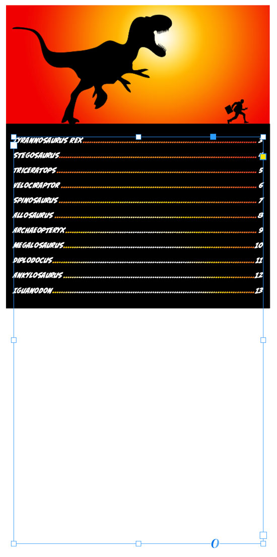
Here’s the how the same TOC looks with the same gradient in linear format.
 Want to use this technique outside of a table of contents? You can, you just need to either apply the gradient manually to the leaders (boring!) or use a GREP style (bingo!).

Indeed, life finds a way.
hahahahah … this whole article was Primo Mike Rankin. Discovery, instructions, inside jokes, artwork, Jeff Goldblum quotes. It has it all. Bravo!
Amen! :D
I’m cheering for this tip just for the dinosaurs. Great work Mike, you obviously spared no expense.
Love it! Not just for the insight, but as kitschy as it might seem, it could be perfect for children’s books.
Thanks, Brad.
Really fun & useful! Thank you!