

2018 Font Purchasing Habits Survey

 Have you ever wondered how your font choices, habits, and knowledge compare to other creatives? If so, the results of this Font Survey are sure to be informative, thought-provoking, and might inspire you to try new fonts, font formats, and suppliers. This 2018 Font Purchasing Habits survey polled 15,745 creative professionals around the world, with a goal to focus on the font user and the font customer, uncovering “what do customers really want?” The survey, conducted by Mary Catherine Pflug of Monotype and sponsored by 10 other companies, consisted of 56 questions related to font preferences and purchasing habits.
The goal of the survey was to take customers from discovering fonts exist to becoming people who value type. The full results were announced at TypeCon 2018, and are summarized here.
Part 1: Demographics & Distributors
How do you stack up with other font users in the survey?
- Responses came in from 119 countries with 46% from the US.
- Skill levels were normally distributed, with 74% reporting intermediate or advanced skill level.
- 57% report using fonts primarily in the field of graphic design. Of those 57%, 41% are freelancers.
- 55% report purchasing 1 to 10 individual fonts in a year on average.
- 52% of the survey respondents are male and 39% are female.
- 69% say they use fonts as part of their job.
- The average age is 41.6 years, with a median and mode of 40.
- 21% of respondents don’t know if they have software where they can access alternate characters and use OpenType features in fonts!!!
- 44% of respondents use fonts from a subscription service.
- 67% of respondents are aware that Adobe Typekit is included with an Adobe Creative Cloud subscription.
- 73% of respondents pay for a subscription music or video service.

Sponsors of the survey.


This year’s results compared to last year.
Part 2: Font Features, Evaluation, & Pricing
Part two contains information about the font features customers want, how customers evaluate fonts, and the prices they are willing to pay. Additionally, there are questions about licensing, budgeting, spending, and managing fonts.
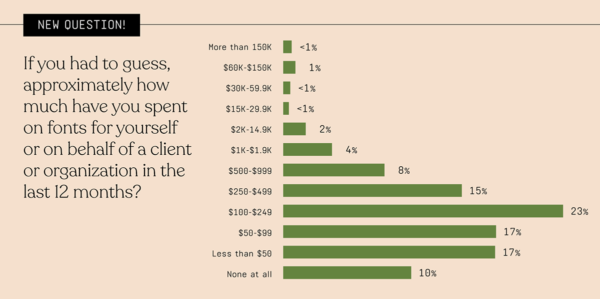
There are two distinct but essential parts of the font purchase. The first is what features customers want when they download or buy a typeface. The second is how customers are evaluating fonts. As it turns out, the #1 thing font customers care about are the numbers of styles in a font family. When asked about font evaluation, customers want to see the entire character set, type out their own words and phrases, see if the font has alternates and ligatures, and select and compare fonts with each other. As for spending, the largest sector spent between $100 and $249 on fonts for either themselves or a client or organization in the last year. 

In terms of pricing, the results indicate that 78% of people don’t think of discounted fonts as lower quality. 
Part 3: Font Feelings & Customer Segments
In this section the survey goes into how customers and type designers feel about variable fonts and major font brands. As it turns out, 36% have never heard of variable fonts, with the other sectors shown in the image below. 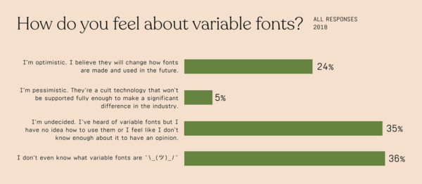
There were five questions that addressed brand perception of five major design brands related to fonts: Google Fonts, Creative Market, MyFonts, Monotype, and Adobe. The respondents were also shown the logo of each brand. The descriptive words given responders as choices (shown below) were carefully crafted to reduce value judgement. The results are shown two down.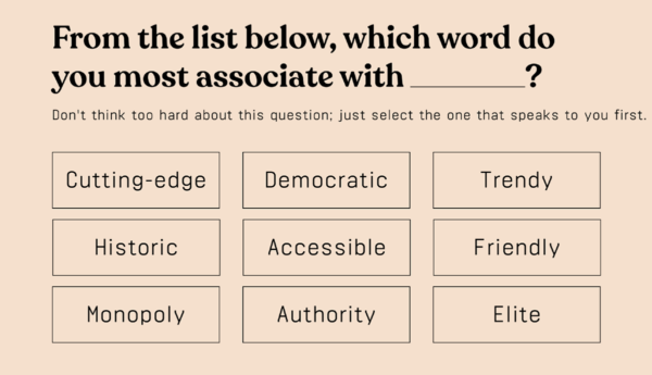

These are the results of the survey that address brand perception.
The part on Customer Segments is quite lengthy; therefore, I chose to include one image, but to see a breakdown of all six of these replies, go to the complete survey. 
The Takeaway
The goal of the survey was to take customers from discovering fonts exist to becoming people who value type. But the problem is that these numbers are going down, because there are so few people who value type. To make the group of people who value type increase in volume, there are a few things that can be done, in the words of the survey author.
1. Type Education
‘Type Education’ doesn’t refer to just traditional type education. If someone is going out searching to learn more about type, they’re going to find it. And it is important to ensure that there are good resources out there for those who want to learn more. What we also need to focus on is educating those who aren’t looking actively to be educated about fonts. Finding ways to educate users while they are browsing or shopping, or along the purchase path will generate impact.
2. Font Awareness
Font Awareness is very different from Type Education. Increasing font awareness will get more people into the first step of this diagram. There are so many people out there who become very interested in or curious about fonts once they discover on a conscious level that fonts exist. We can help the public connect the dots that fonts are made by humans, that fonts can be a valuable tool in business, that fonts are intellectual property, and that fonts are actually quite accessible.
3. User Experience
The final step to increasing the number of people who value type is providing a superb user experience. I’m not just talking about UX in the traditional sense, but instead holistically about the experiences of buying, managing, and using fonts. Accessible customer support, font management solutions that are delightful and effortless, and ways to make licensing more palatable are they keys here, because they are the biggest pain points.
I love that my hubby (a scientist) now critiques advertising and signage on bad kerning. Font awareness is possible!
It’s mildly depressing that the excellent Monotype Subscription Library hasn’t made it onto the font sources list *at all* since it was released. Even the Monotype/Linotype fonts on the new Adobe Fonts is only a subset of what’s available on MSL. I’ve pointed out to Monotype reps at MAX and elsewhere that their marketing department seems to be asleep at the wheel.
It’s too bad the graphics in this article aren’t clickable to see a larger version. Also, what’s with the throwback fonts/B&W/screens in pie charts/color palette? I feel like I’m looking at a report from 1985, not 2018 … unless that was a conscious design decision. Very tough to read those pie charts, IMHO. Good info here, though, interesting insights.