- Home /
- Archive: March, 2001
Quick Guide: Two-Pass Sharpening in Photoshop

The steps below summarize the two-pass sharpening technique described in “Out of Gamut: A Two-Pass Approach to Sharpening in Photoshop.” STEP 1: Sharpen to Correct the Image CREATE EDGE MASK Duplicate your image, using Image>Duplicate… and leaving the original image open Convert the duplicate to grayscale (duplicating one of the color channels using the Channels […]
Continue readingNotes from the Epicenter: After the Land Rush

We Americans are a smart lot. We know, for instance, that the “com” in dot-com stands for commercial. We also know that “edu” stands for education, that “mil” is for military, and that “gov” is short for government. We also know that the only extension that screams “Internet” is .com Even if you think of […]
Continue readingdot-font: New Fonts for the Web

dot-font was a collection of short articles written by editor and typographer John D. Barry (the former editor and publisher of the typographic journal U&lc) for CreativePro. If you’d like to read more from this series, click here. Eventually, John gathered a selection of these articles into two books, dot-font: Talking About Design and dot-font: Talking […]
Continue readingBit by Bit: A Taste of Titanium

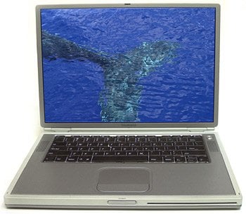
As the plane reached cruising altitude, I opened the lid of the new titanium PowerBook G4 and started it up. The machine was on loan from Apple Computer; I had picked it up that same day at Apple’s offices in Cupertino. I was on my way to San Francisco for a presentation, then on to […]
Continue readingUnder the Desktop: Powering Your Way to a Desktop LCD

Following this winter’s energy supply emergency, California-based creative professionals (and many other cost-conscious individuals) may be looking to LCDs to help lower their energy bills over the next few years — and to meet the 10-percent reduction in energy consumption requested by the state’s governor last week. If you’re in the business of providing content, […]
Continue readingOut of Gamut: A Two-Pass Approach to Sharpening in Photoshop

In my last column, which delved into a couple of useful sharpening techniques, I promised additional techniques this time around, and I’ll make good on that promise. But first we should turn to one of the important questions about sharpening: When in the image-editing process should you sharpen? The Traditional View Conventional wisdom has it […]
Continue readingInside Photoshop: The Spectrum of Gradients

Application: Photoshop 5/5.5/6 Operating systems: Macintosh, Windows A simple gradient can make a flat, colorless background exciting, blend photos together, add color to black-and-white line art, and much more. In this article, we’ll show you how to make your own gradients and we’ll go over a series of techniques used to create interesting effects, by […]
Continue readingNotes From the Epicenter: The Not-So-Good Old Days

Last week I watched the 1976 film “All the President’s Men.” Robert Redford and Dustin Hoffman play “Washington Post” reporters Woodward and Bernstein on the trail of the story that ultimately destroyed Nixon’s presidency. What’s surprising about this film is not that two regular joes managed to bring down a president, but that they did […]
Continue readingdot-font: The Challenges of Cross-Cultural Typography

dot-font was a collection of short articles written by editor and typographer John D. Barry (the former editor and publisher of the typographic journal U&lc) for CreativePro. If you’d like to read more from this series, click here. Eventually, John gathered a selection of these articles into two books, dot-font: Talking About Design and dot-font: Talking […]
Continue reading
