

Think You Know What OpenType Is? Think Again!
I have been teaching typography to both students and professionals alike for over 20 years, and am always surprised to see how many folks think they know what an OpenType font is, but are totally shocked and surprised to learn about some of its amazing features. Therefore, I encourage you to read this article, as this might possibly change the way you design, or at the very least, help you take advantage of options you didn’t even existed in your fonts.
OpenType is today’s font format of choice for design professionals. Compared to its predecessors PostScript Type 1 and TrueType fonts, OpenType is vastly more sophisticated, with features that make a font seem more like software (which they are). The primary features of OpenType fonts are the following:
- They are platform independent
- They can have a built-in “brain” (aka glyph substitution)
- They can accommodate thousands of characters
Let’s look at each of these features.
Platform Independence
Prior to OpenType, fonts were created for either a Mac or a PC. This meant that if you worked on these two platforms, such as for work and home, inter-company, or for web design, you had to purchase two versions. The beauty of OpenType is that it is platform independent – that is, the same, exact font can be used for both a Mac and a PC. This was not only a groundbreaking feature, but a major cost-saving factor.
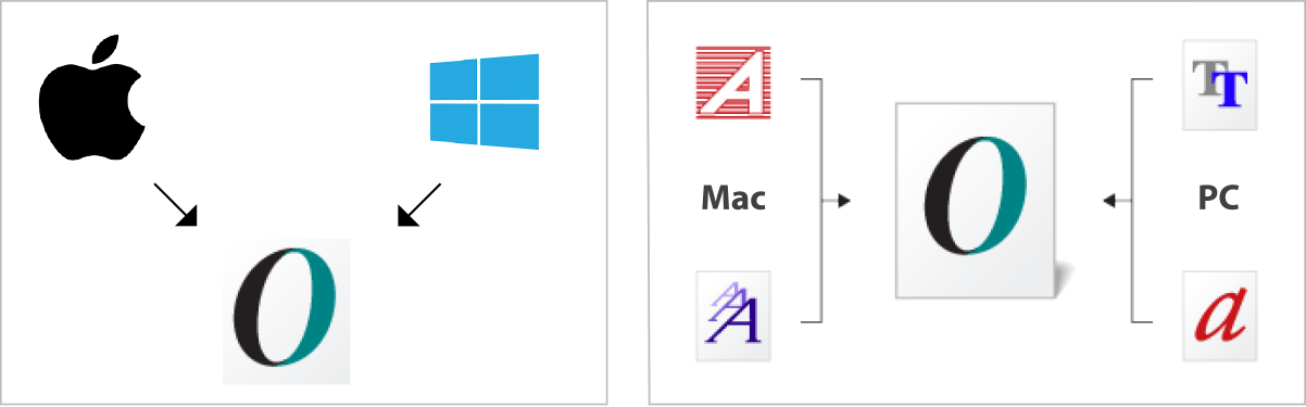
An OpenType font consists of one file that works on both a Mac and a PC.
Glyph Substitution
This refers to the capability of an OpenType font to have a built-in “brain” that dictates the insertion of certain characters in specific instances. More simply, it is a programmed script that can be used to allow certain alternate characters, such as swashes, to only be inserted where they were intended to be used. For example, glyph substitution can automatically insert initial or terminal swashes specifically at the beginning or the end of a word. This feature can be used for other characters as well, such as to select certain discretionary ligatures and alternates (when a font has more than one or two) to create a pleasing, balanced appearance. This is accomplished by programming a specific character to “know” where it should be used when that particular OpenType feature is selected. The good news is any of these automatic “decisions” can be overridden via the Glyphs panel in Adobe apps, but in most cases they are a tremendous time saver for the designer or typesetter, especially for lengthy copy.
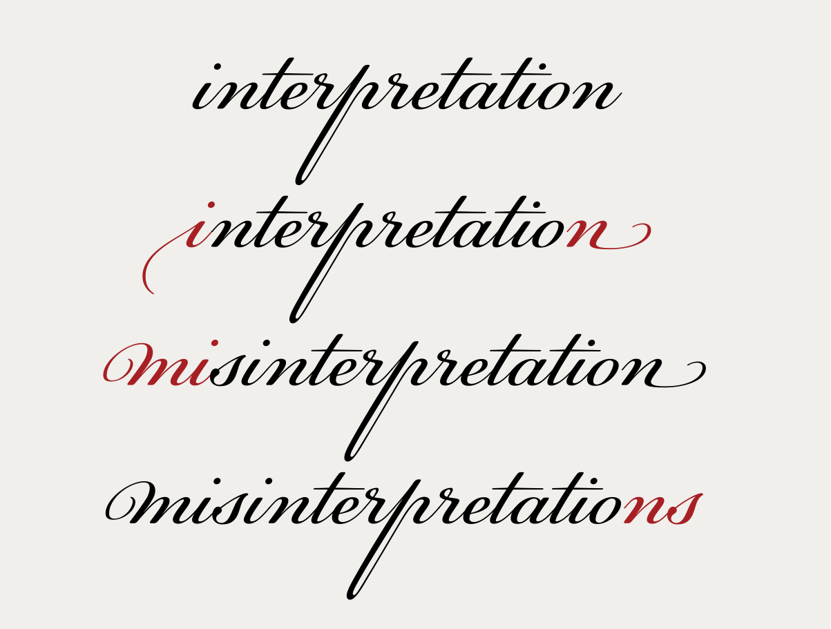
When the Contextual Alternates option is turned on for this setting of PF Champion Script Pro, both initial and terminal swashes will appear, replacing standard characters as you type, as noted in red.

Ed Interlock contains several different ligatures for most pairs of characters, such as “en”. When the standard ligature command is turned on, the font inserts the most aesthetically pleasing glyph based on the neighboring characters. A different one is used for both instances shown above in red.
Expanded Character Set
The most exciting and valuable feature of an OpenType font for designers is its ability to contain over 60,000 glyphs. Yes, you read it correctly! This is a huge improvement in an OpenType font’s capacity to contain all kinds of additional glyphs, compared to a measly 256 in their predecessor font formats. This feature is a tremendous boon to designers who have had to make do without many important or decorative glyphs that were unavailable in digital format (but were in previous font and typesetting technologies such as Phototype and hot metal). Additional characters can include:
- Multiple figure styles
- Fractions and fraction-making capacity
- True-drawn small caps
- Unlimited standard and discretionary ligatures
- Swash characters
- Contextual alternates
- Stylistic sets
- Flourishes, dingbats, and other graphic symbols
- Expanded foreign language support
Keep in mind that these additional characters are available in some, but not all, OpenType fonts. So it is important to check each font carefully to know which characters are available in any given project. (More about OpenType’s expanded character set in Part 2 of this article.)

The available OpenType features are located in InDesign’s Character panel menu, as shown above. If a category name is bracketed, it is not available in that particular font.
How to Identify OpenType Fonts
The icon for commercial OpenType fonts (as opposed to built-in system fonts used for onscreen display) is a two-tone O. Most of them end with .otf, a font extension that is easily remembered as the abbreviation stands for OpenType Font. Knowing this makes it easy to identify which fonts in your library are OpenType, as this icon appears next to the font name in most font menus in both design software as well as font management utilities.

OpenType fonts are usually indicated with a two-toned O in the font menu of most design software (upper). You can also filter via font format in many font management utilities, such as FontAgent Pro (lower).
* * * * *
Check out Part 2 to learn more about OpenType’s expanded character set.