

TypeTalk: Timesaving Tips for Designing with Type, Part 2
Most design projects are done on a tight deadline. That fact, coupled with many designers’ inclination to procrastinate (also known as doing research), makes knowing tips and shortcuts indispensable for getting a job done as quickly and efficiently as possible. Having said that, it is impractical for designers to know every, single feature of their most commonly used design software… which is why I am sharing these with you!
We covered some great tips in Part 1 of this series. Here are four more that can help make the job of designing with type faster and easier.
NOTE: Software-related topics are explained via Adobe InDesign, as that is the industry standard for page layout and typesetting. Other software might have similar features.
Right-Click for Common Commands
One of my favorite shortcuts is right-clicking to access commonly used commands. (Right-click on a Mac mouse can be set up via System Preferences > Mouse > Point & Click > Secondary click, also accessed via Control + Click, or two fingers on a track pad.) The revealed contextual menu varies depending on which app, tool, or document you are in when clicking. When setting type in InDesign, this action includes Font, Size, Change Case, Insert Special Character, and dozens more. When setting type in Illustrator, it reveals Font, Recent Fonts, Size, Transform, plus others. When used on the desktop, right-click accesses New Folder, Get Info, Clean up, and when applied to a file on the desktop, it can easily Move to Trash, Move to Dropbox (and then copy the link), Compress, Rename, and a lot more. Try it out on all kinds of apps and documents, and it might quickly become one of your favorite shortcuts as well!
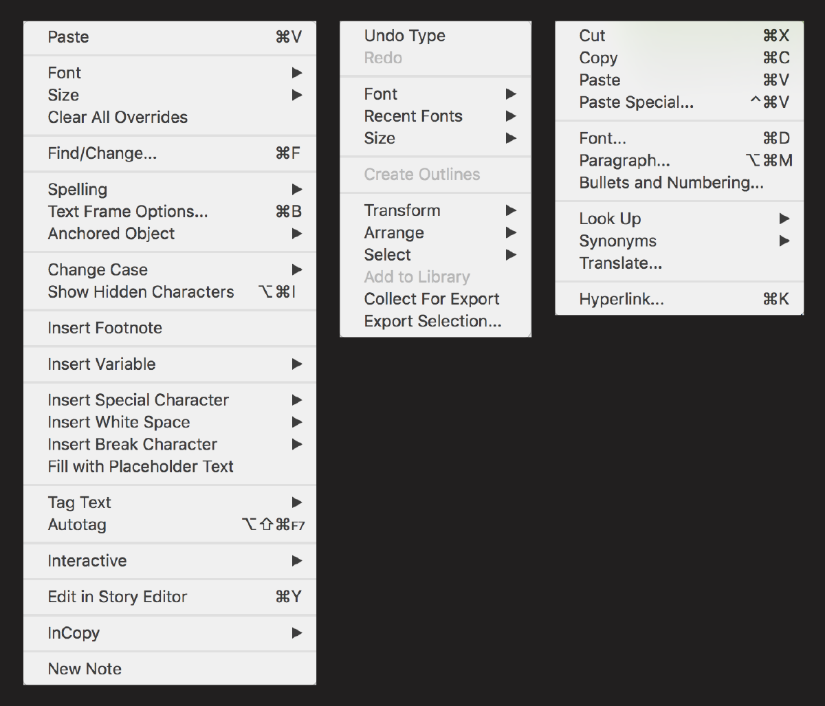
The InDesign and Illustrator right-click actions for setting type are shown on the left and center, while the menu on the right is from Word.
Apply Automatic Indents
When setting indents, some designers use the space bar (a poor practice as it doesn’t allow customization), many use tabs (which is inefficient as it requires an action for each indent), but the best and fastest is to use the First Line Left Indent function located on InDesign’s Paragraph or Control Panel. This method creates indents automatically, thus saving time when formatting lengthy copy such as books, magazines, and manuals (where you should include indents as part of your paragraph styles). This function also makes it fast and easy to change the indent value for an entire block of text. Here’s how:
- Insert text in a text frame
- Select a paragraph or entire text frame
- Display the Paragraph Panel, and locate the First Line Left Indent field
- Select an indent value, either by using the up and down arrows, or by manually inserting a value. Indents should appear automatically.

InDesign’s First Line Left Indent can be found in the Paragraph panel.
Use Kerning Shortcuts
It is a common occurrence for type-sensitive designers to adjust the kerning in headlines, subheads, and other relatively brief settings that are important enough to call for this kind of finessing. Although this can be done using the kerning field, it becomes tedious and time-consuming for more than a few characters. The fastest way to accomplish this is by using the keyboard commands for kerning, as well as for moving around character pairs, words, and lines.
Here’s how: In InDesign, using Option + right or left arrow (lower right on keyboard) will increase or decrease spacing by 20/1000ths of an em for each click. If you want to reduce the default 20 units to a finer increment, go to Preferences > Units & Increments > Keyboard Increments > Kerning/Tracking, and change to 5 units, or whatever value you prefer. To go right, left, up or down in a setting, use the related arrow keys. Note that there are also similar keyboard shortcuts for tracking, type size, and line spacing, but these attributes are more easily adjusted from their respective panels.
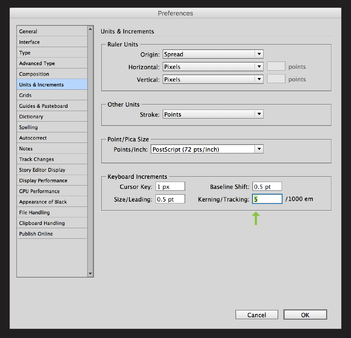
The default kerning (and tracking) increment can be changed from the overly-generous 20 to a smaller unit that allows for finer adjustments.
Avoid Fake Small Caps
One of the most common type crimes that frequently pops up in typography—often unknowingly—is the use of fake, computer-generated small caps. While some fonts do contain the true-drawn variety (particularly some OpenType fonts which have room for thousands of characters), most do not. Unfortunately, if you don’t know which fonts have them, it’s easy to wind up with the fake imitators when using the Small Cap command available in most design software. The best way to avoid this is entirely to change the small cap default setting from 70% to 100%. When using InDesign, this is accessed via Preferences > Advanced Type > Small Cap (Size). This will still allow a font’s true-drawn small caps from appearing when available, but will not allow the software to create the computer-generated, fake kind.
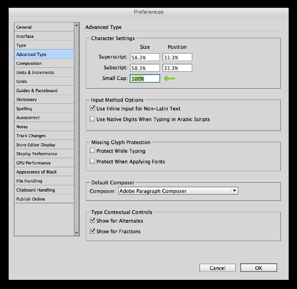
You won’t have to worry about fake small caps from unknowingly appearing in your work when you change the Small Cap size setting from 70% to 100%.
The best way to remember these tips is to read through them all and try them out. This will help to ingrain them in your memory, and go a long way towards completing your next job more quickly and efficiently. Do you have any favorite tips we didn’t mention? If so, feel free to share them in the Comments section below.