TypeTalk: Steve Lambert’s Typography for Social Change
Steve Lambert cannot be categorized. Although I was first attracted to his intriguing typographic neon work, further exploration revealed a depth of self-expression, purpose, and humor rarely found in traditional typography and graphic design. His work, which often contains an element of ‘performance art’, engages the viewer (sometimes literally!) with both medium and message in a social, physical, and occasionally political way. I immediately became ‘hooked’, and asked Steve to tell a bit more about his work, his process, and his use of type.
Q. How would you describe yourself: graphic designer, fine artist, performance artist, or perhaps visual communicator?
A. It depends on who’s asking. As an artist, I am free to combine the skills of a researcher, a designer, a provocateur, an organizer, a prankster, a software developer, and whatever else I may need – those just came to mind first. Describing myself as an artist gives me the most latitude.
Q. How did typography and signage (especially neon) become part of your work?
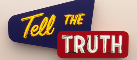
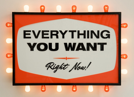
A. Starting around 1999 I began studying advertising and public space. Over the years, that format – both the aesthetics and the directness of the messages – became part of my visual language, so when it came time to express certain ideas I jumped straight to text and signs. My background is fairly working class and I didn’t go to a contemporary art museum until I was nearly finished with school. My instinct leans more on the side of clarity and accessibility than most contemporary art, which – even with two art degrees and a university level teaching position – I often find vague and inscrutable.
Regarding neon and lights, they’re a good tool to have on hand. The light and flashing patterns can read as everything from joy to desperation depending on how they’re used. There’s also a warmth and nostalgia that a viewer brings, so they automatically *want* to like it, even before they know what it means – that’s helpful too, especially with the “Capitalism Works For Me! True/False” sign.
This interactive signage piece is complete with a voting station.

Q. Describe your process.
A. My ideas often start as a note or drawing in a paper notebook I carry around. I also obsessively photograph or draw signs and fonts as I see them as a way of building up a vocabulary I can use later. When moving from the initial note to a finished piece, having those references on hand keeps the process moving.
Eventually I move to working in a vector editor because it’s so much faster to work through iterations of an idea. With my last show I started leaving myself a breadcrumb trail from the original idea just to see how many versions of a design I go through. When working on a computer it’s helpful to have some stand in fonts that do a good job of approximating what the final product will look like. I can change colors and layouts and then tweak or replace the letters in the final design.
Just a couple of the numerous sketches which led to the final concept.


Q. Do you use commercial fonts, hand-drawn type, or something in-between for most of your typography?
A. All three. But I am very careful about it.
I worked my way through school at shop restoring old motorcycles and scooters like Vespas and Lambrettas There I really learned to tell the difference between something that was actually from the past and someone’s half-hearted attempt to make something look “vintage” that isn’t. I still can’t stand the latter and work really hard to steer clear of it.
So I do use some commercial fonts in that process, but very few make it unscathed into a final piece. For one, many of them are too perfect and need to be deliberately messed up! Handmade signs have all kinds of idiosyncrasies that are very difficult to work into a piece, especially when you’re using a font that has precisely correct stroke weights, kerning, etc. So for example, I might use a commercial font up to a point and then try to put myself in the brain of a lazy sign painter from 1962, reworking details and add “mistakes.”
This is more difficult that you’d think.
In the end, the designs might be cut by a laser or a saw, sanded, or painted by hand so there’s all these points where they can collect little errors.
I’ve also drawn my own letters based on photographs of hand made signs. I found a laundromat sign that read WASH and I used that to make “LOOK AWAY” and the word CAPITALISM in “Capitalism Works For Me! True/False.” All of those were extrapolated from W, A, S, and H. When I was done I had made about half the alphabet, so I reached out to type designer, Ksenya Samarskaya. We’re collaborating on finishing off the alphabet and releasing it as a font.
I also have a font made from my own brushed letters which I later used in a digital video on a giant screen in Toronto (Close Your Eyes).
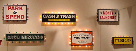
The following pieces are from Steve’s first solo show. For the complete experience, check out this gallery walkthrough.


Q. What are the limitations for choosing a typeface for neon?
A. I haven’t hit any. When I work with neon I do it through Signature Sign in Cleveland, Ohio, who fabricated the “Capitalism Works For Me! True/False” sign. I send them drafts and they tell me if it will work. So far, they have made everything work. Shipping it without it breaking is another matter…
Q. How did the “How Change Happens” piece come about, specifically the interactive aspect of it?
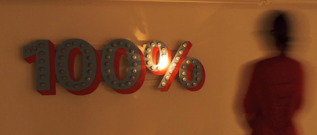
A. Over the last six years I’ve been learning more about electronics, circuits, and programming. What’s great is that it keeps opening doors to other ideas I didn’t know I had. I had a class I was teaching where I bought a box full of different sensors and one was a sonar sensor. It basically can tell you how far objects are from it. And they cost $9. The brain is an arduino which costs about $30. Anyway, we were playing with it and got it measuring distance. I filed that away in my head – like “mental note: now I can have art works that know if people are in front of them.”
I had the 100% cut out from another piece that stalled out. It was just a matter of putting the pieces together.
One light flashes on the sign all of the time; more lights turn on as more people stand in front of it. See it live here.

Q. What part do humor, irony, social responsibility play in your work, and why?
A. It’s huge. I could write a book in answer to that question.
First, I actually don’t think of myself or my work as ironic. Everything comes from a place of total sincerity. Sometimes people are surprised to find how sincere I actually am.
Of course that doesn’t mean it’s not funny. Humor allows me to reach people I normally wouldn’t and present ideas they may not be comfortable with. I can do that over and over and over again, as long as the laughs bring them up for air.
Humor can also allow me to speak in a voice, or to take on the character of those I’m critical of. Signs and type, for example, can allow me to speak in a voice of authority. It’s like playing a role. Or wearing a metaphorical costume.
As far as social responsibility… I try my best and I have these skills. Why wouldn’t I use my skills to be the best person I can be and do the most good I can?

