

TypeTalk: Introducing Gill Sans Nova

Eric Gill
Gill Sans is distinctive, historic sans serif typeface designed in 1926 by the influential British sculptor, letter-cutter and type designer Eric Gill (1882–1940). It was the first sans serif of its kind to be broadly distributed, and went on to become one of the most popular typeface of all times. Monotype has recently reworked and expanded this type family into the Gill Sans Nova superfamily, making it even more useful and relevant for today’s users and a broad range of devices.
A Bit of Background on Gill Sans
Early in his career, Eric Gill apprenticed under Edward Johnston, the famous British calligrapher. During this time he was able to collaborate with Johnston on one of the calligrapher’s most well known projects: the signage alphabet for the London Underground system. Stanley Morison, typographic consultant to Monotype in the early 1920s, was aware of Johnston’s sans serif font, and when, several years later, he saw lettering by Gill using many of the same letterforms, it struck him that a typeface based on this alphabet would be highly marketable. In Morison’s plan, Gill Sans was to be the British counterpart to Futura. 
Gill Sans has been popular almost from its inception. In the year following its release, it was chosen to be the official font for the LNER (London and North Eastern) railway system. Gill Sans would go on to appear on nearly everything associated with the company, from the menus used in its dining cars to the timetables printed for use in its stations to posters advertising the railway. In 1948, the newly created British Railways also opted to use Gill Sans for all printed media, including its timetables. Gill Sans continues to be a popular choice, and has been featured prominently by the Church of England, which adopted the typeface in 2000. Saab Automobile uses Gill Sans in all its marketing and advertising materials, and Gill Sans has also been the corporate typeface of the BBC (British Broadcasting Corporation) since 1997.
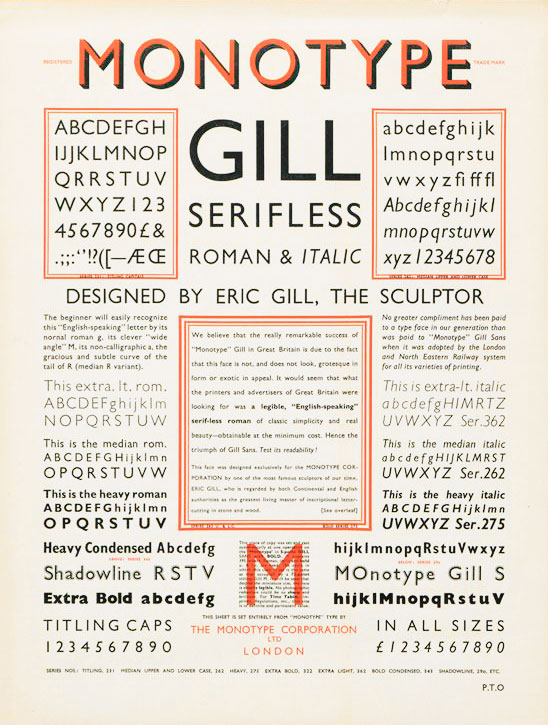
Monotype Newsletter No. 5 (1932)

The original Gill Sans
And Then Came Gill Sans Nova…
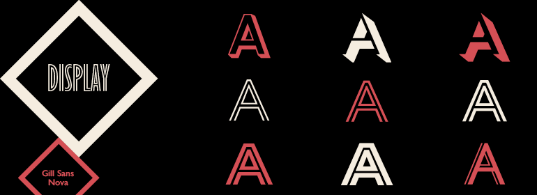
Gill Sans Nova is an expanded typographic system consisting of 43 fonts, including UltraLight, Light, Book, Medium, SemiBold, Bold, Heavy, ExtraBold to UltraBold with accompanying italics (except for ExtraBold and UltraBold). There are also three weights of Gill Sans Nova Shadowed (Light, Medium and Outline), five weights of Inline, and Gill Sans Nova Deco, a new version of the font originally called Gill Shadow Line. There are a further eighteen condensed variants, including a condensed Inline.
The reworking of Gill Sans Nova was overseen by Monotype’s Steve Matteson and executed by designer George Ryan. The goal was to take a proven design and re-tool it to function well for the modern designer. OpenType has made it possible to include experimental ideas from different points in the long history of the Gill Sans typeface, including pointed diagonals on A, V and W and alternatives for b, d, p and q. They took ideas withdrawn from the Monotype library and brought them to light, including the unique Gill Sans Deco (originally called Gill Shadow Line).
The typefaces of today have to perform heroic tasks never envisaged by Eric Gill and the Monotype designers of the 1920s and 30s—from mobile devices to giant billboards; from catalogs to e-readers, and more. Designer George Ryan explains, “Gill Sans was fast to strike a chord with people after its initial 1928 release and quickly became popular. It’s been adapted for every publishing technology, from mechanical typesetting to digital imaging… My goal was to ensure clarity across digital environments, add missing weights, and bring more personality to the family with new display fonts, as well as Gill-inspired alternate characters.” 

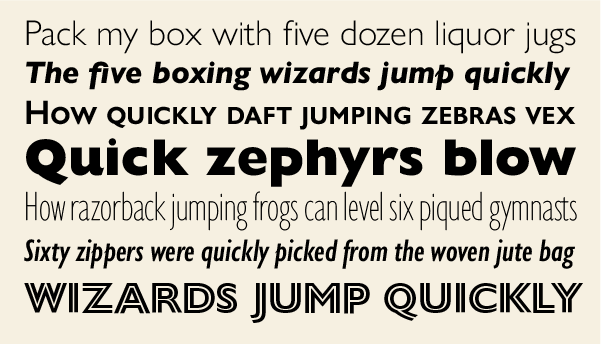
A sampling of the Gill Sans Nova weights and versions.
The Eric Gill Series
Gill Sans Nova is part of the Eric Gill Series, which pays homage to Gill’s original designs. The series consists of this family as well as Joanna Nova and Joanna Sans Nova. Joanna Nova is an extensive family based on Eric Gill’s Joanna that brings this much admired but underused serif typeface that was originally designed for letterpress printing into the 21st century. Joanna Nova consists of 18 versions: Thin, Light, Regular, Book, Medium, Bold, ExtraBold, Black and UltraBlack with accompanying italics plus Greek and Cyrillic. This careful reworking of a classic design has restored many of the qualities lost during the digitization of the typeface in the early 1990s.
Joanna Sans Nova is an expanded version of a typeface originally designed for digital tablets, a Gill-inspired contemporary type family for the world of screen-based reading. It has 16 versions: Thin, Light, Regular, Book, Medium, Bold, ExtraBold and Black, with accompanying italics plus Greek and Cyrillic. It also has small caps in both upright and italics, several numeral options and contextual ligatures. 


Ink drawings by Eric Gill for Joanna from 1939.
The Series also brings to life new elements inspired by some of Gill’s unreleased work that have recently been discovered in Monotype’s archive of original typeface drawings, designer correspondence and documents from the last century. All in all, a very exciting development worth exploration by every designer.