

TypeTalk: An Interview with Ray Nichols of Lead Graffiti Letterpress
Ray Nichols is a man who follows his passion. Ray, along with his wife and partner Jill Cypher, left their successful design and education careers to open Lead Graffiti in Newark, Delaware. Lead Graffiti is a letterpress studio that creates and prints anything from hot metal, classic projects to highly creative, and sometimes experimental works. They have done letterpress printing for the Metropolitan Opera, The Art Directors Club of New York, the Sundance Film Festival, and Sagmeister, Inc. They’ve given letterpress and bookbinding workshops to numerous individuals and educational institutions.
We asked Ray to tell us a bit more about the studio, as well as the pros and cons of letterpress printing in a world where digital printing predominates.

The Lead Graffiti logo
How did you get interested in letterpress printing?
Jill, my wife, and I were on a study abroad trip to London in 2002 with about two dozen of our design students from the University of Delaware. We set up a visit to St. Bride Printing Library where I had asked the then head librarian, Nigel Roche, to show the students 10 special items from their collection. One of the items was a box containing the original tissue drawings of the Gill Sans typeface by Eric Gill, which was personally a knee-buckler for me.
Then came the book entitled Ornamented Types, printed by Ian Mortimer of I.M. Imprimit Press, London, which turned out to be life altering. The letterpress book contained 23 alphabets from the 1820s of wood-engraved, ornamented letters from the foundry of Louis John Pouchée. In my pre-letterpress design career, I had never been a big fan of Victorian frilliness with typography. My early experience with the type was with Dover Books, which designers often used back in the day as clip art. I disliked clip art because I thought of it as a lazy choice. But standing over Ornamented Types while these pages were being turned, I was mesmerized by their stunning beauty and truly remarkable craft, both in the wood engraving process and in the printing of these 180-year-old blocks of wood. The ink used by Mortimer made the type look like a hole had been cut through the earth into the blackness of space. I couldn’t even sense the paper the ink was on.
As we walked out of the building I said to Jill, “We’re going to start a letterpress shop.” So, we started Raven Press at the University of Delaware, where I taught until 2006. I retired from teaching and together we started Lead Graffiti, which is named because of the hand rolling which produces a very painterly surface we often incorporate into our letterpress posters and books.
What do you consider the advantages and disadvantages of using letterpress printing?
Something I really love about letterpress is the ability to experiment. I also love the restrictions of not being able to nudge type sizes up and down or to negatively kern (unless you want to add a run to the process), like what can be done on the computer. Letterpress reduces creating the visual design to a much more raw experience. The more I learn, the more I can experiment with various adjustments to the process. I like not having cursor keys to produce incremental movements of elements. I still do that, but a block of wood type nudges quite differently than digital elements.
Jill and I love that much of our personal work (see the Tour de Lead Graffiti posters below), especially posters, can be done quite spontaneously and almost always without sketches. We occasionally don’t get particularly close to what we mentally see, but the result is also often much better than where we were headed. Sometimes, honestly, we just start by putting anything down on the paper. Once the first run is finished, we’ll react to it and move to the second run and so on until we are satisfied.
Regarding disadvantages, letterpress cannot visually reproduce photography with a reasonable degree of resolution. You can do some things for some images (i.e. posterization, big dot halftones), but a traditional CMYK photo is probably out of the question. In the autobiographical series of small, fine press books Jill and I are doing, we may inkjet print directly onto the paper and then letterpress the type or tip-in an image to that page.

In this piece, the selfie of my parents is inkjet printed directly onto the paper. The smaller photo is tipped in. We like that the photos then have a slightly different personality implied in their application.
Another disadvantage to the medium is that some pretty serious equipment and a lot of miscellaneous trappings are required to do a really professional job—to be able to craft the final piece that is worth the cost to a client or purchaser. No one makes this equipment anymore, and good presses are getting more and more expensive, and harder to find. Lead Graffiti has two good ones we were lucky and smart enough to acquire early on. A number of shops are starting to rent their equipment, which we do at Lead Graffiti after renters have either taken the appropriate technical workshop or given proof of their knowledge. That way someone can just walk in and start doing something as long as schedules don’t butt heads.
Space is also an issue. We currently have a 2,200 square-foot studio, which is pretty packed with equipment, type, workspace and supporting supplies. For the consumer, letterpress can be fairly expensive when compared to digital and offset processes, mainly because of the time and labor involved and sometimes we like to incorporate things like handmade paper. However, there is no substitute for the impression of type carving into sexy paper. The sometimes inconsistent printing caused by how well history has treated that type can produce a really stunning piece that needs to be housed in a box of valuables.
Without question, letterpress adds a serious sense of weight to a piece because it has that keepsake quality you get when type and image actually merge with the paper and aren’t just carried on it. Speaking of weight, many designers today want to print on both sides of a typical business card. In letterpress, the impression from one side of the paper often shows on the other, so we print on two sheets and glue them together to present each side at its best. Three layers of 120# cover stock gives the card the heft of something akin to a brick. We love a business card that not only lands on a conference table with an authoritative thud, but it also has the visual and emotional presence of that metaphorical weight. A digital or offset print on a really thick business cards seems like a boisterous exaggeration with little substance.
Given the right circumstances, letterpress can be quick. We don’t like having to print fast all of the time, but it is often quite possible. Normally when someone wants something, my first response is “two weeks.” Most of the items Lead Graffiti prints say, “Printed slowly & patiently via letterpress.” By way of example of an exception, a designer recently called us about a wedding invitation he had had printed via letterpress, and he and the bride were unhappy with the result. The printer had suggested they do a reprint with us as we are often known as an “interested problem solver.” Starting in the morning we made two easy digital adjustments to the design to improve the printing issues, rush reordered the photopolymer plates from Syracuse (we are in Delaware), which were then made that same day, and had the plates overnighted to us for the next morning. We reprinted the job that afternoon and the designer picked it up that evening—32 hours from start to finish with a happy bride and designer. Keep in mind here I’m only talking about printing and not designing from scratch.
Lead Graffiti’s attitude toward printing via letterpress tries to keep the process quite loose. For five years (from 2011 through 2015) during 23 consecutive days overlapping July, Jill and I, and any collaborators for that day, watched each stage of the Tour de France cycling race in the morning, looking for moments we could translate into wood and metal type to form a kind of daily visual journal of the Tour stage. We would eat lunch and talk about what we saw and how we might pull off the translation. Then we spent the rest of the day in the studio (until midnight, max) making a 14.5″ × 22.5″ poster from whatever elements we had on hand. The posters almost never required any form of sketch, and were always completely spontaneous.
While letterpress is often described as a very rigid process, at Lead Graffiti we try to keep the typography and images fluid. By way of example, these Tour de Lead Graffiti posters from 2013 and 2015, complete with hand rolled type and image (in the two posters below), were each produced in an edition of 45 in about nine hours from start to finish.

(left) This poster from 2013 conveys the dynamic twisting 4th-place solo ride by cyclist Mark Cavendish. (right) The image for this one used vertical handcut lengths of 1/4″ masonite to convey the steepness of the winding road up the side of a French mountain.

In this poster also from 2015, we printed four bike chains wound into a spiral to represent a snail for the “slow” Rest Day. The colors in the Zs at the end of the snail’s tail are all printed simultaneously using eight different colors on the press at one time. How’s that for expediency?
When should a designer or client consider letterpress?
Honestly, I don’t think there is any project that couldn’t somehow be executed by or include letterpress. I mentioned the issue of high-resolution photography earlier, but there are lots of ways to combine it (gluing two sheets together, inlaying, binding sheets together, photographing printed antique type for editorial illustration, etc.). Every time I think of something that won’t work, the opposite also seems like a great use of it. Letterpress invitations are usually thought of as strictly denoting elegance and extreme formality, as for a wedding announcement. But Lead Graffiti designed and printed a fun-loving wedding invitation that was 12 beer coasters. While clean, slick type can be perfect for a memorial piece, we’ve also printed them with beat up wood type that lends a sense of history and a life well lived. It’s really pretty easy to create a story for most any piece and why letterpress would be the perfect solution.
Budget is often a major consideration (after all, letterpress usually means lots of physical hand craftsmanship), but for many letterpress printers, if the project is interesting, the price can be negotiable.
Quantity can be an issue. For the certificate or memorial or keepsake that only needs a handful or fewer copies, letterpress is ideal.
How should one decide when to have you do the typesetting and design vs. delivering a digital file? What are the pros and cons of each?
I think the mistake most designers make when using letterpress is that they design the job for offset and then try to execute it via letterpress. When the designer starts with an understanding of the letterpress process and then designs it, they will almost always come out with a result that is far more impactful and satisfying for the designer, the intended audience, and the printer. Almost everything Lead Graffiti does for a client is designed on a Macintosh with either InDesign or Illustrator. Like most designers, we need the flexibility the computer offers to adjust design, type size, edit text, etc. subtly. When we are doing it for ourselves as a piece we might want to sell online (or if the client is adventurous), we typically reach for handset wood and metal type for its unique character, even though it has lots of size, placement and usage challenges.
What was your most challenging job? …and the most fun, interesting, or notable?
Five design educators (including myself) were fortunate to receive an award from the Art Directors Club of New York. They found out that I was a letterpress printer and asked if I wanted to print the award. Of course I did. It ended up as a 9-run print (the frame image took six runs, all perfectly registered) and they only needed one copy of each of five certificates. The challenge here was to posterize the image in multiple colors for printing, versus doing a halftone. Trying to get the right color for gilded frames without using gold was difficult. The result was fabulous. We like doing projects that push us technically. Not every time, but often. We love showing this piece to letterpress printers, because they always rub their fingers across the recipient’s name (which is also letterpress). Then we say, “No. Feel the frame.” They almost always gasp. Letterpress is great for certificates.
Our favorite job was the diplomas for an 8th-grade class of the Waldorf School of Philadelphia. I had always been attracted to the Nobel Peace Prize certificate, which was presented in a folio with an original piece of art by a Swedish artist on one side and the calligraphic certificate on the other.
The Waldorf students came to Lead Graffiti and printed the common text on a blank sheet. They also created a few sheets of pastepaper, which would be used to wrap the outside of the presentation folio. Each student handset their name in metal type which they then printed onto their own diploma. After they returned to school, the students did collaborative drawings where each created a piece of artwork to which each classmate added some element. They supplied us with a calligraphic line from a poem they read at the start of each school day, which we turned into that radiating pattern. Jill hand rolled the yellow sun. We then built the folder and put everything together. To understand how nice a project this is, you should have been with us when we delivered them to the students. A joyful squeal from a client can really make your day.

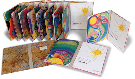
Our favorite job was this diploma for an 8th-grade class of the Waldorf School of Philadelphia.
Any other stories or anecdotes?
Our newest poster is a type specimen sheet of 7″ high wood type entitled Alphabetachaos. A time-lapse video that we’ve put on YouTube shows us locking up the 3rd run of the alphabetic element and our hand inking process.
Sports Illustrated did an article on our Tour de Lead Graffiti project and we’ve had major exhibitions of the posters at the Hamilton Wood Type Museum, The British Library, AIGA, and a keynote talk at the Society of Typographic Arts in Chicago. We didn’t do the project this past summer, thinking five years, 1800 of my personal hours, and 115 posters was enough. Our big personal project that we’ve switched to is a series of autobiographical books entitled Moments Carved in Paper.

Lead Graffiti’s newest poster is a type specimen sheet of 7″ high wood type entitled Alphabetachaos.
Is it tough to keep a letterpress studio running in today’s digital world?
For the most part it isn’t hard to keep it running. Once you have the equipment, it is pretty straightforward. We do have some more complicated presses that require some special knowledge. We also have an Intertype (a later version of the Linotype) which we use to cast “hot metal.” It probably has 4,000 parts to it, weighing in at something like 3,400 pounds. My son, Tray, is great with machinery and for some reason (not heredity), he seems to be able to talk the language of the machine and so far has kept us out of trouble and in business with it.
Making enough money to match a normal job can be pretty tough with all of the other printing options available. Doing a wedding invitation (or any other type) via letterpress, versus printing it out on an inkjet printer, presents a difference in cost. The problem I see is what it says to the guests. It takes a lot of effort to go to a wedding or big event. Presents. Maybe a hotel. Eating out. Babysitters. New shirt or dress. So to bang out a digital print invitation is somewhat lame and weak to the guest. The point of an invitation is to get the guest excited and make them feel important and welcome, not to just make a personal announcement.
One of the most fun things we do is offer a lot of letterpress-related workshops to design classes, design groups and professionals looking for a bonding experience, and writers. Our of all-day creative letterpress workshop can accommodate up to 14 participants, and results in a 14-page, hardback book. We include a tour, show historic and contemporary examples, and teach the basics of handset type. Participants set their own words, print their own covers and pages, type their names on our Intertype, and make three copies of their book to take home. The image below shows a sample finished book.

A sample finished book from an all-day creative letterpress workshop.

This shows the lockup for the 2nd color run from another workshop, and the unfolded broadside print.
One of the special things we love to point out when we have a student group is the ability to mix typefaces with a rather reckless abandon. Students are almost always taught to avoid more than three typefaces on a page. Letterpress has taught us that you can often radically break that rule. I think a subject like typography is often taught before the importance of finding good ideas.
I love telling students about a designer once saying in a talk, “You wouldn’t want to use Franklin Gothic for a lingerie ad, nor would you want to use Nuptial Script in an ad for nails.” It took me about 30 seconds to come to a counter-argument that both typefaces were perfect. Imagine a wonderful photo of sexy lingerie with the headline in 72 point Franklin Gothic Extra Bold that said, “Hard Core Lingerie.” Now imagine a photo of a pile of nails on a white seamless with a Nuptial Script headline reading, “The perfect marriage between a rock and a hard place.” I think it’s more important to find an idea worthy of an interesting choice of typography, than to somehow pick “nice” typography.
Another really great two to three hour workshop we do is based on the design and letterpress work of H.N. Werkman, a Dutch designer from the 1930s and 40s. As a letterpress experience, this one is unusual in that the printing is “upside down.” Normally type rests face up on the bed of the press where it is inked and paper is pressed against the top of the type. In this workshop, the paper is laid on the bed of the press, the type is handheld while being inked with one or more colors with a roller, and then it is carefully placed on top of the paper for printing without any lockup. Each print is unique, so this process doesn’t lend itself to edition work. You just keep inking type and pressing it down until you get somewhere. This is a great workshop for people studying typography in a design program because it completely removes the notion of type making words: the designer simply concentrates on the shape of the type or its negative space. Here are a few colorful samples from workshops. You can see from the inset photo that the person is putting the wood type down onto the paper.

The Werkman workshop at Lead Graffiti allows participants to move around in the studio, printing on any of the office presses we typically have in operation for the workshop. We’ve had up to 15 at a time taking the workshop.
An added element that completely surprised us was how much kids like the workshop. Kids as young as six (with help with the heavier bits) are really quite taken with it. They really love using iron handpresses and our automatic Vandercook. We recently held what we expected to be a three hour workshop with a Boy Scout troop. After three hours, they kept printing. Jill and I spent most of our time during the workshop cleaning the ink off the type. After about 4.5 hours I called it quits and said I was going out to sit in the front yard of the studio with the adults. Quite frankly, I kind of forgot about the scouts. About 90 minutes later I walked in and most all of them were still working. Literally every piece of wood type we had out for the workshop (probably 200 pieces) were all stacked on the table covered with ink. They quit because they simply ran out of ink that we had put out for them.
A good friend wanted two of his grandkids to try our workshop. The older one, aged nine, loves trains. We said, “OK. Make a train, but just do it with type.” Great smoke and cow catcher (which is a half-inked Y), we thought. How cool is that?

A fun poster designed and printed by a nine-year-old!
* * * * *
You can see more Lead Graffiti work at LeadGraffiti.com, and we actively participate on Facebook, Twitter and Instagram as “leadgraffiti.”